Unsharp building queue UI

Hello,

I have a problem with my building queue UI which I can’t seem to fix on my own.
Unfortunately, my UI is very unsharp. See the following images from in game footage:

grafik

grafik

In the prefab the numbers are fine but the outline of the inner circle is also blurry:

Do you have a fix for this issue?

Thank you in advance.

Kind regards
Banlode

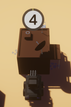
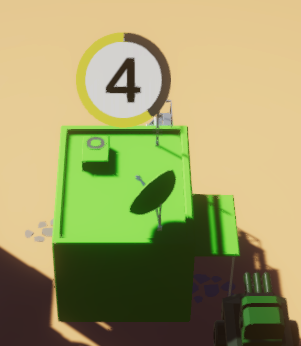
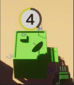
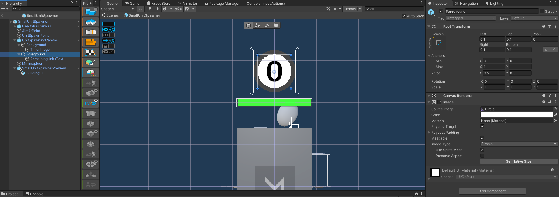
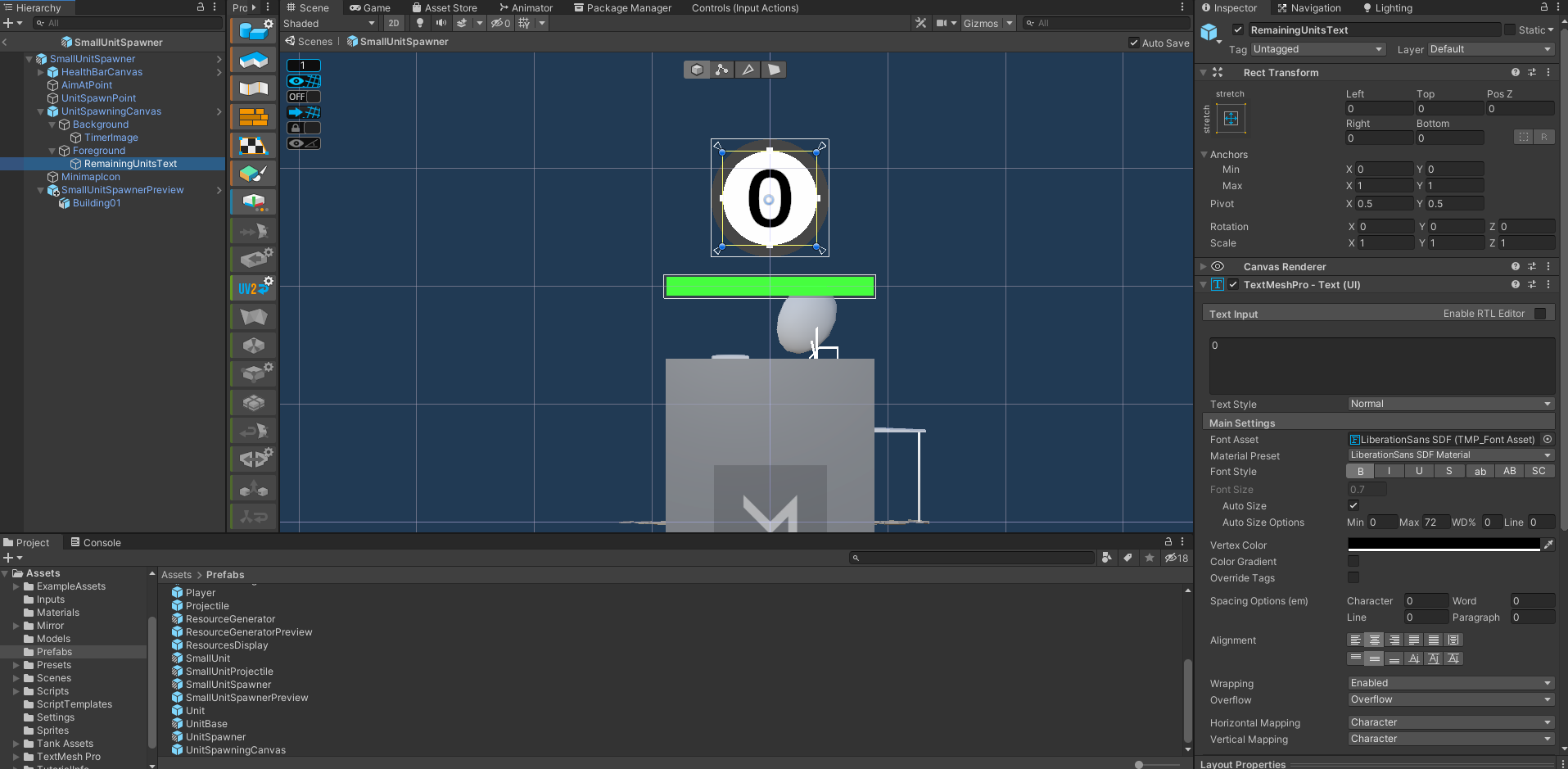
Hi there, is it specifically the number/text that is blurry? This probably has to do with the font size and scaling. Would you like to share how the text is set up in your game including the parent canvas?

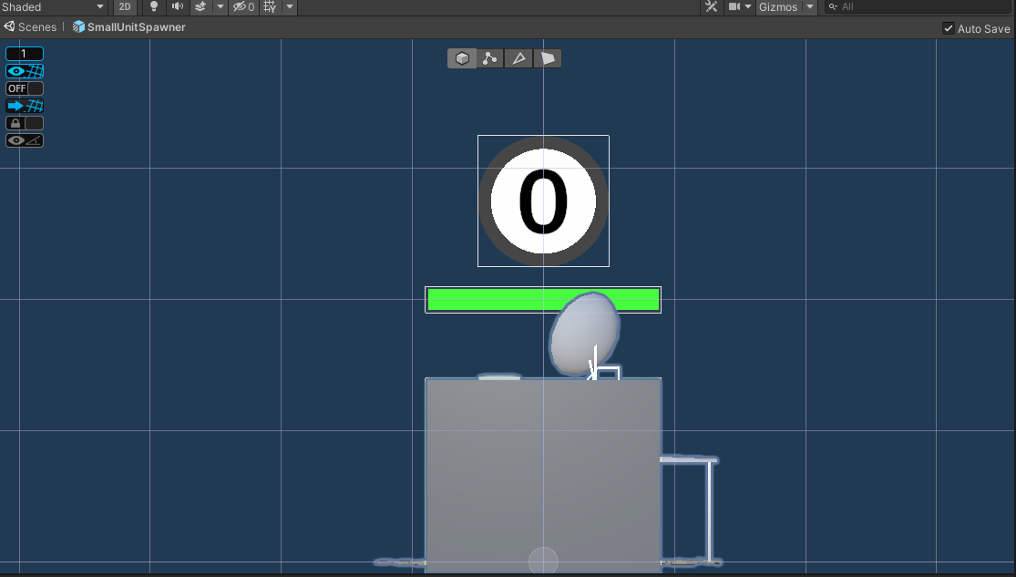
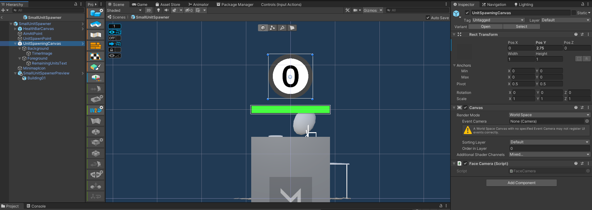
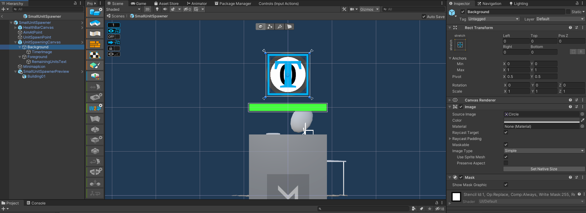
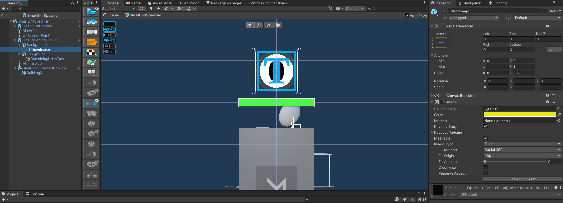
Basically you need to think about how many pixels are being used to draw the numbers. Increasing font size usually ups the number of pixels, but then you have to scale back to the size you want (so text size up, scale down, to sharpen). Your canvas also does some pixel scaling depending on what it is set to. If it’s on world view, it will scale with the game resolution, so check what resolution is set in the Game tab (might be this if you followed the course exactly). Also TextMeshPro seems better at it than standard text UI.

Hi Yitzchack,

thanks for your quick reply!

Maybe I am very critical about this but I think that the UI (text & circles) looks sharper in the course than in my game. Here is the UI taken from the video of the course:
grafik

And here is what my UI looks like:
grafik

In my UI the number itself looks very blurry to me. Furthermore, the borders between the circles don’t look sharp to me. It looks like they are a bit mixed because there are no clear borders.

Here is the setup of the prefab:
Canvas

Background Image

Timer Image

Foreground

Remaining units text (TMP_Pro)


grafik

And here the graphical settings for the game:
grafik

Thanks for your effort.

Kind regards
Banlode

Hi there, it looks like everything is setup the same way as in the course. If you build the game, does the UI look fuzzy in the build as well? Just trying to narrow down the cause.

Hi,

yes. The UI looks unsharp both in the editor play mode as well as in the build game.

Kind regards
Banlode

I’m not sure why it looks different than the course. If you increase the font size and decrease the scale of the text object, does the text get sharper?

This topic was automatically closed 20 days after the last reply. New replies are no longer allowed.

Privacy & Terms