Thor's Hammer

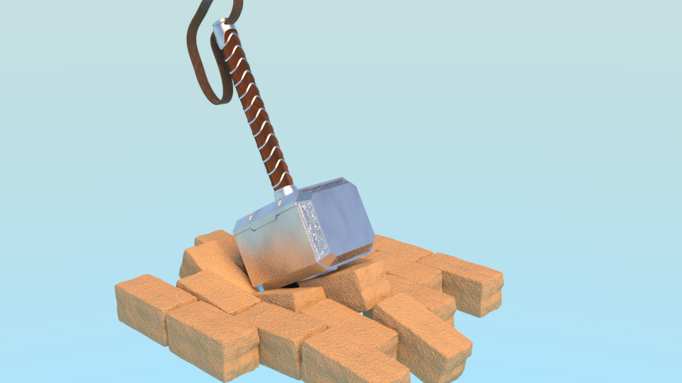
On YouTube as saw this tutorial on Thor’s hammer. It is a simple construct. The model is easy to create. But it allows me to focus on other 3D aspects. Like materials, lights and composition.

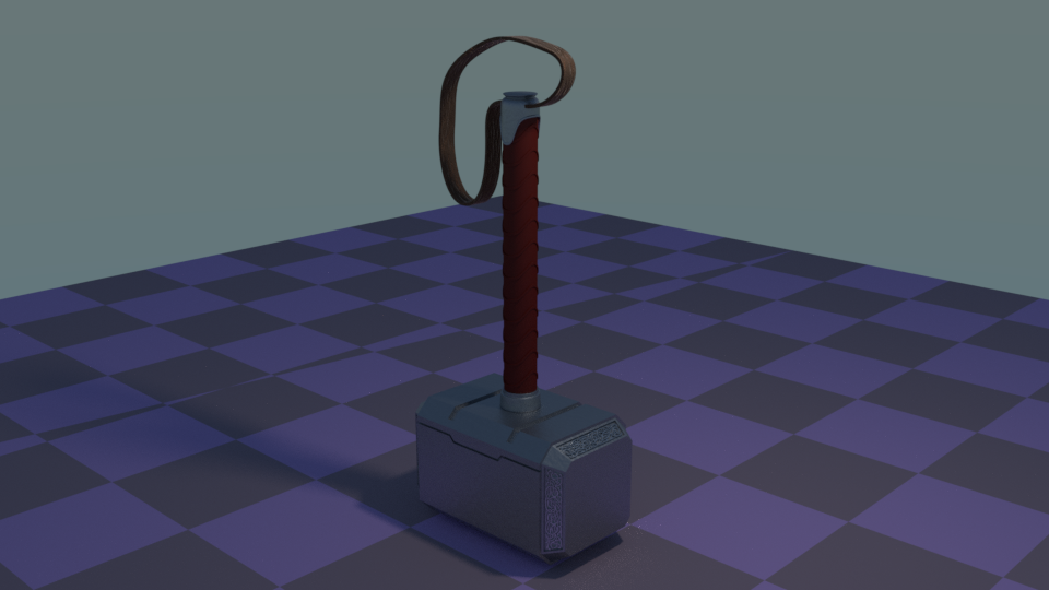
I have problems understanding how the physics of materials work. Or even remember stuff, learned weeks ago. So here follows my first attempt. Strange, my checker floor is already a bit odd :frowning:

First%20color

Part two of the Thor’s Hammer video course, isn’t available. So I used my learned skills to add some bricks. I had a lot of problems creating the iron material. I forgot that iron doesn’t have a diffuse colour, only glossy.
No I’m going to breake some bricks :wink: (Lesson TEN ‘Destruction’).

Hammer%20and%20brick%2002

18 Likes

Uploading this to a Sketchfab account would be good @FedPete, you could paste the URL for it into your post and it would be embedded in all of its 3D wizardry :slight_smile:

Nice work on the hammer, how have you achieve the detail around the angled edges, it looks a bit like writing. Is it a texture or 3D also?

1 Like

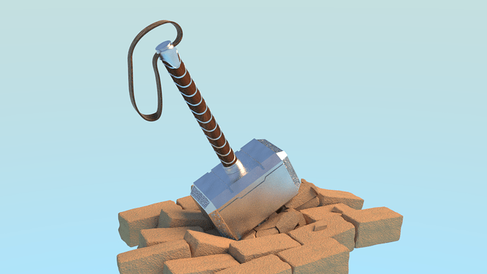
So I added some broken bricks. Leaving me with the question, how to compose the image and with what.
The hammer is lying around somewhere. Maybe some scenery …

2 Likes

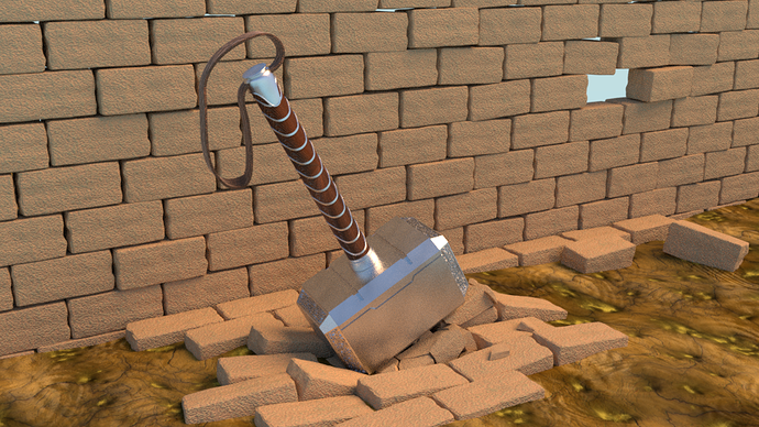
I added a wall with the same brick type. I like the colour schema in combination the the floor. But it’s to much of the same type. Leading a dull composition. It needs more green or something. I’ll work on that.
Composition, composition …

4 Likes

awesome !

2 Likes

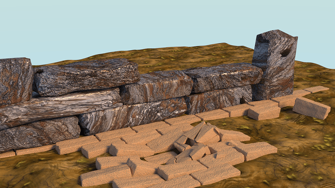
The idea is to add a stone wall, using a texture bitmap on simple mesh. It will keep the render times low.
But still fighting with a composition. I’m thinking on adding grass and a environment map.

1 Like

When you had the other brick wall I was thinking about a hanging cape. Like those old banners hang down in medieval castles, but perhaps the colour of Loki or Thor’s cape instead. Might look quite cool draped over your lower brick wall… not sure if the red cape would clash with the handle colour though? Looking very nice by the way :slight_smile:

2 Likes

I think this picture with a mood lighting would be great for modeling around in a 3d viewer like sketchfab my man!

1 Like

So the thing for me in these pictures for composition is the story that it tells, Thor’s hammer wouldn’t be just left around xD

Whatever the choice for it being there will help you create composition. If the hammer is lying on the ground how long has it been there? Maybe have some dust and crumbles, on it etc etc) Or did it get there because of a fight? Like he threw it at an enemy? Maybe embed it deeper, Any choice of why it’s there will flesh out things you can do for composition.

I downloaded a few images to help if you’d like!

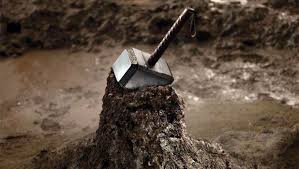
So the original images from the first movie, I mean these guys get paid for composition no?, -thor%20impact close_up
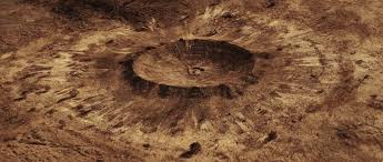
The cool things i feel with these shots is a sense of power from the impact (good for a god-weapon) even the close up where the hammer is partially embedded shows a sense of weightiness by being isolated and also a sense of worth since its on a pedestal of sorts to show that its not an ordinary weapon. Its especially cool how they tied the two together, the crater makes the pedestal xD Its a cool simple composition.

I like that you broke the bricks beneath the hammer in your picture, thats the idea of story in composition, just push it further with why the hammer is there and I think the composition will come a little more naturally friend :))

4 Likes

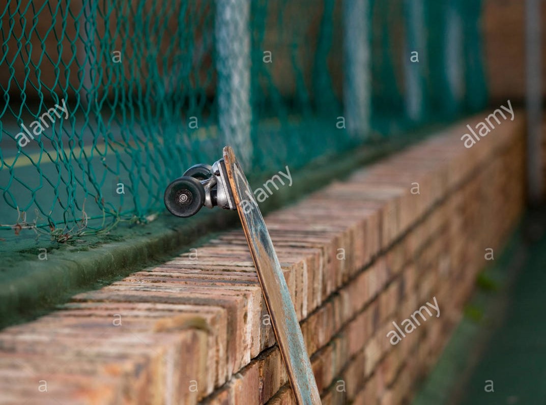
How about having it leaning against a wall, like he left it there while prepping for a battle?

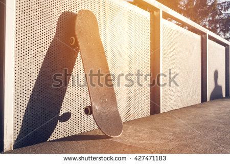
This picture shows that the guy is coming back for his skateboard, the leaving of said item is temporary, and has a focused lighting scheme, its late in the afternoon (which to me gives the feeling this guy is a dedicated skateboarder maybe taking a break)
Lying%20against%20wall

I thought it would be fun if you had Thor’s hammer sitting on a brick wall sorta like this one (just take away the longboard) and had a cute little note on it like "For Thor, Love Odin <3 haha

Thanks for reading these, hopefully some of it helps your photo :))

2 Likes

Oh boy, what a nice breakdown on the story (composition) of Thor’s hammer.
So modelling the 3D object was fun. Material and texturing is problematic. But composition, story telling in one image, very difficult.
I have a lot of ideas, but foresee Blender problems because of the skills I have.
And YES, Thor’s hammer is a powerful object, so show it. Why is it left behind, … try to explain. And above all, keep it (Blender render) simple. :wink:

My original story line was; Thor’s hammer flew through the air. Hits a wall and falls down. Then an other train of thoughts. The hammer (always) return to Thor.

Thank you all, for your thoughts and insights. I really like this. And still working on this project of composition.

1 Like

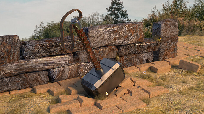
As a learning process, I added some grass and some daisies. I don’t know why, just to soften things up. Or adding colour to the scene.
The stone material is too shiny and I still don’t like the composition.

4 Likes

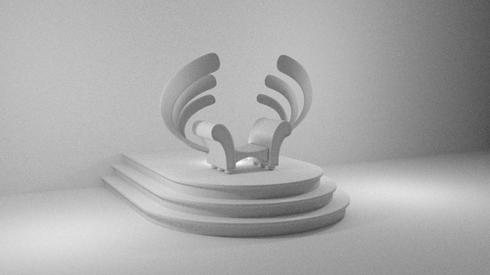
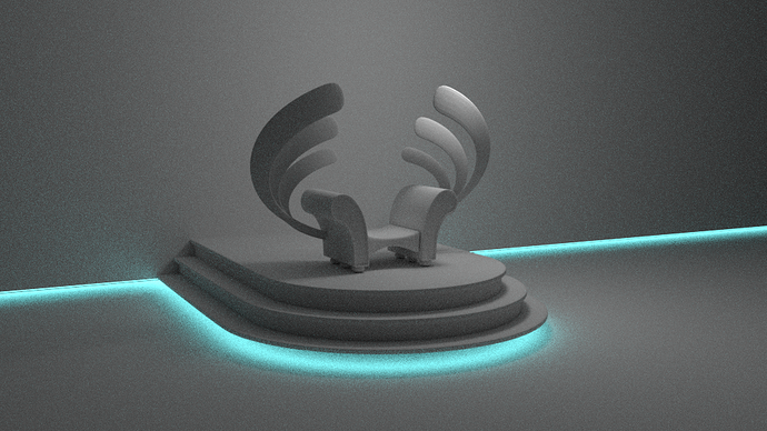
So I’m thinking about a different scene. A majestic throne. But again, if the hammer is the central object, it will be too small in the scene. So it will be a close up of the throne.


2 Likes

That throne is sick man! Also I’m glad you weren’t disheartened by my posts haha xD That lighting adds a cool future vibe and super minimalist, fitting of a throne for any advanced civilization :slight_smile:

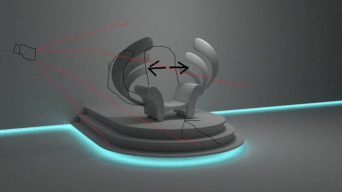
I think the throne is a touch to far forward on the flat of the platform, it feels like there is no landing before the throne and to me landing says something kingly, but mainly it’s odd that people can get behind the throne so easily xD a lot of space back there, you could fill that space too and it would probably look more natural as well :slight_smile:
(Dont worry about all of the markings it was just some theorycraft)
I also go back and forth a lot about the no back for a throne, the throne right now feels almost elvish


The camera I drew should be moved more to the left though so it doesn’t start at the bottom stair but rather gets some floor on the left side of the throne as well,
This is what the throne reminds me of in a sense, sorta a seat for fair judgment/good council rather than a throne. Which is a cool choice depending on your ruler.

Also,
I love the wings on the side of the throne, you might have to move them around a little bit perhaps push them to the side a touch if you add an intricate back though. I suppose the main thing to avoid is making your throne back or throne in general from looking like a sofa-recliner which becomes possible with the arms of your throne.


It could be cool to get some back lighting in there somehow too, like from the behind the throne. this picture is a little dark for your scene haha but there is something really neat about that source of light from behind the throne, maybe its because it like declares majesty or something haha I don’t know lol

3 Likes

The grass and ground adds a lot here man! That tuff at the bottom left of the hammer gives me the feeling the hammer has been abandoned which is cool stuff, I would reposition that flower face though thats facing towards the right. It sorta reads like a spot more than a flower xD

Overall this image feels like it has a more enriched story still, nice work! The stone reads like marble or granite to me rather than cobbles, so ye’ a little shiny haha

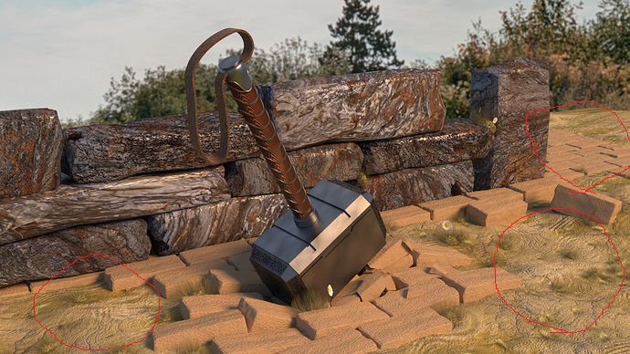
I think you did a great job of filling up that space in the background with that foilage and it really brings stuff together as a scene, honestly I don’t think the composition is as bad as you think. The only thing that sorta stands out to me now are the bricks and why there are large patches of just ground except where the hammer is. It might be nice to place and scatter the bricks a bit more in these places (I tried to circle here xD) -
HammerCircle
Maybe add more bricks to the bottom left circle, do what you will with the upper right circle and leave the lower right circle open for a nice contrast?? that’d be cool i think lol xD

2 Likes

This may also be nit picky but the tuff of grass I like at the bottom left of hammer face, would probably look a little better not blocking a little less in the center of the image. The focal point maybe contested a touch, just move it like this


Just over to the blue circle and then if you want you could toy around with its size and see if making it bigger adds anything :)) Also that flower circled in the red is the flower I was saying looks a little bit like a spot lol

I’m liking the improvements man

2 Likes

This is all really awesome! Really love everything you’re doing here. I think my only suggestion would be to scale up the texture on the stones in the stone wall. The textures look a little too dense, imo.

1 Like

Hi Robert, I really like your comments. They reflect my own personal feelings about the project.
Somewhere in my brain there is a majestic view of a mighty Hammer. Showing it strength, it’s story or what ever.
I also think, I started with a different goal. First it was “I follow a tutorial” creating Thor’s hammer. Now I have it and trying to make a nice composition. Better was to start with some sketches, trying to formulate the composition. Because 3D takes more time then just a sketch.

Regards,
Pieter

1 Like

Hi, I will try to scale up textures. But I’ve red somewhere that stone material at close range looks exactly as at far a way. It has to do with the structure of the material.
The glossy on the material is a bit odd. I know. But sometimes tweaking is not enough, if you don’t like the composition. :wink: But I’ll give it a go.

Yeah, I also think it looks like a sofa! That’s the problem, reference material … chair, sofa :slight_smile: I have seen a lot of real thrones images on Google. But as you said, “Advanced civilisation”. No references for that. Use you imagination, which is based on that you know from experience.
I want to move from that. That is why I used blue light, floating throne.

But I’m also working on low poly to high poly (more details). But again little stuck on the composition … and where to spend time on (is it visible in the camera).

I like the idea of a window behind the throne, as you explained it. Could contain dramatic imagery. Or high tech buildings (civilisation), to emphasize the story.

Privacy & Terms