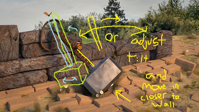
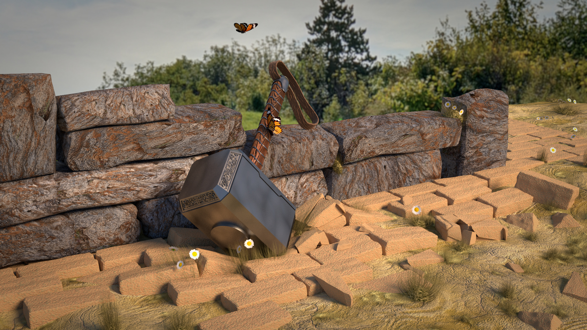
The grass adds some effect to the composition. But only near the hammer. The grass color is the same as on the ground. But then less visible (no contrast). I had thoughts on making this darker green but then, it wouldn’t be dry soil, ground any more.
Then I thought, well make it more visible in size. But that means, the hammer is standing there a long time, to grow such long grass. Then the bricks to too clean (no weather worn).
Of course I’m nitpicking. But that’s my train of thoughts 
Yeah, I had the same feeling. It’s because I started the tutorial, which used bricks. Then I started to expand that and ended with the question “What is a nice (logic) composition”.
So again, your ideas are helpful!

 ). Which bring more life into the picture, like the daisies.
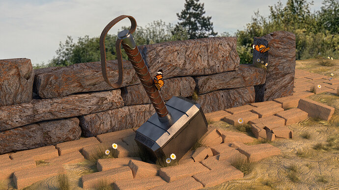
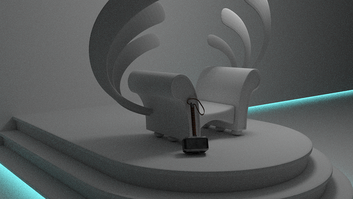

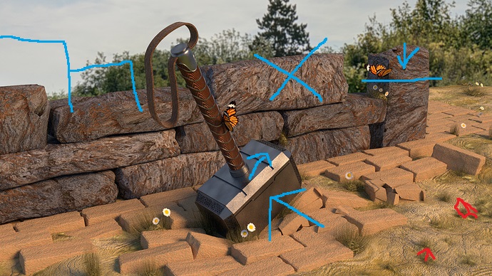
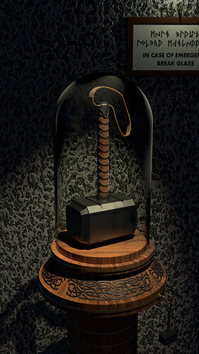

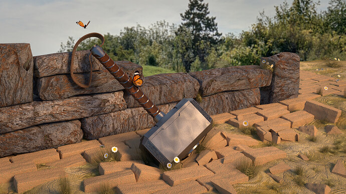
 Thor is the one holding the hammer, obviously
  It’s so funny these new ideas. Never, ever thought about the symbolism of Thor and Loki as butterflies.