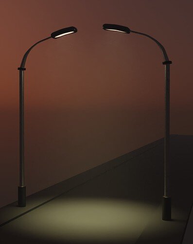
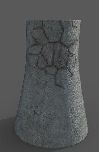
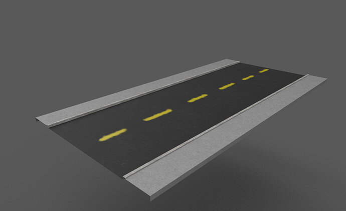
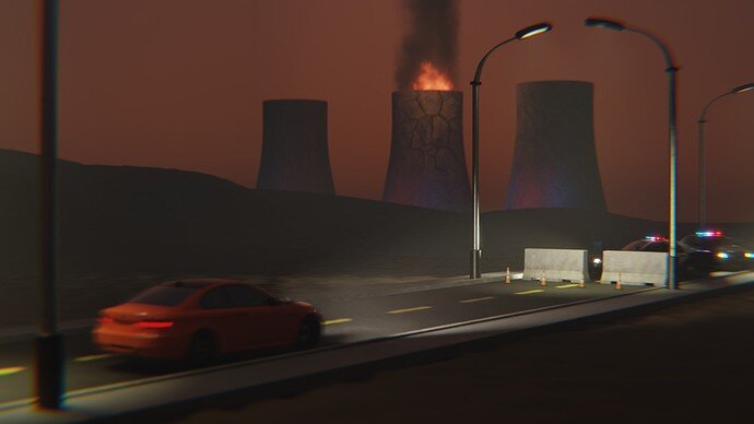
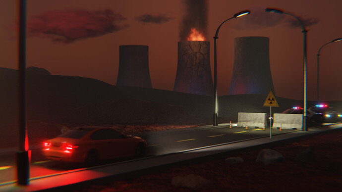
Street lamp textured with substance (first try at it) back in blender. Not perfect, but in a context of a final scene, the imperfections hopefully will not be seen 
Where there’s a fire, there need to be some damage, doesn’t it? 
(got a bit distracted from my plan  )
)
Ok, doing final render ongoing. Large sample size so it will take a bit.
Unfortunately I didn’t mange to replace the models I used during the blockout. So Credit’s for the models I’ve used:
The cars are by MAC2001 (CC-BY) from blenderswap: https://blendswap.com/blend/20961 and https://blendswap.com/blend/22404.
Traffic cones and barricade also from blenderswap: https://blendswap.com/blend/21865 (by jeandiz, CC-0) and https://blendswap.com/blend/25811 (by colkaih, CC-0).
I took a few rocks from CC-BY https://sketchfab.com/3d-models/lowpoly-rocks-2-7f8361d14ff24e27bc460f7f7ba318b6
And I used a ground texture from texturehaven.com.
Love the car blur … maybe brighter braking lights …
Edit, if you learn working with the compositor. The car could be in a different layer, with a special bur
Great point about the lights! Not enough time to learn more about compositor, but I’ll play around a bit with breaking lights!
Phew… That took a while to render… I got to stop being so drawn to volumetrics 
Special thanks to @FedPete and @Jaco_Pretorius for being my art directors in this work!
Short “post mortem” (random order):
- Its good to listen to feedback and not be too stubborn on original idea. I.e., I like the “Fire in the Coolant Tower” idea way batter than the “police chase”
- Having full time job & family = should scope the projects to be smaller
- Iteration & frequent feedback is a key!
- Good planning is important (for me
 ), but plans rarely survive the first battle
  (and that was just 1 week long project!)
 - When blender have a bad day, it crashes a lot (I think I had around 50 crashes today)
- It’s better to do uv unwrapping in Blender (substance does a good job at it - not perfect though, but the workflow is much easier - no need to re-import models)
What (art related things) have I learnt:
- first models textured with substance!
- basics of mantaflow for making cool looking fire
- how to make volumetric clouds
- improved my knowledge of shaders in Blender (both the clouds and fire require some fiddling in nodes)
(and probably more things that will come to my mind later  )
)
Sounds a good list. I am bad at sharing works in progress, lol. Most get so far and then, left for some other project, like these ‘collab’ entries, or some other thing creates a roadblock. Then I spend ages trying to find out how to do something, or find reference for it. Plus many improvements take ages and are tiny overall.
During this one month of low poly I discovered that sharing the work is improving it. The bigest part of it is getting feedback. But for me also putting it out there and describing stuff helps my brain to wrap around the things I try to make and untangle some chaotic thoughts in my mind… Plus I hope that someone will stumble upon those words and pictures and hopefully also gets something out of it or learn from my process and mistakes 
Good project. I like this dissecting of a project and its progress.
“Kill your darlings” I always say. It’s difficult to let lose of one thought.
But as time passes other ‘darlings’ will emerge in a project.
Personally, I think your project was more about composition. Placing elements, adding details, more like a painter on a white canvas. Still in that process you lost some things, like the rule of third. If zoomed out a bit, the main ingredients are then in the middle of the scene. And not at the border (police cars, breaking lights), fire. The fire could be more intensive. Creating a strongs triangle between the other (high)lights.
Great work and project. You have grown!!
Thank you 
And once again thank you for taking your time and providing feedback!
You are absolutely correct - I actually didn’t do what I originally planned:
…so the final composition isn’t rally good. My intention was to focus viewer on the barricade, but now I think there is no clear focus point at all! And the closest thing to the focus point is the burning coolant tower, which was supposed to be in the background  .
.
Still as you said - I’ve learnt a lot. Given the formula
x = learning / time
x is very high 
I couldn’t let go…  .
.
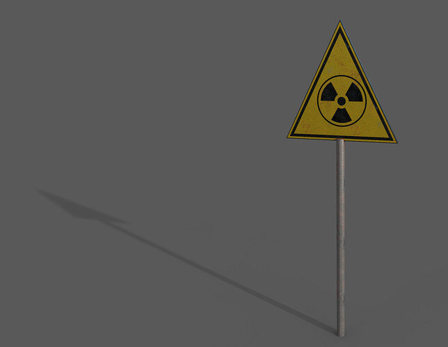
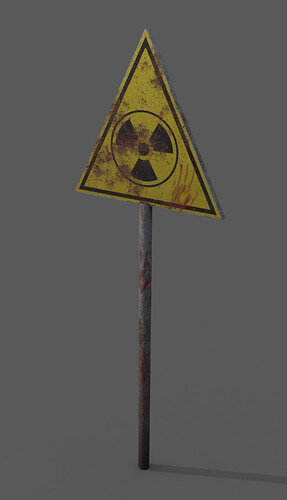
First I redid the sign, to be more horrifying (I actually wanted to try to improve my workflow - and I did. I used vertex coloring for setting up ID maps, and I have now 1 texture set instead of 3 for the sign, which worked but was a waste and pain to set up). This is the new sign rendered with iray:
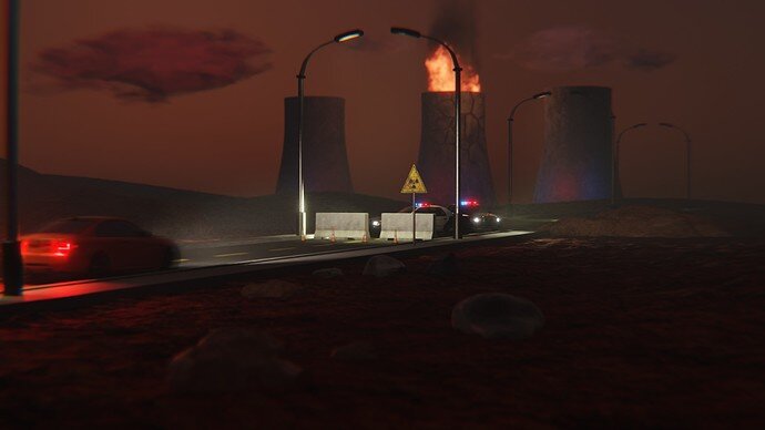
And I worked a bit on composition. This is the result:
What do you think about it now?
Difficult to say now. The last is more from a person point of view.
The sign, yes some things took more time than having use for it.
But then your building also a huge stock of objects.
So maybe good assets for other projects in the future.
After sleeping and looking at the picture now I think that the composition is better (due to clearer focus point for the viewer), but overall the render has 2 big problems:
- lot’s of empty spaces, especially on the right side of the image.
- colors and contrast… everything is orangy-brownish and too uniform… (this is a problem in previous picture as well). The other noticeable colors are blue and red from the lights… which are not really complimentary to the overall hue of the image.
Now I think I should let go of this scene… 
Very good work!
Think I prefer the previous composition tho… this one creates way too much empty space, as you’ve noted.
Both compositions feel like establishment shots… if that is what you were going for then it works… if you were going for more of an “action” shot, picking a camera angle where one of the subjects would fill around a third of the scene’s area is an easy fix for eliminating empty space and forcing focus (using perspective as a compositional tool).
Looking forward to your future works. 
Thank you for your feedback! 
(yeah, I didn’t go for establishment shot  )
)
The subject was ‘on the road’, I think were this me I would close right up on the subject probably completely without the car on the left. Scale down the towers to fit in and look more distant less dominating. Effectively covering about the area of the 3 central lamposts, but not their tops either.
It is a good scene as it is, but the point is the purpose and subject.
That’s a good point… last render went even farther from the subject of the Collab  . Thank you!


