The Blender Collab; Weekly Themed Gallery (Week 1)

Hi guys! I am loving this spot as a collaboration and helping space for Blender students, and I’ve come up with a plan for getting everyone involved in creating original works!

I think we should have a set theme per week, and have people create and upload models according to the theme. It allows for people to see each others progress and techniques, as well as a source for ideas and creativity outside of the chess board, bowling, etc.

The theme this week is:

A CASTLE!!! :european_castle:

A nice square theme to start, but also one where both beginners and intermediate Blenderites can participate! For you beginners out there, try experimenting with low poly cylinders and a lot of squares!

Please upload a picture or SketchFab embed of your Castle below, and we’ll see how successful this is to see if we can run a theme per week. And be sure to let me know if you have your own ideas or themes with a PM.

6 Likes

I definitely like this idea, and I will give a castle a try as soon as I can. BTW do you like my lamp animation?: My lamp animation, and a few other models I have been long overdue to show here

2 Likes

Nice idea, definitely going to try and build something for it with the knowledge I gained in @Michael_Bridges course :smiley:

2 Likes

This is a great idea! A few years back i used to take part in something similar for photoshop that was hosted on Flickr…a topic was set with the deadline of 6 days later to submit your work…on the 7th day everyone in the group voted for their favourite piece of work…whoever won got to set the topic for the next weeks contest…it was pretty good fun and was great for learning and getting better at photoshop working together and making new friends online with similar interests…great idea Mcfuzz!

2 Likes

Well, here is my castle:

-M.47

9 Likes

Great idea! I know that I have problems creating something just for the sake of creating and this will be a good way to practice and improve my blender skills. When is the deadline for the week?

1 Like

I’m thinking next Monday (Or, Tuesday my time because Australia is in the future!) we move to a different theme. Whether that means I create a new topic or just continue this one, I haven’t decided yet. But it gives everyone the weekend to put something together.

That is a great castle @M.47, grats in being the first to upload! I especially like the little curves going on around the edges up the top.

2 Likes

I think a weekly prompt to keep the juices flowing is something @Michael_Bridges would endorse! I’ll get to working on mine.

2 Likes

Ta daa! My own entry. There was a lot more to do, but after 3 hours I decided a lean approach was better… Also known as “I want to go to bed in an hour so I’ll tidy it up and upload it!”

As @rszarka mentioned, does everyone like the idea of voting on a ‘winner’, or should we keep this more as a gallery than a competition? Although, the idea of letting the winner choose the theme certainly makes it interesting and gives a little more encouragement, as well as much needed variety. I like the idea; what do you guys think?

9 Likes

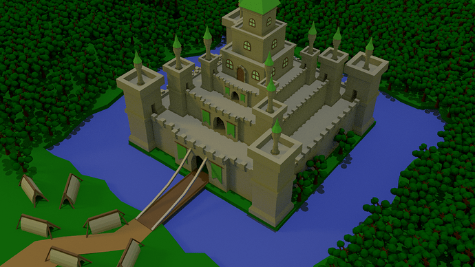
My plan was to create a castle. But I got carried away and made the landscape as miniature tile first xD

Edit: Updated the sketchfab model with the most recent version ^^

8 Likes

Hahah these are great :slight_smile: Love all of them. simple yet effective models!
3 Likes

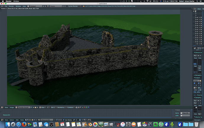
i Tried to make this low poly and simple but ended up putting way too much work into this and couldn’t go backwards.so ended up mapping a bunch because of my attempt at the damned moss on the walls …was hoping to make something similar in style to what mcfuzz made but ended up with a bit of a mess mix instead lol …so anyways here is my messy entry Caeverlock castle ruins…
Caerlaverock was a stronghold of the Maxwell family from the 13th century until the 17th century when the castle was abandoned. It was besieged by the English during the Wars of Scottish Independence, and underwent several partial demolitions and reconstructions over the 14th and 15th centuries.

8 Likes

Hey now, it’s not so bad!

I spent quite a long time actually doing a model BEFORE the one I actually ended up uploading. It was supposed to be a cross section of a Dwarf Fortress fortress, but so much of the geometry was falling over itself and had wrong normals so I ended up throwing it away.

I like your water though. Certainly a step up on “cyan material on flat plane” lol. And that moss is pretty special; personally I would’ve used geometry to do it, but only because I don’t know how to texture properly lol.

@GamedevCala That is a great mini-tile! I almost think you should make that available for download for us; it’s a great template for fun fantasy and medieval dioramas :smiley: Your castle is gonna look great there, maybe a couple trees.

…It just dawned on me, that I intended to put trees in mine, but I forgot the trees. Oh well!!!

Does anyone have an idea where I’d be able to put a poll for these entries (and others yet to come) so that people can vote for a ‘favourite’, to pick who makes next week’s theme? I am pretty into that idea now, haha.

2 Likes

Mcfuzz your too nice my friend…i really hate my castle its needs a lot more work to be decent had to force myself to post it lol
If you are struggling with texturing watch this short like 7 min video…it breaks its down really well and you will realise basic texturing is really not that hard…break that barrier :)…i promise by the end of the video you will feel confident about texturing https://www.blenderguru.com/tutorials/basics-realistic-texturing/ …water is actually easier than i thought…just use a subdivided plane by say 300 x or more tand then glass bsdf with an ior of around 1.333 …then use the displace modifier on the plane to create ripples or waves…oh and be sure to put a bottom underneath it with whatever colour you want the water to look like…if you want the water plane to be low poly use the decimate modifier on it at the end… same here on the trees i meant to make trees and gras but was so annoyed at my castle i quit before then haha Maybe i will tuck it away and one day finish it all up properly :slight_smile: Mcfuzz your castle is awesome! It is a perfect low poly castle scene methinks! Most forum software usually has a voting app or bit of java script that adds that function…maybe ben or michael can add it to the website for this thread… here is the photoshop site i was talking about if you want to see how they do it… https://www.flickr.com/groups/63731537@N00/

1 Like

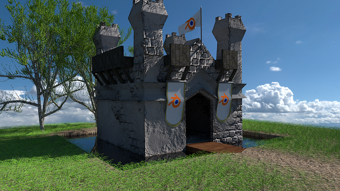
I love this kind of community challenges. I don’t have too much time to work on this, but here it is, my entry.

I will improve this along this and next week when i have the time (fixing the grass, and other things that are bad)…
Is it allowed to edit the entry pic if i find time to improve it?

BEHOLD the mini-castle, conquered by Blender (LOL):joy:

I really liked @rszarka the idea of a poll to decide the next person to set the next topic.
(btw, your model looks cool, just try to improve the lightning a little bit so we can see it better :grin:)
Another idea, is to create another thread, so we can share more details of our work for the challenges, so we can show another angles, other details that got lost in the render, ask questions about another person work and improve all together.
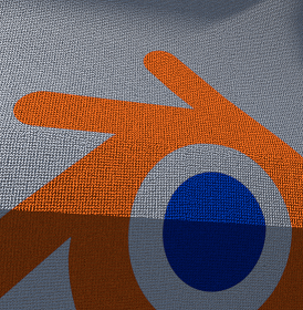
Example of “lost” detail

@McFuzz wow, your work is awesome, simple and very pretty!

I think there is a couple ways of going, one that i think is very interesting is to grab all the work from the challenges and upload at Facebook’s Blender Course Comunnity as a weekly poll (that could be by uploading all the pics and the one with the most likes win), this way more people from facebook’s group would end up joining us here, and joining the challenges.

Another way is simply by clicking ‘Like’ in here, and the most liked wins, but i think isn’t that great, or creating an actual poll (don’t know if possible).

Thanks guys! Hope these challenges stick and more people join.

7 Likes

Lucas thats really good!! You said you don have much time…you made that quickly??? that would take me all day and my final result would not be half as good as that! Awesome!
The way they did the voting in the photoshop contest was on the last day of the contest everyone just placed their vote in the thread with the name of the person that made their favourite work …the admins then counted the votes and proclaimed the winner… the winner then added their winning work to a pool of pictures of winners works then started a new thread with their new topic…the admins also kept a running thread of all the winners of the contest from day one until now adding the new winners to the end of that list each week , i think the contest has been running since 2005 so its a long list haha…

2 Likes

@rszarka Thank you friend, well i did most of it in one day (most of the modelling and texturing). Then i spent more time trying to improve the render, particle system (awful fail lol) and a few more details like the flags, banner, cloth simulation.
I’ve probably spent 8-12h actually working on it, without counting rendering and idle times.
And this was a looong and heavy render, that i only realized later that i forgot to render the larger grass :confounded:

Cool, i hope we can keep this challenge running and fun =)

1 Like

Here’s mine. I actually made this a while back :slight_smile:

9 Likes

Here is my modest submission. I started by modelling this tower, which I was going to use to build out a castle, but things slowed down as I was trying to add more detail on the other pieces. If I get time I will put some of the pieces together.

5 Likes

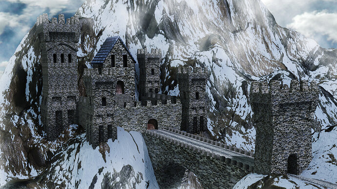
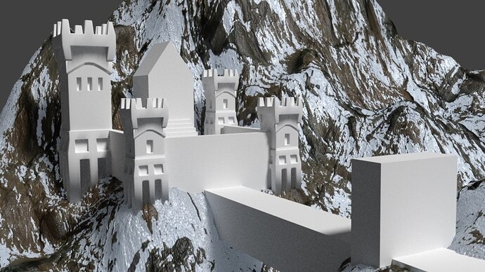
That’s a great idea! Here’s my castle

The mountains were already made from a tutorial I followed a while back, so I appended them and basically reshaped it a little and placed the castle on it.

At the start it was only rough shapes.

I modeled each of them, then duplicate linked the ones that were the same (like the three small towers and the two side walls).

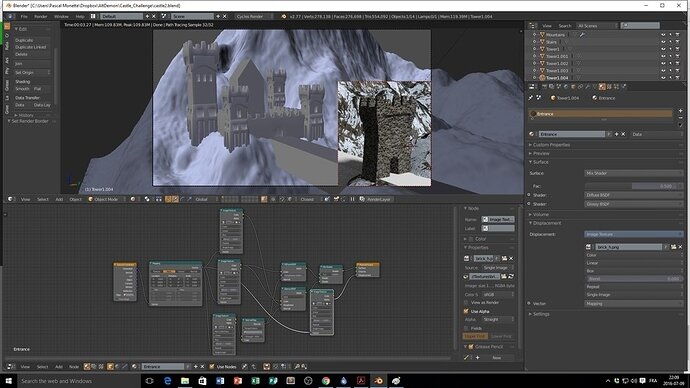
The I started to play with the materials. I prefer the Cycles render engine, once you get used to the nodes it becomes really powerful.

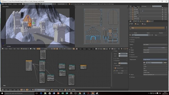
After that I unwrapped the more complex models to be able to texture the door.

Finally I went in Gimp to adjust the brightness / contrast, put the clouds background and tweak everything a little.

Maybe I went a little too far with this lol But I’ve been using Blender for almost a year now and can’t seem to get enough of it! There’s still a lot I could do to fine tune that scene, but there is so much to do and so little time…

You are all making great work, I want to see more!

15 Likes

Privacy & Terms