I googled it, I know what’s it…
I haven’t traveled much but if there’s a place that I’d like to visit again, it’s definitely city of Lviv
It’s got beautiful tourist centre but that aside, it’s well known for the chocolate that they’re making
It was probably the best chocolate that I’ve ever tasted, so I decided to make a this little scene as a memento of that city:
I used this picture as a reference:
I didn’t want to spend too much time on making it, so I skipped most of details and it kind of looks flat because of it
But at least I got to play with a few cloth physics and stuff
I decided to go for a cartoonish look of one of my favourite theme park rides (which is not a rollercoaser). Can you guess the park and the ride?
With this occasion, I tried animation for the first time, and I’m really proud of what I could get with the most basic of animation skills.
Image format:
by the way this is (nearly) only one object edited in edit mode.
I have seen some videos from imphenzia, 10 minute modelling.
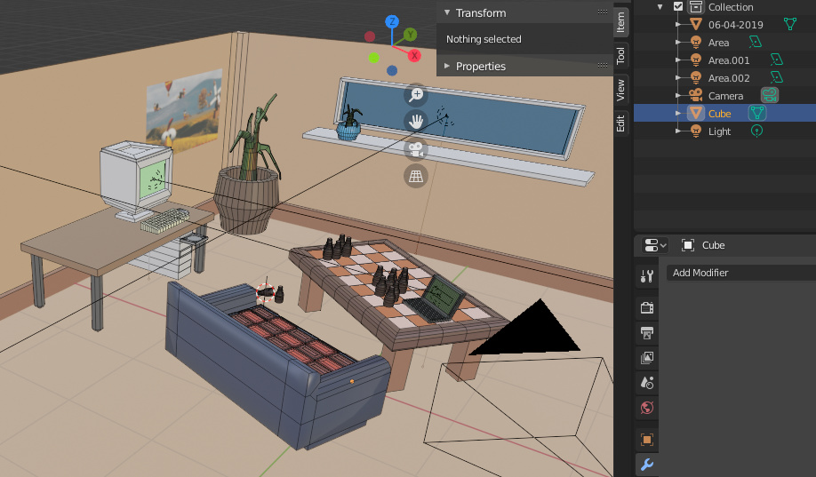
So i tryed to make a room that has something to do with the topic
and in special with a location that I have visited and that I associate with very good memories.
Might just be my screen but it seems really dark. Hard to tell what’s going on. Maybe could add some moonlight?
I think it may be your screen because when looking at in on my phone, it was darker than in reality, but on my computer, it seems fine.
Could be. Images on my phone are Always much darker, buy this one was also dark on my laptop. Not at home so I can’t check on my desktop. maybe you can disregard
There’s a way in Cycles to check light exposure! (Tip from a BlenderGuru video I watched a while ago) Under Color Management, choose false color, instead of filmic:
Areas that are overly bright lit are red, green/greyish is ideal. Blue is darker.
It’s a way to evaluate the brightness of the light, no matter the settings of every individual screen. Maybe that helps!
I don’t seem to buy many souvenirs so did a photo I took that I’ve used as a screensaver (without the snow). Thanks to @Tyger2 and his thread a few weeks ago that featured glass and Textures.com.
Cool! Is it Japan?
That’s right a shochu/sake bar in Tokyo.
Dang! We got amazing submissions this week, great job everyone!
Nice! The second render is definitely much cleaner. I like how you stylized the window and door shape.
Actually second scene in rendered in 512 cycles whether the first one was in 128 so that’s make a huge difference.
Bridge
You probably know this bridge. It’s pretty Iconic for the city on one side of it. You’ve probably also seen it get destroyed in many a monster/disaster movie.
This is my first time doing one of these low poly orthographic scenes. It took way longer than I thought it would. I’m used to focusing on a single/few object(s) at a high level of detail, where as this was many objects at a low level of detail. I like it because it changes the scope of what you can do. Much bigger/macro scenes are possible. I still need more practice at this style, but it was fun.
Nice work but I guess the clouds could be better. Great work though.
Beautiful low poly scene! Amazing job for a first attempt, the only thing that seems out of place is the clouds, a bit too realistic in my opinion, the water on the other hand fits despite it’s rather realistic look.