Hah! One of my all-time favorite movies. Well done. Great spot lighting on the food, and I like the brief case in the back. Marsellus Wallace will be wanting that back soon. 
@NP5 I would love to see you continue and finish those crates and sand bags. And bring in those zulus 
Thanks. I suspect I will retain it as something to toy with. But may feel the need to start afresh with a decent topology human. Never really happy in low poly. Plus I have just discovered making clothing with real thickness makes all sorts of difficulty weight painting the rig influence. So it’s all been a learning experience. Or avoid auto weights.
Thank you! Felt like it was important to include the briefcase as a light source, still to this day wonder what was inside.
Oh, how nice! And thanks for reminding about denoise… I wanted to find it.
Here added denoise! Looks better!
I stopped studying the course at sculpting. Because my creation was too weird. Now I took my husband’s graphic tablet and will try to use it, though I am not used to it…The new character course (or updated), handles the sculpting very good. Even I got reasonable sculpt results.
I didn’t know it but have needed it already a few times - thank you! 
Or do naked characters instead. I am not talking about only creating nudes but also animals, aliens etc.
It’s in my list.
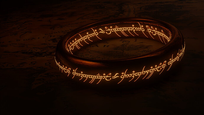
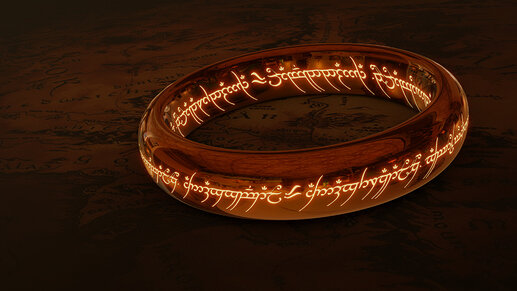
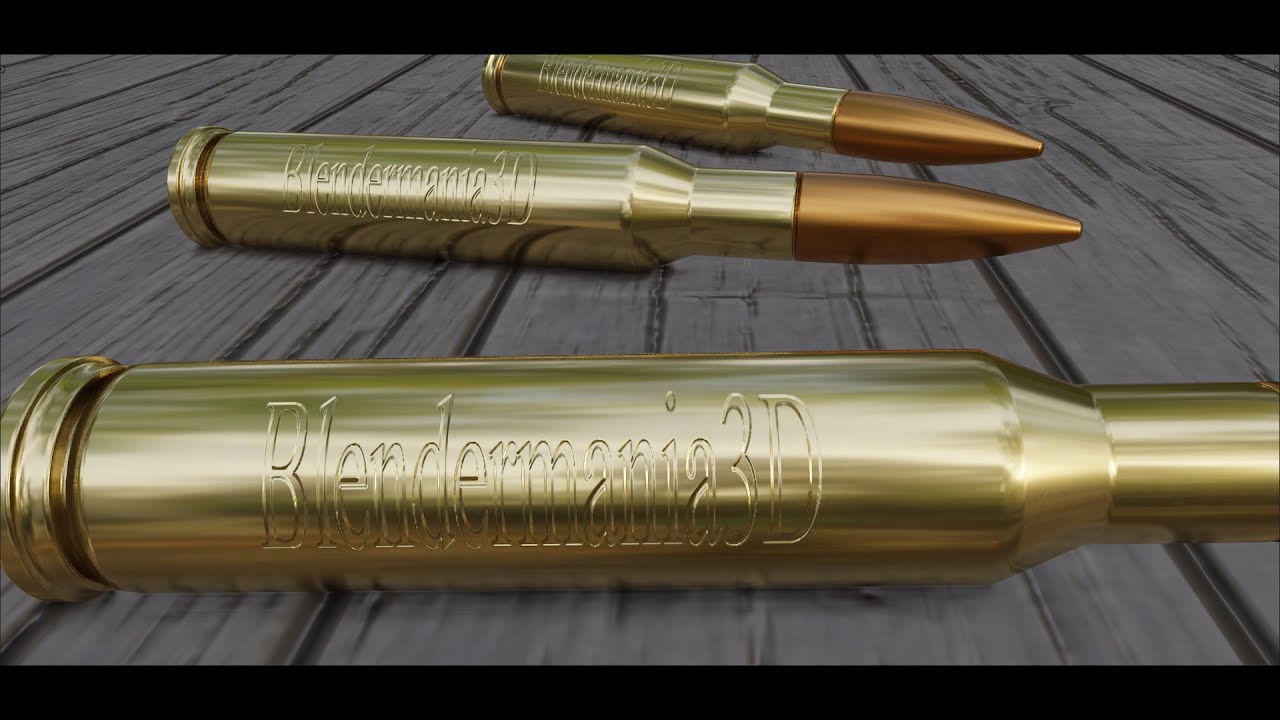
Just got inspired  (Nice lighting was really hard though, because of weird reflections…)
Cycles:
Eevee:
Love it, and yes the Eevee render does seem over reflective. I do like the Cycles render though. Nicely done. 
That looks great! Would you mind sharing how you did the inscription?
Yes, the problem with Eevee is, that it reflects the HDRI (or if you turn on Screen Space Reflection it starts looking really really weird.) And I coudn’t make light probes work  If anybody has any tips how to solve this issue, I would be more than grateful! ^^
Sure, I’ll try my best to explain! 
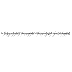
I started out with a black-white square texture:
Then I used this tutorial for the carving in the metal (by creating a normal in Blender from a plane with displace modifier):
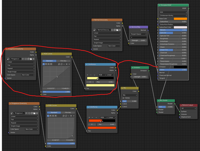
For the inscription to glow I simply used the inital black-white texture and then used color ramp to get color to the black parts (and RGB curves to tweak it a bit) (For emissions: black = none, color = emission in this color)
I have two mixed inputs, because I wanted a orange-red edge for the inscription.
In Eevee you only need the part I circled red and can directly connect it to the Emission in the Principled BSDF, then just activate Bloom and you can easily choose a color there too.
But for a ring, I just couldn’t really make the reflections work 
In Cycles, you need a separate Emission node and to use the “Glare” node in Composition and set it to "Fog Glow " instead of “Streaks”. Tweak with the settings and that way you get a Eevee-like Bloom from your Emissions.
Here’s the node setup (if my explanations didn’t make sense or you have other questions, please just let me know!):
Thanks for the detailed explanation! I’ve tried some similar things before to mixed results, so I was curious how you did it. I will have to check out that tutorial too.
The poll is closed, and this week’s winner is @Blest! Congratulations! Looking forward to seeing what you come up with for the next topic.
Thanks! That’s only because I have a vacation now ). I voted for Sblendid. OK, the new theme is “Travel impressions”! - Something that reminds you of a place you’ve visited and would like to return to.
Congratulations - you, the teenage witch and grumpy old Salem definatley earned it 


