GameDev.tv
The Blender Collab: Week 24 Themed Gallery (“The Laboratory”)
Blender Courses
Blender Collab
NP5
June 25, 2020, 11:51pm
38
Laboratory2
3840×2160 1.78 MB
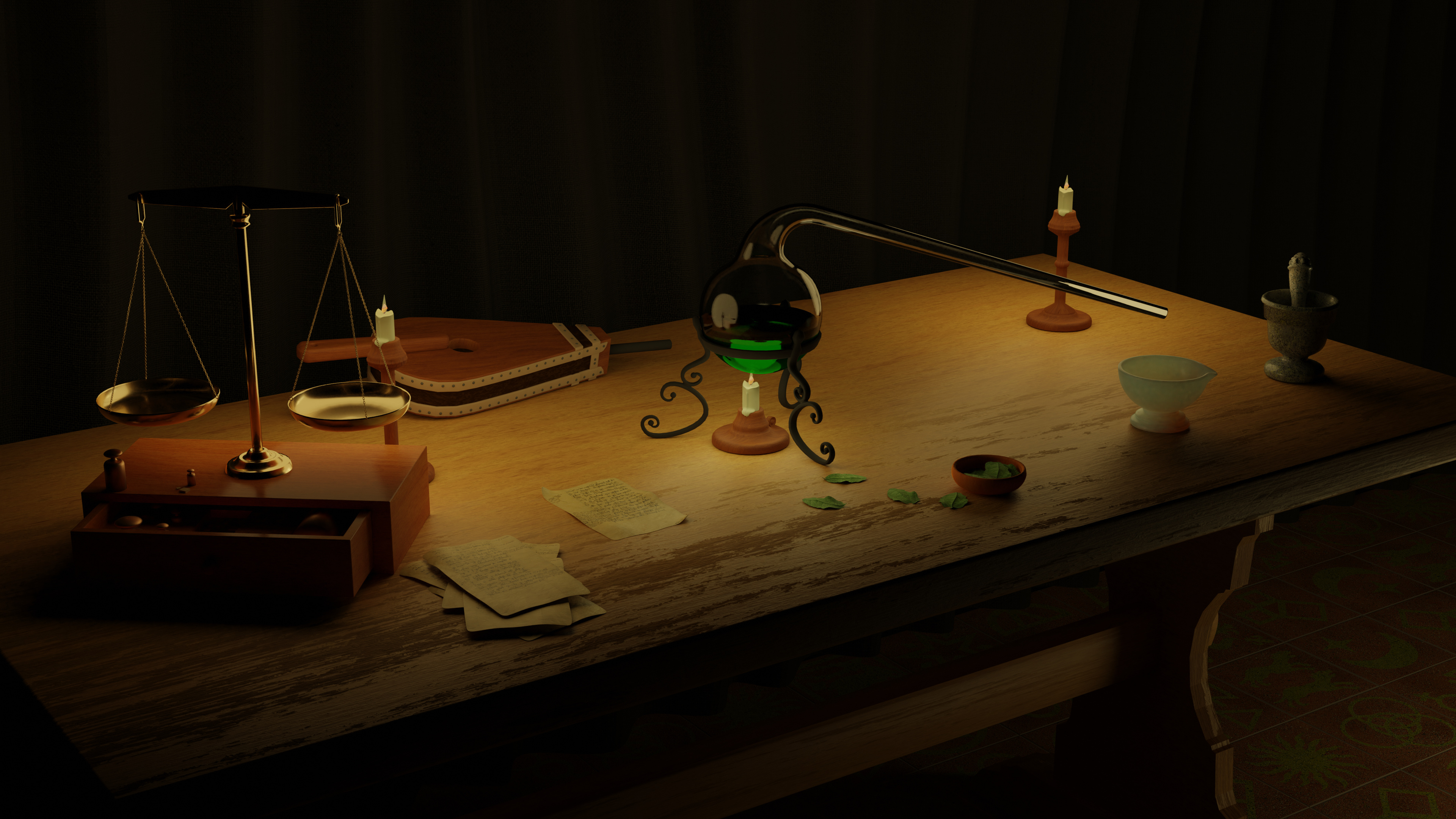
Alchemists, lab.
Need so much more time.
8 Likes
The Blender Collaboration 2020 edition
show post in topic