The Blender Bi-Monthly Project: Month 1 (September - October 16)

We’re back again, with a new recurring challenge this time. For those who need a bit more time, want to challenge themselves, or prefer a more collaborative environment, the Monthly Project is for you!

I am submitting this early for you guys to get a feel for it, and a bit of an early start for the first monthly ever. Because it’s a different environment to the casual weekly topic, I believe we will be choosing a winner from these! This will be announced on October 30th!

The theme this month is: :money_mouth: TREASURE HUNT :gem:

This could be just a scene with many items, like a mini i-Spy game, or an animation of characters going on a treasure hunt. The theme is looser and more open to interpretation, and we openly invite innovating and experimenting with it. How you interpret this is up to you! Game, animation, diorama, picture, comic strip; the sky is the limit!

The monthly project encourages things that there aren’t enough time or resources to put into a small weekly excercise. I would also love it if people helped each other out. If you don’t want to or can’t submit a large project, feel free to message people who are making one, such as offering to make assets or textures or improve animations. And if you are making a large project, feel free to post your progress, methods, advertising for asset collaborators, and anything else in this thread over the next 60 (65 in this case) days!

I am so very excited to be a part of this community, and I know you guys will give it your very best!

Ready. Get set. GO!

8 Likes

Not sure where to post these, so am going to post them here. If I should repost them elsewhere, just let me know where.

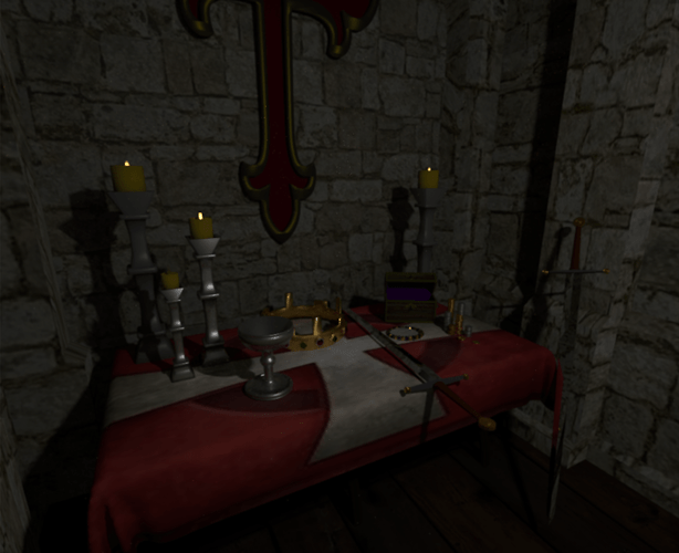
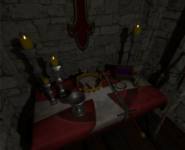
I wasn’t sure what to create for this category. I have been reading some historical based fiction so decided to do a flight of fancy and created some pseudo medieval fantasy for my lost treasures.

I want to thank RSZarka for assisting me with the jewels in the crown using an array modifier.

I should also mention that I did not used Blender for the cloth on the table instead I used Marvelous Designer for the cloth’s creation and for adding the initial texture. The rest of the items were created in Blender using Cycles for texturing with the exception of the walls and floors, those textures were from another source.


Lost Treasure 1


Lost Treasure 2

19 Likes

Wow morgaine you are really good! What a great scene…awesome!

2 Likes

Very much “ditto” - I love the theme and the quality of the work is amazing! Well done…

In case you didn’t know already, if you have any of these on SketchFab you can paste the link in on you posts and we can then enjoy zooming around and in and out on them too :slight_smile:

My progress for the monthly project. Looking to fix a few issues and to add more sea life.

8 Likes

Very nice work Morgaine :smile:

Nice work, Brandon! My first thought was doing an undersea scene but decided me and ships might not be a good idea! Great job!

1 Like

Thanks, Rob! I appreciate the compliment.

I hadn’t really thought of SketchFab for this particular scene. Mine is just a box with an illusion of interior and not a full room or building. How does SketchFab work with scene boxes?

Of course now, after I have posted it, I have moved all the files around and didn’t pack the file with the textures!

@rszarka I couldn’ t have finished this piece without your excellent instructions on how to use the array modifier, rszarka!

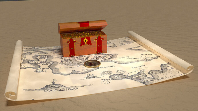
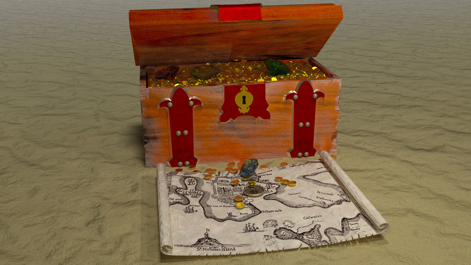
Here’s mine, not sure if I’m going to do anything else with it.

9 Likes

looking at it now, I think the map and compass should be a lot smaller, will rerender tomorrow.

1 Like

Very nice! I really like the way your map turned out with the cool rolled corners.

1 Like

I love this… as a diver it appeals to me a lot :slight_smile: I was going to say, “wouldn’t it be great if there was someone in that boat”… then I zoomed in!!! :smiley: love it :slight_smile:

1 Like

This is very cool - makes me think of Pirates of the Carribean etc… :slight_smile:

1 Like

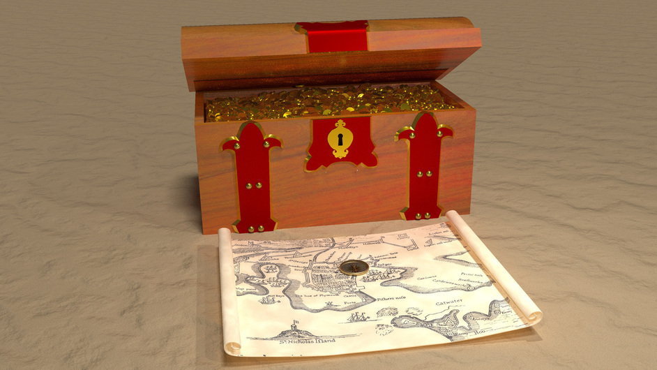
Updated to increase the size of the chest (more treasure :slight_smile: ) and put it in the sand

5 Likes

This is getting better and better @Stephen_Jenkins, well done… I didn’t realise at first it was supposed to be sand, but can see that now…

One thing that struck me on the other image (above) was how “clean” it all looks - which is obviously very lovely - but I wondered whether scruffing it up a bit may add to the effect? At the moment the map feels like it’s perhaps an “admiralty” map because of it’s pristine condition, maybe it is meant to be, and the gold perhaps to pay for something - perhaps to bribe people… but initially I felt this was a bit more “piratey” - grubby hands all over the map, stains, bits ripped/missing… scuffed/chipped chest…

I am letting my imagination run away with me now, so I will shut up :slight_smile:

That’s a good point Rob,it’s got exactly the same shader on it in both images, but the size and angle is different, so you can’t see it as well, I’ll try fiddling with the weights, the original image used for the texture is black on pure white, so I’ll add some more noise and you can’t really see the displacement on the map either.

1 Like

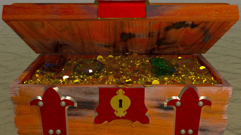
I’ve done lots of work on all the materials, to roughen it up a bit, and added some gems :slight_smile:

8 Likes

ooooh, now that is looking really awesome… loving the damage to the chest, the jewels, the spilling out of the coins and the crumped/torn map… great work :slight_smile:

1 Like

Very Nice!

A close-up of the chest (1:32:43 to render)

6 Likes

Privacy & Terms