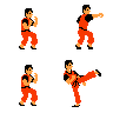
Not much to say here. An interesting exercise for the journey ahead 
![]()

Not much to say here. An interesting exercise for the journey ahead 
![]()
Just an idea to make your pic easier to see…
…it’s really easy to scale this up or down if using LibreSprite.
Got to Sprite Tab → Sprite size and then enter in a doubled multiple of your original canvas size…
So like, if you start with 32x32, you could do 64x64, 128x128, or 256x256.
LibreSprite will scale everything perfectly, like these:


![]()
You can also scale back down without distortion. It’s super easy.
I hope this helps.
Hi. Thank for the tip! I already used it for some other previous challenges  (with Skate, for example, as explained below). But for this specific dithering challenge, I don’t know, I thought it might be better in a small size
Maybe you could create a New Talk Topic to share your tip more widely  ? Under the first lesson here, eventually?
I hadn’t thought about that, but it might be a good idea.
I really like Reese’s course, but I really wish he would have taken a few extra minutes to add this one detail.
So many people have been posting these micro pictures and I can’t see them very well.
I agree. In my case, the size of the images I share is an artistic choice. But it would be nice if everyone knew how to do it before sharing the first image 
I would like to see a larger pic of your images just to be able to observe the detail and technique, but you’re right, it’s an artistic choice.