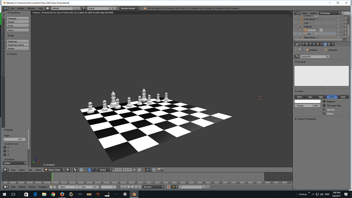
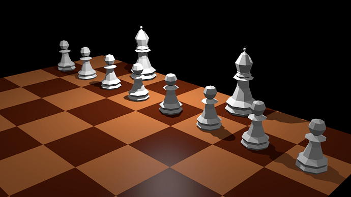
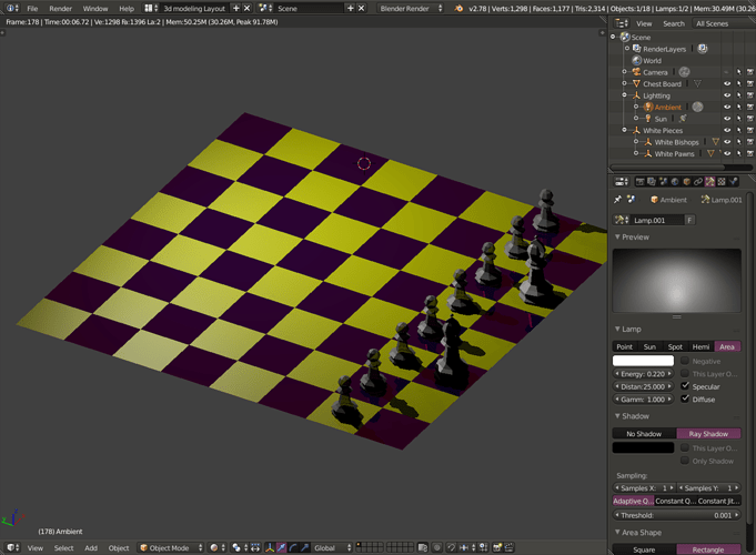
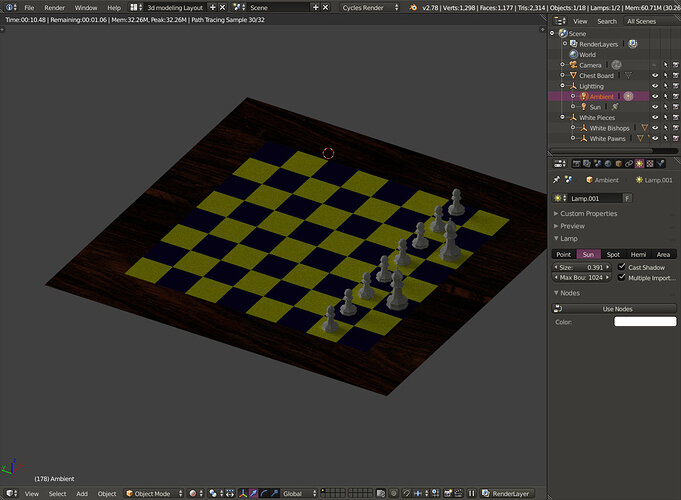
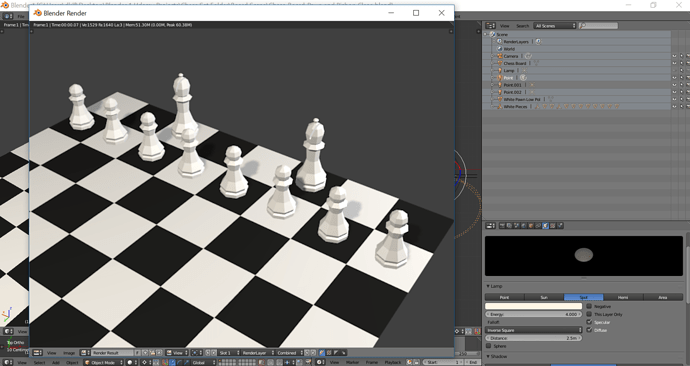
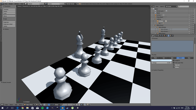
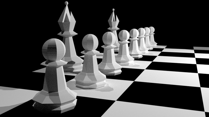
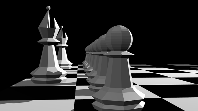
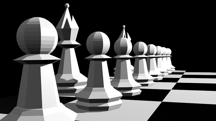
Here’s my lit and rendered chess scene.
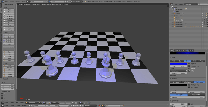
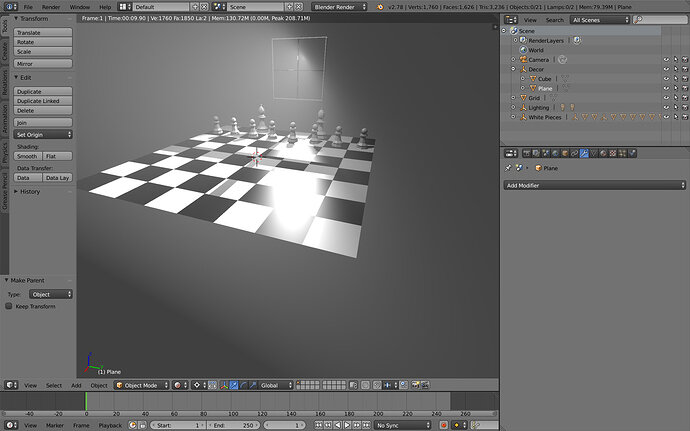
I added a sun and hemi lamp to my scene and reduced the intensity of each lamp till it fitted the look that I liked
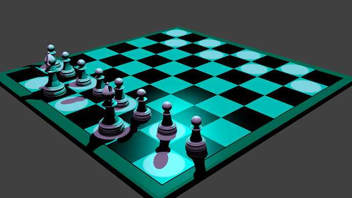
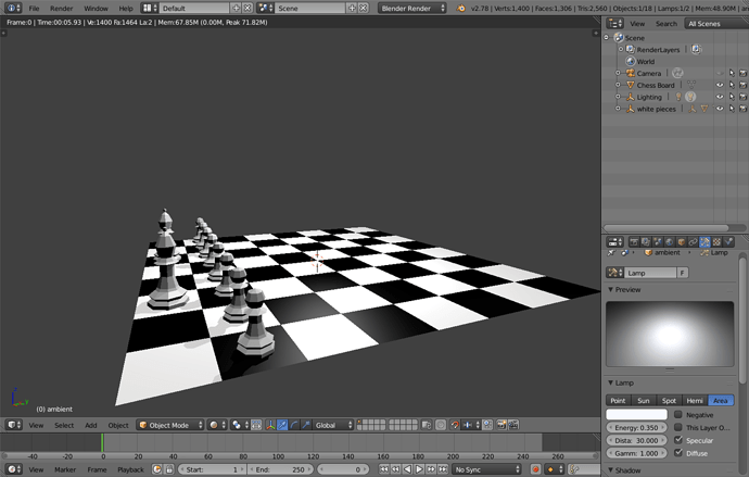
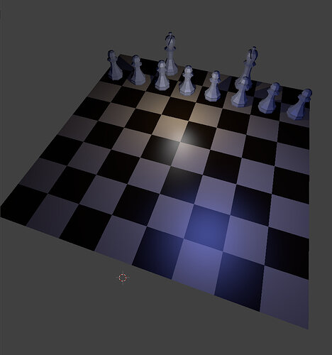
I decided to go with an ambient light for the board but just to mix it up a bit highlight the starting squares with individual coloured spots.
Need to work on how to use the lights a bit more.
Correction need to switch cycle render on the second image to blender render.
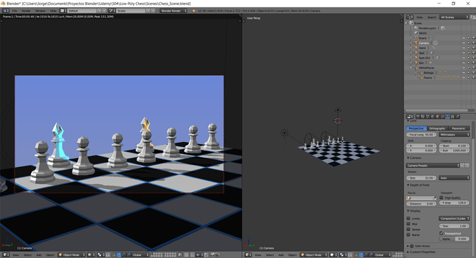
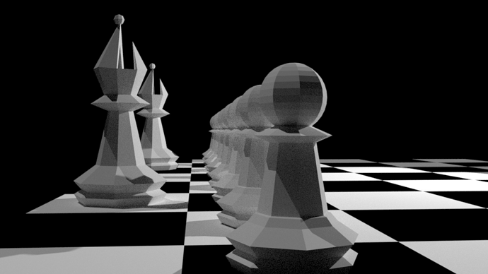
I played around with the lights before we light it up for realsies. I’m a horror fan and enjoy all things creepy, so I decided to light the pieces eerily by using a spotlight, angled up, slightly above the board.
In using techniques we’ve learned, I dupe linked the one spot when I got it to where I wanted, placed the dupe linked spot on the next pawn over and then hit SHIFT + R for the rest. I duped the pawn’s spot in front of one of the bishops, moved it in place and dupe linked that spot, placing it at its final destination in front of the second bishop.
That lighting scheme left the board bathed in absolute darkness, making it unclear what I was looking at. I placed a hemi light high above the board and dropped its energy to .015 to allow just enough of the board to be seen.
A friendly game of spooky chess, anyone?
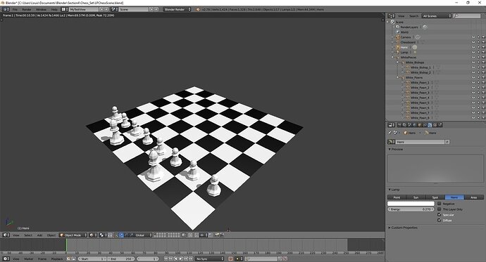
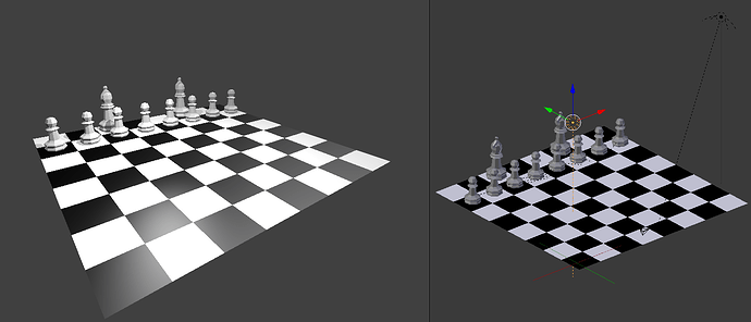
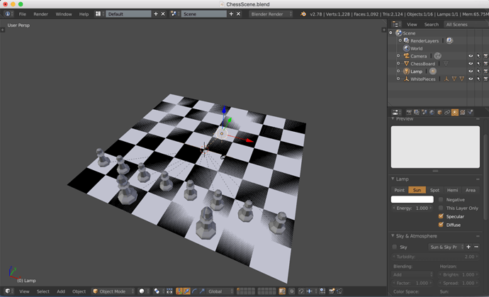
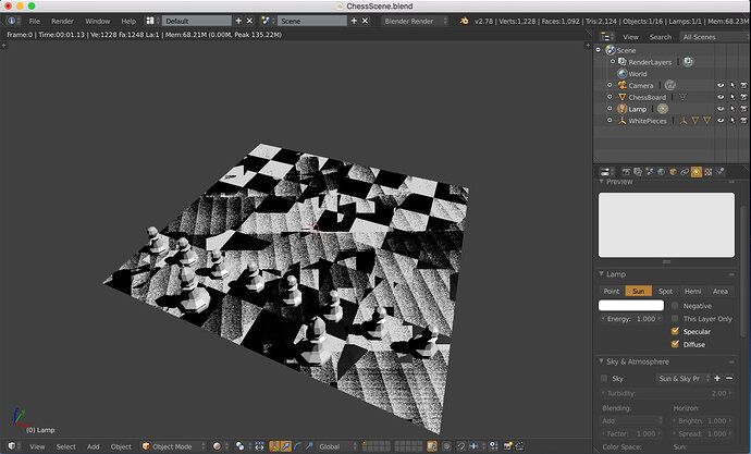
Not sure what is going on with my chess scene. I noticed the chess board was acting strange when the materials were added. The black material seemed to change appearance depending on how the model was rotated in the view.
See the solid view and the render view. Anybody have any ideas on what I have done in my settings that could cause this? The lamp is set to Sun with the default settings.
Yes, the indoor look is strong here.
Outdoor is harder and needs a few more tools, like Environment HDRI and coloring aids (if you go for realistic).
But don’t worry, the coming lessons will introduce that in the right context… 
Nice work! 
.
Very nice.


