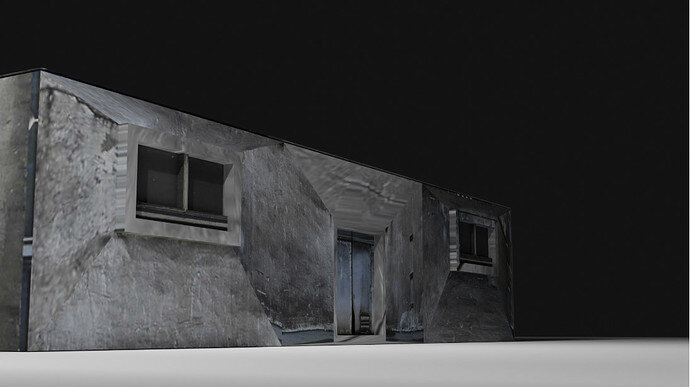
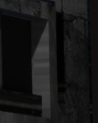
So, as this one’s texturing wasn’t properly done and there was a lot of stretches
I was lost on fixing the problem so I remembered one of Ian Hubert’s tutorials on buildings
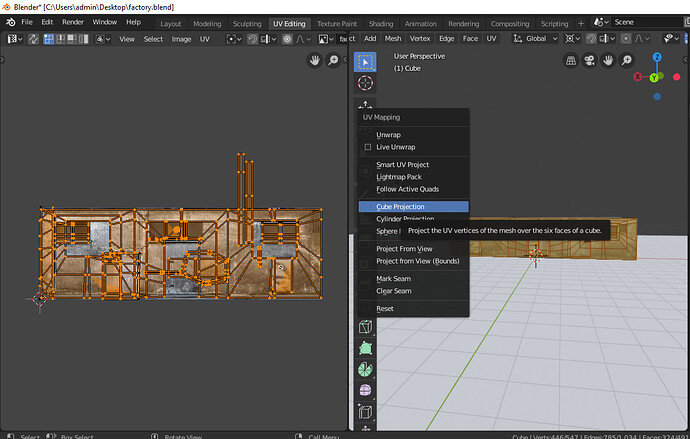
and remembered cube projection…
and then I clicked it and it worked except I had to tweak the length and breadth of the UV
unwrap
and came this
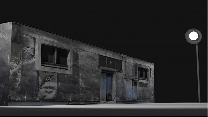
I even added a bit of lighting to it by making the spotlight?
actually, I’m not sure what you would call it
here was how it looked after I tweaked the settings
I was actually a bit satisfied then it came to my senses that there was some stretching
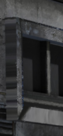
I fixed it and added some more detail…
and as it’s an abandoned factory I tried to remove one of the lights…
and also extruded some parts matching it to look realistic…
and then I saw one more stretch…
I had to fix that too!
oh! and I forgot to tell as I am using blender2.80
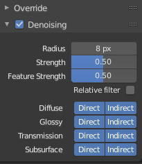
I used the denoising option
in the context(view layer)
and then… changed the sky colour to dark blue
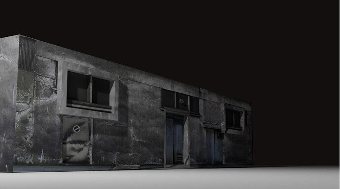
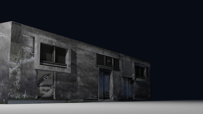
I rendered it…
there we go!
rendered it like a boss

if there is anything that doesn’t look nice in the render…
please make sure to reply about it!!!
peace!


