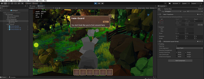
Hello, my game is working fine but for some reason the Next Button is appearing out of place (on top of the text as opposed to below the text). I am suspecting it might have got something to do with the Layout Group but have not been able to fix it. The image below shows the issue. Any help would be appreciated. Thanks!
Sorry for the delay on this. I’m assuming that the AI Response is itself a Vertical Layout Group. If this is the case, try dragging the AIText (in the Hierarchy) above the Button Row. This will instruct the Vertical Layout Group to put the AI Text first, and the button below.
Thanks for your response. Your suggestion puts it in the right space when I play the Game, but it still shows it in the wrong place when I am in Scene view, which is confusing. Do you know how I can also fix it in Scene View? Thanks.
Confusing as it may be, the important thing is that it’s working correctly in the Game view. In fact, when I edit my own UI, I never look at the scene view, the scene view is generally a lie anyways (the scene isn’t the same aspect/resolution as the Game view generally, so anything aligned by the Scene view can be misleading). I prefer to edit in the Game view so I know that the correct anchors and pivot points are being applied.


