Hi,
I downloaded it and running on Win 7 Pro 64bits. No problems.
In my daily work I do a lot User Interface design stuff.
So maybe my comments are a bit harsh, or you already know it (because its in Alpha phase).
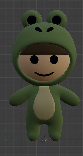
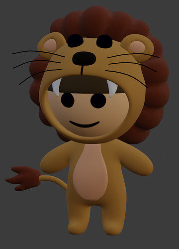
The visuals as a beauty! 
- I don’t know the game mechanics, so it’s difficult to say what I can do as a user. Maybe let him in idle stand (so now and then) trying to grab the coin above him. As a hint for the player and show ‘spacebar’. You do have a nice “ready for jump pose” but it’s too subtle at first glance.
- No indications of which keys to press.
- Walking off the floor and coming back to the other side is a bit of a cheap programming trick. I would expect a different level to play. Or just stop.
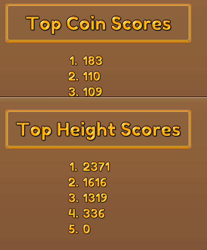
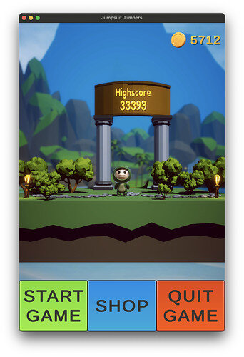
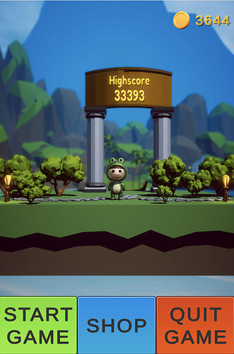
- As you said, the high score isn’t seen as clickable, but you can as you explained. Only by accident, hovering by mouse. But how on mobile? no mouse hover.
- The high score design, looks like a portal to walk through. As in starting a game. (my first keypress was cursor up.
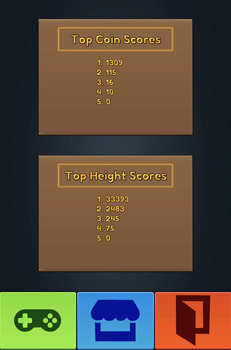
- I had difficulties closing the high score table. Because when you click, you look where you clicked and I didn’t notice the status change of the blue button. Just use an ‘X’ to close the high score window. And don’t show those three buttons in the top score mode.
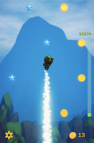
- Because I didn’t know the game and press space bar as a way to move the puppet. I didn’t do anything else. I got 11 coins, with a score of 43 as I believe. The puppet drops down. Ready for the next jump. But then there nothing to jump to!
- The lowest level is cleared and unplayable. Leaving me as a player in the backward position what to do next?
- Better to replace the green start button until the coins are unreachable. As my first experience, show it and say, sorry try again? Because I did not know I had lost. I was anxious to press the spacebar again. It jumps but into nothing. (try to keep the player in the mood, now he needs to press a button, while a better experience is to use the spacebar to restart the game)
- Or give more starting coins columns in the beginning. Maybe to find the best path? But certainly to avoid that a player lost immediately at first stupid try (like me)…
- Maybe as a game mechanic throw his caught coins in the air to build a path for the next try … it cost you some coins, lowering your score …
- I see a part of a slot machine in the shop. There are laws that forbid gambling in games.
- left column has a coin shadow, but it is rotating faster than the first one. And the second is very slow.
- The blue glowing stone, looks like an interactive object (clickable).
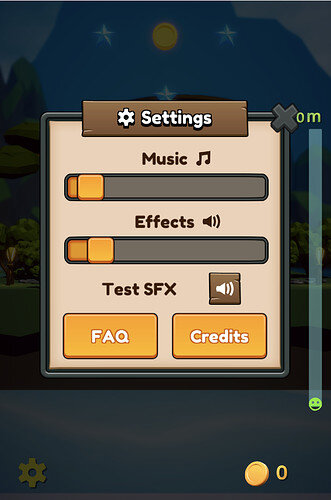
- FAQ and Credits don’t work. Test SFX? Better to play the Effects sound when dragging the effects slider. Then no test effect button needed. Fewer buttons, simpler user interface.
- At the cogwheel, to adjust your sounds, maybe adjust the keyboard keys also? A nice moment to explain the move keys.
- It’s a better experience to use the upper key also. because your hand is also at the left-right keys.
- The puppet fall sequence is abrupt. I would expect a nice landing and a next try with the space bar.
- maybe clear high score option when playing with a friend. Or having a game for two friends…
- maybe an Option to play full screen.
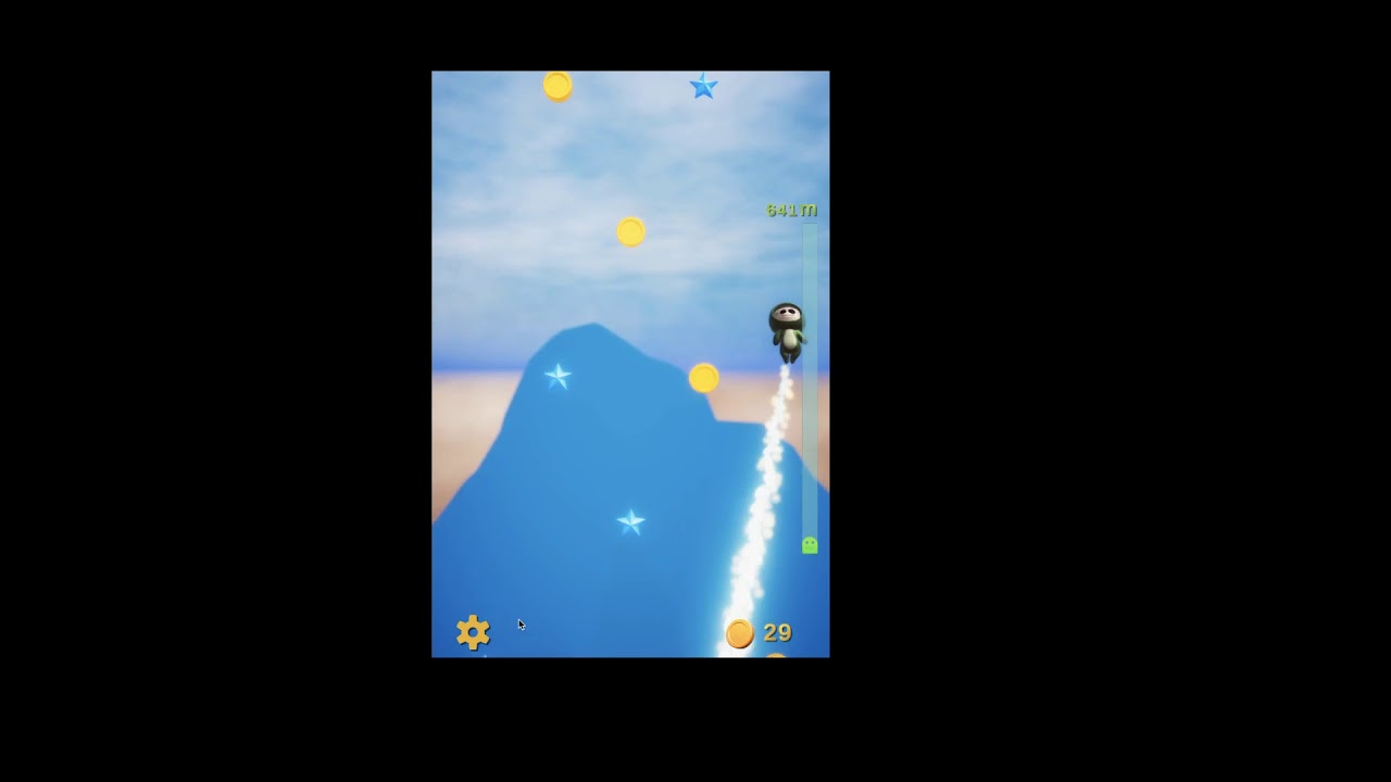
The gameplay is smooth
Good control of left and right
Very, very nice graphic design.
Music and SFX are enjoyable …



 . That’s probably obvious, but plan your work well, halve the features, double your initial time you planned
 for successfully completing the game!