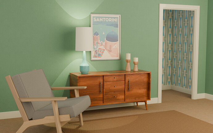
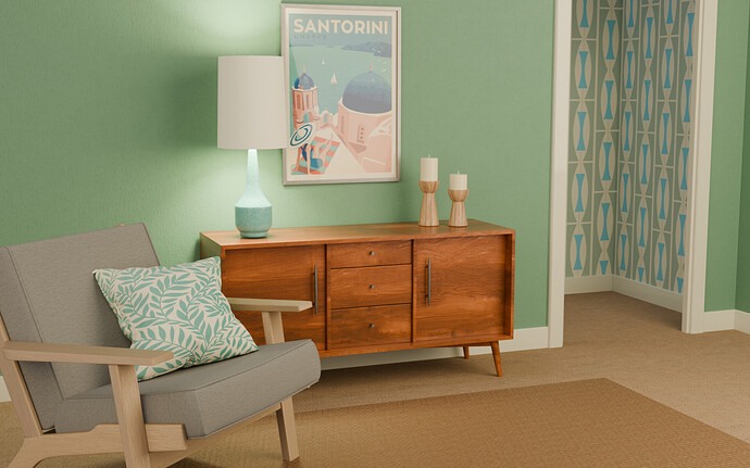
My finished scene, lots of fun with hard surface modelling and texturing  I learned a lot with this one.
Nice early 60-ties vibe.
Lamp light/shadows are a bit harsh. If you used light cones, maybe softer border. (difficult to express)
I’ve been wondering how to do that - the shade casts such a hard shadow! Thanks Pete, I’ll try light cones, I do think the hard edges ruin the pic a bit.
What is the size of your point lamp?
Bigger size, softer borders.
Thanks Pete - I hadn’t really looked at the lighting options, I’m so glad you pointed them out. Instead of a cone I used two back-to back disc shaped area lights, which have given it a much softer spread (hadn’t seen the cone option yet) but I’ll fiddle around a bit more, and maybe turn the brightness down. It makes a huge difference from that hard edged light, thanks for that 
I did a similar project “1950s” the start of color TV…
I like your lighting better. I focused on the TV glow setting, but that was hard.
I would say, to again improve your scene, is to add a bit of noise (texturing) on the wall) etc.
Your project is now in the realm of adding tiny little details (not too much!!!), to make it even more realistic.
Great project, add it to your portfolio.
Beautiful vase and what a match! Well done 
If you look closely you’ll see the wall has a raked plaster effect - I took off the ambient occlusion bit because it was a bit too much, I wanted just a subtle something otherwise the wall is just too bland.
Thanks for all the help, Pete!
You are on it again. Looks great. And the '60s flair 
Thanks Ray, much appreciated 
Are the wood textures procedurally generated? They look amazing.
Thanks Ray! They’re textures (still need to learn how to make procedural wood!) - finding the oak was easy but the cabinet was a bit trickier finding the right texture, but glad I got it in the end 
Looking great with the lamp light softened.
Thank you 
another solid piece of work my friend 
Thank you, Jimmie! Much appreciated 


