I don’t know if I understand you properly because I understand you with a translator.
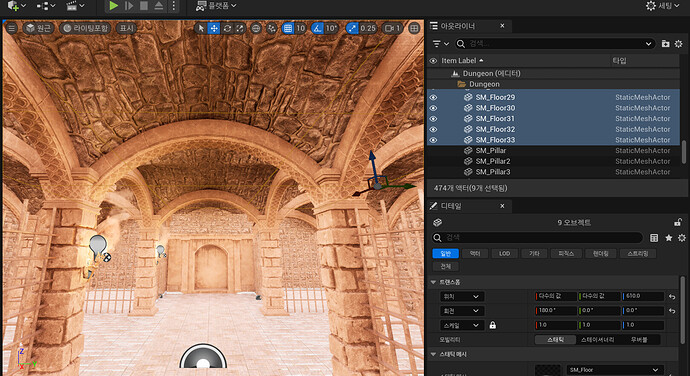
Are you saying that this ceiling you added to block out light seems to be located below? Because the arch is above the ceiling?
Sorry, I’ll try to write more translator-friendly:
Yes. I think you must move this flat ceiling higher. And take care not to create new holes. Be careful around the edges.
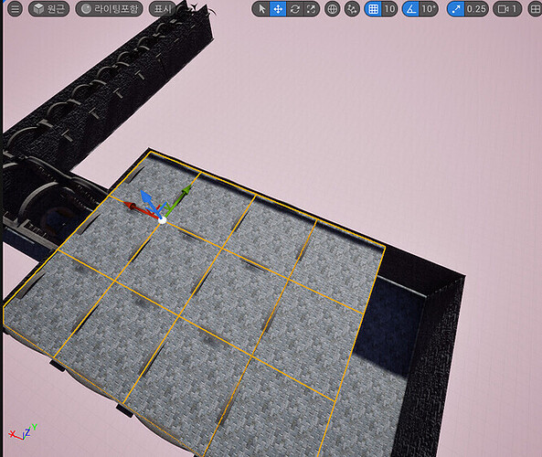
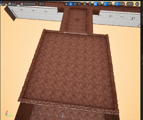
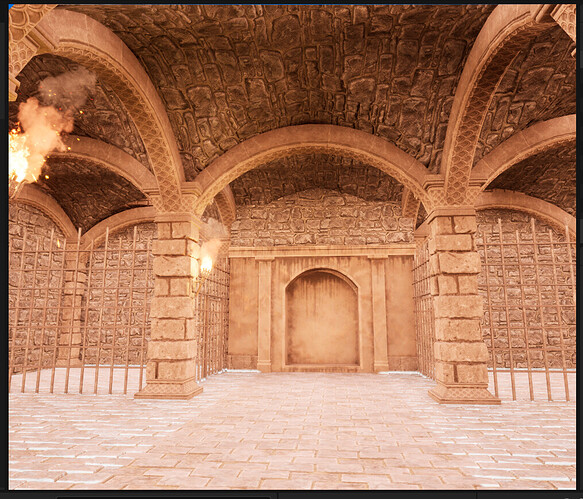
In your image where we look down from above, you see that a part of the arches go up higher than the flat ceiling. In your image from below (inside the room), the same parts of the arches are bright.
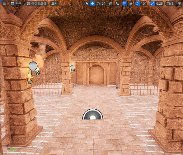
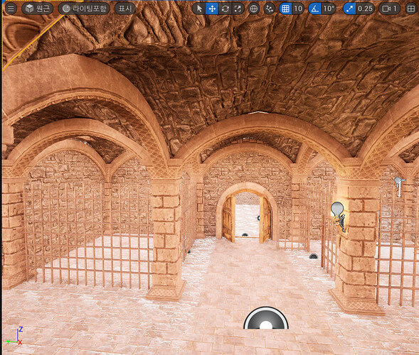
Also, in your image looking up from below, the parts of the rounded ceiling let the light pass through where they are higher than the flat ceiling.
You must remember that a few of the meshes only have faces in one direction. This has two consequences: A) You only see the meshes from one side, so your flat ceiling is only visible from above, but the rounded ceiling parts between the arches are only visible from below. But they do overlap, if I am not wrong. B) They only block light from one side. This is why we have to do this extra work on blocking the light.
Thank you for your kind reply. I will try to understand as much as I can. Thank you for your consideration. I may also have unnatural sentences to write through the translator. Please understand.
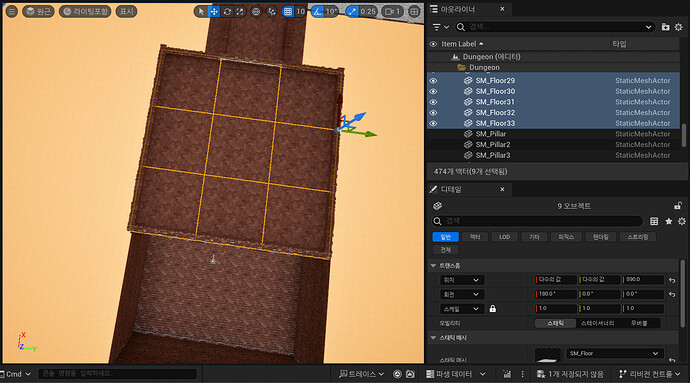
The z-axis position of the flat ceiling is set to 590 and the round ceiling below (in the room) is set to 500. If the round ceiling is set to 520 or more, light will come in.
If I look at the arch part of the 3rd picture, I think I can see a little light. Should I adjust the arch position?
A) If you look at the words, you see the words “overlapping.” You mean the flat ceiling and the round ceiling overlapped?
B)I didn’t understand what I said… I’m sorry。
What do you mean by blocking light only on one side? Then, what additional work do I have to do? Do I have to add more flat ceilings?
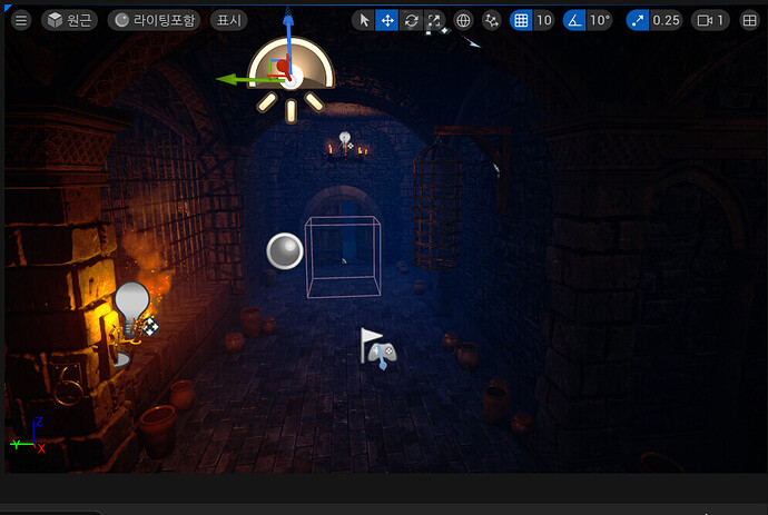
I think you did quite well. I am not sure why your third image has this bright spot. Maybe one of the objects is was moved from where it should be so there is a little hole. You could check that. Also, there seems to be too much light inside the room in general. Or are the second and third image from an unlit view again, and the spot is not related to light?
A) Yes, like this: the arched ceiling had parts that were below the flat ceiling and parts that were above it. You could not see it because the flat ceiling is only visible from above and the arched ceiling is only visible from below. But the overlapping seems fixed now.
B) In general, each face of a 3D model is only visible from one direction. (The player is not supposed to look at them from the other side. E.g., you would not see the faces of a wall if you were inside the wall.) With UE5’s lighting system, they also only block the light from that direction.
If you keep having trouble, maybe it helps to replace the flat ceiling meshes with basic shape planes. It does not matter that they are ugly, because they are only behind other meshes, and the player won’t see them if everything is placed correctly. They have faces in both directions, so you can easily see if they are where they should be and how they overlap with other actors.
The current flat ceiling is made of SM_floor.
I am in school and may be slow to respond. I am sorry for the delay in your response, compared to your sincere response. Please understand.
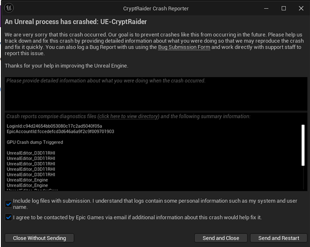
But when I suddenly tried to open a project on Unreal, there is a problem with the graphics driver version. It says it’s not the latest version and it says to install the latest version. So I installed it, but the screen keeps coming up like the second picture. The project closes automatically.
I installed the three shown in this picture.
But it keeps popping up like this.
(https://www.intel.co.kr/content/www/kr/ko/download/785597/intel-arc-iris-xe-graphics-windows.html)
I went to this site and installed it. And then I rebooted it. Now I can’t see the comments on that black screen. I’m so glad.
I’d like to replace it with a basic shape plane instead of a flat ceiling. I’m not sure what the basic shape plane means…
I am glad you could resolve your driver problem. Don’t worry about response time. I wish mine was better sometimes.
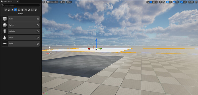
I was referring to plane actors as available in the “Place Actors” panel:
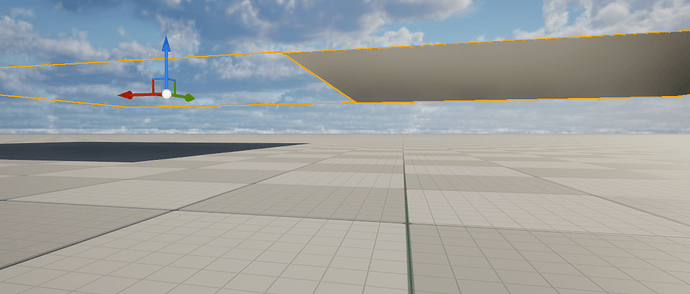
But I see that I was wrong: These planes also only have a face towards 1 side. You can see in the images that they only block the light from one side. In the first two images there are two planes of equal size next to each other. One plane faces up, the other plane faces down.
So, such a plane is not better at light blocking than the mesh you have been using. If you want to use such planes in the way I intended before (as a light blocker that you see from both sides), you could put two planes of equal size at the same location but facing into opposite directions (by setting the X or Y rotation of one to 180+the same rotation of the other). You could do the same with your existing meshes instead of such planes.
Does the existing mesh mean SM_floor? If it means SM_floor, do I just rotate this mesh 180 degrees + the same rotation?
I don’t understand very well I’m sorry 
I tried once as I understood. The yellow line you see over there is a 180-degree flip. When I set X to 180, the mesh looked transparent like the second picture you sent.
The inside is like this.
Sorry I forgot to get back to this topic for some time.
Your description of your steps sounds good. Are you satisfied with your result now? It looks like your last inside image is from an unlit view, so it is hard to tell if you still get unwanted light through the ceiling.
It’s fine!
How can I see if unwanted light is coming through the ceiling?
Play your game and see!
After the exam, I’ll play the game!
I don’t have time because I’m studying for exams
I’m sorry😥
Don’t worry! Good luck for your exams! 
Thank you for waiting!
It’s been a while since I got into Epic Games. I have a Quickel Bridge in my installed plug-in. I saw an update so I did it, what is this?
I tried playing the game.
It floats like this. Well, there’s still light coming in.
I think when I posted something else before, I said if the GPU doesn’t fit, it’s like this… Is that the problem?
This is the map that was present by default when you downloaded Medieval Dungeon.
This default map is dark, but what’s wrong with it when I make it?
The question has gotten too long. 
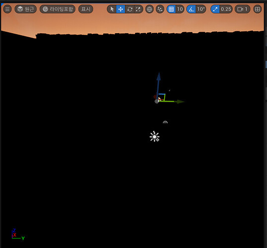
But the light does not come through the ceiling anymore. That is good.
Maybe you can find out if any other light sources in your scene are causing your problem. You could disable them (turn down their power) and see which make a difference. I would also suggest that you continue the course and fix the lighting problem later. It does not have to block you from progressing.
Quixel Bridge is an interface to an asset repository from Epic. From there you can download many high-quality 3D models into your UE projects for free. It is used in a few courses on GameDev.tv.
I’m currently in school, so I can’t take the lectures. So I wanted to solve the lighting problem little by little if I could!
What do you mean disable (power off)? I didn’t understand…
Thank you for always answering!
I have the same issue and since I was unable to block light from entering the dungeons even after trying all you tried too, I just hid all the external lights (directional and sky) to be able to progress. If anyone still knows what’s happening, it would still be good to know; could it be a problem with software versions?
Thank you!
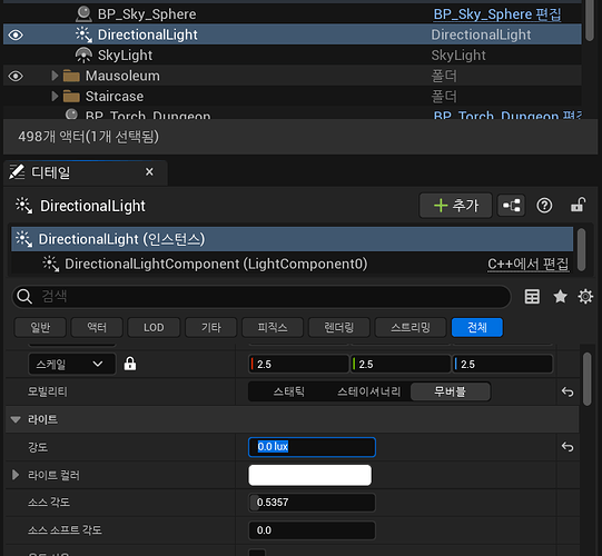
I mean: find all lights in your scene. They should have an intensity setting. Try reducing this value, even down to 0 for testing. You can also choose a dark color for the lights.
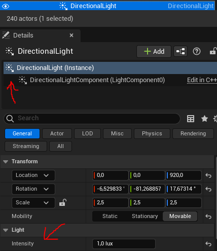
Look for all types of light.
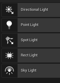
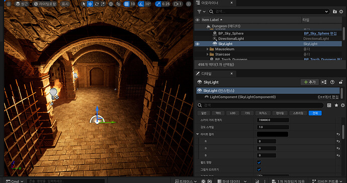
Also check all the torches and any lights you have placed inside the dungeons. For a sky light, the field names should be different, because it works differently. But bad values here could also make your dungeon too bright.
At some point, everything should be dark. This would be a success. Then you can try increasing the intensity again for the lights. But maybe only in small steps and one by one.
After a change, maybe you need to rebuild lighting to see a difference.
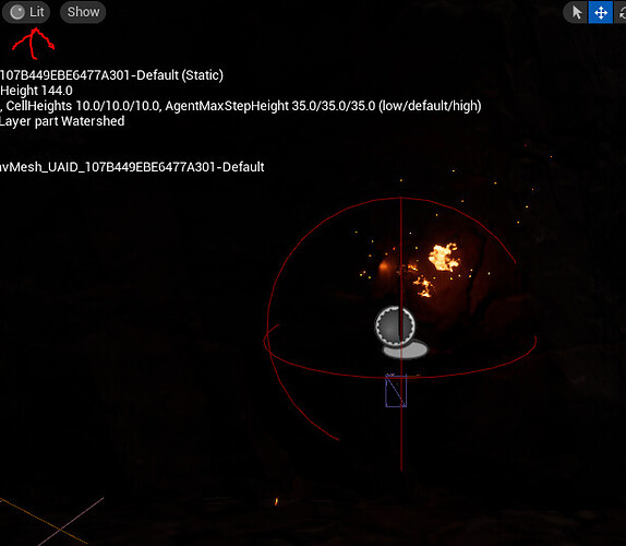
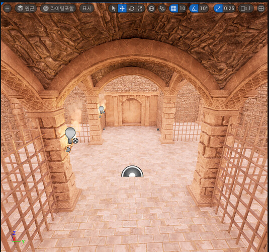
If you just look in the editor, make sure you are in Lit view to see the difference. In Unlit view, dark places look brighter. This is just an editor feature and has nothing to do with the light bleeding.

