I debated whether or not to just start to my original showcase thread but as it has been almost a year since my last post to that one, I decided not to zombify it again. For those who haven’t seen my earlier work you can visit that thread here
Now on with the posts. In this post I’ve decided to challenge myself to re-create the same painting as the ladies and gentlemen working on the group collaboration project. The painting is ‘Western Motel’ by Edward Hopper
Step One: figure out just where the heck the painter was looking at the scene from. While it seemed like an easy step, this turned into quite the ordeal. At least until it dawned on me that all of my efforts were pointless unless I was looking at the camera’s PoV. After that, it was only a matter of a half-hour, or so, to get the room and camera positioned. Here is my result…
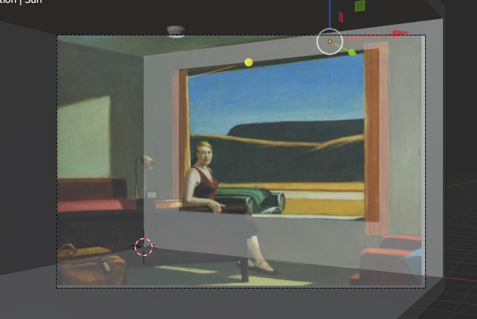
As you can see, it’s not quite perfect but, it’s better required for government work. Also, a wise man once said, “Perfect is the enemy of Good Enough!”
Step Two: Lighting and Room Color
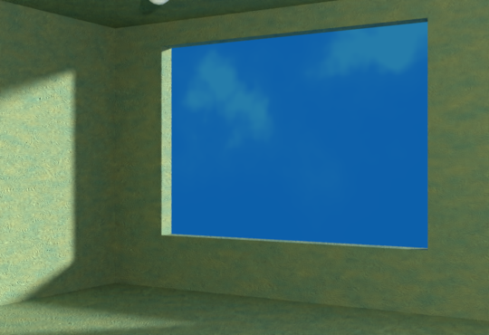
Matching those shadows was no picnic (hoo-boy). But, with a bit of patience, I was able to get nearly there. Of course, at this point, I’m starting to think that Mr. Hopper may have had a problem with perspective, but then again, it’s just more likely that he was relying more on impression than accuracy.
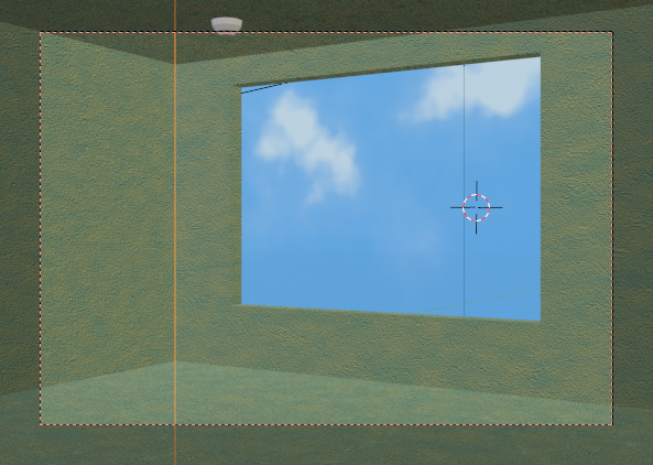
For the color, I had initially intended to do a simple mix based on a noise texture but, I realized today that that method wouldn’t capture the coloring properly. In most paintings, colors are layered in order to get the final look and thus, to mimic the colors of the walls faithfully, I had to mimic the way the colors would have been laid onto the canvas.
and here is a render of the project so far:
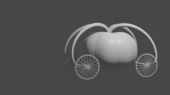
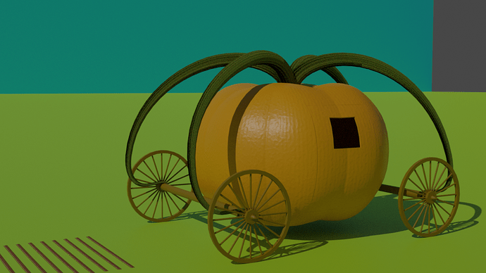
Well, I thought about keeping my Collab week 28 project a secret but decided that since others are sharing I should share too. In that spirit, I’ve decided to make Cinderella’s ride.
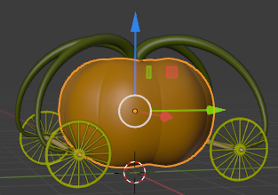
This has proven just a bit more challenging than I had thought… amazing how the simplest-seeming objects can be so complicated to model.
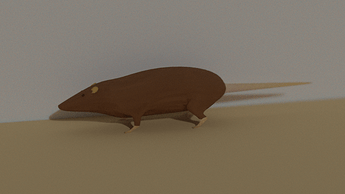
Next: Um … does anyone have a good side view image of a mouse standing on all four? I’m gonna need to make 7,560 of those little buggers 
Update:
I ended up coming up with this as a starting point for my mouse army, or should that be army of mice? Meh, whatever.
I’m asking for feedback on the mouse here so any suggestions to improve the form would be welcome.
Update: 2020-07-25T02:06:00Z
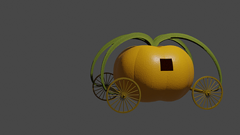
got a bit more done on this today but I fear I am rapidly running out of time to get it the way I want. First, thinking I was finished with the mouse model, I worked on the textures for the carriage.
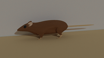
Then I went back to do some final touchup on the mouse and discovered that I had lost all the work I did on it yesterday afternoon. So, I did my best to recreate the work and finished with this…
In the end, it really doesn’t matter how good the mouse looks, in fact, it matters even less than I thought it would since he just looks like a brown dot in the final scene. and here is how it is coming together.
Well Back to the picture project. In this image, I’ve added in the exterior landscape which took way too long to get figured out. I spent a couple of days trying to find the right settings to eliminate the color bleed from the environmental lighting and then another day looking for the setting to get the sky plane to not cast shadows. but in the end, I found what I needed and was able to get the colors to come out right.
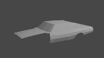
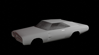
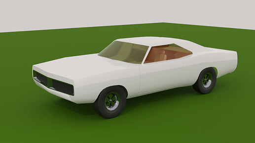
Having finished that portion, I moved on to the car. After a bit of searching, I’ve decided that the car that modeled for the scene was either a '56 Bel-Air or a '56 Century. I started out to model the Century but as I worked on it I realized that some of my initial impressions of the image were incorrect and that has led me to reconsider the Bel Air which I had decided to dismiss because it looked to have too much hood. Anywho, here’s today’s render.
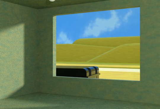
I’m gonna leave the early work on the car as a placeholder for the time being as I’ve also decided that most of the rest of the image will need to be modeled in separate files and linked in. And now it’s off to visit with my Enterprise-D project. Happy Blending
Hmmm… My favorite TV Show or Movie… so many good ones to choose from (most made between about 1975 and 1985) I’ll leave you guys to guess what this model is gonna be (at least for now)
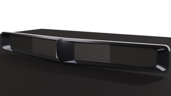
Back with an update (July 31, 2020 7:18 AM) now that it’s cooled down a bit. Finished the prototyping tonight so I’ll be able to start on the final modeling tomorrow. Even added a couple of prototype textures, though I had to switch to Cycles since Eevee never seems to always turn my white objects grey. 
Does it by any chance have Burt Reynolds in it?
No, but one of the supporting actors got elected to congress after the show ended 
This might help some people (I’m NOT one of those people)
Edit
I should clarify. The atrocity of a movie based off this particular show had Burt Reynolds but the show itself did not.
Ah, Pretty sure I know what it is… Quite a racy pick 
Think there was a remake in 2005…
I’ll leave everyone else guessing.
Finally finished most of the major modeling for this weeks collab entry but with only two hours to the deadline, it’s starting to look like I won’t get the textures done in time it in time. Ahh well, it was a fun challenge figuring out how I wanted to do the work!
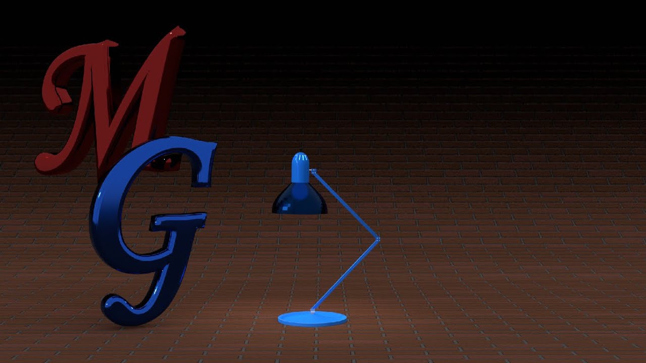
Been just a little while since I posted here but I’ve been hard at work improving my animation skills. This animation is my video for the challenge in 42_PL_CBC (Use the graph editor to refine the lamps movement.)
I struggled picking this one up again as it has been sitting idle for a number of months (since Michael announced he was moving) and ended up completely scrapping the original annimation. This one ended up being longer than the original and I’m still not satisfied with it (only about 75% atm) but at 40 hours for the final render I think it’s just about right for the purpose. As Michael always said, "Perfect, is the enemy of good enough.
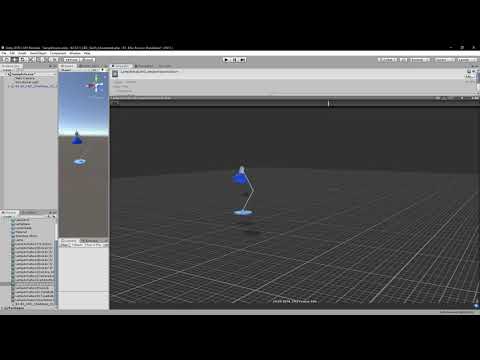
Finally! here is the final video for my animated lamp showing the Lamp’s animation playing in Unity’s preview tab.
Special thanks to @Digitz for helping me by tracking down the final bug in the re-rigging portion of this process.
and now on to Game Assets.
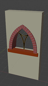
I’m really liking the window. 
Started working on the big window for the choir loft this week. I didn’t get too much done on it as I first ended up creating a bunch of node groups for quickly adding colors and then had to redo them cause the rendered colors were different from the groups I had assigned them to. This of course through me onto a two-day long squirrel trail of remaking and updating the materials in my material library. So, long story short, I’ve still got a long way to go on this window.
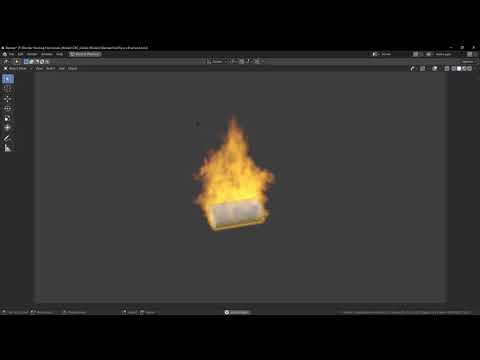
Haven’t gotten much done with the window this week as I’ve been working on my entry for the Blender Collab for this week. If you haven’t seen that yet you can find it over there. I spent way too long trying to make it look good with just a particle system and then spent today playing aroung with the Physics System trying to understand how the smoke and fire simulator works. Think I got that…
… now I just need to figure out how to get it to actually show up in the renders (suggestions welcome)!
Another week gone; and it doesn’t feel like I got much accomplished this but I’m still chugging along.
(note: this one is rendered in 4k to give enough detail for the Lead lines to look good.)
Making progress But a lot of work for this one window.
at 8ft x 8ft, this will be the largest bit of detail for the cathedral so I’m really focused on making it look good. Unfortunately, the 1 reference pic I’ve been able to find for it isn’t very good. And, after studying it to try and figure out the best approach I realized that the original window is likely only 1 to 1 1/2 feet tall and painted rather than being colored glass.
I’ll probably go back and recreate the image as a 3D scene at some point so I can get a good diffuse map to use in unity. But, for now it’s really challenging me in regards to topology and working with various kinds of curves (I’ve decided that N.U.R.B.s are way to much work to be useful though).
Wow, didn’t realize it’s been over a month since I posted anything here so looks like I’ve got a bit to add.
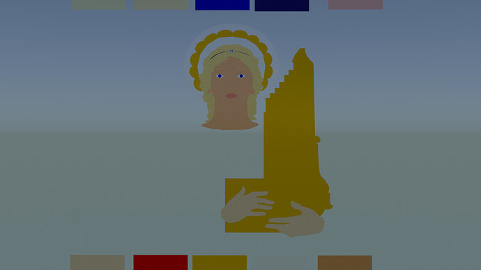
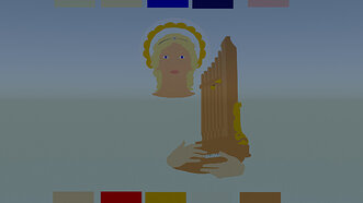
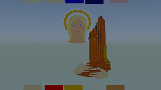
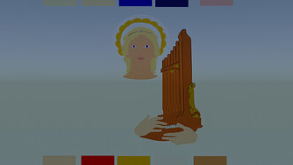
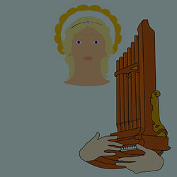
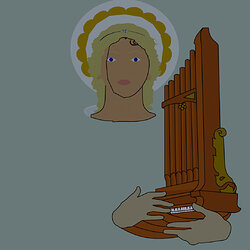
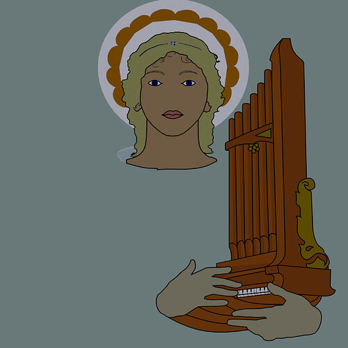
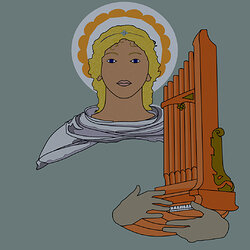
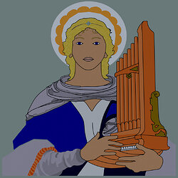
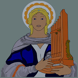
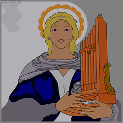
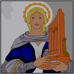
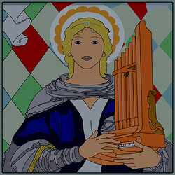
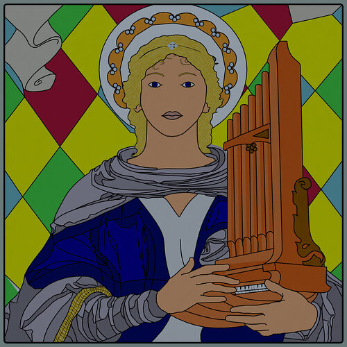
First, I’ll start with my St. Cecelia window as it has been the major project I’ve been working on for a while.
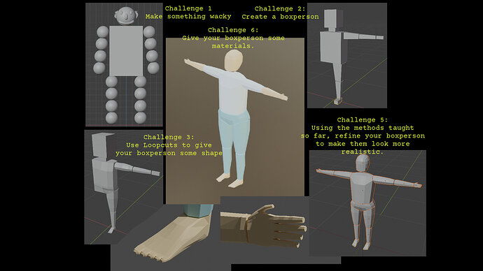
Next, some image renders from Grant’s Blender Character Creator Course.
here we have a composite of all the Section 1 Challenges.
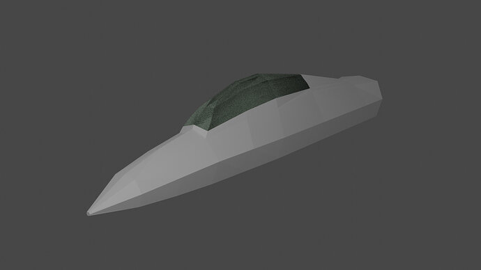
followed by the cockpit for the mech I’ve decided to make
I should note that I haven’t spent much time on the Mech section so I’ve not been advancing in that one very quickly.

Following that, a series of images I’ve worked on for the Blender Collab
Week 39 Challenge
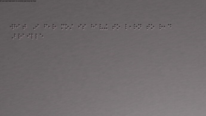
Week 34’s topic was “What are you afraid of?” My entry for the week is an image of a sheet of paper embossed with Braille
The braille lettering spells out my fear of having to learn braille as my sight continues to deteriorate.
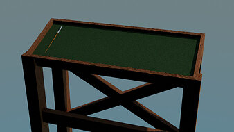
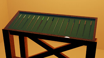
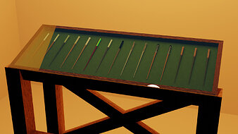
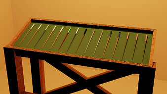
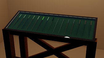
Week 36’s topic “Magic Shop” inspired me to create a scene where a merchant would be selling Magic Items at the village’s local market. Unfortunately, creating individual materials for the wands took a bit more time than I anticipated so I had to settle for just a stand full of wands. The display is lit magically of course.
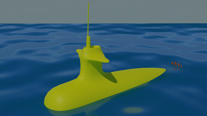
Week 37’s topic, “Yellow” was a hard one to come up with and I almost passed on that week’s contest. But, pretty close to the last minute the chorus for “Yellow Submarine” got stuck in my head (I have no clue how it got there as I haven’t heard the song in years) and inspired this…
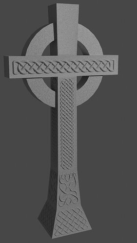
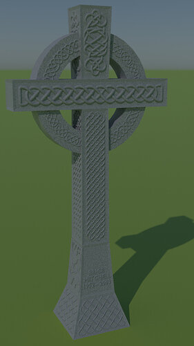
Week 38’s topic, “Celtic” was another hard one. I’m not Celtic so I don’t really know what defines the Celtic People as a group. However, I wanted to do something that would give proper honor to their culture. The only thing that really came to mind for me was the ‘Celtic Cross’. So, with a bit of research, I created this.
The interesting thing I learned in doing the research for my Celtic project is that the interlace (what most people in my area think of when they think of Celtic work) is not in fact, Celtic. None the less, it was a challenging project that taught me a few new skills.
Well, looks like that’s all of it for this post. See you next time and happy blending!


