I noticed it now. I was lost in my tweaking frenzies, bummer … you lose something you win something …
I used the grease pencil to draw a simple web.
Converted it to a mesh and added some random vertices displacement.
That last action will create the bumps in the shiny material, more/less reflective faces.
It needs more attention but time is a factor on these collabs.
Thin threads and low cycle samples are a bad combination.
Oh I didn’t think about the grease pencil. I’m guessing it could take more time, though.
You know, I was actually wondering how you did those webs in your submission, they look so neat. Now everything makes sense. Thanks for the info!
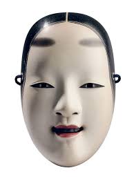
Random freaky stuff. Definitely slenderman influenced that one, the other was a Japanese Noh mask and some random tentacles from some offscreen monster but I like the Ursala suggestion.
You got my vote this week. Loved the modelling, composition and colours.
How do I even choose… Debating on @Tyger2’s (great atmosphere and environment, and the skeletons look really good), @Bruno_42’s (really good assets. Could definitely see those in a game), @Tetiana_Stasiv’s (Great lighting, and the depth of field looks great), and @anfloy’s (An overall great scene, definitely has that Nightmare Before Christmas feel). Lots of amazing submissions this week. @FedPete’s is another consideration, lots of little details like @Tyger2 said.
Edit: Ultimately decided on @Tetiana_Stasiv’s submission.
So we have the winner! Congratulations, FedPete! (Though I voted for the scene by anfloy, I love the atmoshphere in it!) FedPete, the next week is yours!
Thank you, It’s was a close call yesterday.
It was and always is difficult to choose.
I will create a new subject soon, as in, within a couple of hours.
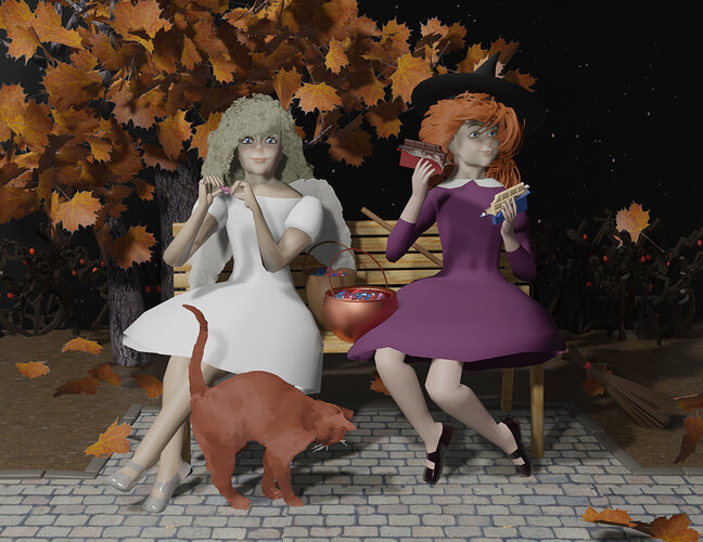
Awesome composition and colors! I could feel the creepy-cute flavor of Halloween:))) Congrats!
Did you change the grin grimace of Fish in shadow for purpose, or it just accidentally seems cuter and not so scary?
Thank you.
Yes, the fish shadow was intentional, but also a bit lucky because it’s glass material.
Then you need to tweak parameters als in 0…01 increments.
And the glass is not flat. It has some (slightly) deformations (bumps).
It even has some roughness. All procudural materials, so difficult to predict how it falls together (lucky part). I still have a lot of other probems, wanted to do more with the Blender post processing features (functioning like in Photoshop). But time in an issue in the Blender weekly collab.
And better to do many small projects. Working with new insights from previous projects.
New subject “Architecture”, examples.
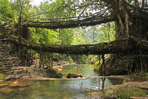
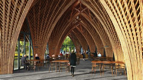
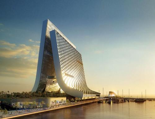
Add items to give the viewer the impression it is part of a hospital.
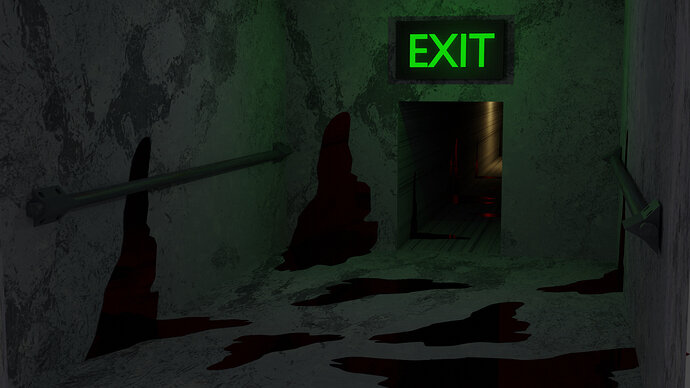
i will think about it, my first idea was liike it was the exit, but i will consider that, Thank you!
It has a nice spooky vibe with the lighting and pools of blood. The proportions seem a bit off though. Those are handrails on the walls, right? They seem too high, and the door too small.
I decided to make my Halloween project 2020 public for download.
Maybe to re-use, get inspired or just a how to guide.
Halloween 2020 - 12.3MB - CRC32:3638788d
Thank you!, i will see how did you do to make those materials
EDIT: just for curiosity, how did you make that background, when you go to the rendered mode i can see like a room, how did you did it?
The background is the HDRI that was used for the project.
You can find it in the project under the World Properties tab:
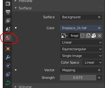
I’m so sorry, to mislead you. Because this Collab was finished in 2020. 
Maybe next week ?

