If you’re reading this, there probably aren’t very many posts yet. But don’t worry, you can be the first! Either create a new post or just reply to this one to say ‘hi’.
Good way to make you think about what you are going to do.
Glad you like it, I was worried it may be a bit to analytical for some people.
This is my choice for section 2:
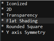
- Iconised
- 2D
- No transparency
- Flat shading
- Sqaure edged
- Axis of Symmetry
About the Axis of Symmetry / Mirroring, I’m not sure if I understood the difference completely in relation to icons. Looks very similar to me…
Iconised
3D - ish
Not Transparent
Shading not quite realistic, but not flat. Cartoonish 3D maybe
Square Icons
No Symmetry
This is what I have decided and these choices will guide my fate.
Here are my choices:
-
Iconised
-
2D
-
Opaque
-
Flat Shading
-
Rounded Square
-
Symmetry not required
Oh dear, I am unsure of my decisions, but here goes nothing!
-
Realistic
-
2D
-
Non-Transparent
-
Realistic Shading
-
I think I want square-edged? I am too new to art to really know what I want
-
I don’t think I want an axis of symmetry, but once again, my comprehension of what I want is a little limited.
This should be good though! I’m excited!
-
Ionized
-
2D
-
Transparent
-
Flat Shading
-
Square Edged
-
No Symmetry
Specification
- Iconized
- 3D
- Transparant
- Flat shading
- Square Edged
- No mirroring
Spec:
Look: Iconized
2D/3D: Stylized 3D
Perspective: Isometric
Transparency: yes
Shading: Stylized -> 3D-ish, but not exactly realistic
Rounded edges
My Spec:
- Iconized
- 2D
- Tranparency
- Flat Shading
- Square (maybe with rounded corners)
- Symmetry not needed
Here is my plan for some buttons and what not for an rpg/builder concept I’ve been toying with
- Iconized
- 2d
- No transparency
- Some shading
- Rounded Square
- Mirrored in general
1 icon
2 2D
3 no transparent
4 flat
5 not sure about edge
6 no axis
- Iconised.
- 2D.
- No Transparency.
- Action Icon.
- Rounded Square Edge.
- Not mirrored.
I see what you did there 

Though, in the symmetry, I think there will be slight inflections, like if a person is holding a sword
Here are my choices:
Iconized - So I have more room to work with.
3D - So I can have an open world environment.
Transparency - So I can blend my icons together.
Flat Shading - Because I want a cartoony look with my icons.
Rounded Square Edge - For a more polished looking icons that still have a pixelated look.
Rich Vibrant Colors - So I can enhance that cartoon feeling and have a playful look with my icons
Not mirrored - Because I’m still not sure what that is… So this one might change as I become more knowledgeable.
Binary CHOICES SPEC
Ionized
2D
Transparent
Flat Shading
Square
No Symmetry
Iconised - Gives a comfortable appearance
3D - Gives depth
Transparent - Assists with depth/3D
Flat Shading - Should look vibrant, not gritty
Rounded Square - Gives smoothness
Symmetrical - Personal preference
Real or iconised - iconised
Shape - rounded square
Appearence - 2D
Transparency - none
Shading - flat
Symmetry - none

