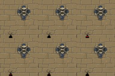
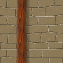
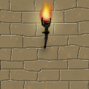
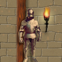
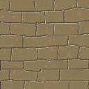
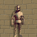
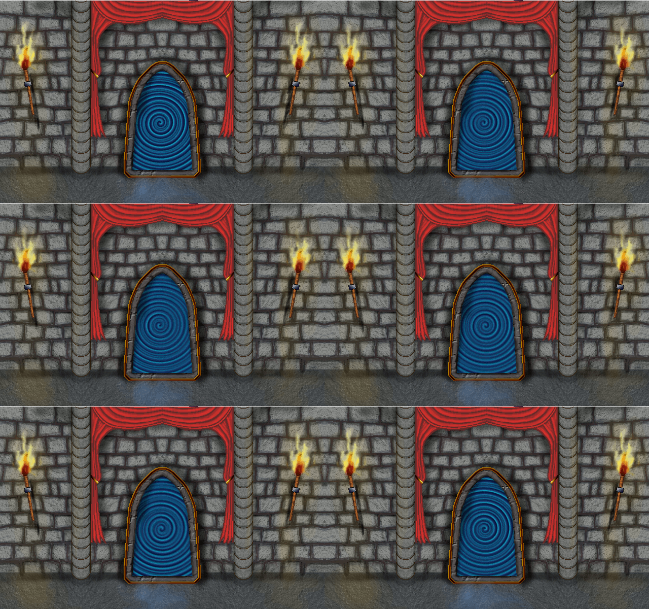
This project was fun. I was able to create a brick template from the paper pattern and then used the duplicate then horizontal and vertical flip to make a pattern that would always match up. I loved how it turned out with just simple shading of the walls different for depth. This is where my journey stops with GIMP for now and I go pack to programming in the Unity Course, as I feel confident in my ability to create the assets I need for the 2D games. I really wanted to create my own assets which is why I took this class. Im sure I will see you again for the Blender course when we get to 3D. (I already bought it ) Thanks for the class!
Minimalist animation
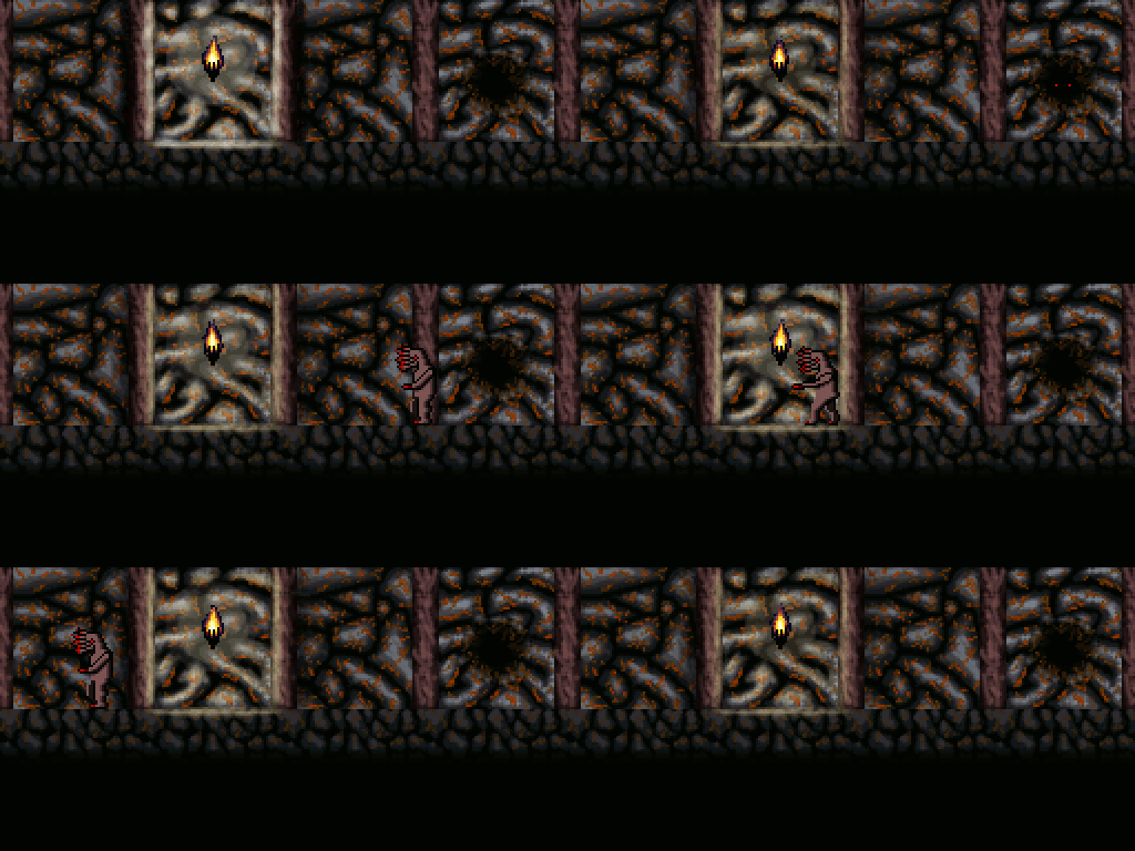
Added lighting effects plus a roaming monster:
I love that monster. It, and your scene in general, make me nostalgic for 90s Apogee action-platformers. That dude would fit in perfectly in BioMenace
Thanks Stage!
Appreciate that!
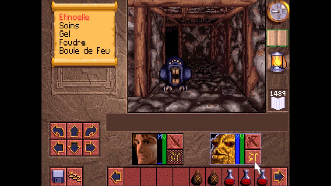
The scene itself was inspired by a level from an old RPG I used to play as a kid called Lands of Lore.
You can probably tell the walls are quite similar.
I couldn’t say the monster was based off anything however, I just sort of threw that thing together off the first thing that came to my mind
Oh my god I’m pretty sure I played the first chapter or so of that game. I can definitely see how the stone floor in your scene resembles that screenshot.
It’s a great game, and a very big influence on the stuff I do nowadays along with the Dark Souls series and Castlevania!
Since I used only few pixels to draw flames it required much accuracy to make animation and it became boring and takes too much time to manually change all flames every frame! So I came up with another way. Just made sprite sheets for flame, door and lighting in another image. Every sprite sheet for different objects was placed in different layer groups. Then I just dragged and dropped every single sprite (door and lighting) or the whole layer group (with all flames) from sprite sheet to every new frame, replace sprites as I needed and deleted all unnecessary layers. This way takes less time and is much comfortable if you use very low resolution.
To be honest I’ve create already a lot of animations. And if I known this, I would have created them in the same resolution and color settings (style). And for this part I only created a small mouse animation. So this lesson was just a 2 sec job. Because I easily could rearrange my tiles.
or
or
just rearranging my 7 tiles as .PNG .GIF images.
Love it, nice twist
Challenge accomplished !
It took several hours to do that but it is worth to have this animation.
Thanks a lot to this course due to their effort and courage.
Here’s my entry for the end-of-section challenge. I might tweek it a little bit at a later date, but for now I’m going to take a break from it.
That one could be the main menu screen of a polished professional product. The reflections and shadows are really well done. I think I can tell how you did the torch shadows, and it’s pretty clever.
Thanks