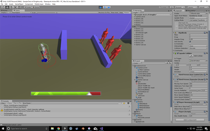
I went with a vertical bar whose lower portion changes to orange when health drops below 50%.
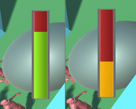
After seeing some of the examples I may want to play around more. This was thrown together quickly but a bit of inspiration hit near the end and I got a little ‘indicator’ on the health bar.
Still having issues with player movement even though I changed it back from >= 0 to walkStopMoveRadius (0.2f)
Would enemy mind giving me their Player Movement script? Pretty please I can’t figure out what’s wrong. Thanks!
You could use the Code Changes links in each lecture to take you to the GitHub repository and grab it from there.
Maybe take it from the last lecture you completed and then compare it to.yours to see if there is any differences.
See also;
- GitHub : Unity RPG Course Organisation (each section is in it’s own repository)
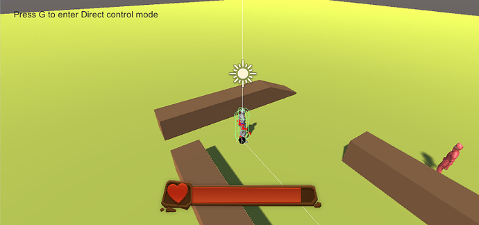
Didn’t do anything drastic but I plan to have all the player info in the bottom left of my screen, so I’ve moved the anchors, and redone the graphic using a black and white gradient (This allows me to recolour in the editor)
I also went for a vertical healthbar, and added a bit of transparency. I hope to, at some point, change the UI to a 3d helmet-HUD like setup that shifts around while the player moves their view.
I did a different health “bar”
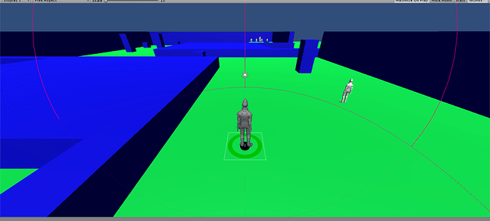
when the player lose health, the green circle will change and start to get red 
I used this tutorial https://unity3d.com/pt/learn/tutorials/projects/tanks-tutorial/tank-health?playlist=20081 from unity to implement that health bar.
I liked the idea of putting the canvas as a child of the player and the effect when you lose health is really nice.
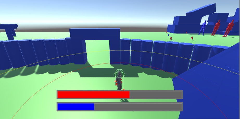
I decided to add multiple bars - a health bar and a mana bar.
It’s funny how Ben implemented it with basically one line of code. I decided to try it myself without watching his method, and came up with my own Lerp-based implementation which is probably more complex than necessary, but I’ve been trying to get my head around Lerp() so I figured I’d try it. It now works.
If anyone’s interested, here’s the code:
public class PlayerHealthBar : MonoBehaviour {

	public GameObject healthBar;
	[SerializeField] float barIncrementAmt = 0f;
	[SerializeField] float totalDistance = 0f;
	Vector2 translationEndPoint;
	Vector2 healthBarPosition;
	float distanceTraveled;
	float moveFraction;

	// Use this for initialization
	void Start () {

		healthBarPosition = healthBar.transform.position;
		translationEndPoint = new Vector2(healthBarPosition.x-totalDistance, healthBarPosition.y);
		distanceTraveled = healthBarPosition.x - healthBar.transform.position.x;
	}

	// Not optimized -- will use delegates later, but for now it calls the health bar updater every frame
	void Update () {

		LerpHealthBar ();

	}

	// Changes the increment the health bar graphic moves (left or right) with the arrow keys.
	void LerpHealthBar ()
	{

		if (Input.GetKey (KeyCode.DownArrow)) {
			distanceTraveled += barIncrementAmt;
		}
		if (Input.GetKey (KeyCode.UpArrow)) {
			distanceTraveled -= barIncrementAmt;
		}

		// update the interpolant -- the value between [0,1], based on our incremented or decremented distance from above
		// Then give that value (moveFraction) to the Lerp() function to move the health bar
		// Finally, update the distance traveled after we move the bar
		moveFraction = distanceTraveled / totalDistance;
		healthBar.transform.position = Vector2.Lerp (healthBarPosition, translationEndPoint, moveFraction);
		distanceTraveled = healthBarPosition.x - healthBar.transform.position.x;
	}

}
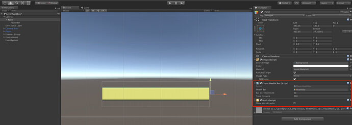
And here’s a screenshot of the editor with the parameters added in.
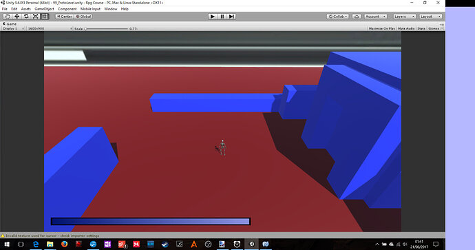
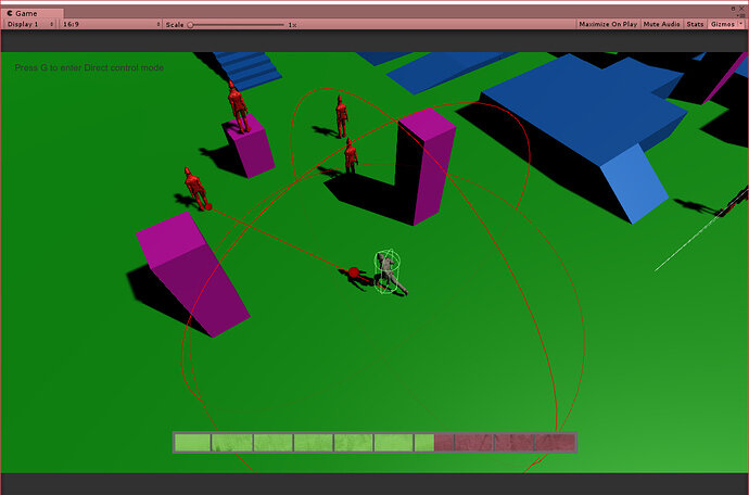
It’s nothing special, but here’s my place holder health bar. All I did was tweak the colours and add a new mask. It’s not great but it’ll get the job done for now.
Eventually, I think I’d like to highlight health on the character directly in some way (a la Dead Space). I’m not intending for combat to be a big part of my game, so I don’t think it will have to be quite as obvious as a giant bar on the screen somewhere.
I also want to focus on the other elements of the game before worrying too much on the UI.
Wow, there’s some nice health bars in here. Mine is just a simple one… not that good with Photoshop, but I managed to do a couple gradients and a bevel. Doesn’t look all that bad 

I don’t want my UI to take up a lot of screen real estate, so I’ll be making even more adjustments to it as the game progresses. For now, it’s in the general area I want it with the general look I want it to have.
Was a bit hesitant about posting what I’ve done here, but breaking the ice

I couldn’t ignore design thing. Just. Could. Not. Even if Ben told us to do so, hehe.
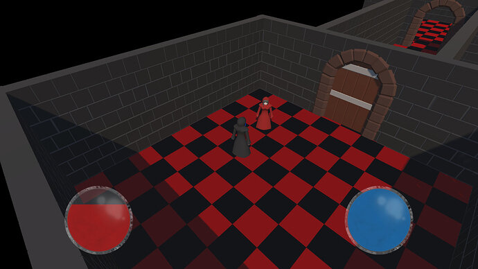
I followed the Circular approach as well 
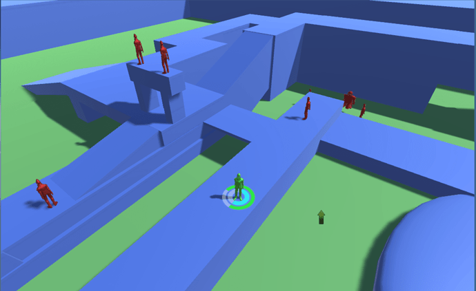
Green for health and cyan for mana. I will polish it’s appearance as we progress the game and decide an art style 
@Manu_Scheller : That looks cool. How did you get the bars projected on the ground under the character like that? I’ve been attempting to do something like that with a targeting ring and can’t seem to get it.
@OldRod
Hi ^^
I made the Canvas to worldspace, made it a child of the player and put it at his feet with a rotation of 90 degrees. Hope that helps 

