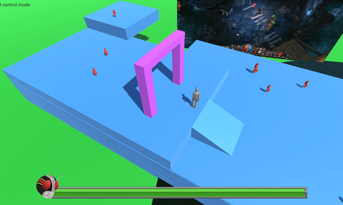
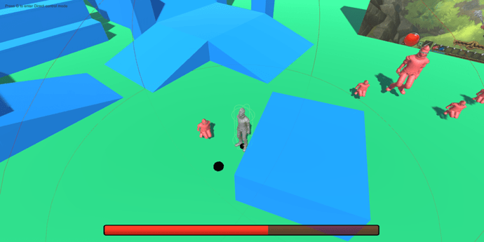
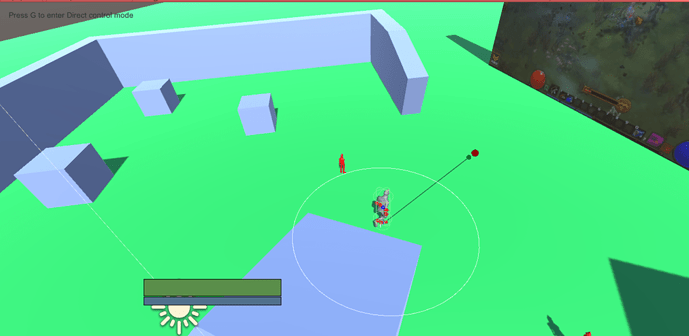
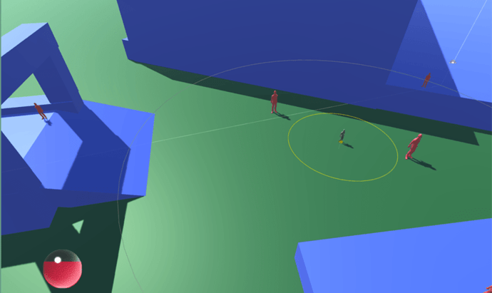
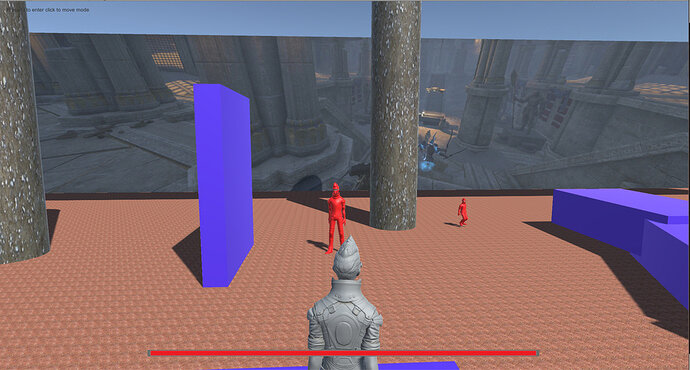
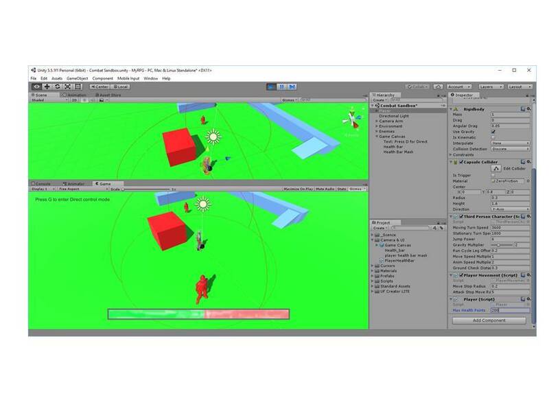
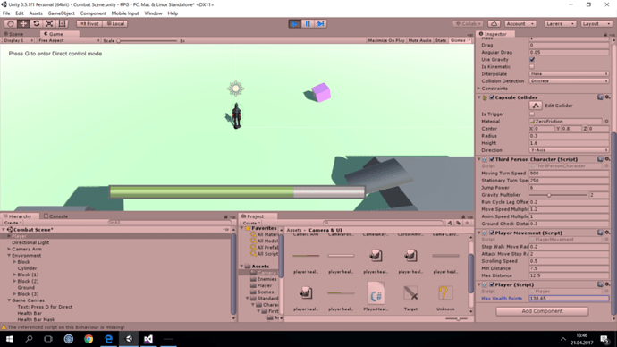
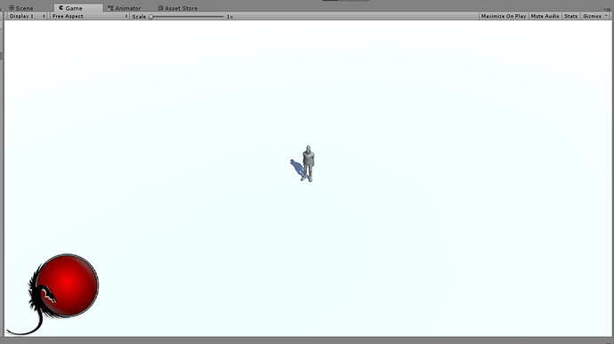
Here is my health bar, currently using Kamen Rider Black as a template
That’s my Player UI (WIP)… Diablo inspired 
Now i’ll work on enemy UI
Nice @Paolo_Bernacca !!
That looks great!
Care to elaborate any details on your effect?
I’m assuming your ‘detail mask’ is animated?
@Bejasc I’ve made the “animation” in after effects (just simple fractal map that moves and i’ve masked borders so it appears seamless). I’ve exported the animation as “PNG sequence” and i’ve used TexturePacker Importer to pack them together and import into unity.
After that i’ve created the “glass” effect in photoshop and i’ve exported the image as PNG in unity too. The mask is a circle image.
Last i’ve used Animator component and animation tab to animate all the sprites.
Then i’ve done almost the same for creating the “little wave” that u can (barely) see when health is not full.
Hope to have been clear enough. I’m sorry but english is not my language  .
.
Let me know if u need some other explanation.
Ps: I’m thinking about releasing it when i’ll finish it.
@ben don’t you think when you were exporting the healthbar and because of the dependencies was selected, the whole project was selected as well that means the project code is a kinda “spaghetti-code”?
I used to develop using Java in may dayjob and for my other hobbies and clean coding, SRP is a must there. Developing using Unity though is a though thing if I wan’t to use every principle I learned. Meaning trying to keep a code clean when using [SerializeField] connected stuff through the editor, components loaded via GetComponent etc. is not easy.
What do you think?
Here my implementation  I used Image and I added the Image as a child of the mask and used the mask component to change the shape of the health bar. I could use this or use the Slider Unity offers. Is using Slider a good option? I find it a lot easier to change the way it looks. The way they introduce in the course is only if you had a simple bar then it is easy. What do you think?
I noticed the rotating around the destination bug too. It came back! It is in the line ‘if (playerClickPoint.magnitude >= 0)’ . I just changed 0 to walkMoveStopRadius and it solved it. Could also just put a small number in like 0.1f and test it with your speed settings.
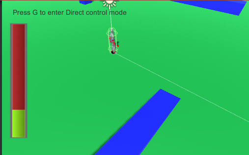
Here’s my health bar. Made it red, and semi-transparent where the health is gone. Rounded corners for the mask.
I thought it looked better on the side. I was thinking the color blue with the screen but I didn’t want to commit to colors or masks until I do more art design.
Not 100% decided, butt might go down the Zelda heart container route - instead of doing it by 1/4 I might just do 1/2 or decrease the amount of fill
Here is my health bar, but I don’t have any tools to improve it (outside of paint).
P.S. Why are we only allowed to respond to ben?
2 posts were split to a new topic: Can’t Create New Topics
Here is my go at the Health Globe, ala Diablo Style. It is animated and you update the value by setting the Slider object’s value to the healthAsPercentage in the PlayerHealthBar.cs
I found a tutorial online on creating this type of Orb with a Slider.
Am I permitted to Share the link on this forum?
I also created a Prefab that I am willing to share, I am NOT artistic and the sprites alone took me about a day to create, I do know that there are other people out there that will do way better in creating the art.
Please let me know if I am allowed to share the link and if I may share my Prefab.
Please let me know if I am allowed to share the link and if I may share my Prefab.
Hi @Chris_Marais, yes this is fine, if the tutorial is beneficial to other students and free, please link to it in your post.
If you want to share your prefab you could export a package, zip it up, and then upload the zip file to your post also.
Hope this helps ![]()
Thanks @Rob the link is here: Diablo-esque health orb in Unity with zero lines of code
This is my prefab: HealthOrb.zip (657.0 KB)
I hope this can help students like me, that aren’t Art designers, to get something in their game that looks semi good without having to design it them selves. I Like to code, the animation and graphics are not my strong point.
NB: Only things I had to figure out by myself was the sizes of the images and how to update the slider.
the FILL images are 200 x 200 in a 600 x 600 Canvas and the HANDLE I Made 200 x 15 and setting the slider “Value” moved the fill level
Here is my health bar - it does not look like much but I actually made a new image in GIMP and got it imported and working. I am not GIMP expert so I am pleased!!
So I decided to go for more “tarnished” colors. The effect can be seen below. I wish I was better at GIMP 
Later I want to go for more advanced things, like diablo orbs. But first I have to check whether they will fit my game convention!
I’ve been playing with paint.net and come up with this health bar.
I think I might split it in two so the circle holds both health and mana like in Legend of Mir.
