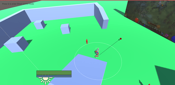
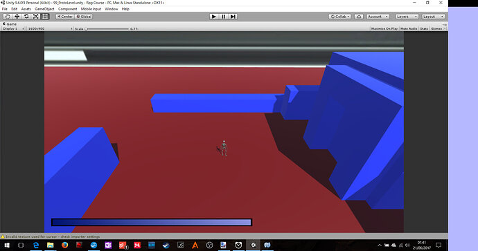
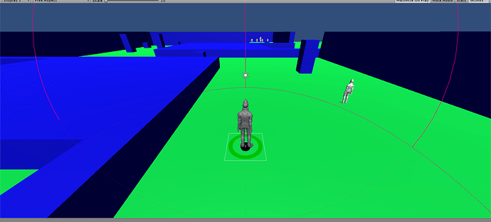
clear and simple, maybe later at another postion
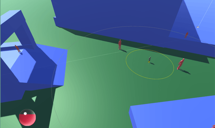
I thought it looked better on the side. I was thinking the color blue with the screen but I didn’t want to commit to colors or masks until I do more art design.
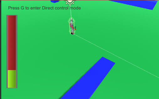
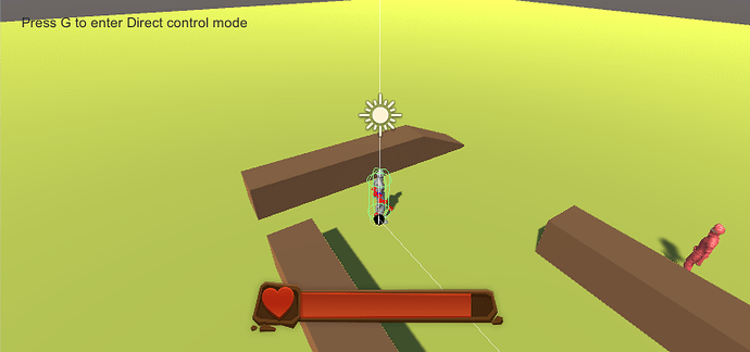
Not 100% decided, butt might go down the Zelda heart container route - instead of doing it by 1/4 I might just do 1/2 or decrease the amount of fill
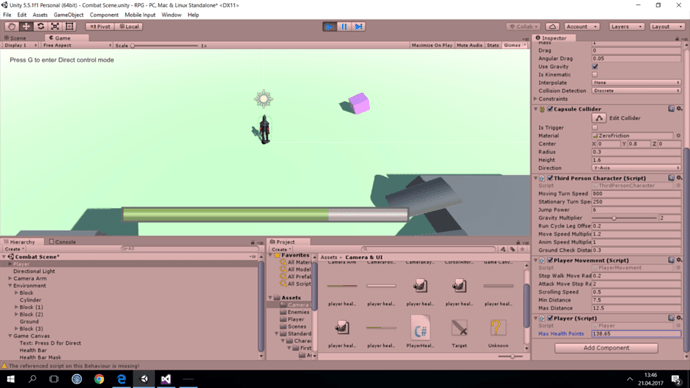
Here is my health bar, but I don’t have any tools to improve it (outside of paint).
P.S. Why are we only allowed to respond to ben?
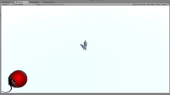
Here is my go at the Health Globe, ala Diablo Style. It is animated and you update the value by setting the Slider object’s value to the healthAsPercentage in the PlayerHealthBar.cs
I found a tutorial online on creating this type of Orb with a Slider.
Am I permitted to Share the link on this forum?
I also created a Prefab that I am willing to share, I am NOT artistic and the sprites alone took me about a day to create, I do know that there are other people out there that will do way better in creating the art.
Please let me know if I am allowed to share the link and if I may share my Prefab.
Please let me know if I am allowed to share the link and if I may share my Prefab.
Hi @Chris_Marais, yes this is fine, if the tutorial is beneficial to other students and free, please link to it in your post.
If you want to share your prefab you could export a package, zip it up, and then upload the zip file to your post also.
Hope this helps 
Thanks @Rob the link is here: Diablo-esque health orb in Unity with zero lines of code
This is my prefab: HealthOrb.zip (657.0 KB)
I hope this can help students like me, that aren’t Art designers, to get something in their game that looks semi good without having to design it them selves. I Like to code, the animation and graphics are not my strong point.
NB: Only things I had to figure out by myself was the sizes of the images and how to update the slider.
the FILL images are 200 x 200 in a 600 x 600 Canvas and the HANDLE I Made 200 x 15 and setting the slider “Value” moved the fill level
Here is my health bar - it does not look like much but I actually made a new image in GIMP and got it imported and working. I am not GIMP expert so I am pleased!!
So I decided to go for more “tarnished” colors. The effect can be seen below. I wish I was better at GIMP 
Later I want to go for more advanced things, like diablo orbs. But first I have to check whether they will fit my game convention!
I’ve been playing with paint.net and come up with this health bar.
I think I might split it in two so the circle holds both health and mana like in Legend of Mir.
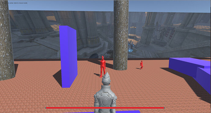
I went with a vertical bar whose lower portion changes to orange when health drops below 50%.
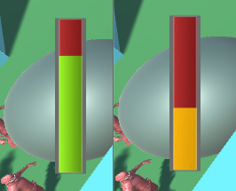
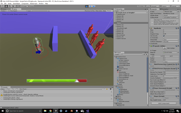
After seeing some of the examples I may want to play around more. This was thrown together quickly but a bit of inspiration hit near the end and I got a little ‘indicator’ on the health bar.
Still having issues with player movement even though I changed it back from >= 0 to walkStopMoveRadius (0.2f)
Would enemy mind giving me their Player Movement script? Pretty please I can’t figure out what’s wrong. Thanks!
You could use the Code Changes links in each lecture to take you to the GitHub repository and grab it from there.
Maybe take it from the last lecture you completed and then compare it to.yours to see if there is any differences.
See also;
- GitHub : Unity RPG Course Organisation (each section is in it’s own repository)
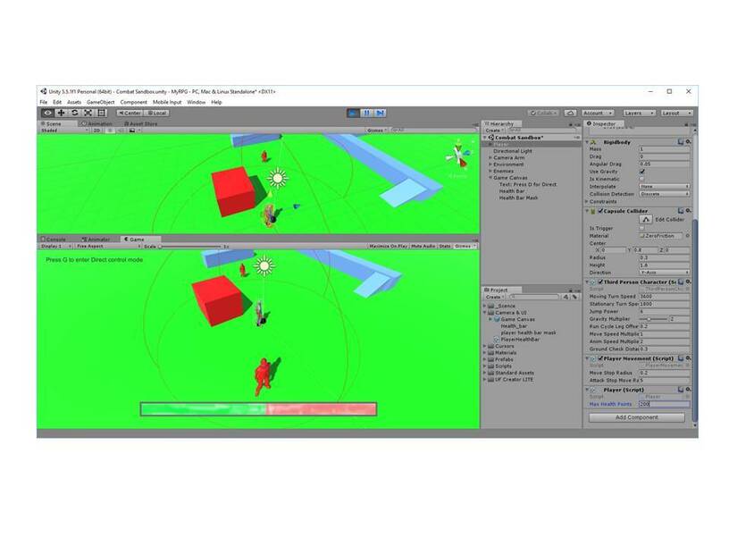
Didn’t do anything drastic but I plan to have all the player info in the bottom left of my screen, so I’ve moved the anchors, and redone the graphic using a black and white gradient (This allows me to recolour in the editor)
I also went for a vertical healthbar, and added a bit of transparency. I hope to, at some point, change the UI to a 3d helmet-HUD like setup that shifts around while the player moves their view.

