If you’re reading this, there probably aren’t very many posts yet. But don’t worry, you can be the first! Either create a new post or just reply to this one to say ‘hi’.
My level 1 idea… ( sorry for the giant keyboard noise, I placed my mic right next to the speaker and still seem to get mostly keyboard noises… i need to be nicer to my keyboard )
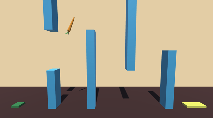
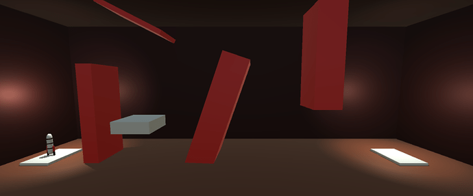
Here’s my level 1 initial design for my game, Levitaste!
The idea is that you’re a lazy chef with telekinetic powers that has to navigate his ingredients (in this case a carrot) through a variety of wacky situations and onto his chopping board.
Let me know what you think or if you’ve got any suggestions 
Great theme!
About suggestions: knifes, stove, fire, water, boiling pan, stinky cheese with big holes to fly through.
Imagine a rack with spoons and whisks 
I’m not sure myself what theme to take. Gonna stick with the basic design first to keep moving.
Thanks for the suggestions! I’ll add them to my list of things to include!
Sounds like a plan - momentum is important in projects like this, and sometimes its better to let inspiration to catch you off-guard!
Good luck, and I’m sure you’ll think of something great 
Dude u just got advice from the Swedish Chef himself!!!
Here’s my little gameplay moment:
Showing off in my quick level draft. Sorry for the light background noises. Had shadowplay set to capture my mic accidently.
Control, celestial charts uploaded, course calculations completed. Initiating count down.
3, 2, 1, Blastoff !
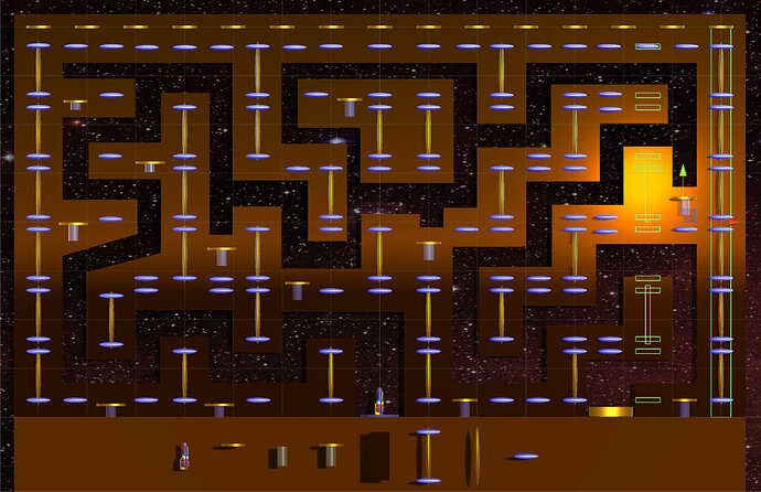
I like the design and complexity of it but at first, I thought that you had to stay within the brown and that you needed to avoid hitting the brown parts. Maybe a bit confusing for the player at first.
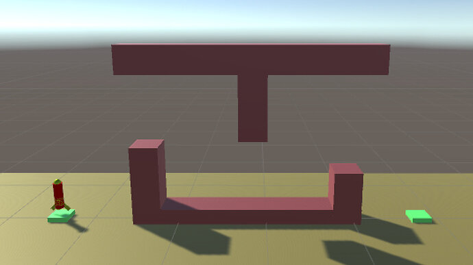
Here is my first level design pretty simple so far but still a bit challenging. Don’t want to go too easy on the player  this would probably be a third or fourth level or maybe the level to introduce moving obstacles. Maybe if I have time as a score the bottom wall part could move up and down and if the player times it and is skilled enough they can complete the level quicker that way. So many possibilities!
Thanks Cody, Yes it is a little confusing. I wanted the brown blocks to be transparent as to show just an outline of the object, letting the star field to show through. I reached my allotted time for this project and had to move on. One thing I have learn from Ben and Rick’s videos is to stay focus on the primary goal and not be distracted in the little details. After the course I plan to revisit all the projects and add the finishing touch.
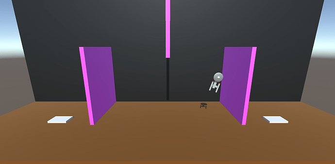
I didn’t stray from the lecture design too much on my level, but I’m going for a bit of a theme with my rocket design. I call it “Escape the Dilithium Crystal Mines, Level 1”. 
Nice job Derrick, love your rocket. The shadow looks like Star Trek’s Enterprise. Beam me up Scotty.
Ha, nice job everybody.
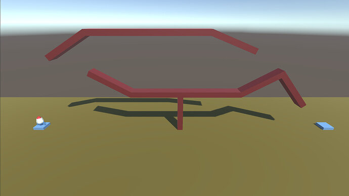
Here’s my version. Pretty standard stuff. I also made the camera follow the shuttle (just average the x and y of the camera position and the shuttle every update).
love that ship
that camera move is a nice touch. I may pinch that.
lot of nice looking ships
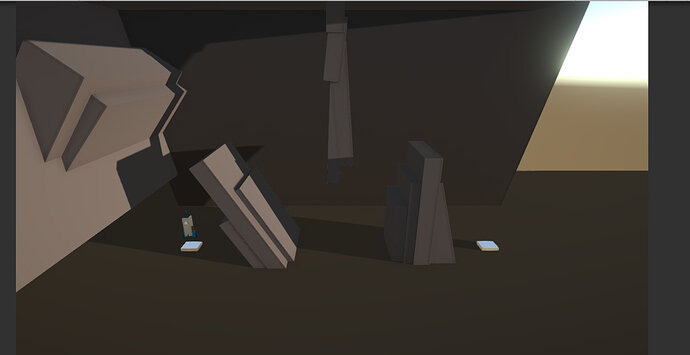
here’s my rough idea for level 1 using just basic objects to create obstacles and a little bit of messing around with post processing, just for fun.


