If you’re reading this, there probably aren’t very many posts yet. But don’t worry, you can be the first! Either create a new post or just reply to this one to say ‘hi’.
Sorry if that is a duplicate: I could not find a thread for this challenge!
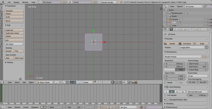
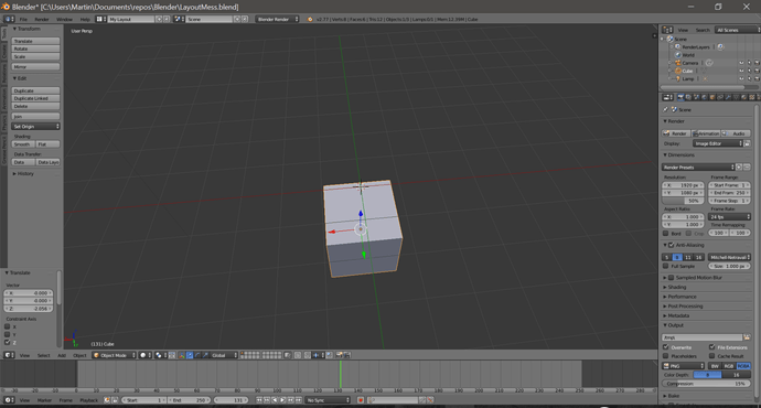
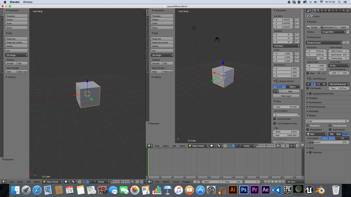
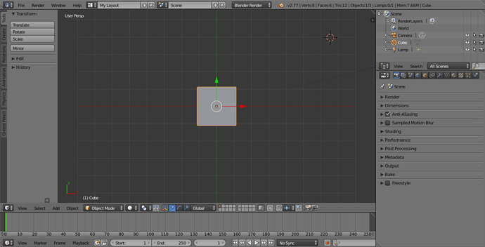
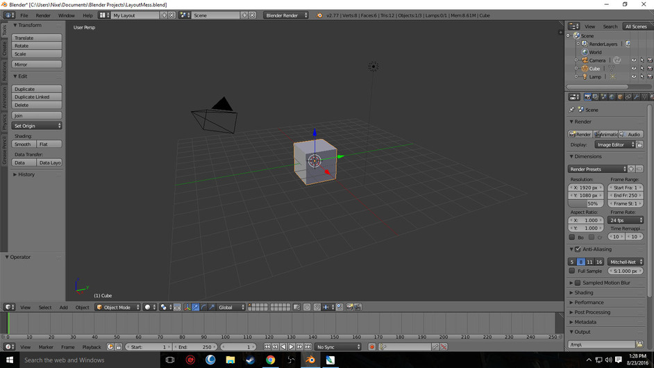
Anyway, here is my answer to the layout mess:
I am pretty sure my solution is too convoluted, but here is what I did:
I first changed Properties to the Info widget, then flipped the bar to the top, which was not needed since I had to flip it right back after the next step. I duplicated the Info widget with the corner slider, then switched it to a 3D View. Then I should have duplicated it to the right to create my Properties widget, but I created my Timeline to the bottom instead. That caused me troubles when I duplicated the 3D View to the right, because the widget did not extend to the bottom of the window. I had to duplicate the Timeline to the right too, and try to merge it with the corner slider. That sent me into duplication hell, because even though my edges were snapped (the two widgets aligned), it did not want to merge whatever corner or direction I used. Finally, I switched the Timeline to Properties, and they immediately merged. However, did not Michael merge two different widgets (3D View & Dope Sheet)?
So, has anyone found a better way? Thanks!
EDIT: Well, I just unpaused the video LOL
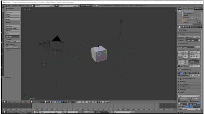
Hi, this is my layout mess fix.
The video didn’t say whether to upload this here or in the Q&A, but since this isn’t a question I’m posting it here.
I had to toggle to default layout a few times to get the toolbars and windows in the right place.
Finally got to do this. Didn’t make sense first time because I accidentally watched the lessons out of order. Oops. Anyway, up in the far left corner is the little box (forget what it’s called) that shows the current window view. I changed it to “info” . The “header bar” was at the bottom instead of the top but I clicked on the box just to the left of “My Layout” and chose “Default”. Took a couple tries but that was the shortest way to the easiest solution I found. Sorry no screen shot. Haven’t taken the time to figure out how to do that.
Hi Pamela,
To easily take a screenshot from within Blender, click Window (at the top) --> Save Screenshot or press Ctrl+(Fn)+F3. Then, you have to browse where you want to save the image file, and press Save Screenshot (to the right). Hope that helps!
Thanks. I knew it had to be something easy but hadn’t gone looking for it yet. I’m off and on with all this right now because we’re right in the middle of repair/remodel of our new house. It had been empty for a couple of years and needs some TLC. Too bad I hadn’t started Blender earlier - I could have used it to design my kitchen.
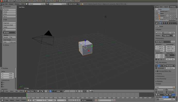
This is my finished layout from the layout mess.
instead of going default I put my own spin on how I would have liked my workspace to look while I work on projects, owing to the fact that each window could be used for a different mode during the editing process.
The only criticism when working on this challenge was that there is no toggle to create another window inside Blender in the bottom right corner, this might be my version as it is 2.77 but I might need to download 2.77a.
Hey guys,
I did this two ways. The first way was really quick and I am not sure if it is what the instructors had in mind, but they did say get back to the “Default” layout.
First way: Open up the LayoutMess.Blend and then switch the editor type to ‘info’ then select “default” in the layout menu. Done!
Second way: Use the hashed areas on the side of the first editor to duplicate and then repeat until you have the layout framed, then switch each editor type to match what you would see in the default layout.
I like the first way 
edit: Just clicked play on the video after posting. Seems this was what they did anyway lol.
Didn’t think to make my own spin to this, @D_en_trotr_ee!

Has both of my monitors on it, has the layout I intended to use. I even played around a little to get the sphere to reflect!
I did basically what @JPTurcotte said. Did not realize there was a better way of doing this! For me personally, however, I’d want the windows I’d want in the positions I’d want them in, so I’d rather do the method I did. Just me personally, though! You can do what you like!
Easy Peasy

Got it!
Here’s mine.
Nothing very original about this one! Hopefully my explanation makes sense…
- First I figured out that there was only one toolbar/workspace. Since only “Info” was the full width of the screen in the Default layout, I started by duplicating up (horizontal split) and changed the top one to “Info”.
- Then I duplicated the bottom one sideways (vertical split) to make the two view halves.
- I duplicated the LHS again (horizontal split) to effectively quarter the main area of the screen, and changed the upper field to “3D View” and the lower field to “Timeline”.
- I then duplicated the RHS in the same way, made the upper field “Outliner” and left the lower field as the original “Properties”.
Done.
The first time I duplicated the windows and changed their types accordingly. The second time I went and found the info bar and selected the default layout.
Here is my version of the Layout Mess. I too took the convoluted way to clean it up. It did give me the opportunity to get practice with modifying and moving the window panes around. It was good practice.

Got it, the info bar gave me a little trouble.
Had to get those sections just right when overwriting.
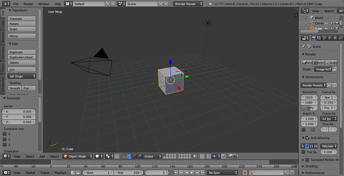
There is my fixed layout. Here is how I fixed it:
- Changed the editor type to ‘Info’ using the button in top right corner (it was first set to properties).
- Used the “Flip to Top” function on the header, which was originally on the bottom.
- Changed the Screen Layout to “Default”
Yay!  Success!
ok Messy Layout Challange

Hello this is my solution.
- I tried to get the “info” view using the the Ctrl + F shortcuts. Using Ctrl + F5 i reach the 3D view.
- Here i change to the “info view”
- Then on this view, i just picked the “Default Layout” and everything comes back to normality.
- Solution.


