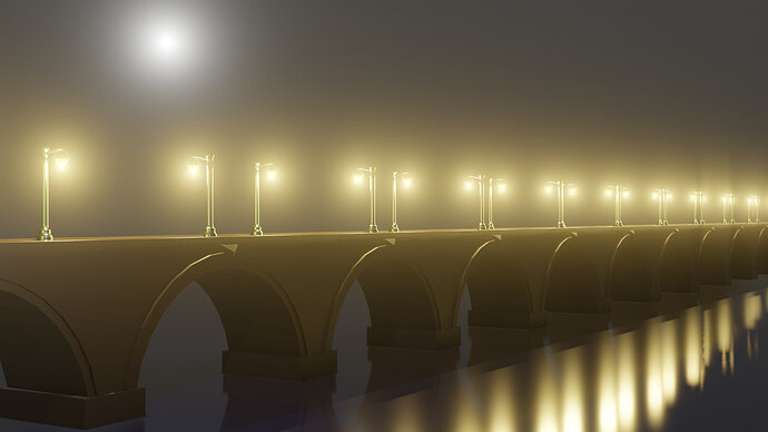
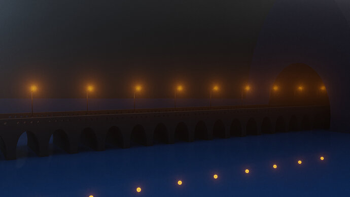
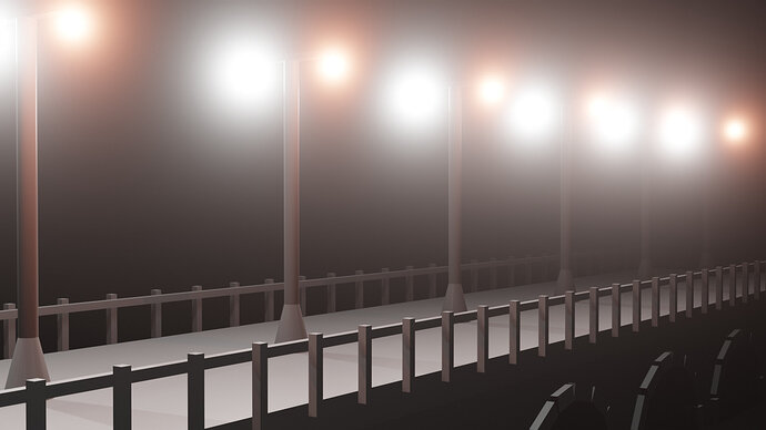
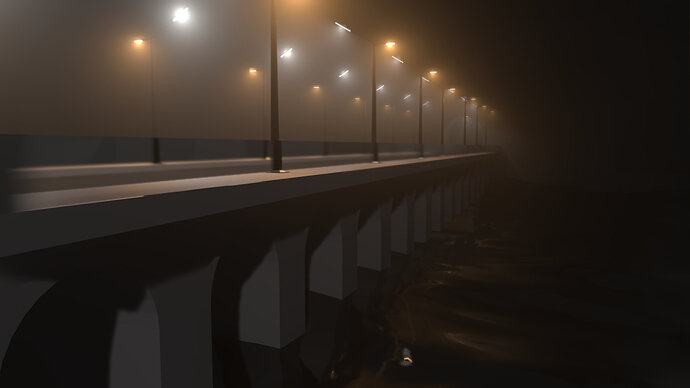
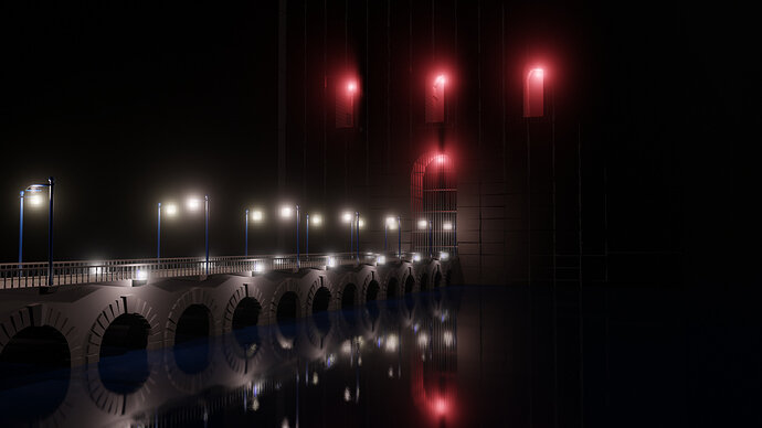
Decided to stick with the basic idea here. The reason I bought this course was the promo picture of the bridge in the mist and the idea I’ll be able to make it myself. And it was a good advice from Mike to restrict the time and to do what you can. So decided to follow the way of making the picture I liked in the fist place and put more effort into the lamps and arch.
Good day Ladies and Gentleman
I present to you my finished challenged. There should be some fanfares on the background, announcing it  Actually it is what I worked from the beginning , I just added the two towers together with the bridge, If I was to remodel it and start from scratch it would be an hour, so I am happy.
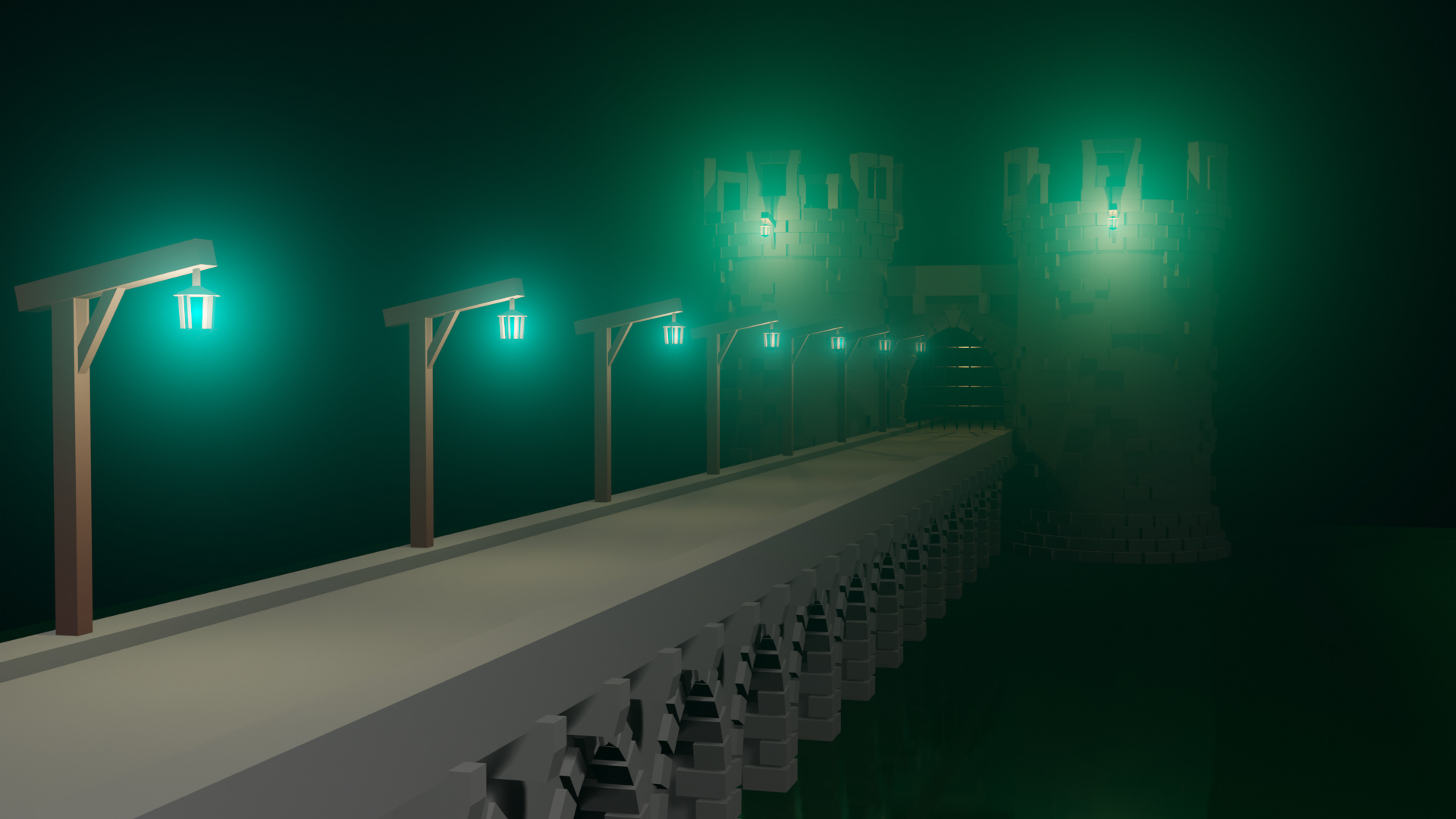
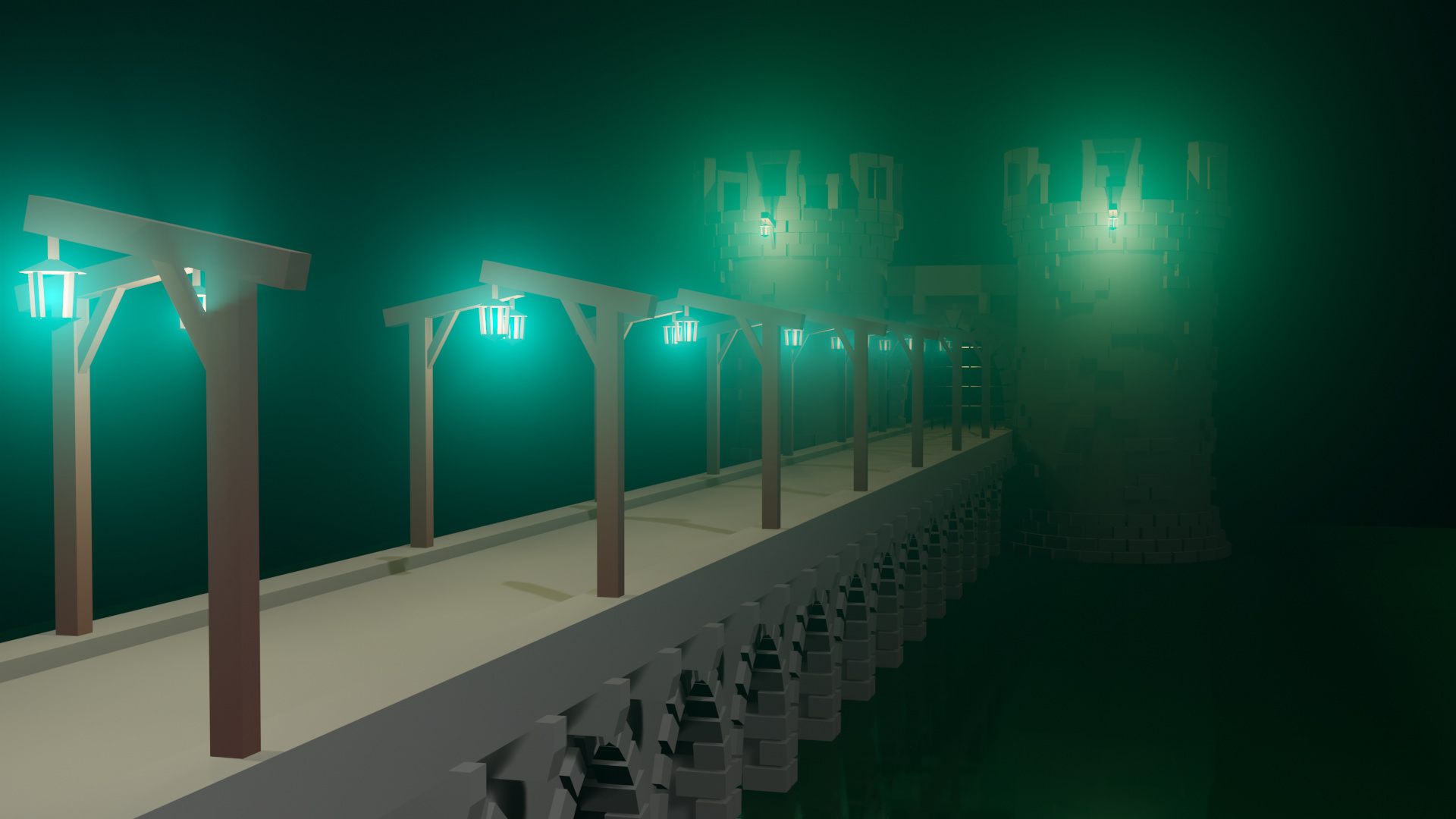
I give you two variants because even I am not sure which one I like more.
Have a good day
Bob
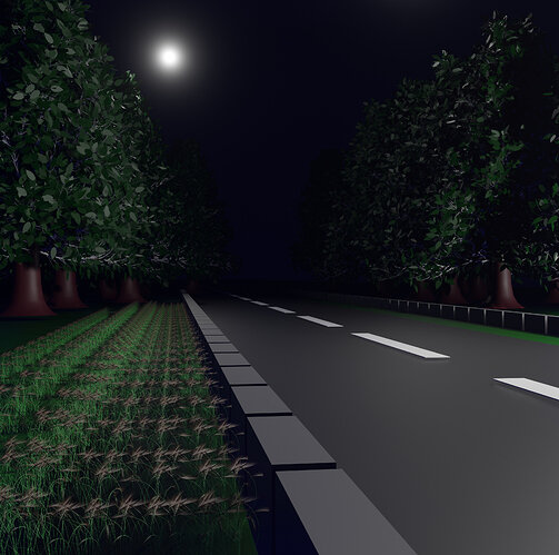
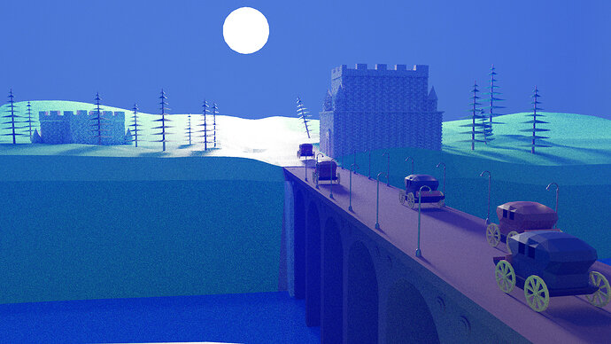
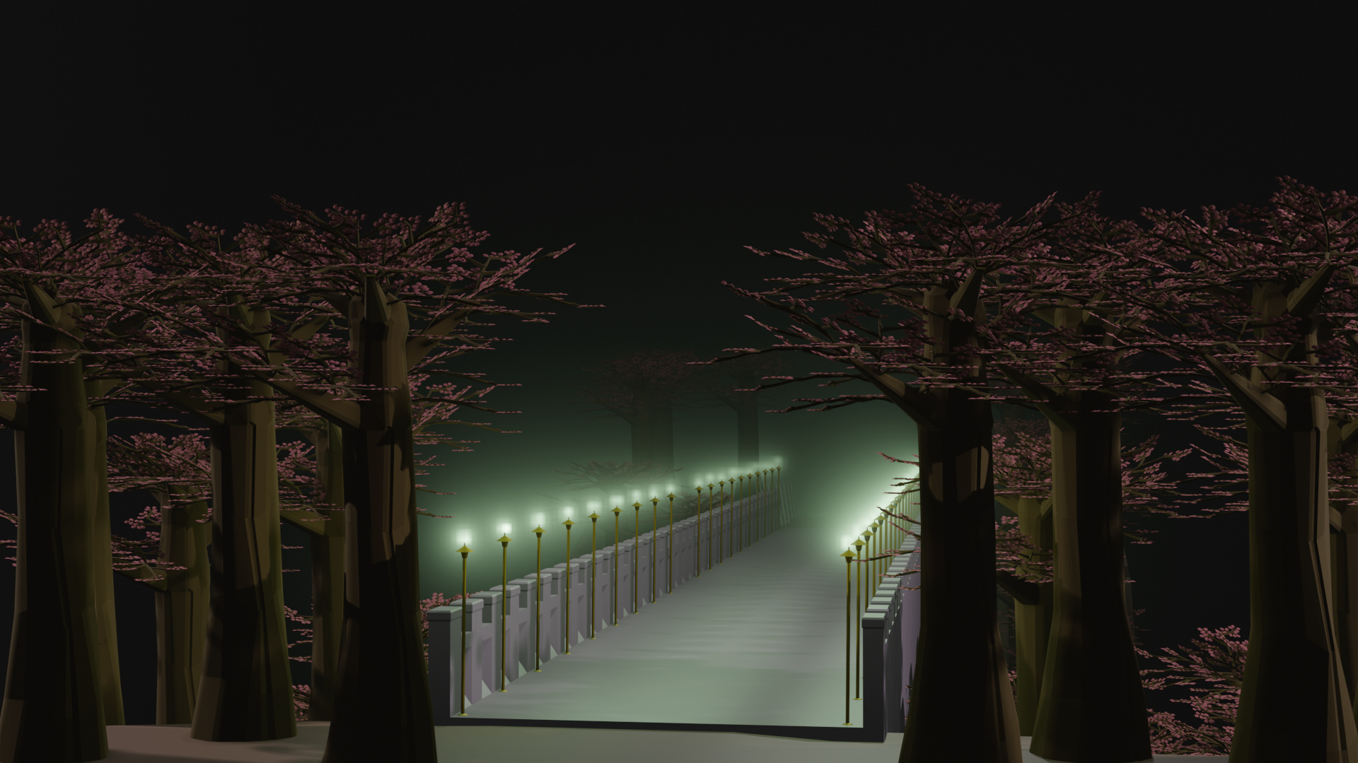
Here’s my 1 hour challenge, I got the trees in in the last 3 minutes!
Great course so far!
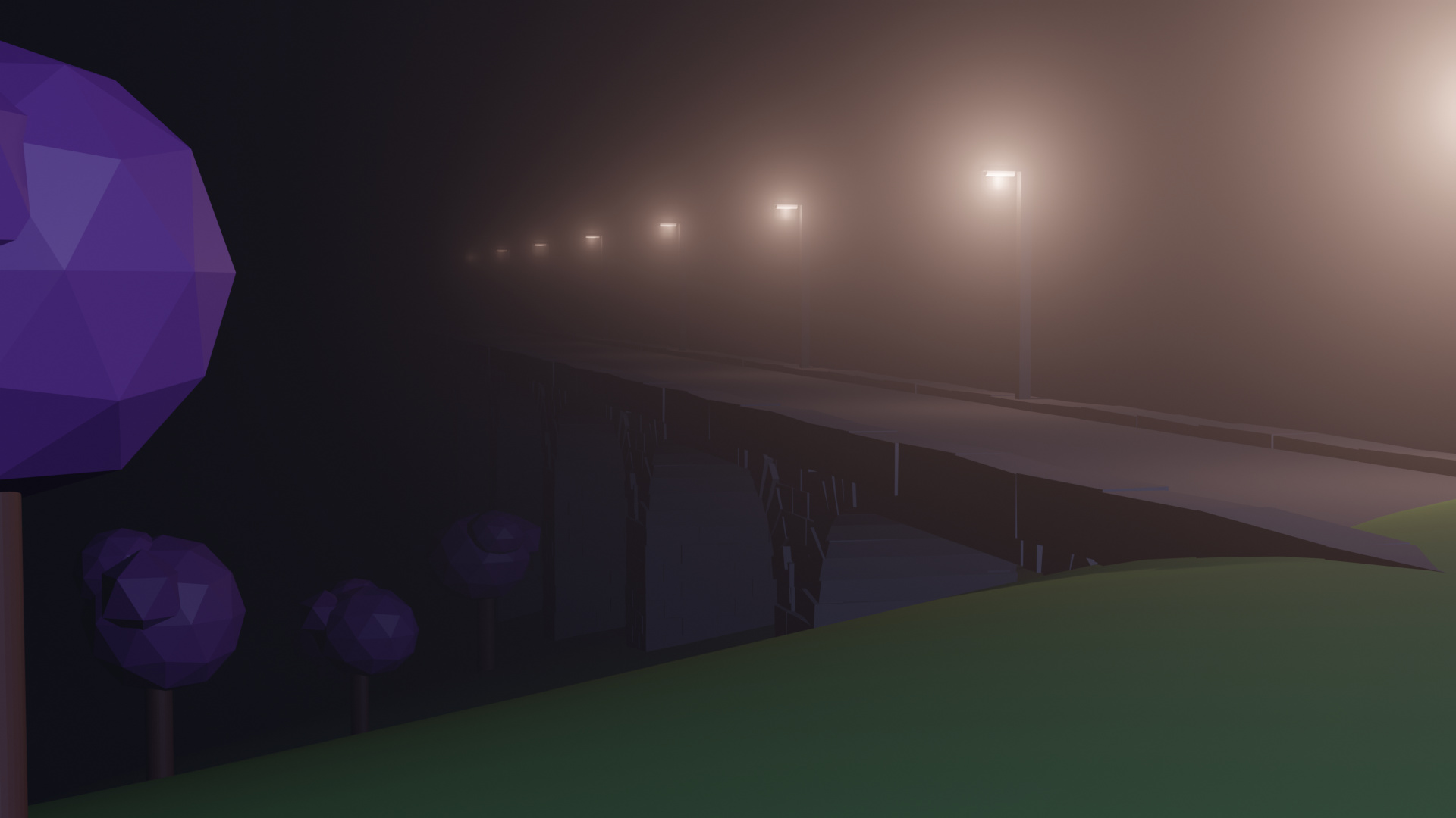
I have to say that I did cheat a bit by using a free add-on that was not discussed in the course to generate the trees and the barely… : 3
end of section challenge - 3 point ligting and volumetrics
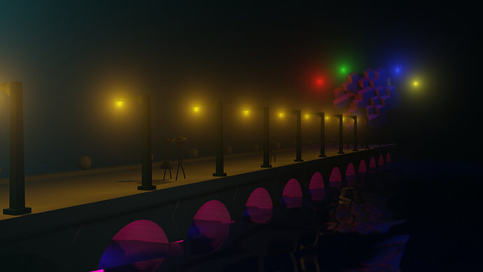
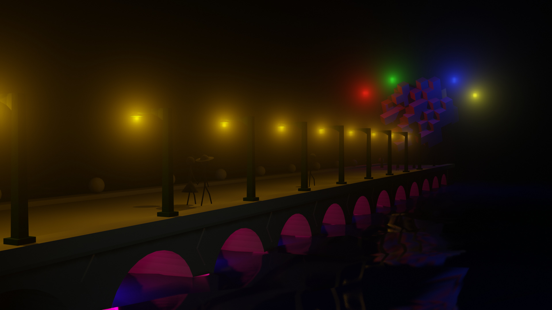
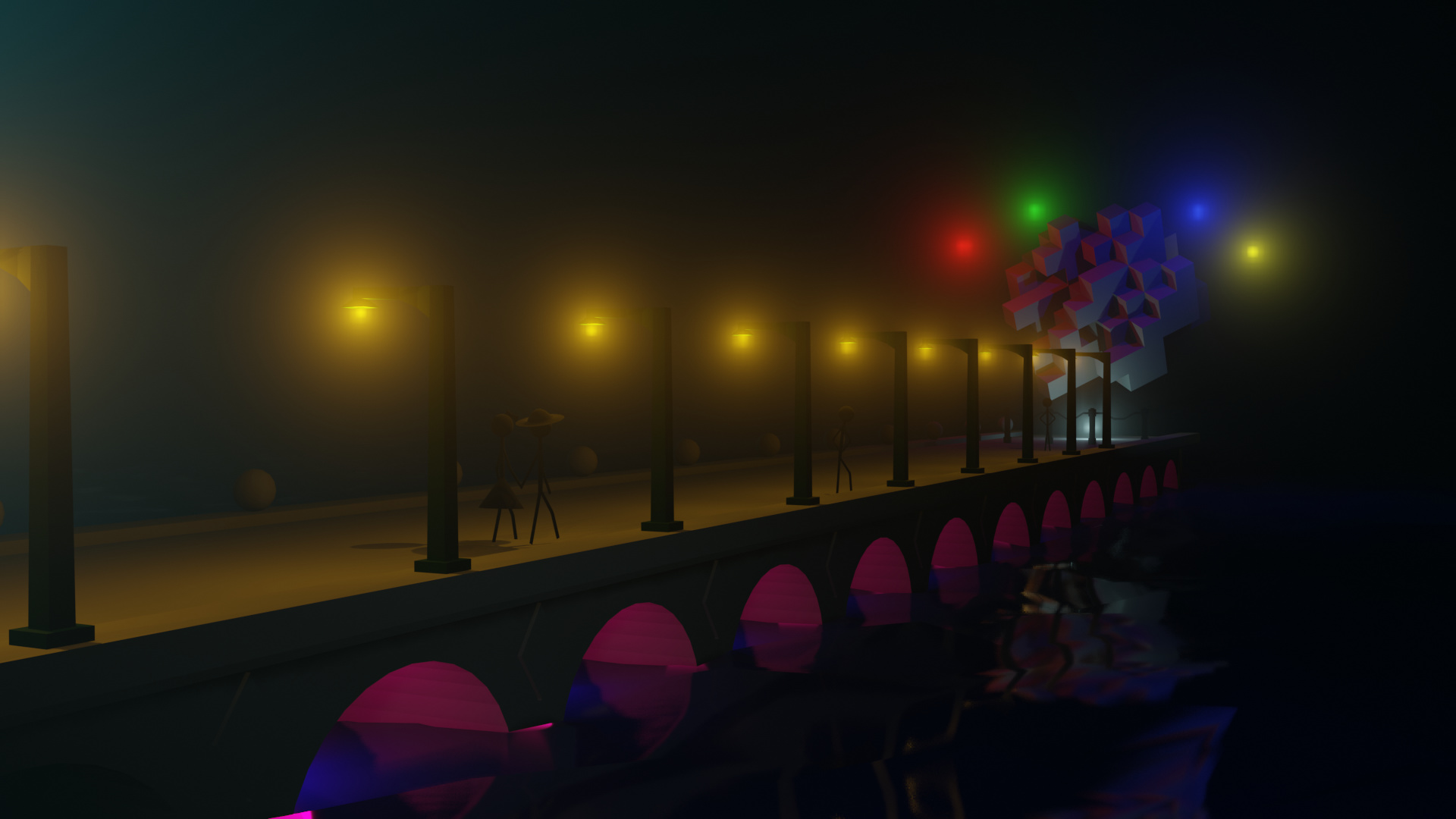
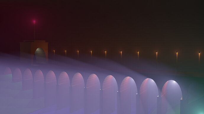
Here is my scene for the end of section challenge, I didn’t do a great deal, given the speed that I work in Blender an hour is quite limiting and even then I overran a bit. I added some balustrades (I must admit that I used previous editing knowledge to shape them), reshaped and resized the lamp posts a little, and added some stop/go lamps to the bridge for some colour effects. Finally a fair bit of tweaking lights, fog and camera position.
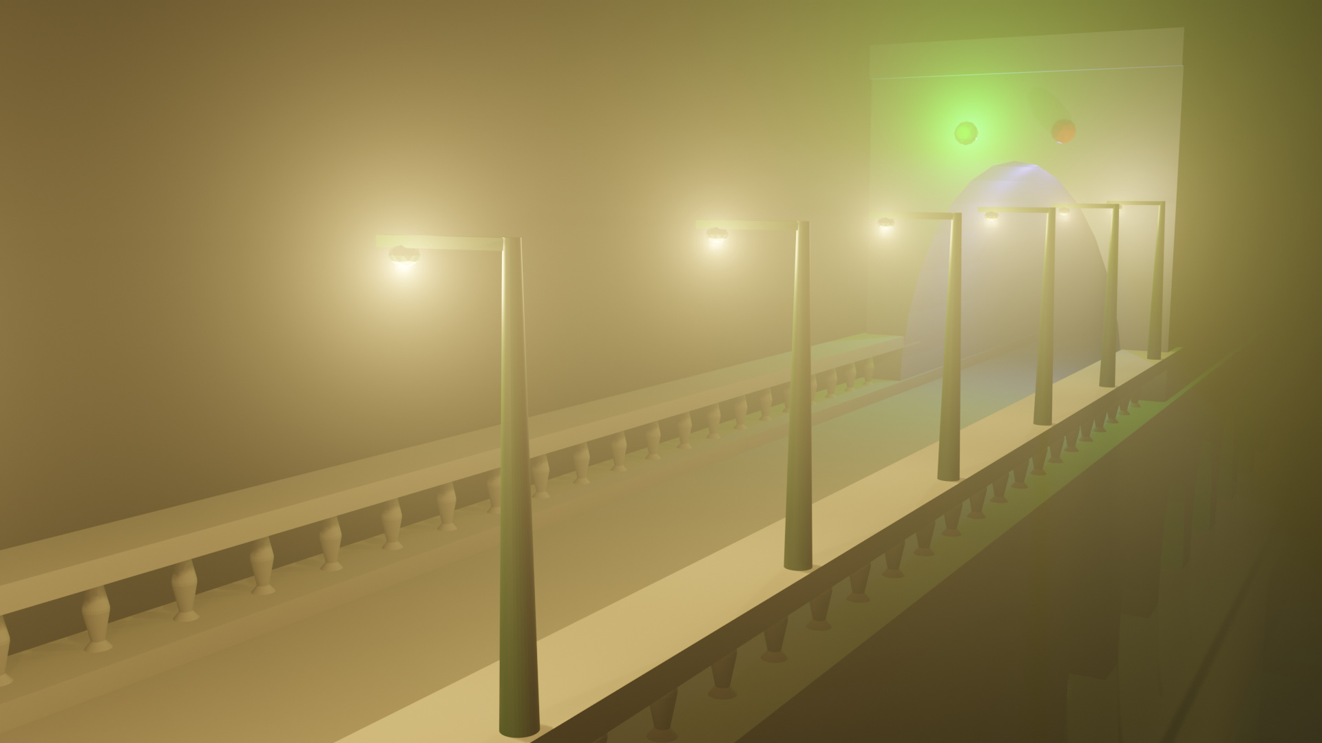
In Eevee
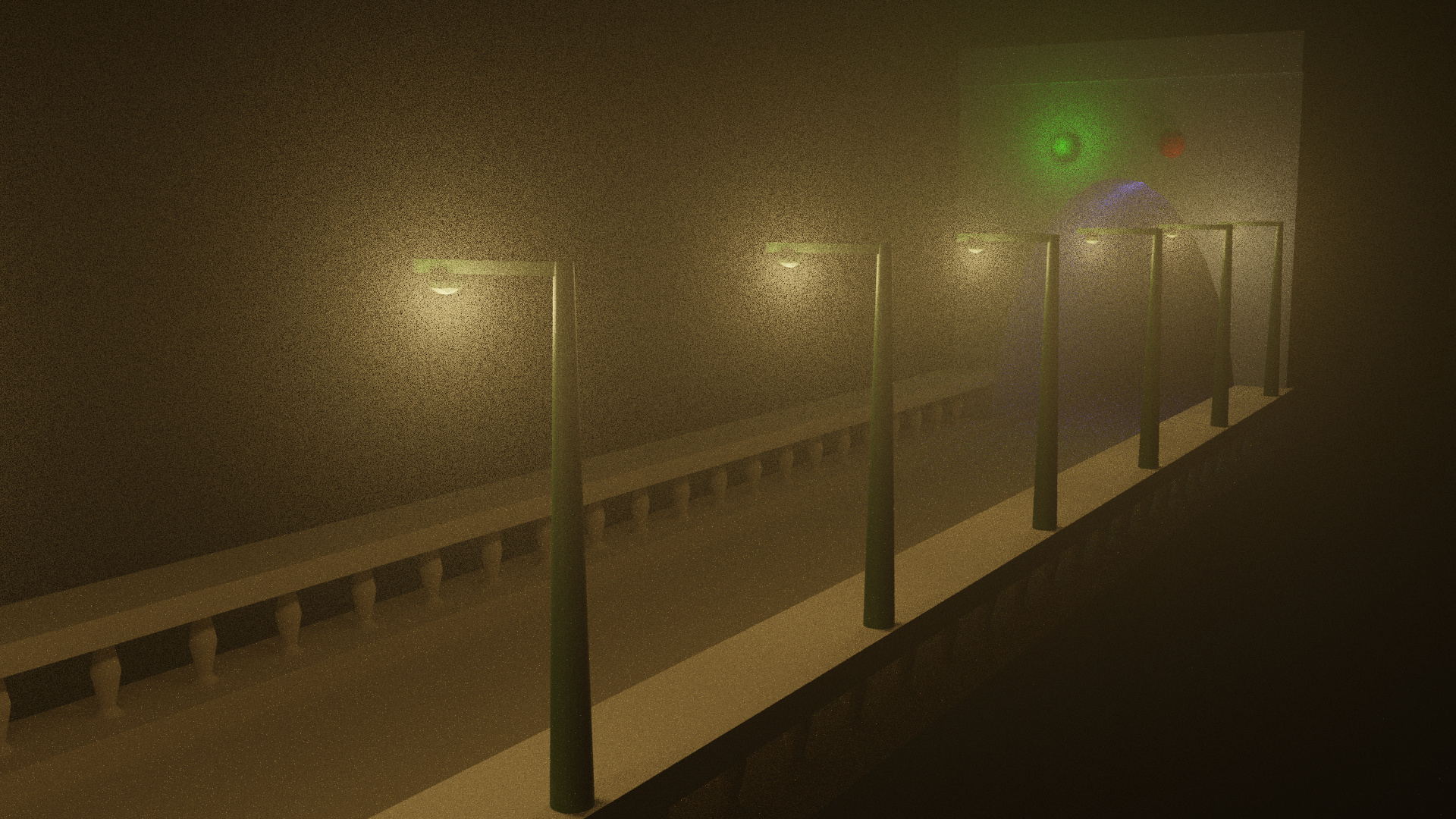
…and the same scene in Cycles. Notice that Cycles renders the fog in a much more grainy way than Eevee, it looks more ‘artistic’ but in some ways less realistic, still I suppose swings and roundabouts.
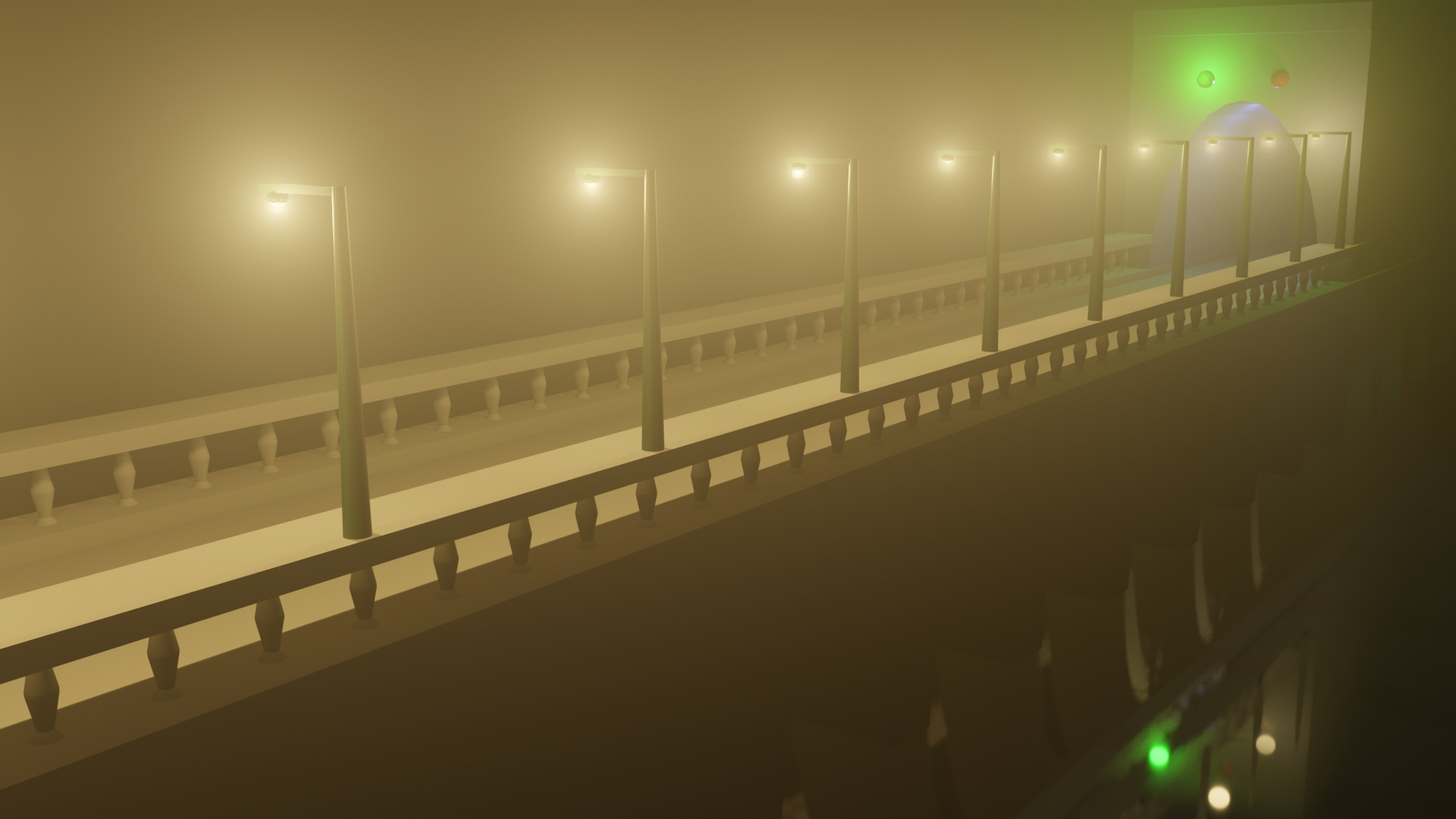
Finally a more pulled out shot showing some of the reflections in the water.
Those look really good keith! I’m ooking forward to seeing your progress.
Thanks, pleased that you like them, a long way to go yet, but it feels good to be making progress. 
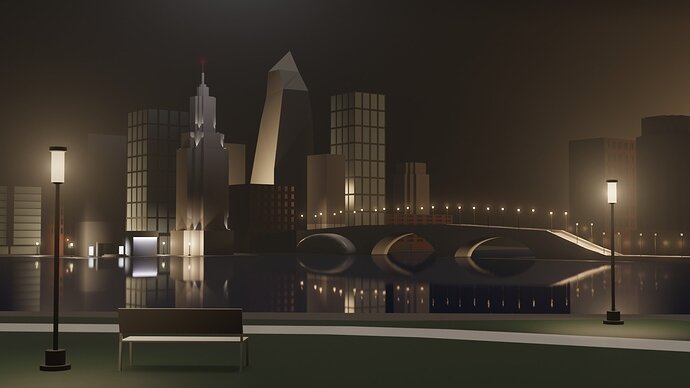
This Is my scene.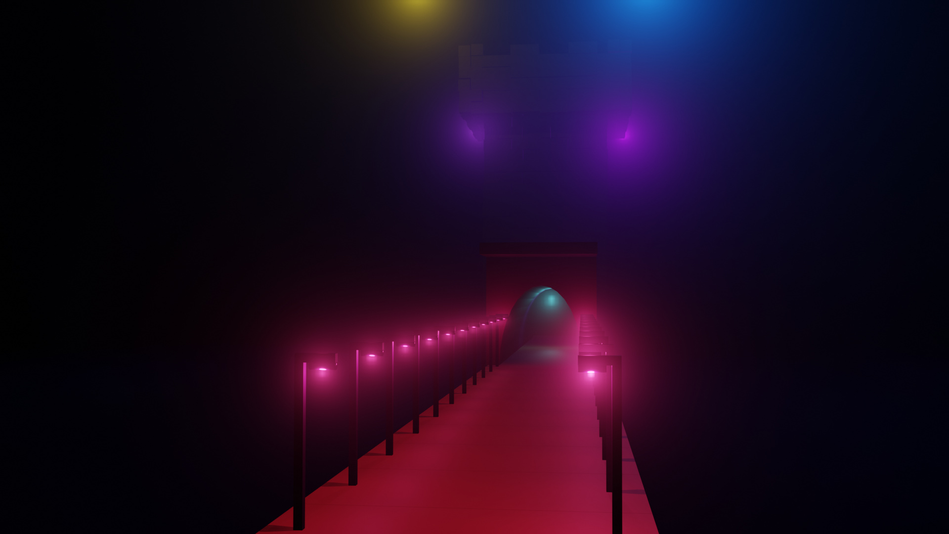
Nice work.
About the cycles renderer though, notice that it looks like the light falloff from the streetlamps inside the fog looks actually better.
The reason its grainy from what I understand has a lot to do with number of samples for the render, and the setup of the scene.
Cycles is supposed to be more realistic, its a physically based, unbiased renderer.
I really hope they have more detailed lectures about configuring and optimising the rendering for cycles.
The sample renders on cycles-renderer.org look amazing.
Very nice look.
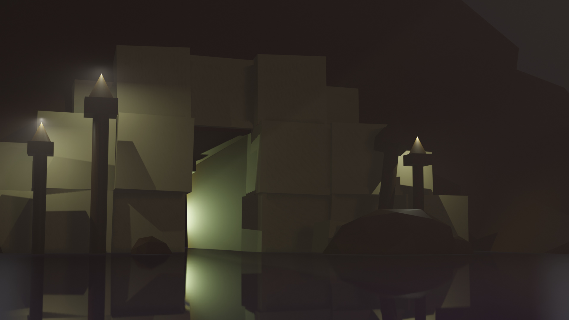
Swamp temple. I ran out of time! But it was a nice practice for improving my speed.
