This is the Blender Collaboration 2025, week 44 challenge. Don’t be afraid to join, a lot of us are beginners. This is all to practice, have fun, learn, and get together.
This week’s subject is “Lost, abandoned place”.
“Lost, abandoned place” - An lost or abandoned place is a location that has been abandoned and usually shows signs of decay, ranging from dilapidated factories to ghost towns and empty buildings.
The rules are simple. 1 subject, 1 entry, 1 week.
You create whatever object or scene or whatever you can think of that has something to do with the subject. It can be as simple or complicated as you want, all entries are welcome!
Post your picture here in this thread. At the end of the week, we start to vote. And if you are the winner, you may choose the next subject and win a unique badge.
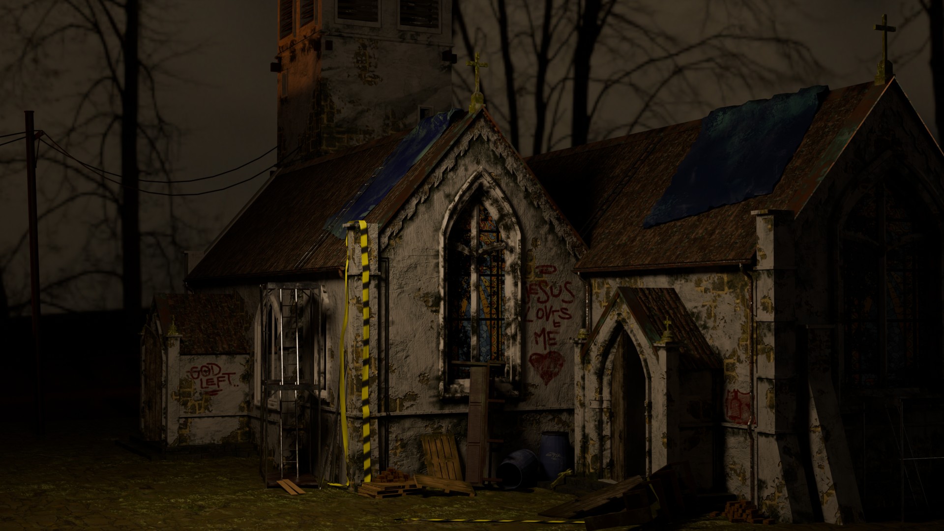
Hello everyone, here’s my current progress. I figured nothing could be more fitting for the theme than an old, creepy church! First of all, many thanks to srl1 for suggesting I try the ucupaint add-on; it’s really great and allows for incredibly fast texturing. I hope I’ll find the time to fine-tune some details and create a complete environment. I’m very excited to see the other contributions; the theme certainly lends itself to creativity!
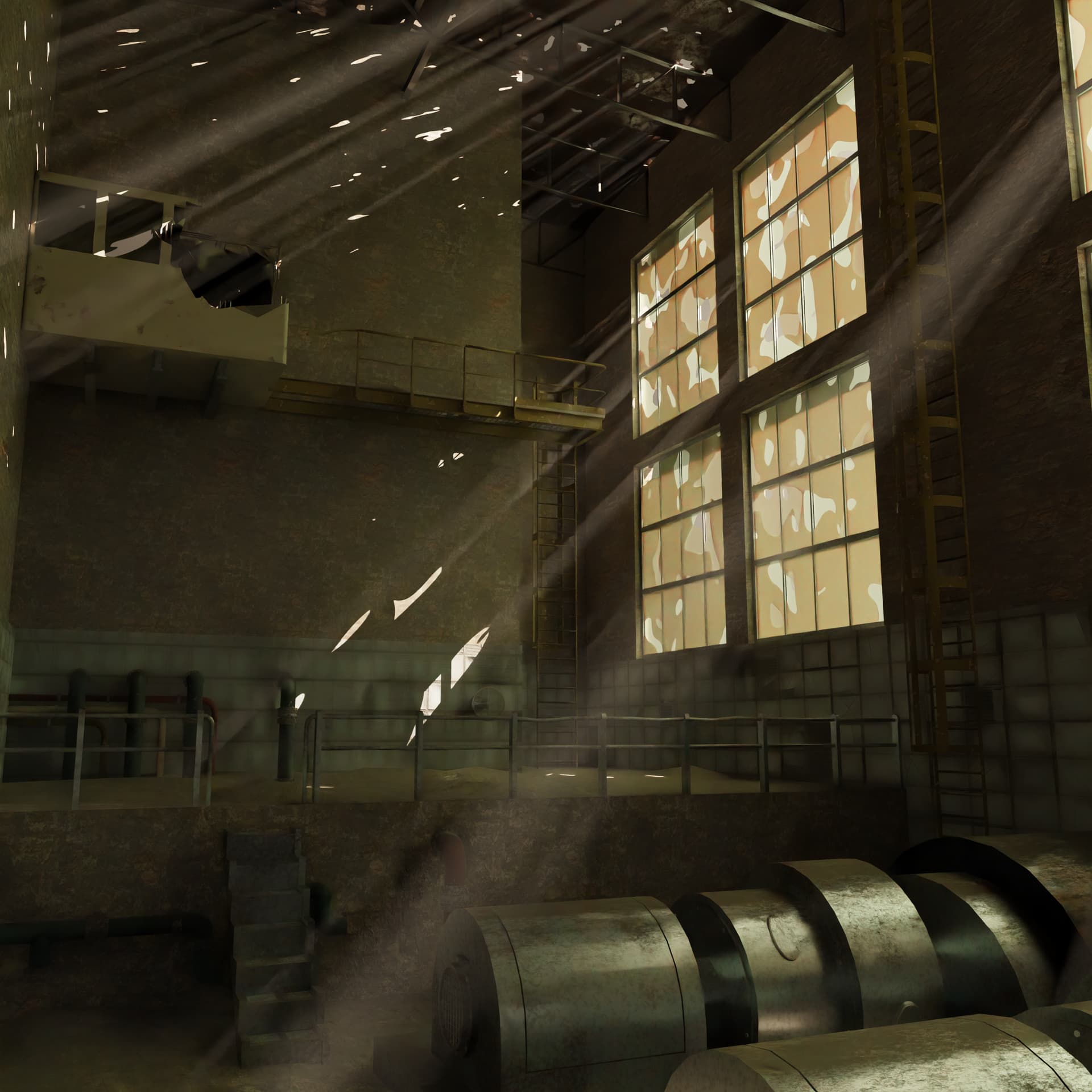
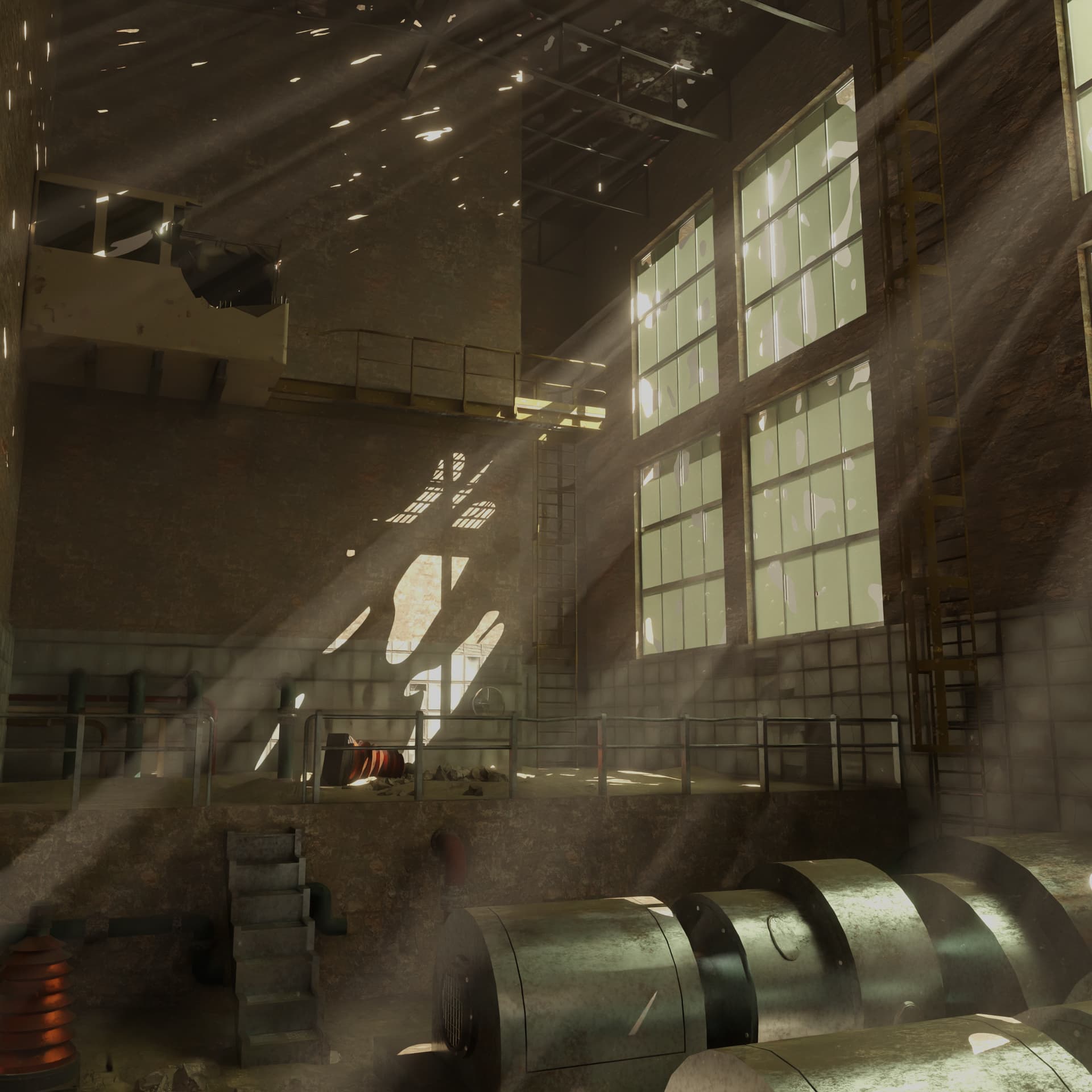
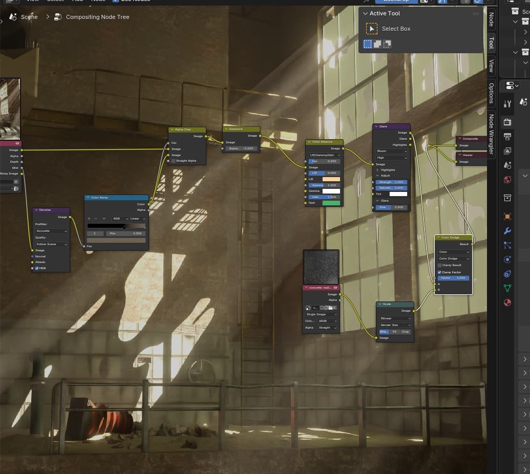
FYI, its just a screenshot, the rendering takes way too long…
Here’s my final render. Unfortunately, my computer isn’t capable of refining the project. I would have liked to tweak the environment a bit more. Nevertheless, I’m reasonably satisfied with the result. In the future, I’ll try to build much smaller scenes so I can perhaps go into more detail.
Thanks so much for the feedback! To be honest, I already knew you’d complain about the lighting You’re right about what you said. The scene was wrecking my computer; lately, every click took several minutes to load, and I couldn’t adjust or change anything anymore…
I think it was one from Blender Guru, not sure anymore.
Something with a grid of light sensors? Measuring light at a grid in the scene…
But also, work in real scale. Like a 100watt bulb in room of 5x5x2.6m Etc.
My otherbookmarks are deadlink now … old info, can’t recover.
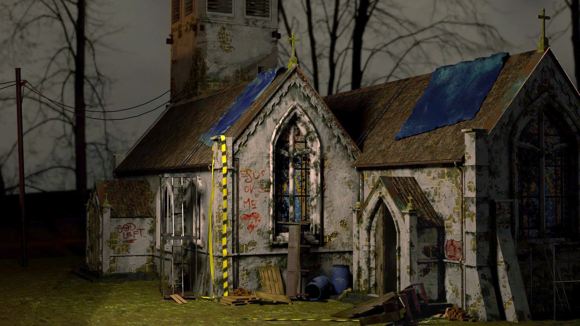
Hi, you made a beautiful scene, but most of it is hidden in the shadows. I agree with Fedpete about the lighting, and you could also make the shadows a bit lighter. I hope you don’t mind that I played around with your image a little, and I’m not good at overpainting, but it’s just to show how I would approach it. I moved your decal closer to the chevron tape because it really screams, “I’m here, look at me!” It’s not the best example, but it helps make your model stand out a bit more.
Thank you for your Feedback. Great result! I See i Need to practice my Lightning skills.. or maybe my Computer Screen is way brighter than others😅 but Yeah, you are Right, it Looks much more interessting with more light, thank you! Next Time it will be brighter👌
To add to the lighting tutorials, Grant Abbitt also has some great videos on the topic. The last one I watched was this one: https://www.youtube.com/watch?v=OQt6S-OrnBY&t=495s
where he talks about horror lighting and composition. There are also courses about this elsewhere, but they take time, and I rarely finish most of the ones I have.
Great, thank you! I will Check this Tutorial out, After i am done with the grease Pencil Tutorial, the introduction Looks to Nice, i Need to know more about that Style and way of Animation
I hope to find the time to still tweak it because I have a busy Saturday ahead of me
Pretty happy with the reult so far but there are still things that can be improved
We @BlenderCollab have a few days to vote. You can vote fast but also think slowly about design, colors, technique, difficulty, subject, realism, etc. Choose consciously and not on your entry.
The new subject week 45 “Micro Life” has already started. The winner of this week’s “Lost, abandoned place” challenge may select a subject for next week 46 and win a badge.
@Wolfguardian , congratulations on your atmospheric abandoned industrial complex. The simple colors and limited variation give it a desolate look. The use of a large, high space adds dynamism and allows the light to shine through (dusty sunbeams).
etikque - Great model and a good subject choice. As discussed earlier, the lighting could be more refined.
Srl1 - I like the right wall part of the scene. Nice sun beams/shadows. The camera position is high (top window) and the chair size feels strange. Tiny aspects which could improve the composition.
Note: I don’t want to offend anyone. I try to write down positive ideas and visions in my simple use of the English language. I am also sometimes more inspired by a particular subject or solution. I’m also learning from you!