This is the Blender Collaboration 2025, week 36 challenge. Don’t be afraid to join, a lot of us are beginners. This is all to practice, have fun, learn, and get together.
This week’s subject is “Video Games”.
“Video Games” - Current or retro? Hardware of Software? Surely everyone will have a connection to that and be able to create either a familiar setting or a character.
The rules are simple. 1 subject, 1 entry, 1 week.
You create whatever object or scene or whatever you can think of that has something to do with the subject. It can be as simple or complicated as you want, all entries are welcome!
Post your picture here in this thread. At the end of the week, we start to vote. And if you are the winner, you may choose the next subject and win a unique badge.
We @BlenderCollab have a few days to vote. You can vote fast but also think slowly about design, colors, technique, difficulty, subject, realism, etc. Choose consciously and not on your entry.
The new subject week 37 “Pizza slice” has already started. The winner of this week’s “Video Games” challenge may select a subject for next week 38 and win a badge.
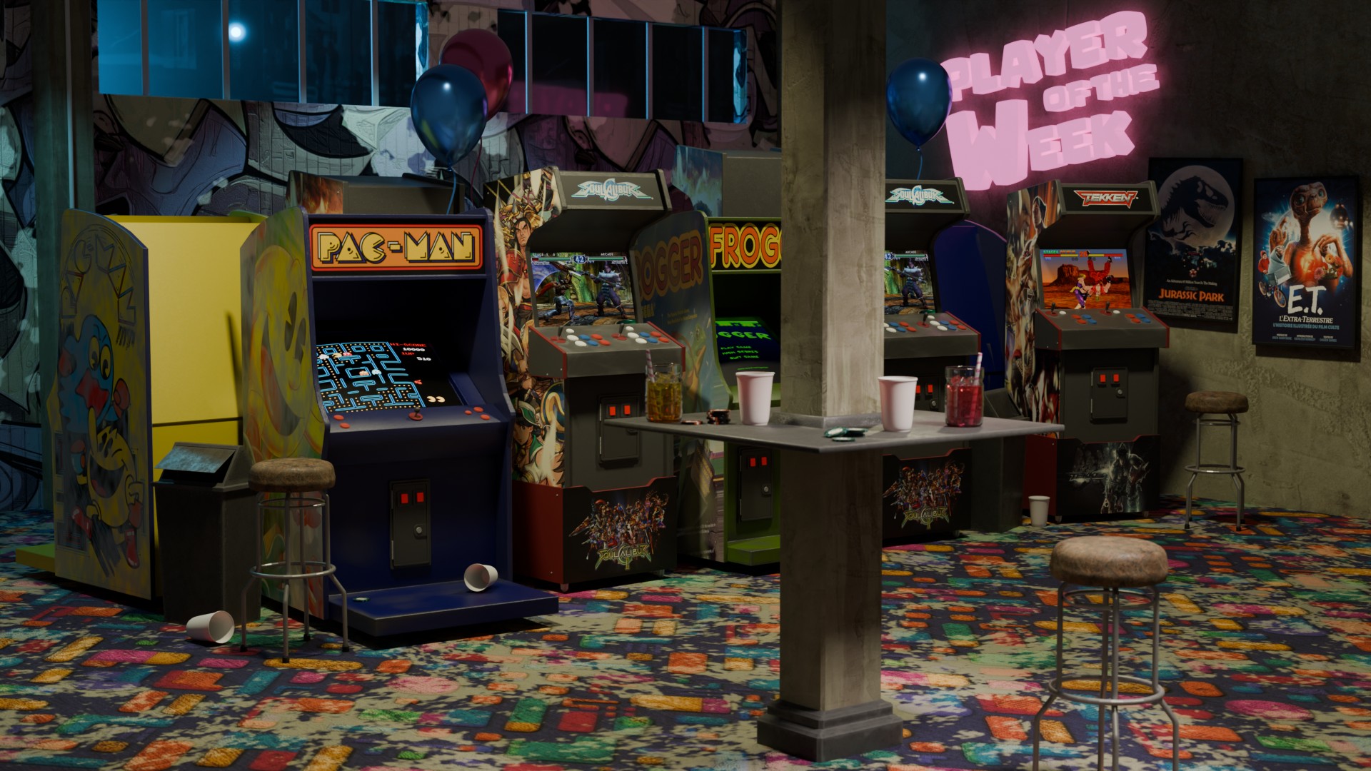
Congratulations @etikque, on your atmospheric arcade entry. Plenty of details to explore. But above all, the atmosphere the scene exudes.
And great asset reuse.
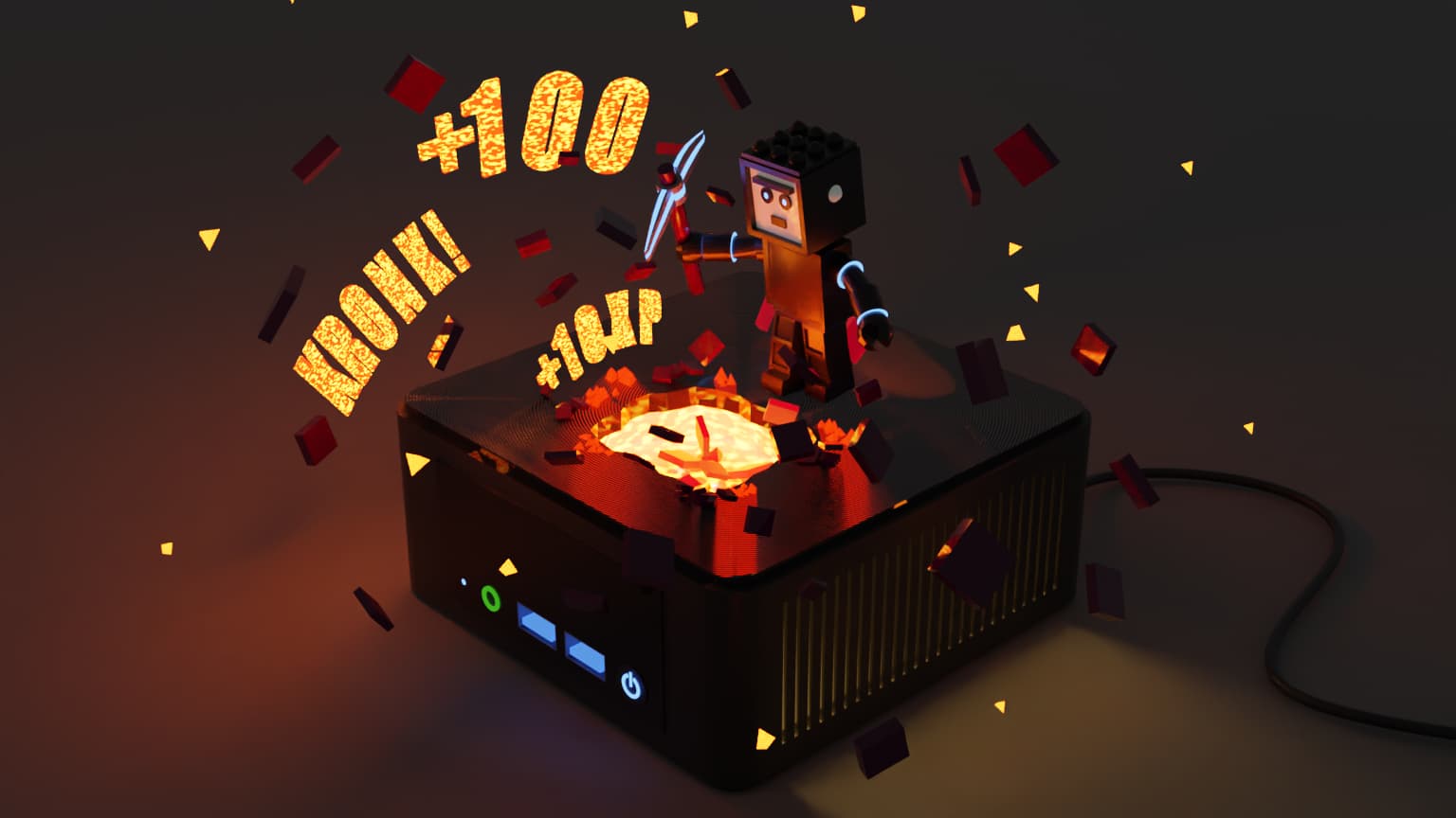
Megane_Wang - An explosion of graphics hardware acceleration. A fun presentation of your new hardware. I like the playful use of light. Was the text perhaps a bit too much?
meg_s - So many recognizable elements in this playful scene. Add a little more attention to the lighting, with softer shadows.
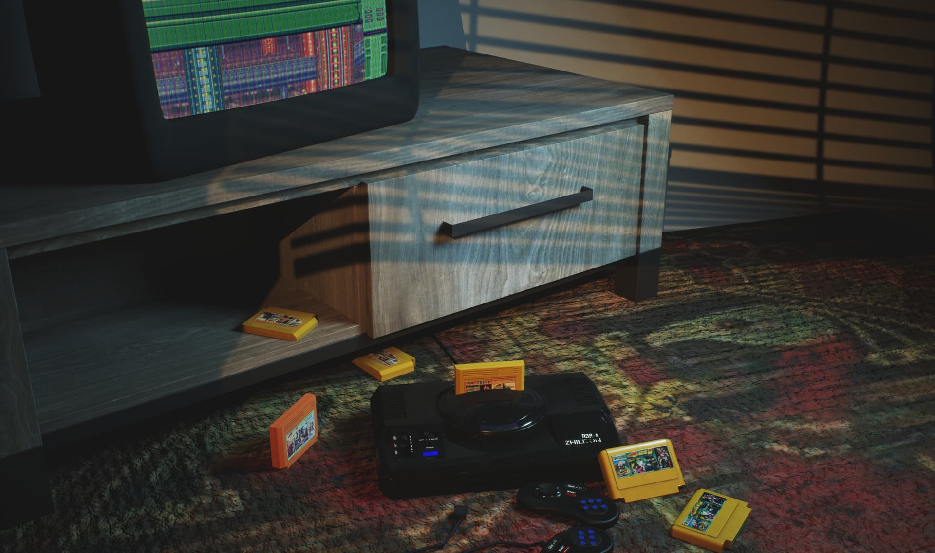
Srl1 - Also a great lighting example. With this dimmed light, you could give the tv-set a more glow effect.
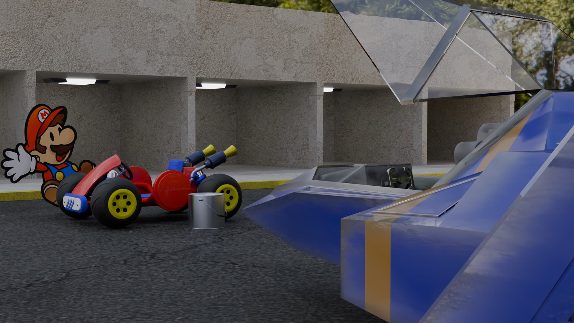
Joey_Cuevas - The use of different styles in the scene is a problem I think. Mario is a 2D cartoon with a matching cart in 3d with matching basic texture and colors. Set in a realistic environment. That happens to me often too. It’s difficult to get a consistent match.
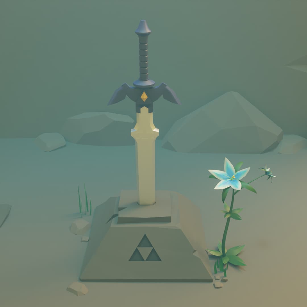
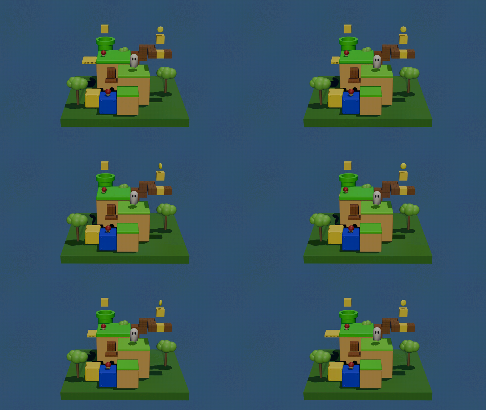
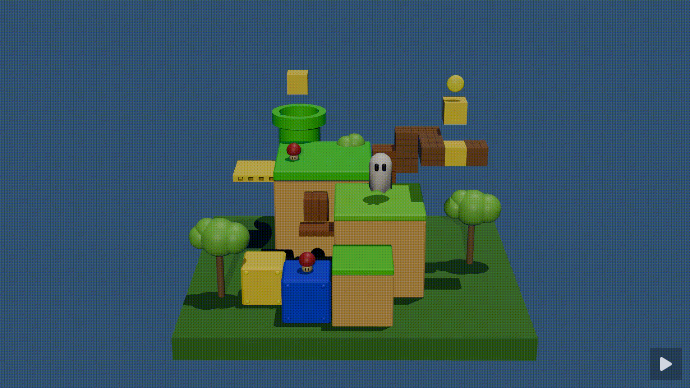
Nerner - I like your low poly style. Nice details and very recognizable. But it could be more playful. Play more with the camera position. And try to brighten up the scene with more contrast.
Note: I don’t want to offend anyone. I try to write down positive ideas and visions in my simple use of the English language. I am also sometimes more inspired by a particular subject or solution. I’m also learning from you!
As always, thank you for your comments @FedPete! Y had a lot of fun with this one, and the text is indeed a bit too intense. My last tests with other textures and formats were less than good, and I finally kept it this way.
But I keep having issues with using text as I do with other solid shapes, and I am not too sure why some things happen. If anyone knows a good source about this, i.e. to make “illuminated” floating lettering, I will be definitely glad to check it!
Text is based on a vector shape. When transform into a mesh it has a lot of vertices and most faces are triangles. You can have influence on the amount of verts and thus faces.
Which makes it easier to clean it up by yourself. But that takes time and it depends it’s usage.
Use a text as default object for an billboard object
For animation and or deformation, lower verts and do a manual remesh.
Yes, I guess it has to do with the way the mesh is built. I had tried converting them into meshes but I did not try cleaning them a bit. I will try this way first and see whether I get better results.