This is the Blender Collaboration 2025, week 10 challenge. Don’t be afraid to join, a lot of us are beginners. This is all to practice, have fun, learn, and get together.
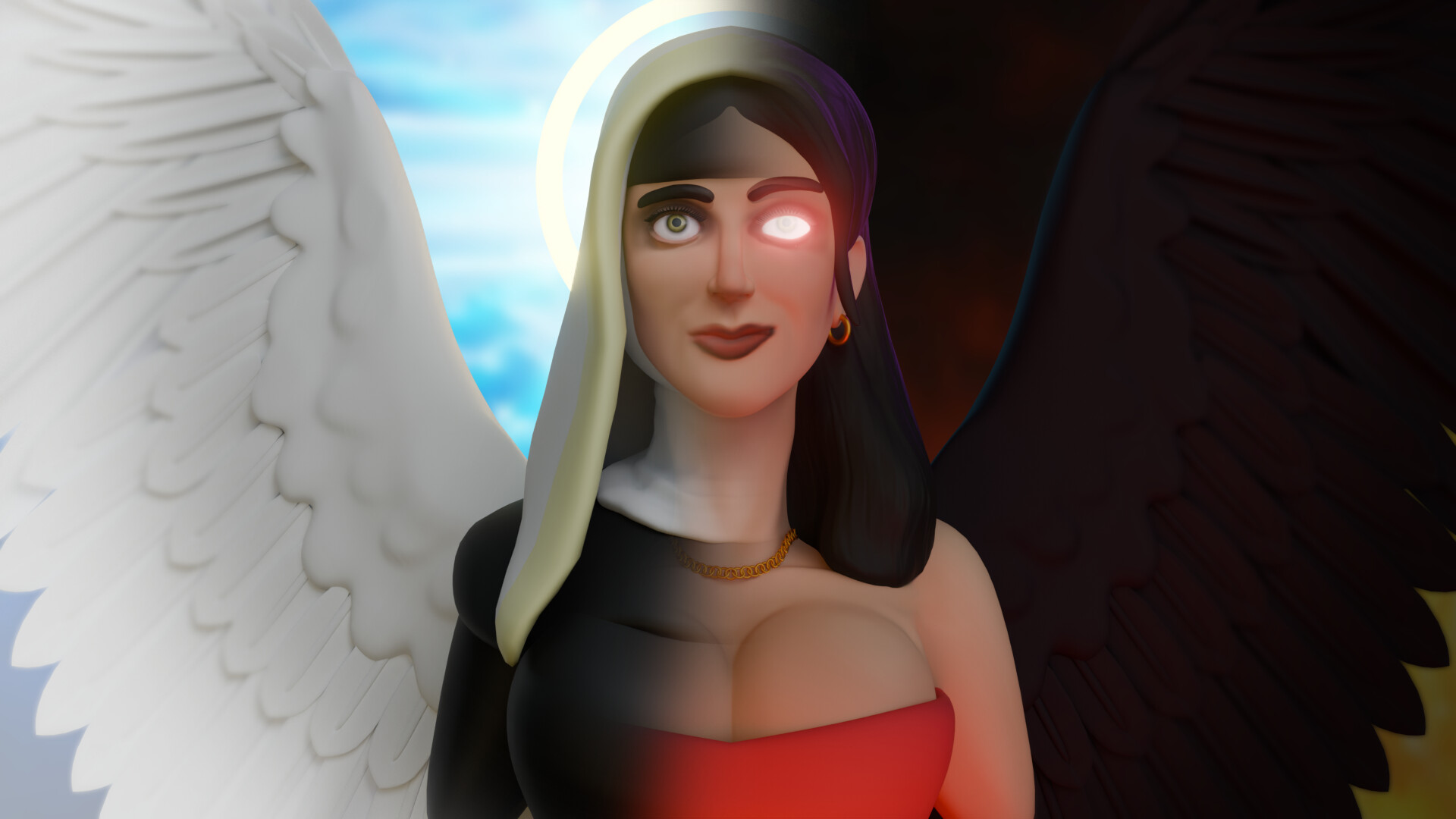
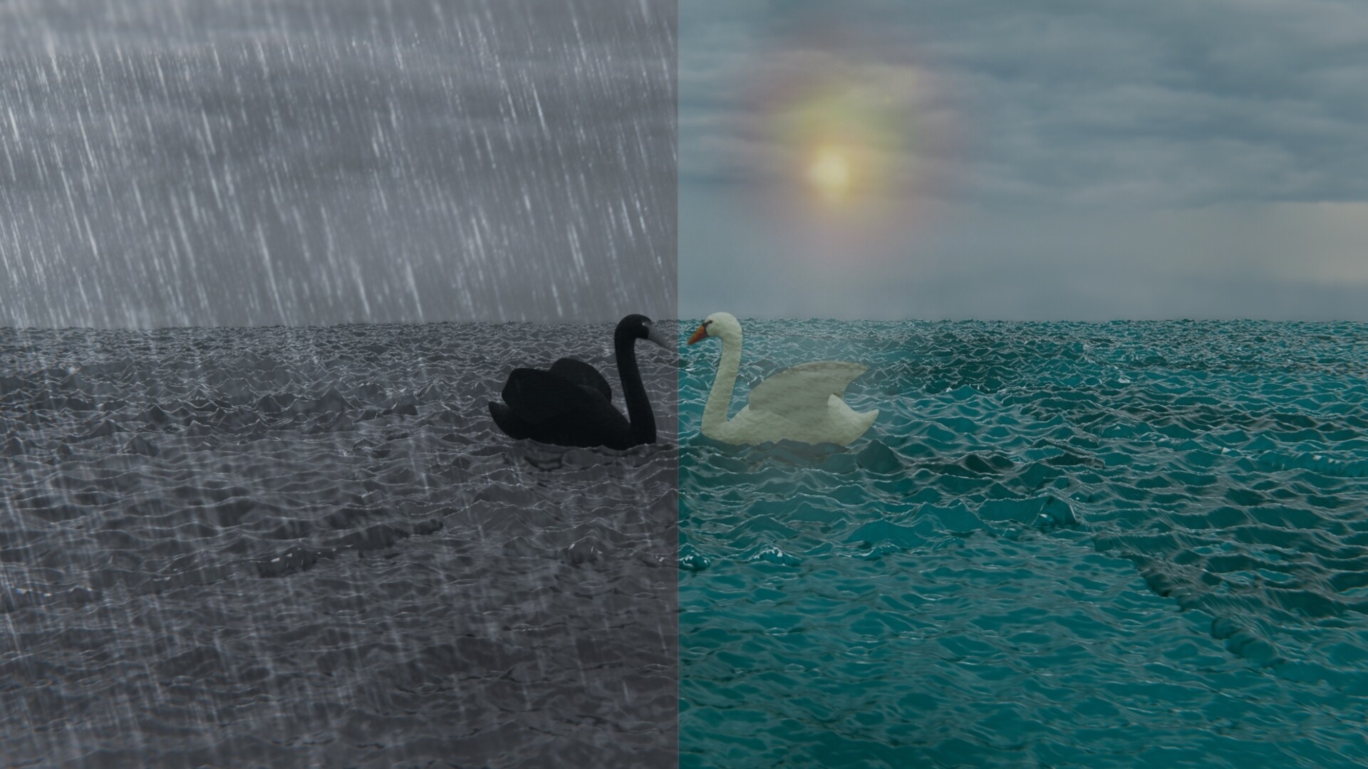
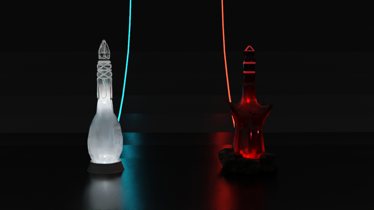
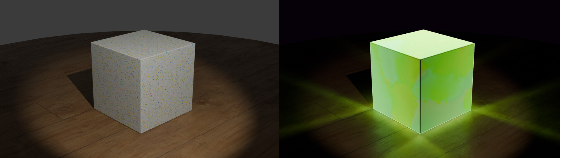
This week’s subject is “Show Light side and Dark side”.
In many stories, simple objects look different to convey that they are related to the “good” or the “bad” guys (through shapes, materials, lighting…). In this case, take a simple object and show two versions of it side by side: one for the “light side” and the other for the “dark side”.
The rules are simple. 1 subject, 1 entry, 1 week.
You create whatever object or scene or whatever you can think of that has something to do with the subject. It can be as simple or complicated as you want, all entries are welcome!
Post your picture here in this thread. At the end of the week, we start to vote. And if you are the winner, you may choose the next subject and win a unique badge.
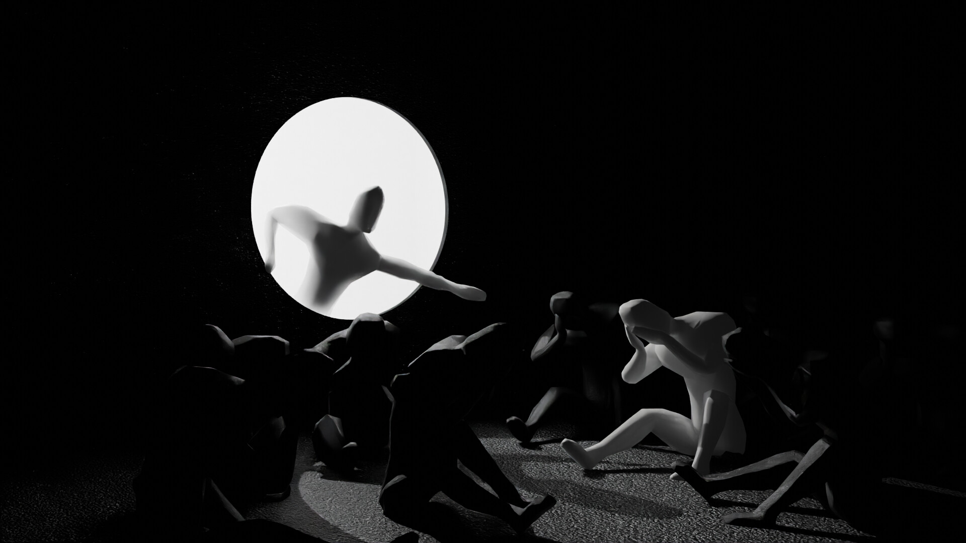
I haven’t done anything for the collab in a year or two and haven’t really done any renders in blender for a while either. Here is a stab at a project.
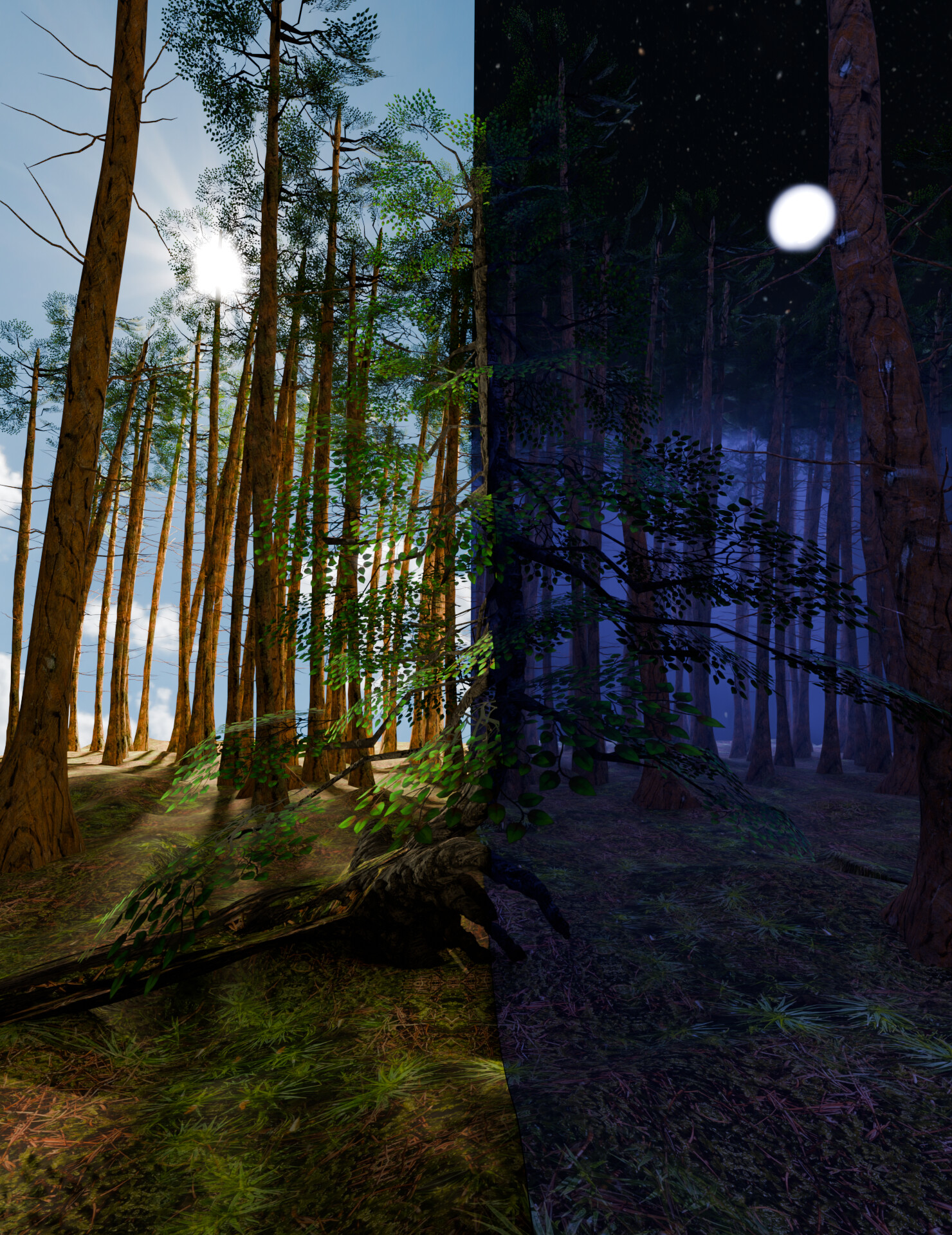
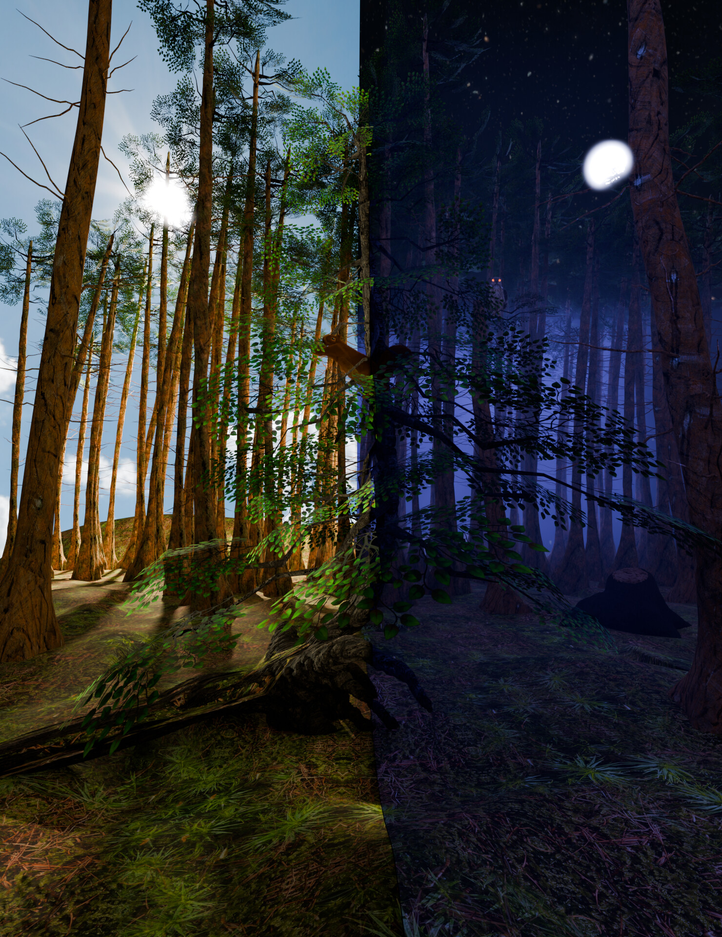
I was fascinated by beautiful pictures from a forest that I saw while I was cycling on my vacation this week. Since I want to learn how to make better and hand-made textures this week, I also got the textures directly from that forest
I like all the entries you’ve placed. They are welcome!
But I think the Collab topic is not about using a dark lit version and a version full of lights.
But to have the same object in two versions with different feelings. For example a positive and negative mood with the same object.
A quote from AI: “You can create different moods on the same subject by altering elements like lighting, color, perspective, and word choice. For example, using warm colors and soft lighting can evoke a happy mood, while cool colors and harsh shadows can create a more somber or eerie atmosphere.”
Doesn’t lighting itself already convey mood? A dark place or nighttime can create a sense of unease, while daylight often represents happiness. The same applies to contrasts like black and white or dark and light. If that’s not the case, I might miss the mark with my render too, I think.
Maybe my version does not convey the differents moods yet But my idea was as well to have one part as a happy and lovely place where you want to play and explore the area and the spooky night mood where you want to get away as fast as possible. Hope I can improve it in the next version But of course light, plays a big role in there.
You can work on light, but it’s about everything that makes you think “uggghhh, I prefer to stay away from this” or “if I were [put a bad guy’s name here] I would find it cool!”. It’s light, texture, shape details. Everything adds up
I tried to make something quick and simple, but when I finished, I realized it didn’t fit the theme at all. So, I added some post-processing to fix the mood. Hope it fits.
We @BlenderCollab have a few days to vote. You can vote fast but also think slowly about design, colors, technique, difficulty, subject, realism, etc. Choose consciously and not on your entry.
The new subject week 11 “Mechanical automata” has already started. The winner of this week’s “Light side / Dark side” challenge may select a subject for next week 12 and win a badge.

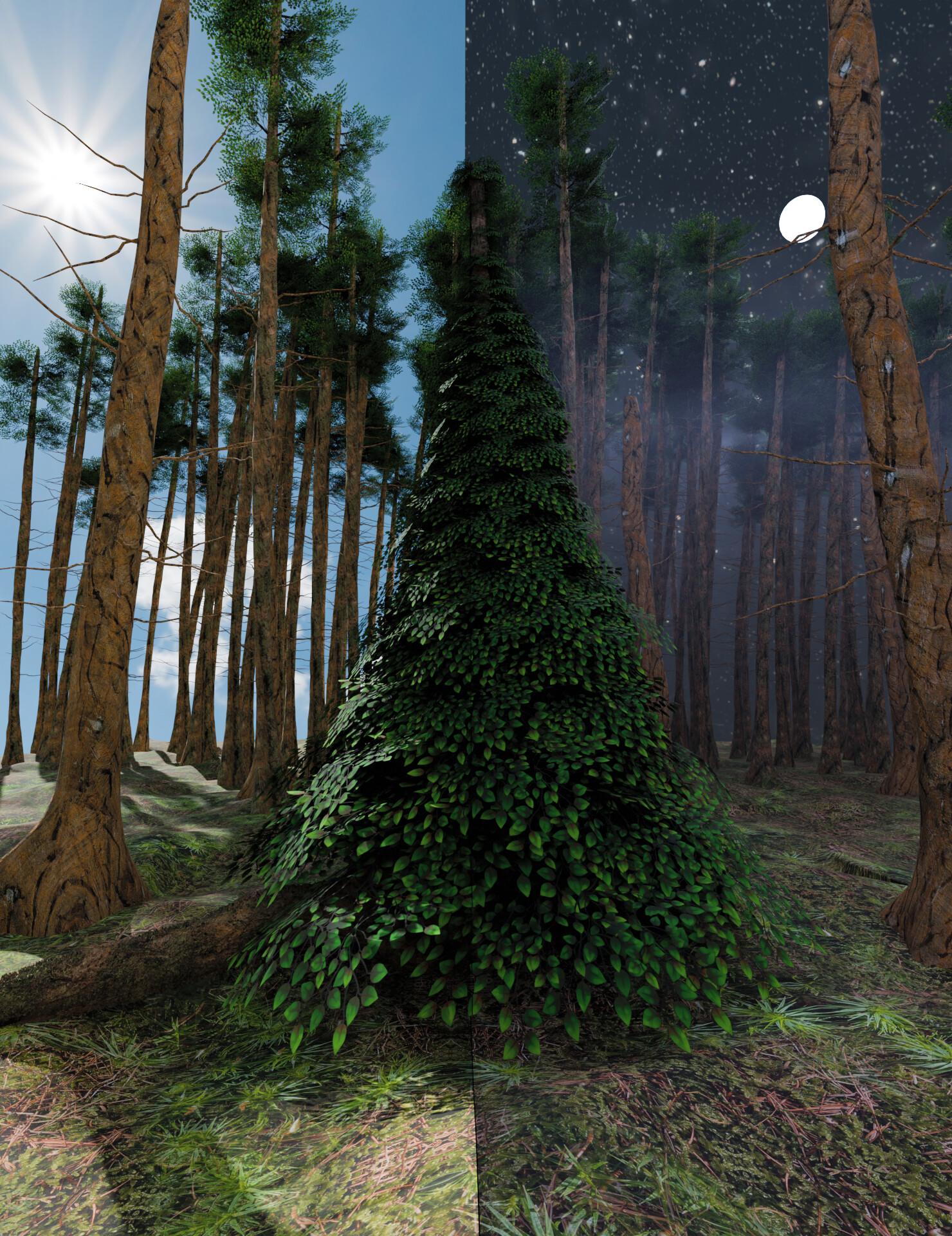
 But my idea was as well to have one part as a happy and lovely place where you want to play and explore the area and the spooky night mood where you want to get away as fast as possible. Hope I can improve it in the next version