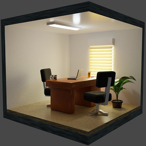
Still not sure if chewing gum goes in an office setup
We @BlenderCollab have a few days to vote. You can vote fast but also think slowly about design, colors, technique, difficulty, subject, realism, etc. Choose consciously and not on your entry.
The new subject week 5 “hobbies-and-recreation” has already started. The winner of this week’s “Office Life” challenge may select a subject for next week 6 and win a badge.
0 voters
Well done, Jimmie! Very well deserved!
Thank you, but i was not at all confindent this week, your models were so clean i thought you’d run home with it, and all entry’s were strong, i’m very suprised 
Yes a good set this week tough call.
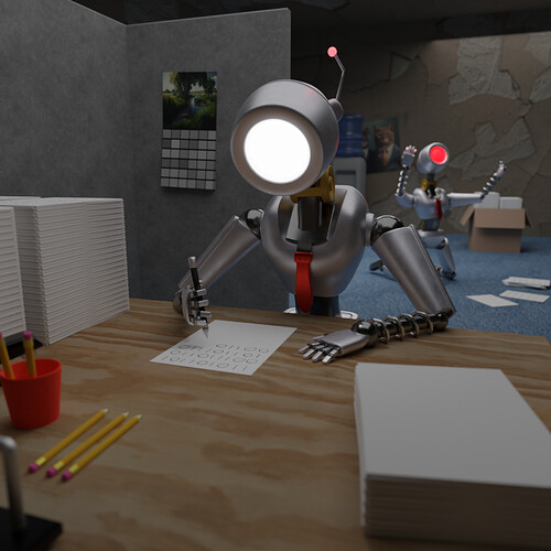
That little guy with the red light waving his fists in the air - that did it for me, yours is FULL of humour!
@jimmie congratulations on your funny entry on the Collab subject “Office life”. I like the interpretation of office workers doing repetitive work and related frustration.
Your composition is good, nice usage of cinematic composition rules. Subtitle camera blur, and an eye for details.
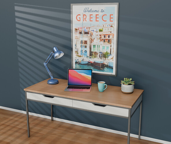
- GeoffW - All attributes of a generic office are there (I miss a chair) and presented. But I miss a story, a central idea in the composition. I love the sun highlights-shadows. The way of dispersion of the light and shadow revealed the use of a point lamp (not a sun).
- Kzanna - First impression, beautiful soft and warm lighting! Giving the expectation of a realistic scene. But then the furniture is very basic, even rough. I think if you gave a better-fitted dimension to the office furniture, it would improve the scene.
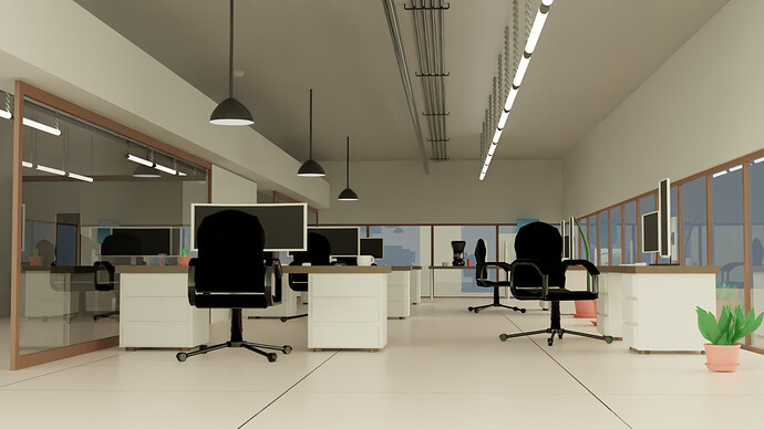
- Willrun - Great technical progress in your work. I like the depth of your scene, the repetitiveness of an office, and the construction lines (room, cables on the ceiling, armatures). All part of cinematography basics, well done. And above all, I like the glass reflections. I do have the feeling that the dimensions of some objects are a bit off.
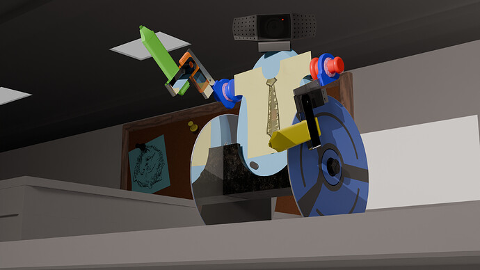
- Joey_Cuevas - It’s like an employee has a boring day and creates a fun object with office equipment lying around. Very nice Idea. Maybe you intended to make it human size like.
Because of the camera position chosen makes it big. A scene where it sits on a desk would be more logical, in my opinion.
Note: I don’t want to offend anyone. I try to write down positive ideas and visions in my simple use of the English language. I am also sometimes more inspired by a particular subject or solution. I’m also learning from you!
