
This is much improved, however, the background is still taking center stage to your objects. I REALLY want to see your objects. Don’t be afraid to get the camera right up close to your objects so we can appreciate their detail. I also recommend blurring out the background a bit - you can use the camera’s depth of field settings to do so. This will also help emphasize your objects even more. Oh, and great image to use for the background. I gotta get back to Fallout 4 - I started replaying it when the show came out and I haven’t finished all the quests yet (including the mainline quest).
2 Likes
I can probably keep adjusting details for days, but I’m calling this finished.
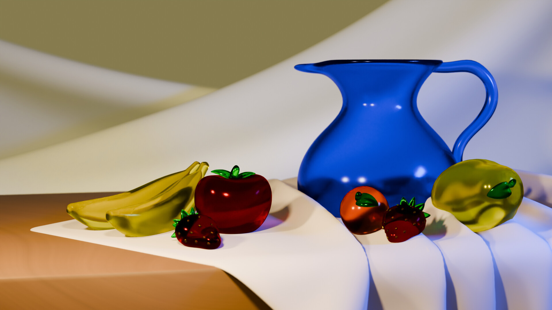
I managed to get some nice folds thanks to @mfortunato’s tips, and I adjusted the glass material plus the light to get some reflections. Lighting and procedural materials are two things I’d like to learn more about in the future.
This was a nice change of pace from my previous low-poly works. I was originally going for a chunky look style before, but wanted to do something with glass, and ended up with a more realistic look.
8 Likes
This is much improved! Looks great. And I understand getting to a point where you say, I know I can do more, but this is good enough. I’ve learned enough and can move on now  .
.
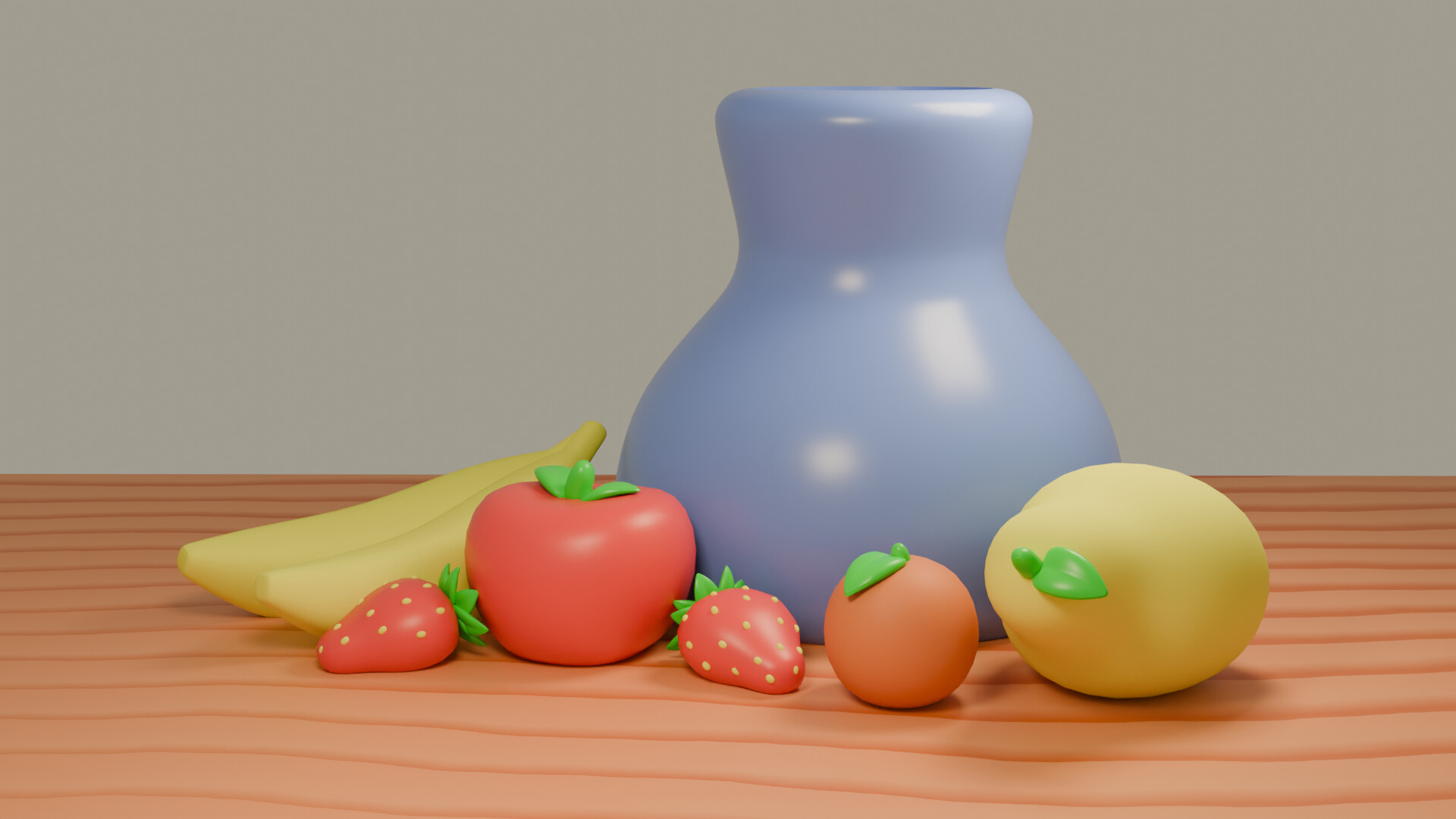
Also, I really liked your original take as well - looked like claymation which is awesome!
And like you mentioned, textures/shaders may be your next learning adventure.
1 Like
I’ve been interested in a sort of beveled, chunky look, something like this? I’m following a bunch of artists with a similar aesthetic and would like to make more art in this vein.
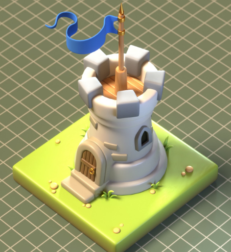
Image from crazyshroomz
Is it the style only or are you also looking to make isometric scenes?
EDIT I checked out the link. The style also incorporates an isometric perspective. I dig it. Would make a really good subject for one of the weekly collabs.
I missed your edit on this initially. I liked the simplicity of the backdrop you had originally. I recommend returning to the original backdrop. But I do like the new camera angle a lot. The reason it isn’t gloomy feeling is because you have a main light pointed directly at your subjects. Try turning the main light down so the main subjects are darker. Or move the main light off to the side more - it doesn’t have to be directly on the objects. Then, you can add an area or spot light up and behind to the left (to your left, but the scene’s right). Place it up near the wall, pointing at the objects. This will create a rim light which will define your objects without the need to have a single, bright light on them. In the examples I uploaded, I even moved the key light below the line of sight so the light is below the objects.
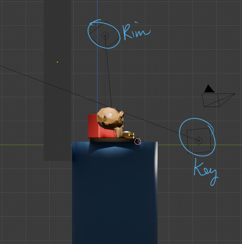
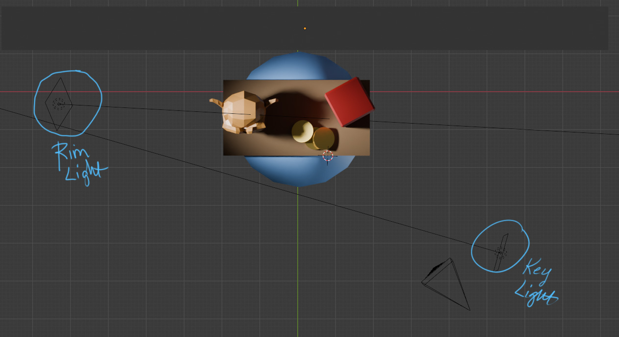
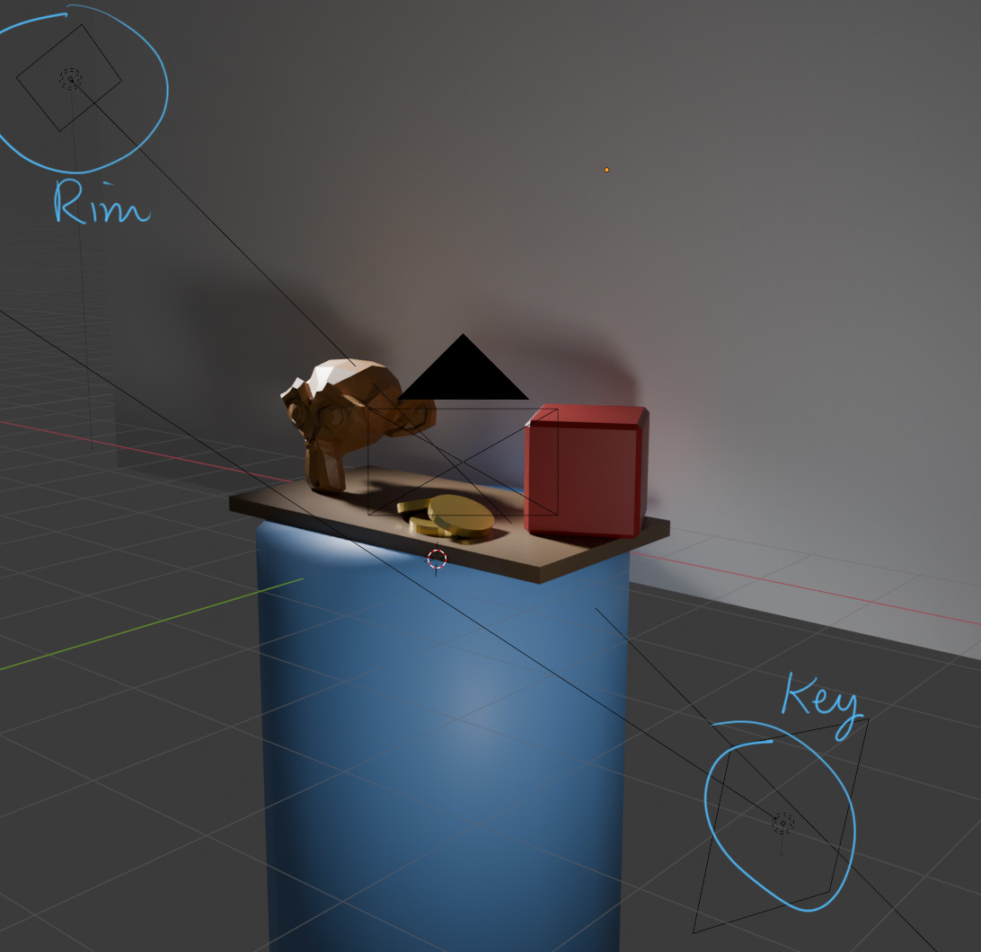
Of course this is just a quick and sloppy example. You could even put a light above the subjects and point it at the wall and let the wall’s light bounce off onto the subjects for an interesting back-lit effect.
1 Like
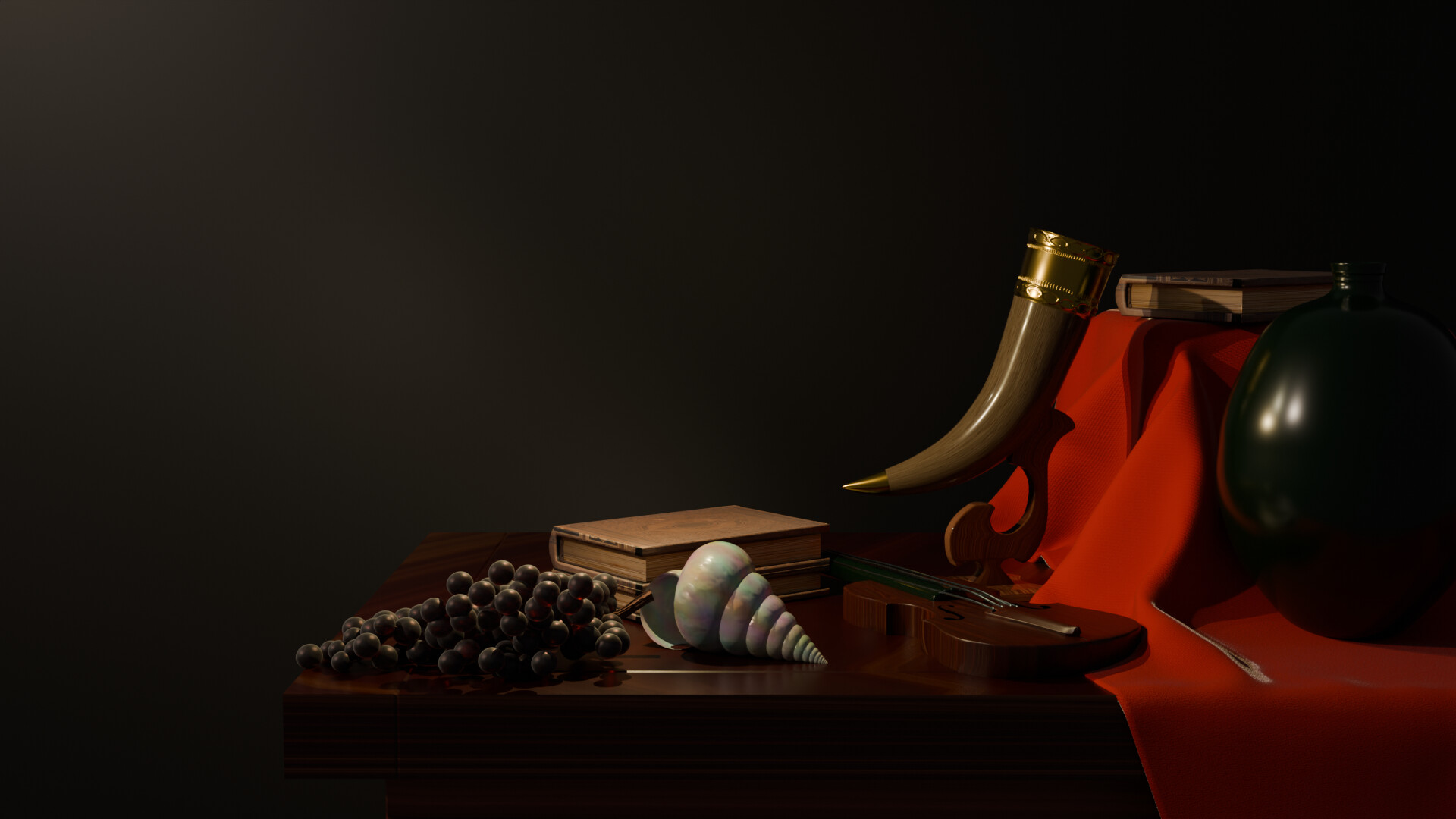
Here’s my final submission. I’m calling this done. There is more I can do, but I’m really happy with it overall. I don’t do a lot of realistic modeling, so this was a fun challenge this week.

9 Likes
Yeah, I’d say this looks pretty solid!
In regards to your isometric comment earlier, I would try for isometric camera angles. The combination of the beveled low-detail look with the isometric camera makes the subjects seem like toys or clay, which is part of the appeal, I think.
1 Like
If I zoom in more, then the bottles will be huge with respect to the background picture and the scale will feel off imo. Are you sure that you can use a depth off field to blur the background? I am using the composition method to superimpose the scene and background and hence the background is added later. I don’t think that it’s seen as an object and the depth of field won’t work.
Yes, I have to get back to Fallout 4 too. I started replaying it after watching the series, but then I got the Cyberpunk expansion and I switched to Cyberpunk, starting a new game. If only I had more time to game 
2 Likes
Gotcha. I see why blurring is difficult. I like putting the background in the scene instead of in post for a few reasons.
- The background will be reflected in any shiny or metallic objects
- You can control the depth of field and blur by moving the background closer or further from the subject.
- You can easily change the size of the background if you use it as a texture on a plane.
- You can set the brightness of the background by attaching the image to the emission field in the shader.
There is so much control you can have by putting the background image on a plane in the scene. It’s what I did for the pirate scene I did last week.
1 Like
The first image, looks more like an old painting.
Personally I like that style.
2 Likes
The new camera position looks good! But the style in the first version was more consistent. Maybe just going back to the first background and reducing the light intensity would be closer to that first idea if you liked it better?
2 Likes
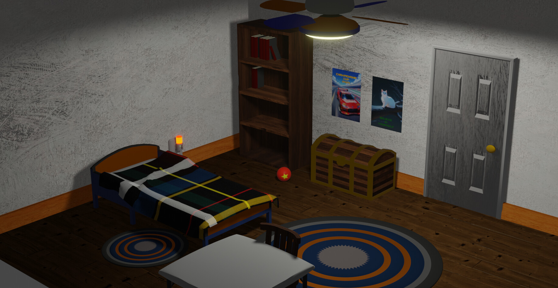
I totally missed your progress on this, @FedPete. Really great job adding in those details, wrangling the lighting, and adding the impasto brush strokes. The scene is excellent!
1 Like

I had all sorts of technical issues with this one, maybe it’s the subject’s fault. But here you are  :
:
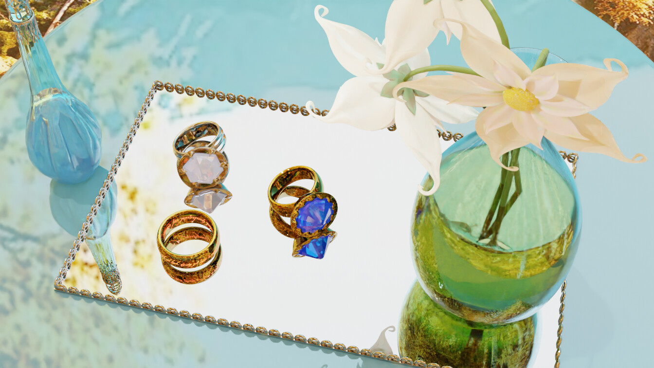
There, with all rings:
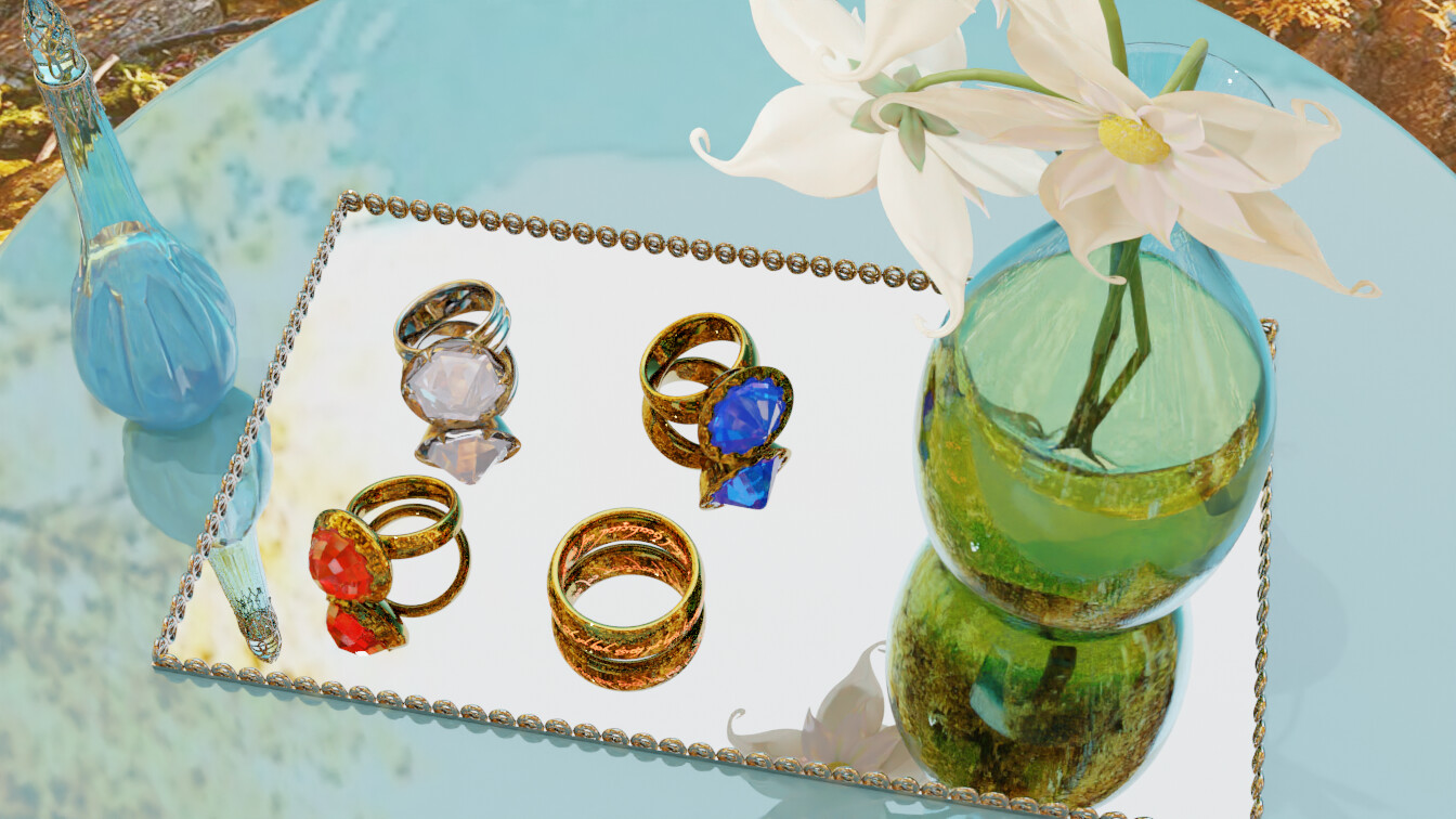
And finally, with some environment:

Note: This light piece was requested by a strange customer with pointy ears and a weird accent. He said that he wanted to sell the rings to some people by placing them in an airy environment. It’s not that you had to beware of rings that glow in the dark or have the inscription “One Ring to rule them all, One Ring to find them, One Ring to bring them all and in the darkness bind them.” in tengwar, with Self-Adjusting Size and Owner Detection Technologies, or should you?
7 Likes
You missed this one. It was all the UNION’s fault ;D
Post it anyway, let us see how far you got! This is all for fun and learning as it is =)
1 Like
We @BlenderCollab have a few days to vote. You can vote fast but also think slowly about design, colors, technique, difficulty, subject, realism, etc. Choose consciously and not on your entry.
The new subject week 32 “Isometric” has already started. The winner of this week’s “Still life” challenge may select a subject for next week 33 and win a badge.
Still Life
0 voters
@mfortunato Congratulations on your beautiful still life illustration. Good use of materials and exciting objects (skull).
- bOBaN - A nice excursion outside your usual renders. Perhaps the sunbeams are too prominent, making it a bit blurry.
- Megane_Wang - Playing with light and reflections, well done. I think it could be more playful, less structured (less forced?).
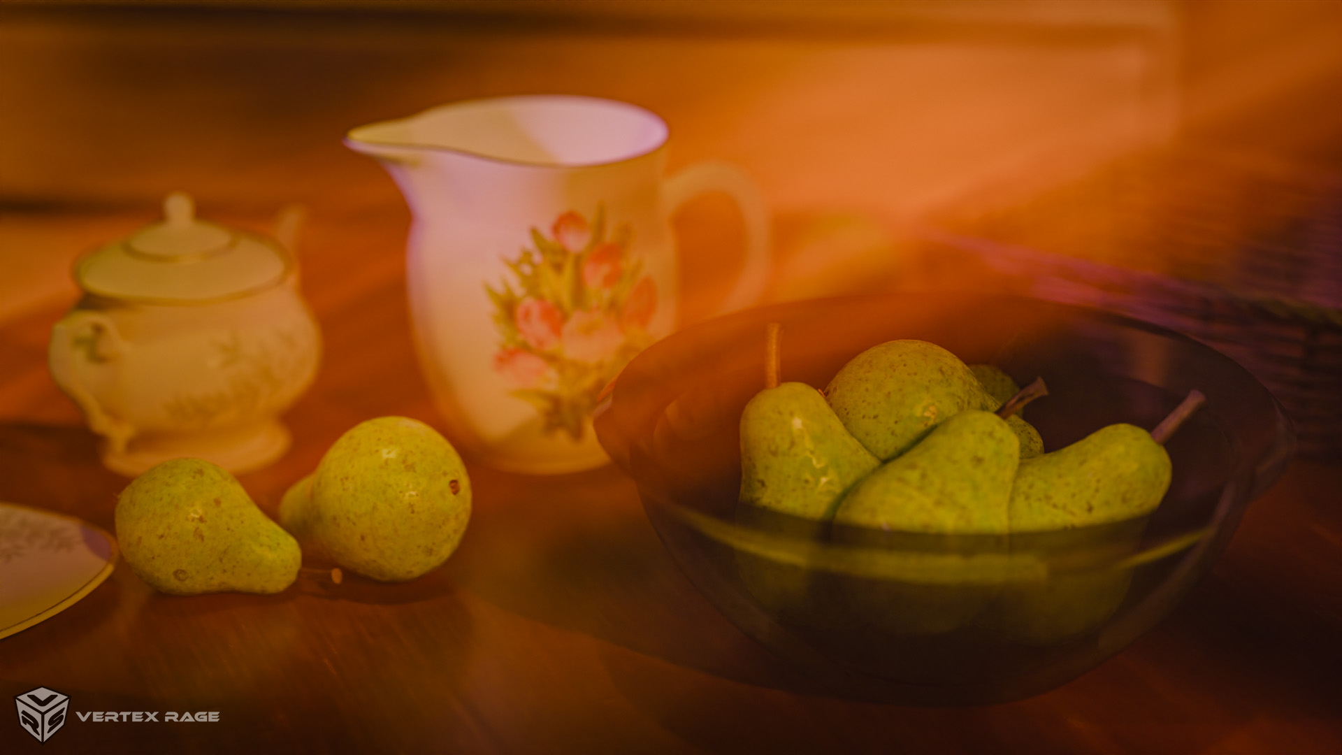
- DustyUnicorn, personally my favorite, because look and feel of an old master. Good use of a single lamp location and unique items.
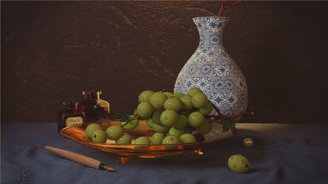
- FedPete - Technically nothing wrong with it -I think-, but not suitable as a thumbnail (losing details, paint effect).
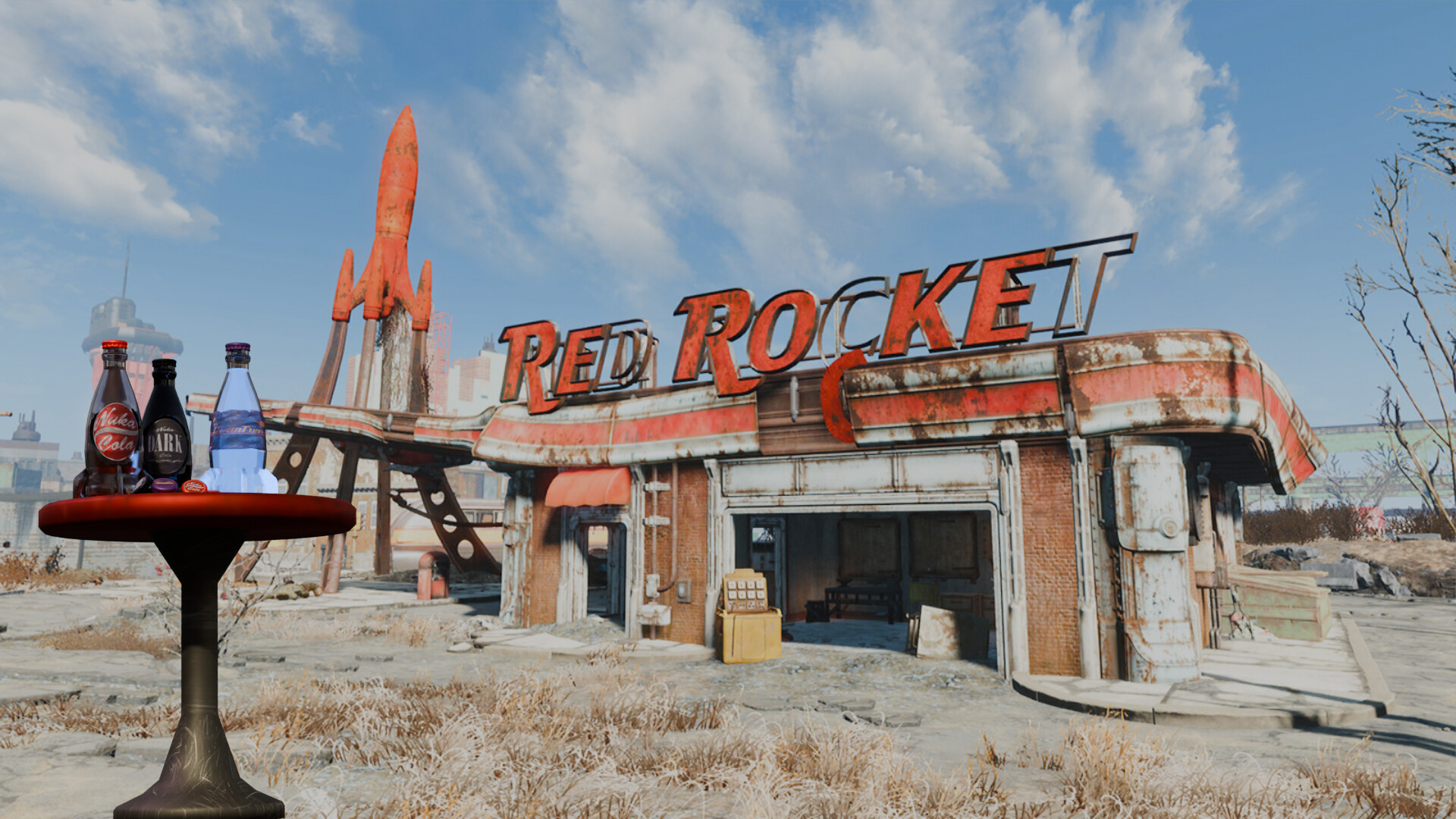
- Revan - This brings back memories. You could improve the scene, zooming in on the bottles (place at the center of the scene) and making the background blurry. The bottles are the main subject then.
- TheSpaceBro - A very nice first try! - Can be the start of an isometric scene (current Collab!)
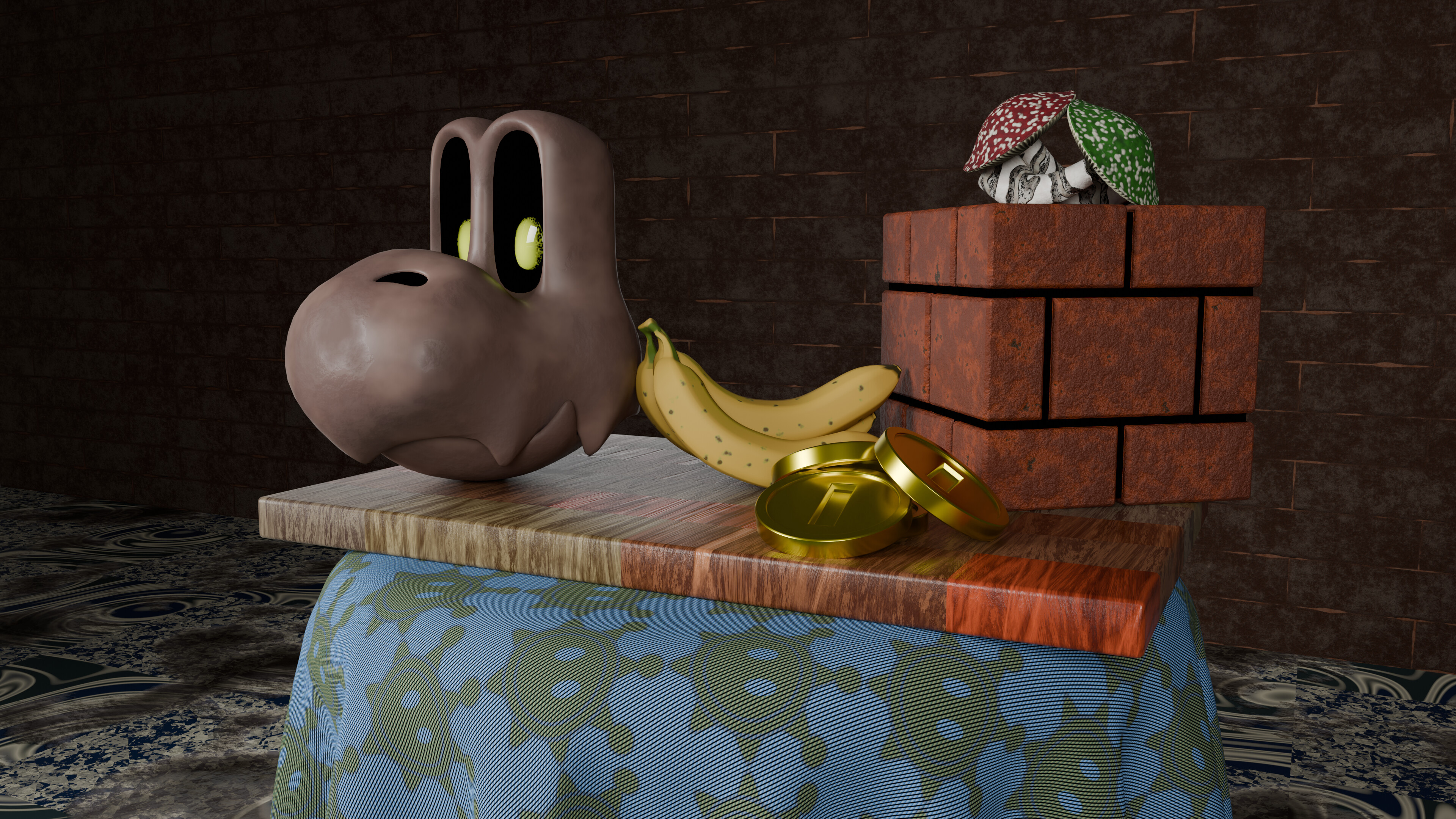
- Joey_Cuevas - A still life with not so classic objects. Maybe it’s the merging of two styles and thoughts that clash. Still a good experiment.
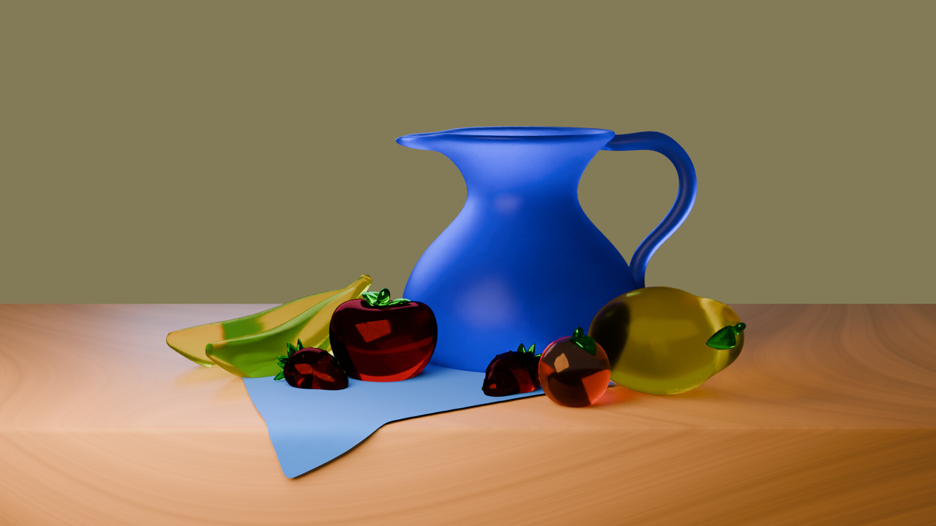
- xealstrag - Beautiful glass objects, but with glass and reflections you have to play subtly with light. Your current flood light is too strong.
Note: I don’t want to offend anyone. I try to write down positive ideas and visions in my simple use of the English language. I am also sometimes more inspired by a particular subject or solution. I’m also learning from you!
6 Likes