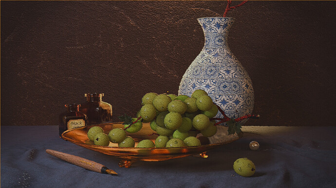
I totally missed your progress on this, @FedPete. Really great job adding in those details, wrangling the lighting, and adding the impasto brush strokes. The scene is excellent!

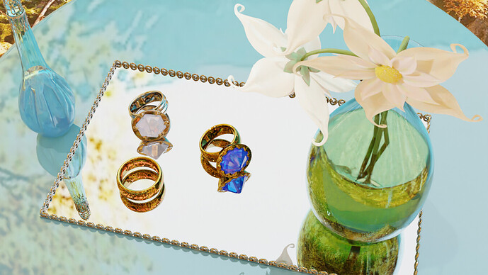
I had all sorts of technical issues with this one, maybe it’s the subject’s fault. But here you are  :
:
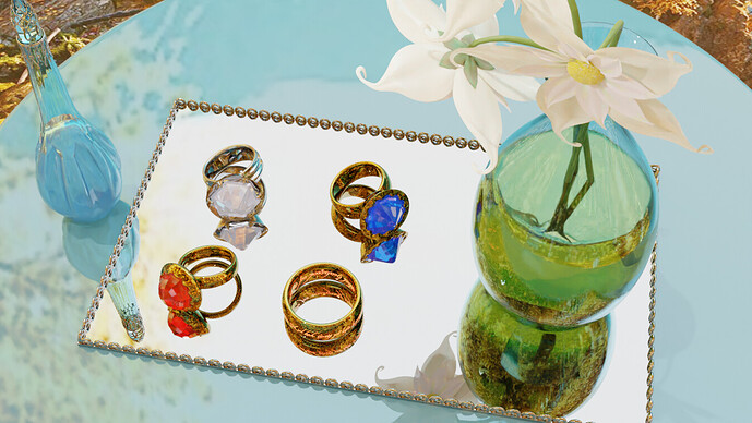
There, with all rings:
And finally, with some environment:
Note: This light piece was requested by a strange customer with pointy ears and a weird accent. He said that he wanted to sell the rings to some people by placing them in an airy environment. It’s not that you had to beware of rings that glow in the dark or have the inscription “One Ring to rule them all, One Ring to find them, One Ring to bring them all and in the darkness bind them.” in tengwar, with Self-Adjusting Size and Owner Detection Technologies, or should you?
You missed this one. It was all the UNION’s fault ;D
Post it anyway, let us see how far you got! This is all for fun and learning as it is =)
We @BlenderCollab have a few days to vote. You can vote fast but also think slowly about design, colors, technique, difficulty, subject, realism, etc. Choose consciously and not on your entry.
The new subject week 32 “Isometric” has already started. The winner of this week’s “Still life” challenge may select a subject for next week 33 and win a badge.
0 voters
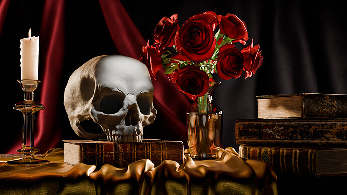
@mfortunato Congratulations on your beautiful still life illustration. Good use of materials and exciting objects (skull).
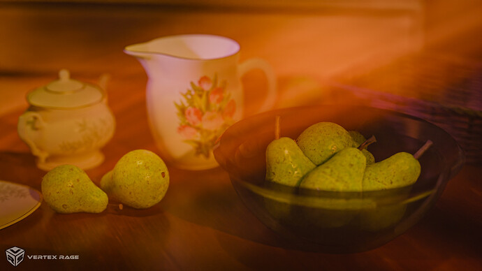
- bOBaN - A nice excursion outside your usual renders. Perhaps the sunbeams are too prominent, making it a bit blurry.
- Megane_Wang - Playing with light and reflections, well done. I think it could be more playful, less structured (less forced?).
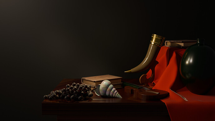
- DustyUnicorn, personally my favorite, because look and feel of an old master. Good use of a single lamp location and unique items.
- FedPete - Technically nothing wrong with it -I think-, but not suitable as a thumbnail (losing details, paint effect).
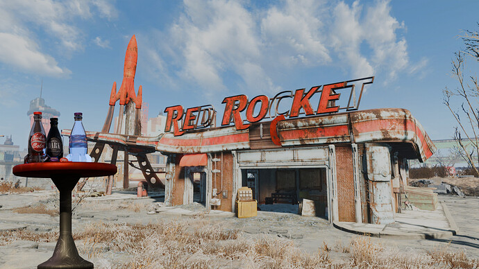
- Revan - This brings back memories. You could improve the scene, zooming in on the bottles (place at the center of the scene) and making the background blurry. The bottles are the main subject then.
- TheSpaceBro - A very nice first try! - Can be the start of an isometric scene (current Collab!)
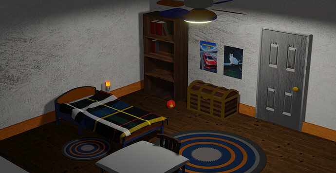
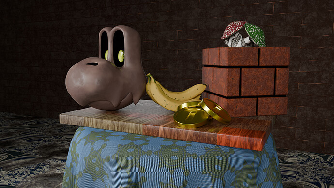
- Joey_Cuevas - A still life with not so classic objects. Maybe it’s the merging of two styles and thoughts that clash. Still a good experiment.
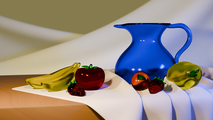
- xealstrag - Beautiful glass objects, but with glass and reflections you have to play subtly with light. Your current flood light is too strong.
Note: I don’t want to offend anyone. I try to write down positive ideas and visions in my simple use of the English language. I am also sometimes more inspired by a particular subject or solution. I’m also learning from you!

