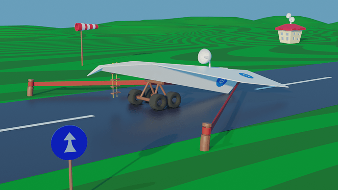
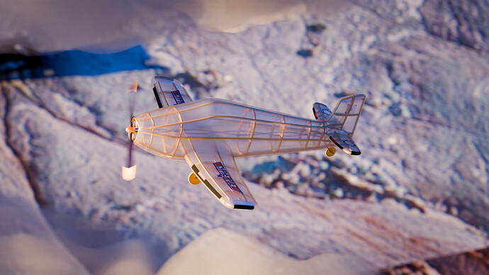
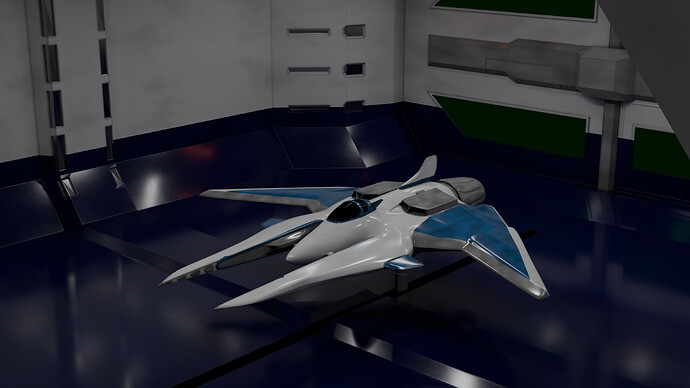
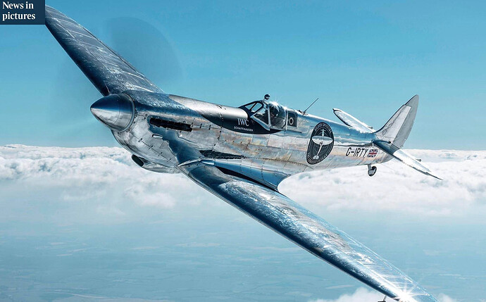
@CypherPoet Congratulations on the beautiful design of a toy airplane. The use of materials and details have been carefully considered. Even the propeller has good motion blur, which adds a nice dynamic touch to the scene. The animation is a bit too real for a toy, but also shows other Blender skills. Well done!
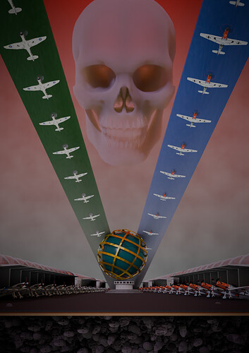
- FedPete - Even with the more hours spend on this project, it still missing realism. And composition wise it can be improved. (I spend hours to build a single tower, to be seen for 15% or so … Time management
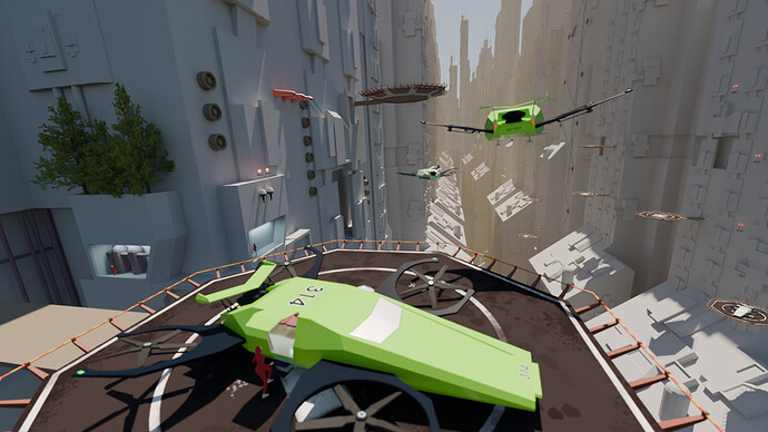
- Joey_Cuevas - Your scene gives a good impression of scale. I think because of the cockpit which can used as a scale reference. Adding more details will improve it.
- Megane_Wang - Such a fun project. I got “Thunderbirds, are go” ready for launch feelings. Good use of Blender basics!
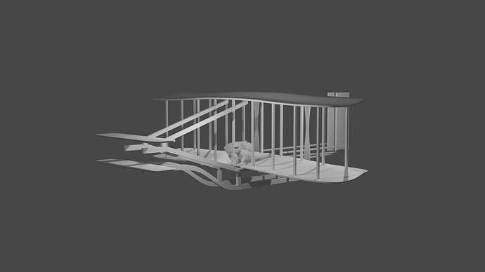
- HenRMJ - I like your model, looks authentic. It could benefit of a different composition. Looking into the sky, but downwards the plane looks strange. Finish the project by adding a pilot and engine…
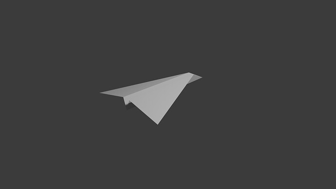
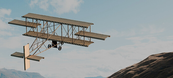
- Joshua_Gillespie - Good model for a paper plane! Zoom in a bit more and create a scene by using a flock of paper planes (just copy and paste)
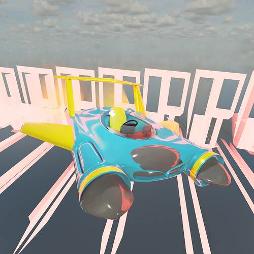
- Lua - Great one-seater, very playful design! Try to make it more distinguishable from the background. Which is difficult to interpreted (strange shapes). Hide it and see what it does for your scene.
Note: I don’t want to offend anyone. I try to write down positive ideas and visions in my simple use of the English language. I am also sometimes more inspired by a particular subject or solution. I’m also learning from you!

