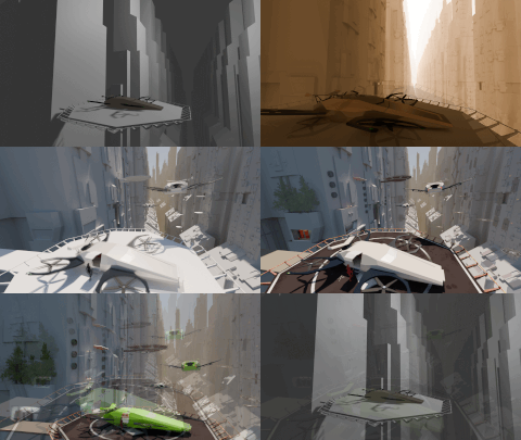
Just in case I don’t get time to finish this project unfortunately!
played around with lattices in this one

Just in case I don’t get time to finish this project unfortunately!
played around with lattices in this one
Very nice!
I was working on this a bit. I am also not happy with how all the textures turned out but I wanted to submit just in case I didn’t get a chance to work on it more later. Was having trouble with the canvas thing looking white even though I set the base color to black. Turned out I had the sheen all the way up so the light was reflecting off of it.
Also Max hay approach for the sky. I just took something off of unsplash. Pretty happy with the lighting 
This is so cool!
I really like this paper aeroplane, rubber band launcher. It is humorous. It appeals to the kid in me. Clever!
Definitely futuristic. Unique color scheme. Sort of reminds me of a Star Wars Pod Racer. Very cool.
Late to the party.
I’m going for a WW2 themed propaganda poster. Maybe a bit off topic 
Final render:
WiP >>> v0.3
WiP >>> v0.2
WIP >>> v0.1
Challenging myself to use geometry nodes as much as possible. Even for things that could be a simple array. This one is worth a breakdown. (Or I’ll have one before completing this piece).
And yes, I made all models myself. The Spitfire as well as the ME-109. I re-textured the Spitfire. And added the landing gear.
Fingers crossed I’ll get this one done in time.
o7
I wanted to focus (again) on far distances. Wide angle lenses and foggy horizons.
Also working with my assets list and adding more items to it.
I do like the concept of an asset library, but Blender has it’s own way of doing so.
I hate to see duplication of assets, when reused. Still learning Blender …
I tried to cleanup unseen faces, because something like this touches what my machine is capable of. Especially the responsiveness of working with the mesh and scene.
Rending this was reasonably fast somehow (I think the lack of huge material nodes)
Camera 25 mm
Camera 14 mm (wide angle), to see more left and right details
The drone is more or less an blockmode thing. I can spend still a week or more so to add details to this asset. Or make it more component like, by capable of changing the roters-wings …
Have fun, I’m going to enjoy the sun a bit.

Very beautiful! I always had a personal preference for 16 mm lenses. Even though I worked to professionalize in photography for a few years and as a Nature specialist, I worked with a tele most of the time.
This looks awesome. I like your modular approach. The atmospheric and color feel are ace.
After exploring a few different ideas, I created a looping, animated scene of a translucent, wireframed, papery, toy-like plane flying through a storm:
The overall aesthetic form comes from a mix of inspirations: some inspiration from the sleekness of fighter aircraft like the Spitfire and P-51 Mustang – but also some inspiration from the cozier, rounder, friendlier vibes of toy aircraft models.
Also, along the way, I had fun creating and applying a few (shamelessly self-promotional) custom labels and decals 
This one reminds me of a real building kit I had. It had a wooden frame made of “balsa wood”? Including an elastic band, like yours. Wrapped in wet paper and when dried up it shrunk a bit. Creating a sturdy frame.
But it crashed on it first flight …
Memories …
This is a cool idea. And well executed.
We @BlenderCollab have a few days to vote. You can vote fast but also think slowly about design, colors, technique, difficulty, subject, realism, etc. Choose consciously and not on your entry.
The new subject week 20/21 “Stars” has already started. The winner of this week’s “Aeronautics” challenge may select a subject for next week 22 and win a badge (if possible).
0 voters
See, that’s why I didn’t include a pilot. Way too dangerous 
@CypherPoet Congratulations on the beautiful design of a toy airplane. The use of materials and details have been carefully considered. Even the propeller has good motion blur, which adds a nice dynamic touch to the scene. The animation is a bit too real for a toy, but also shows other Blender skills. Well done!
Note: I don’t want to offend anyone. I try to write down positive ideas and visions in my simple use of the English language. I am also sometimes more inspired by a particular subject or solution. I’m also learning from you!
I have still access to this forum. Not sure it will be influenced by the changes.
I want to say that the Collab is prolonged by a week. And the subject of “stars” is a two week assignment (week 20/21). You can still participate!