2024 Collab: Week 10 “Exploration” - VOTE CLOSED

This is the Blender Collaboration 2024, week 10 challenge. Don’t be afraid to join, a lot of us are beginners. This is all to practice, have fun, learn, and get together.

This week’s subject is “Exploration”.

The rules are simple. 1 subject, 1 entry, 1 week.
You create whatever object or scene or whatever you can think of that has something to do with the subject. It can be as simple or complicated as you want, all entries are welcome!
Post your picture here in this thread. At the end of the week, we start to vote. And if you are the winner, you may choose the next subject and win a unique badge.

Deadline: 2024-03-09T22:55:00Z

If you want to stay informed of the @ BlenderCollab?
Subscribe or unsubscribe to this “BlenderCollab” group.

10 Likes


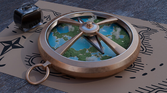
ok heres my entry this week :slight_smile:
had a lot of fun playing around with displacement with this one

15 Likes

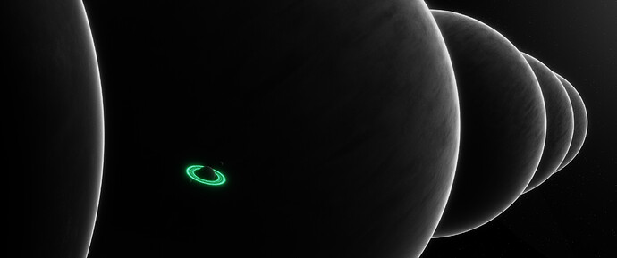
To Boldly Glow :ringer_planet:

Overshadowed, but not outshined, a brave ringed planet appears intent on making its mark in an intensely overbearing solar-system configuration.

12 Likes

You nailed the lighting on this one

3 Likes

Kinda reminds me of that “barber shop infinite mirror reflection” phenomenon =)

2 Likes

8 Likes

We @BlenderCollab have a few days to vote. You can vote fast but also think slowly about design, colors, technique, difficulty, subject, realism, etc. Choose consciously and not on your entry.

The new subject week 11 “My favorite (Saying)” has already started. The winner of this week’s “Exploration” challenge may select a subject for next week 12 and win a badge.


3 Likes

@jimmie congratulations on your creative vision of exploration. I think the scaling of objects could be improved.


  • CypherPoet - The widescreen view is a good choice, somehow it gives the impression of huge planetary objects. But there could be more variation in texture and color. making it more interesting to watch.
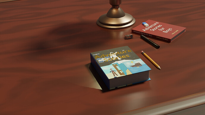
  • Willrun - Check for details, like the unexpected harsh shadow of the front book. And the left and right sides of the composition.

Note: I don’t want to offend anyone. I try to write down positive ideas and visions in my simple use of the English language. I am also sometimes more inspired by a particular subject or solution. I’m also learning from you!

2 Likes

thank you, criticism noted, scaling was a bit of an issue on this project because i wanted to draw attention to the compass (hence why its so big) and away from the map which i drew myself, but am sadly not as good at 2d drawing as i want to be lol, i’m currently working through grants 2d drawing cource but its just finding time, hopefuly will improve in future :slight_smile:

4 Likes

Privacy & Terms