
Those damn drugs! Nice one.
Maybe change the background color to something that makes the bass headstocks pop more, maybe a very light color like in your reference, or very dark, or greenish blue as a complementary to the brown. And you should use a bass clef 
3 Likes
Progress!
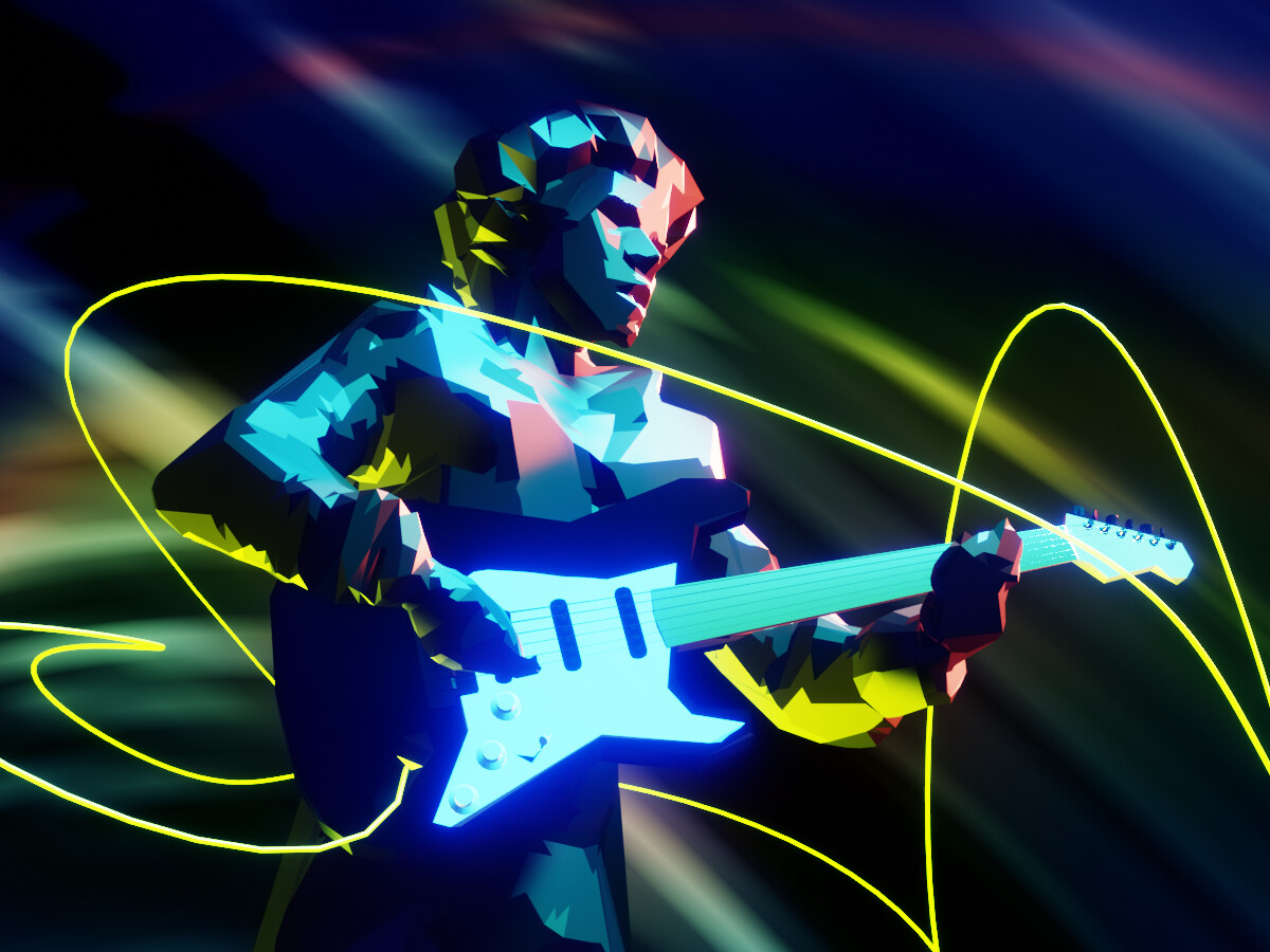
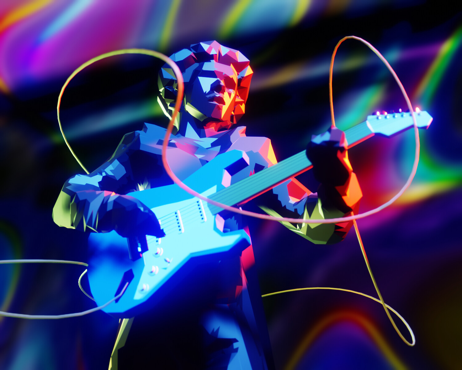
I was going for 60’s psychedelic rock x low poly look with aggressive decimate modifier on a rather quick and dirty guitarist sculpt and multicolored lighting. The magic texture, which usually looks like unicorn diarrhea, isn’t bad for a purple haze background.
17 Likes
That is so cool!
1 Like
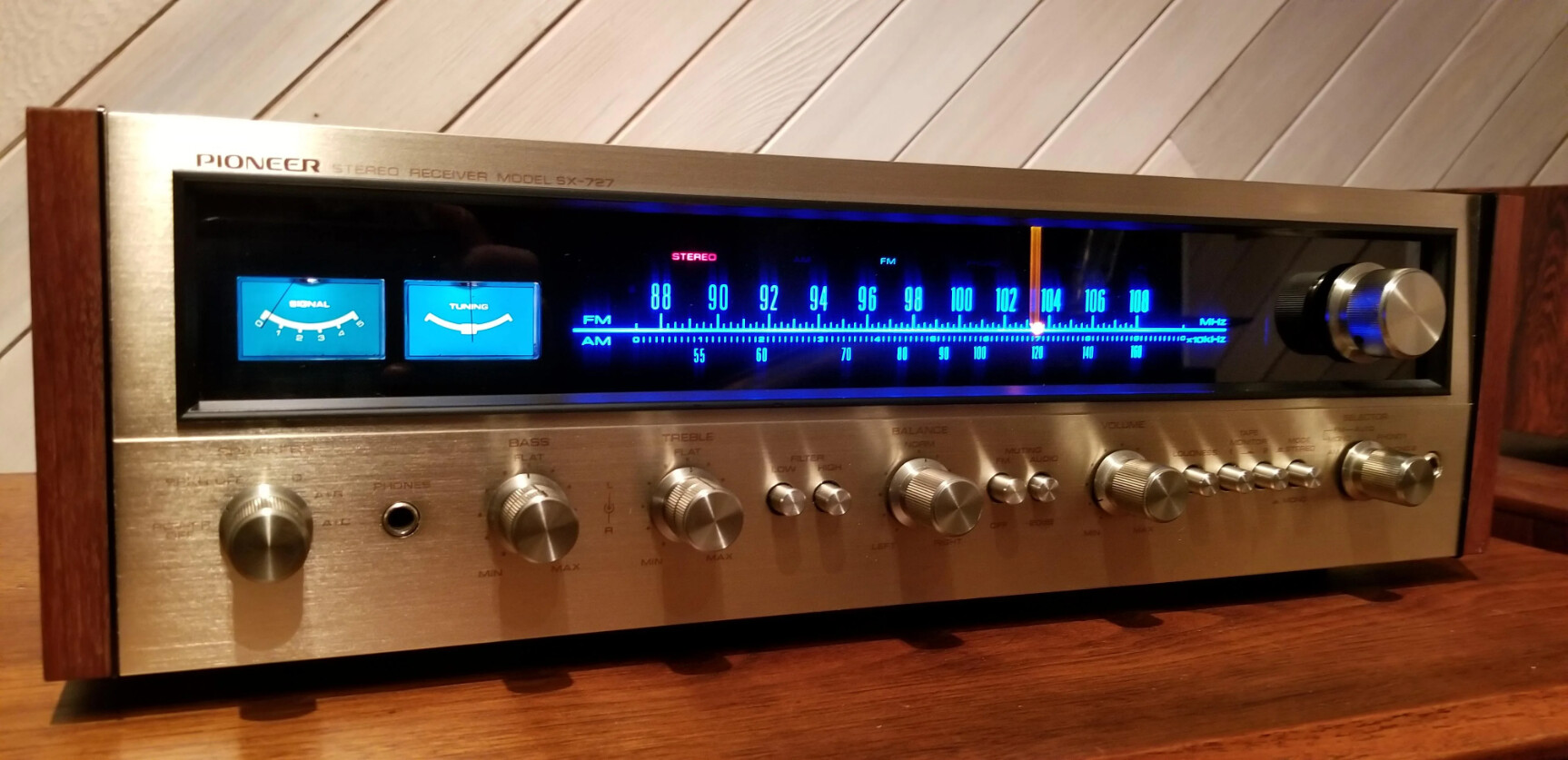
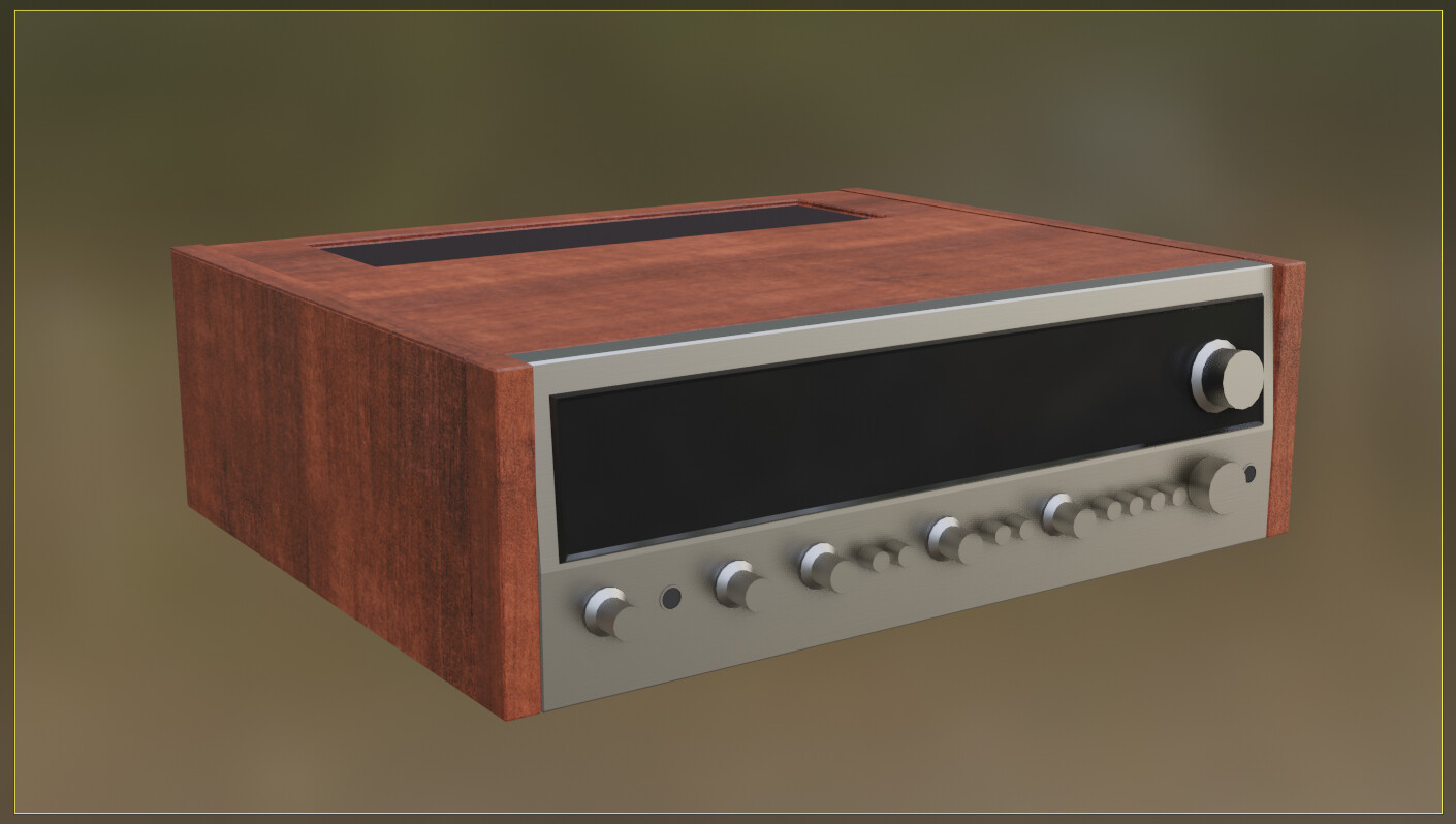
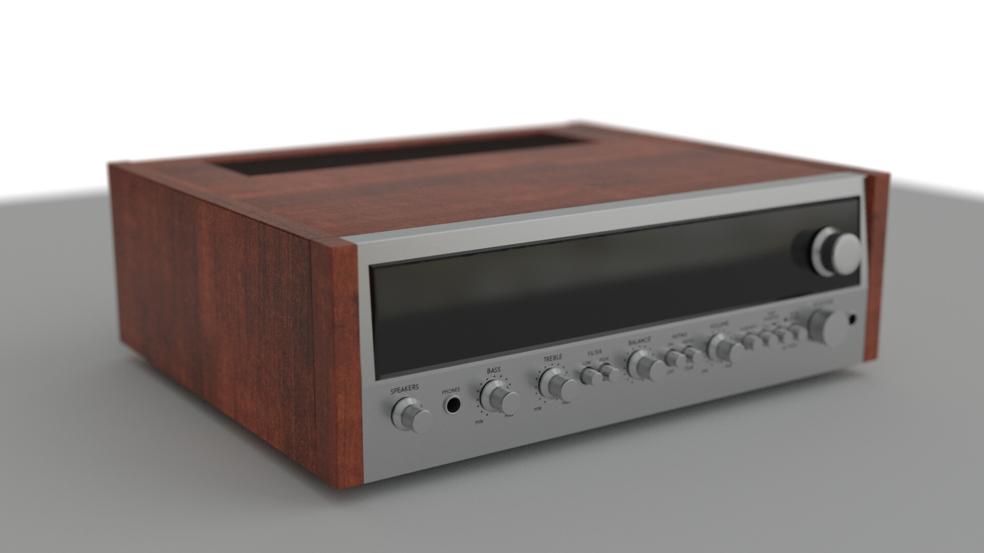
I’m trying to recreate this beauty (Pioneer SX 727 Stereo receiver from the early 70’s) at a few different levels of detail.
Here’s the first level finished:
11 Likes

14 Likes
Added some detail and depth of field and rendered in Cycles. This is really more of a GIMP project than a blender project, as the rest of the detail is just text. Not sure how much more I want to do, though I know the blue text behind the glass would really look nice. We will see.
Edit: Here’s my final render.
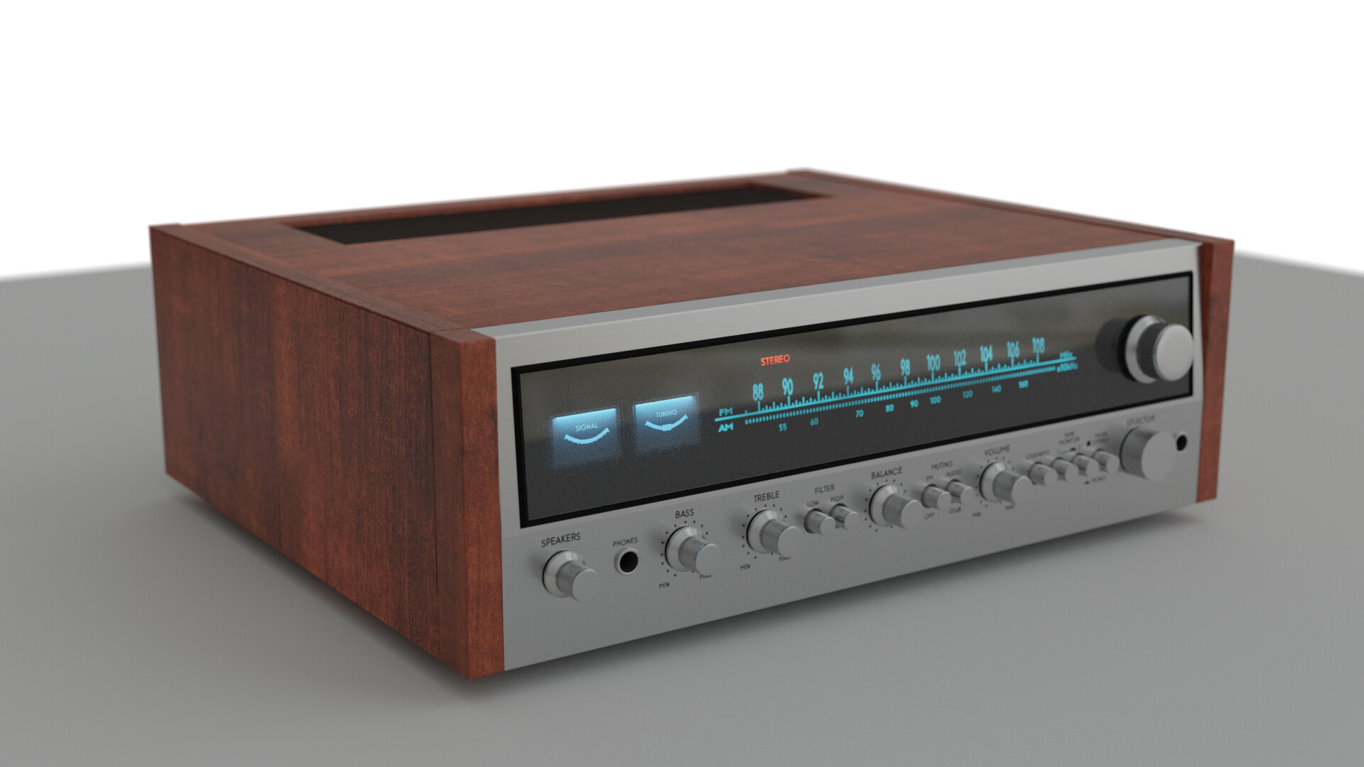
I think it looks OK but it was kind of tedious to make. I don’t think I’ll choose another project like this unless I have a good reason.
10 Likes
I was following an old tutorial to make this turn table so this topic was spot on!
reference:
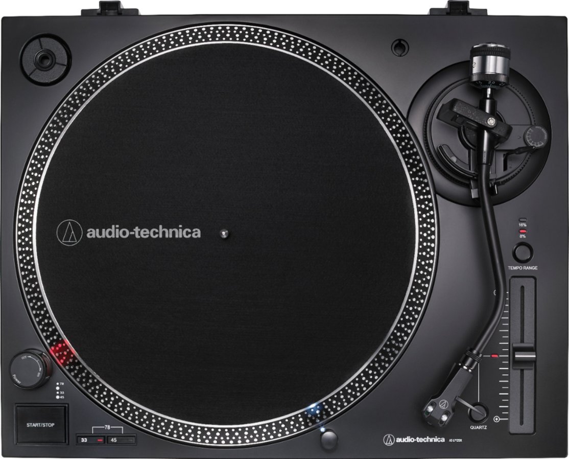
Final render:
16 Likes
That looks great!
2 Likes
looking forward to see that blue text at least 
3 Likes
this should be Jim Morrison 

1 Like
Add details, like price tag, power cable (which makes it ugly I think)>
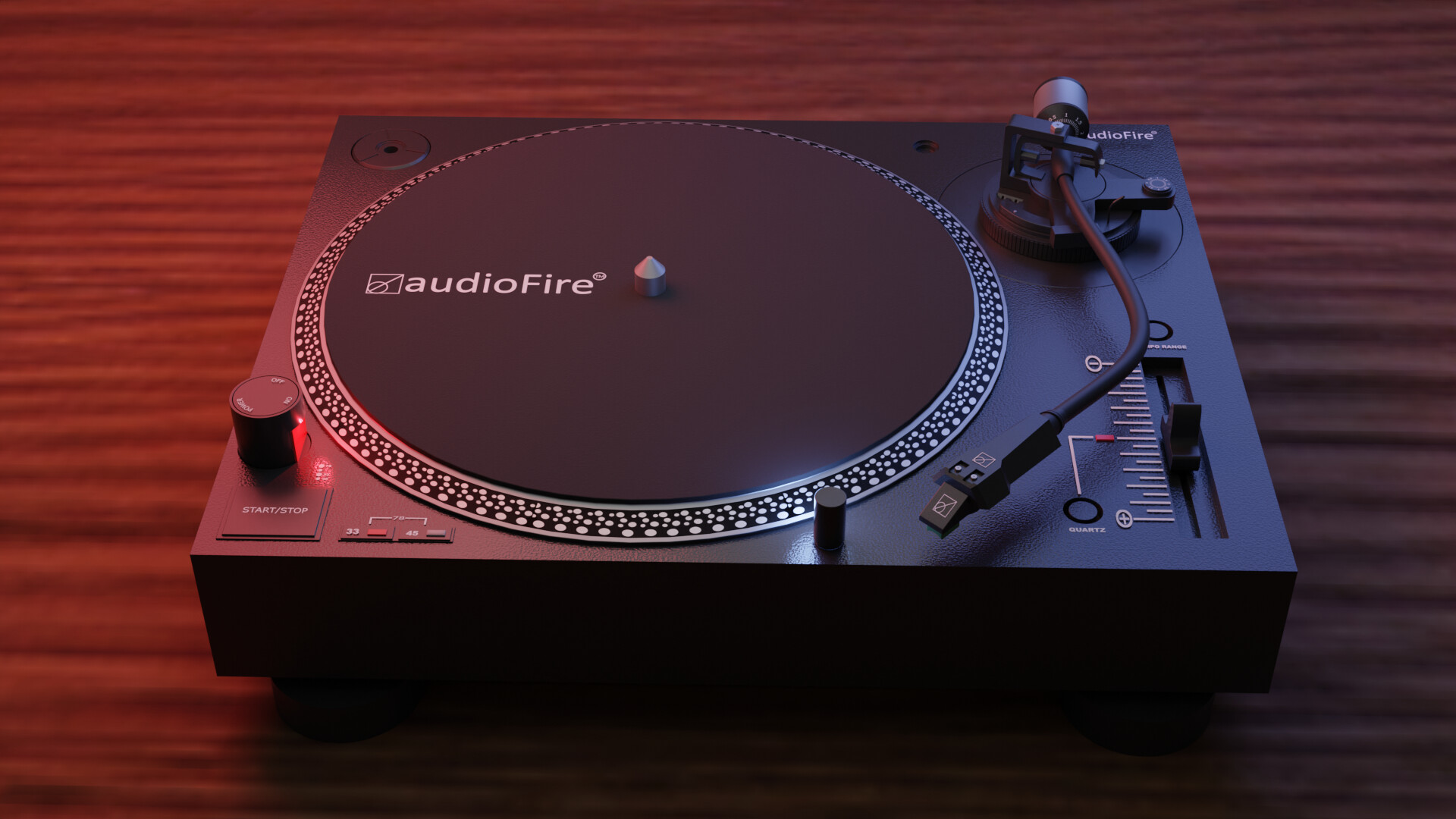
How are products promoted nowadays?.. first render of a new product … find reference on the web.
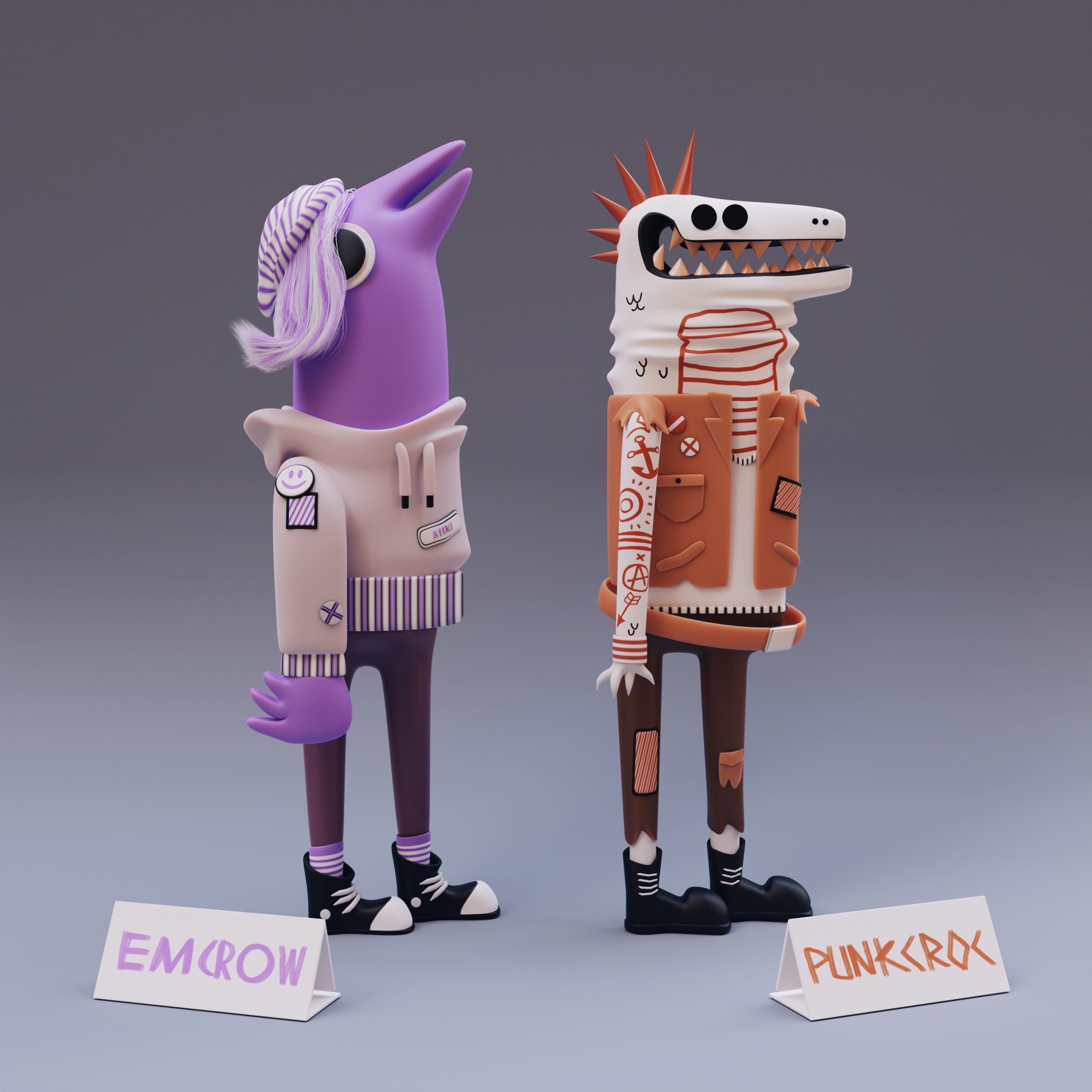
Music fans for this week. Based on 2d concept by jetpacksandrollerskates (jetpacksandrollerskates on Instagram: "Haven't done a throwback illustration in a little bit. Loved making these gnarly characters :)")
15 Likes

15 Likes
Credits
Dark Wood:
Dimitrios Savva Photography
Dario Barresi Baking
Rico Cilliers Tiling
Beige Wall 001:
Dimitrios Savva Photography
Rico Cilliers Processing
5 Likes
There are a lot of good entries this week. It’s going to be hard to choose one to vote for.
1 Like
some really cool renders in here!
2 Likes
We @BlenderCollab have a few days to vote. You can vote fast but also think slowly about design, colors, technique, difficulty, subject, realism, etc. Choose consciously and not on your own entry.
And the new subject week 10 “Pirates” has already started. The winner of this week’s “Music” challenge may select a subject for next week 11 and wins a badge.
0 voters
3 Likes
@benu , Congratulations on your winning entry with a colorful and highly dynamic music illustration. It’s a good composition. Beams of light in the back guiding the viewer to the middle of the action. I think the curves wires does the trick. breaking the static pose into a dynamic one.
- consummatutest - Such a render realism. I miss things to give it more context. Now it’s just a device.
- Tyger2 - Such a render realism. I miss things to give it more context. Now it’s just a device.
- anastasions - so much fun. You could make a whole family out of it. Presentation is good!
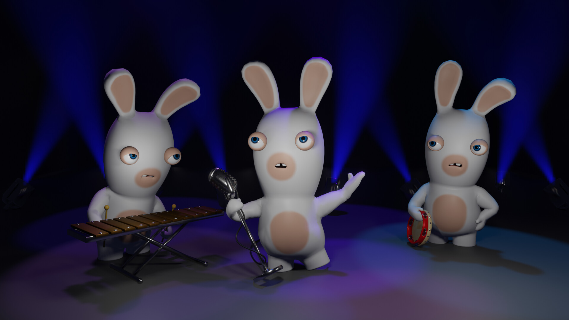
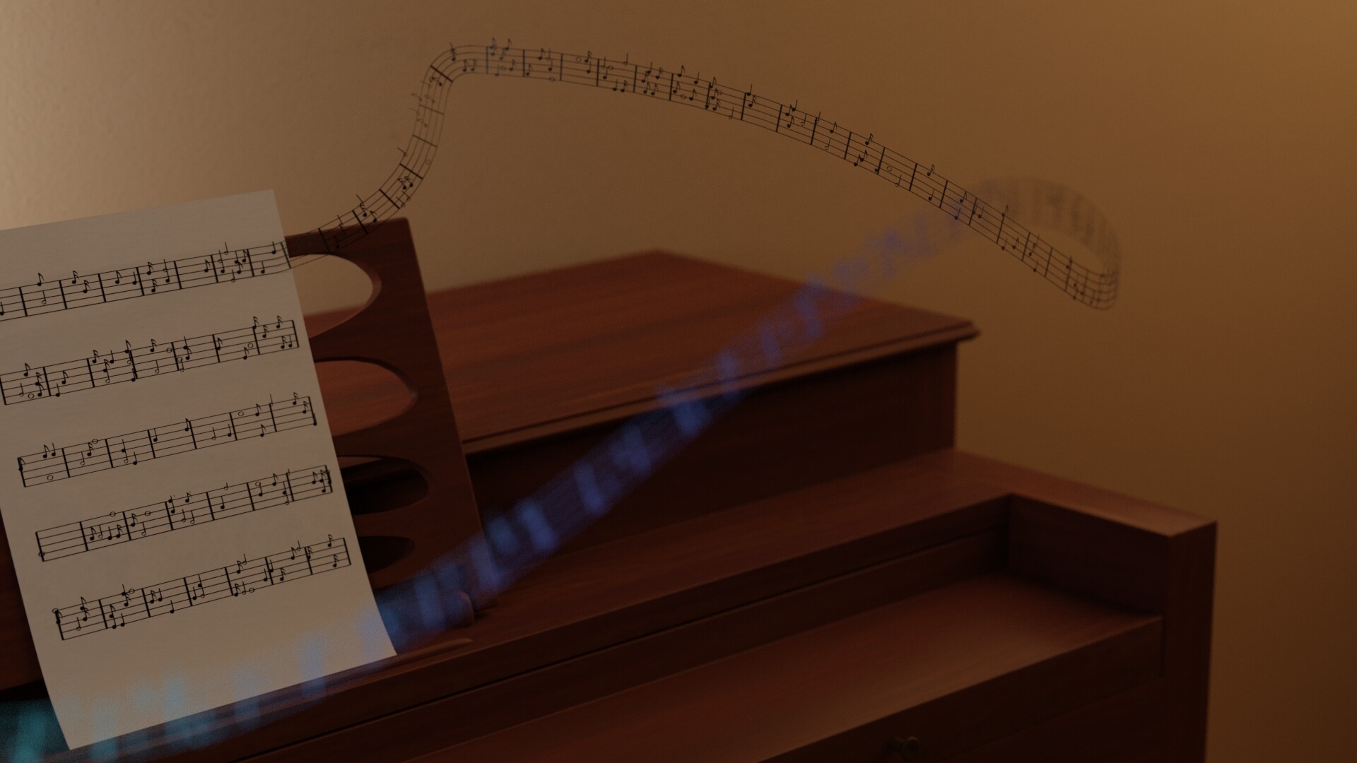
- zeRgenTa - Great idea. While its giving sound (curved lint), the piano keys aren’t visible. They could have given more detail to the model.
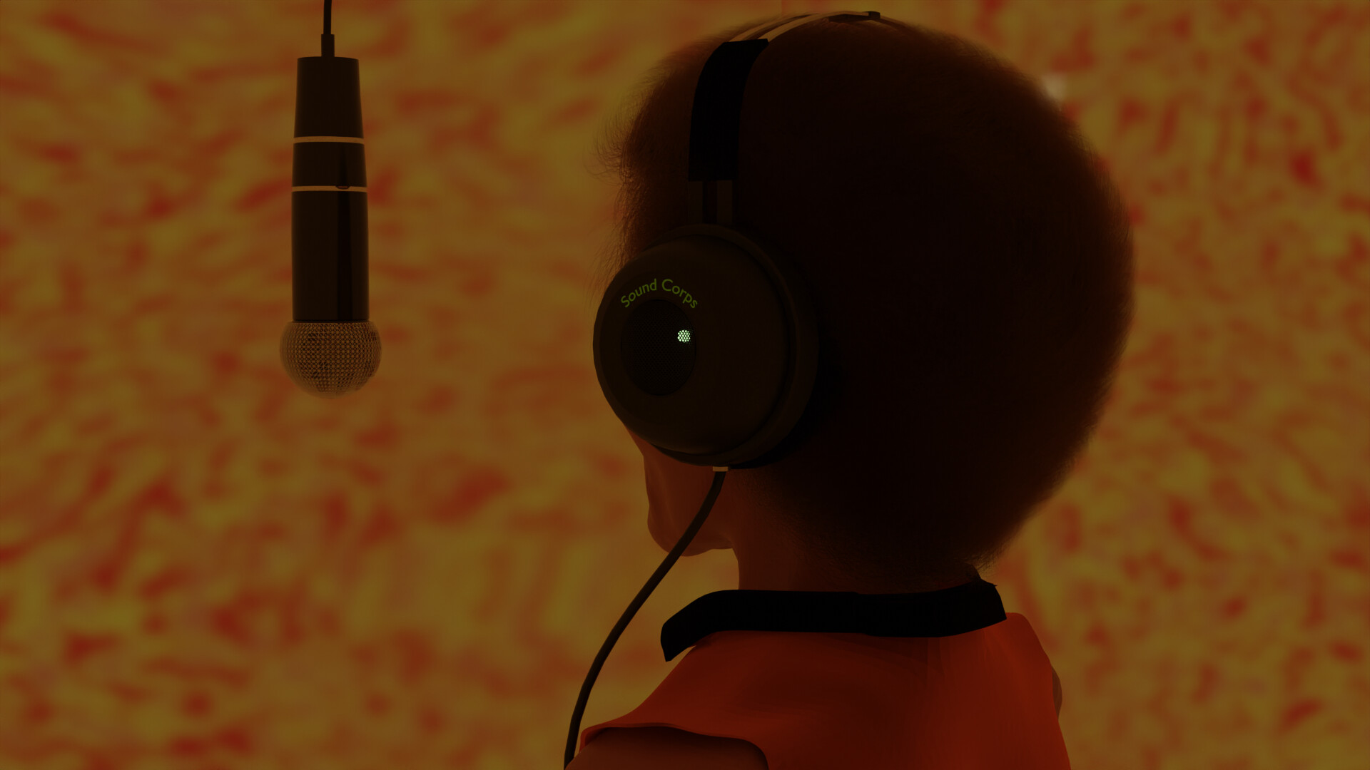
- Cathy_M - So recognizable. The scene could have more story telling ( a little dispute between the musicians… )
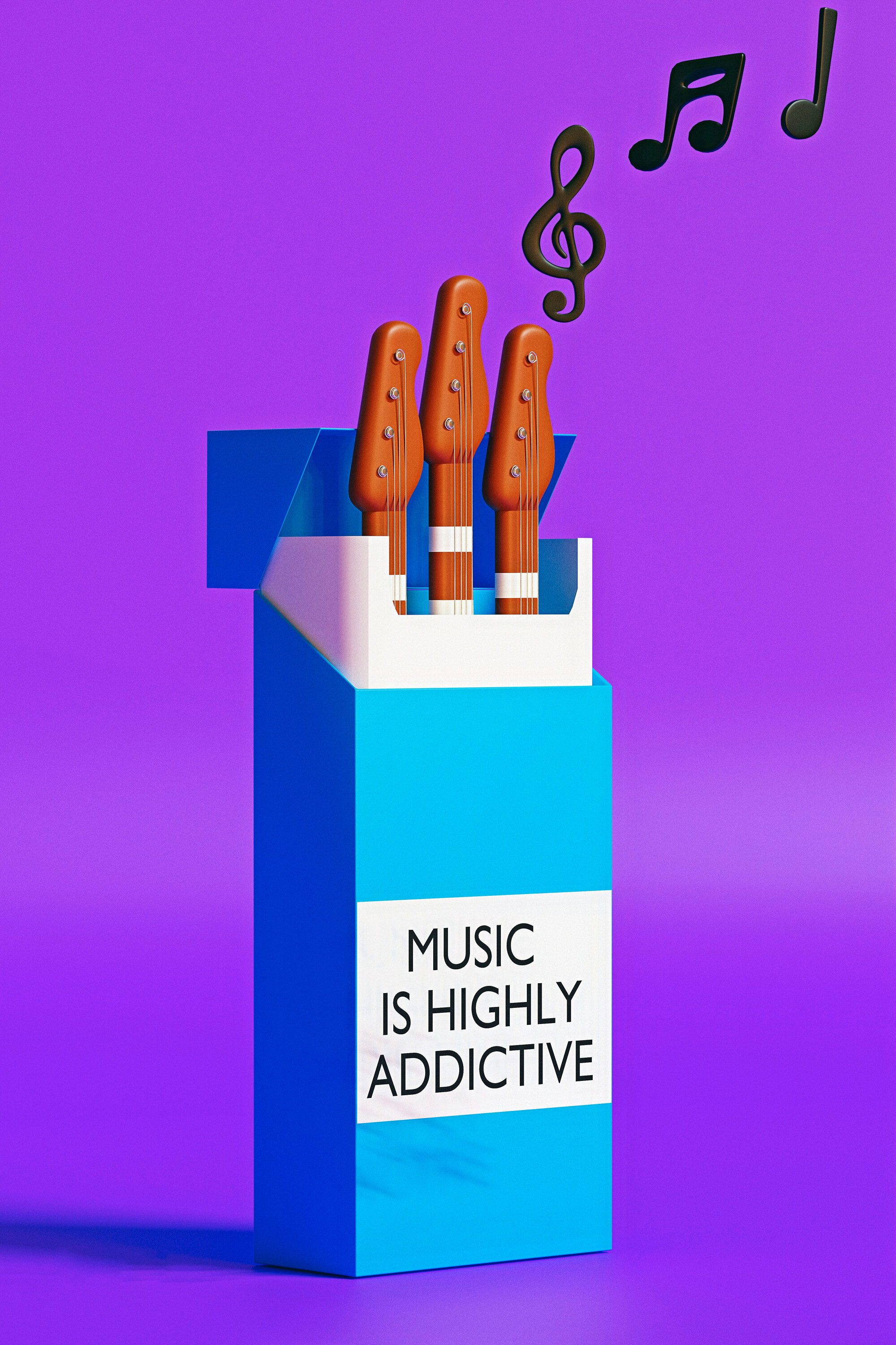
- Oloztarr - Great visual style and story (which is excellent). A bit more details to the blue box. Add bevel to the box corners, making it softer.
- Willrun - great model and solution to a difficult problem. A realistic recognizable face. But maybe it’s also the problem of a missing face in the scene.
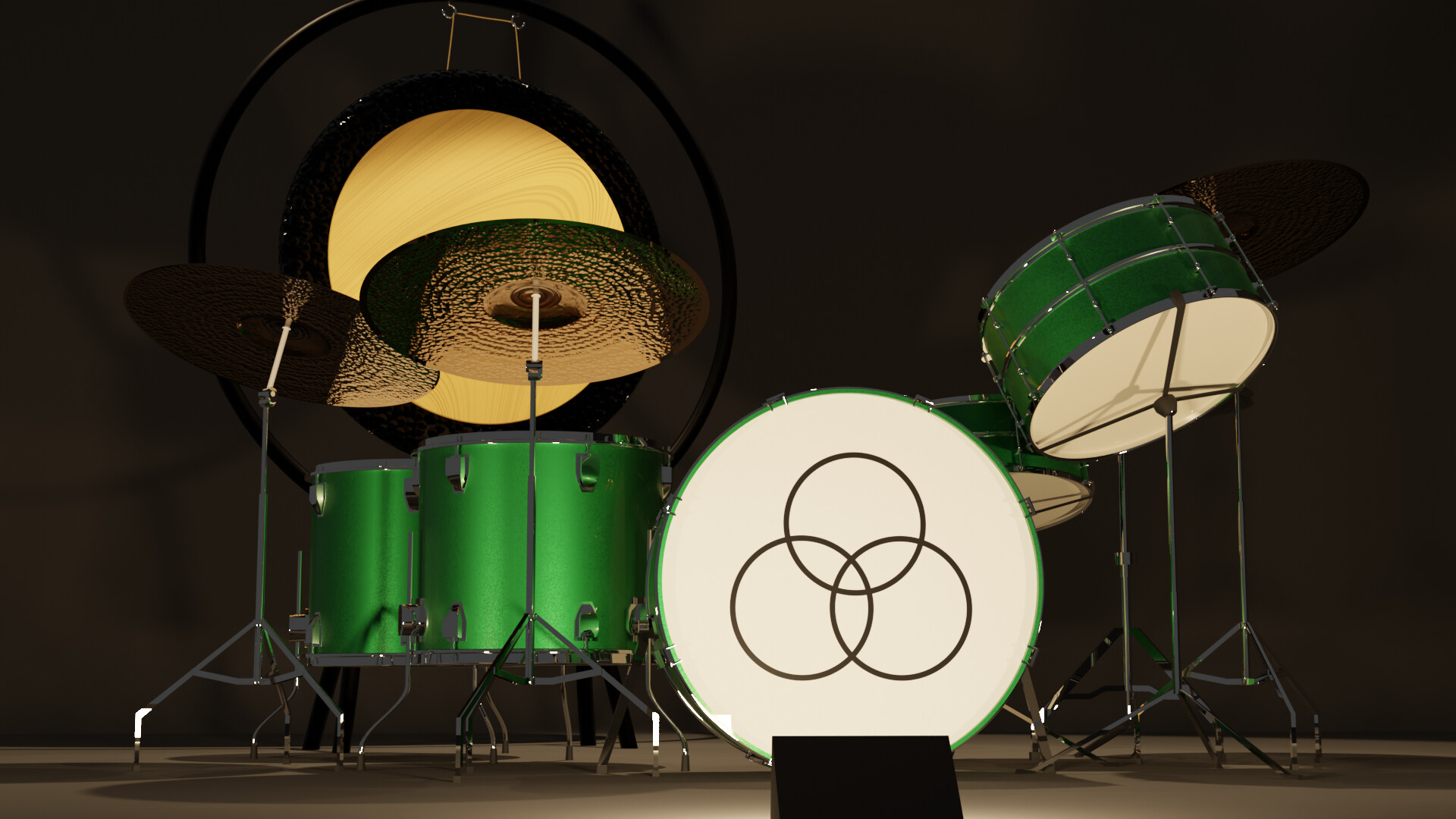
- Joey_Cuevas - Great model, re-usable. I think the front light is a bit too strong. The white circle with emblem is to harsh, too visible. Takes away the attention of the rest.
Note: I don’t want to offend anyone for any reason. I try to write down positive ideas and visions that I have in my simple use of the English language. I am also sometimes more inspired by a particular subject or solution. I’m also learning from you!
3 Likes