some really cool renders in here!
We @BlenderCollab have a few days to vote. You can vote fast but also think slowly about design, colors, technique, difficulty, subject, realism, etc. Choose consciously and not on your own entry.
And the new subject week 10 “Pirates” has already started. The winner of this week’s “Music” challenge may select a subject for next week 11 and wins a badge.
0 voters
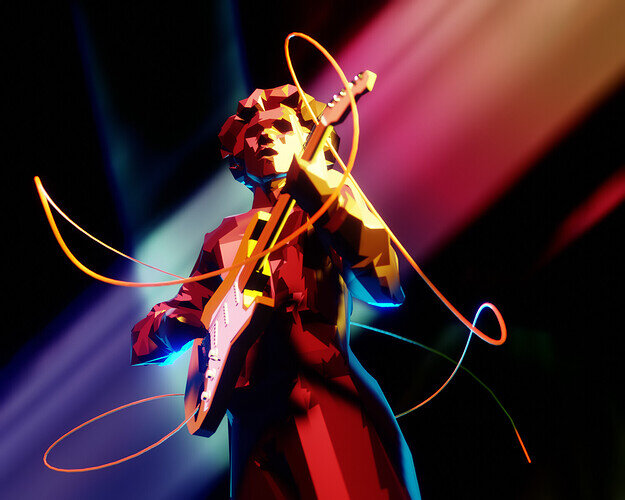
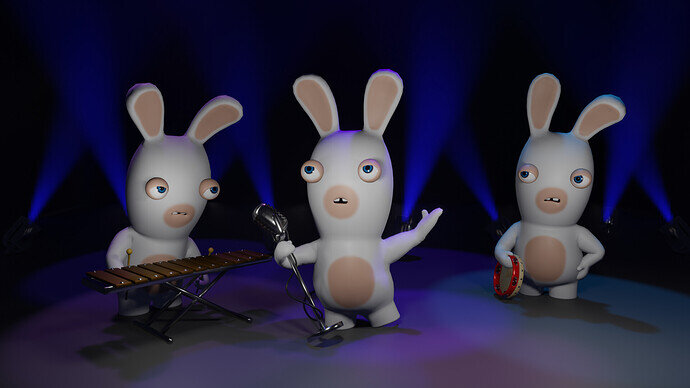
@benu , Congratulations on your winning entry with a colorful and highly dynamic music illustration. It’s a good composition. Beams of light in the back guiding the viewer to the middle of the action. I think the curves wires does the trick. breaking the static pose into a dynamic one.
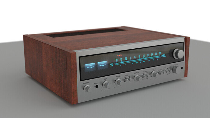
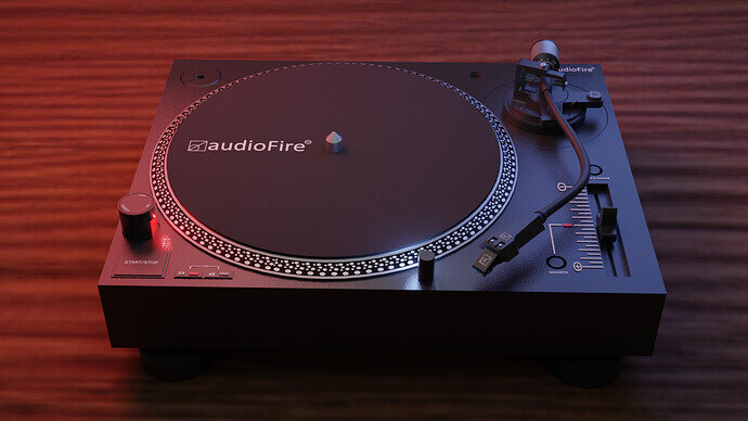
- consummatutest - Such a render realism. I miss things to give it more context. Now it’s just a device.
- Tyger2 - Such a render realism. I miss things to give it more context. Now it’s just a device.
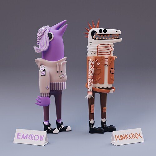
- anastasions - so much fun. You could make a whole family out of it. Presentation is good!
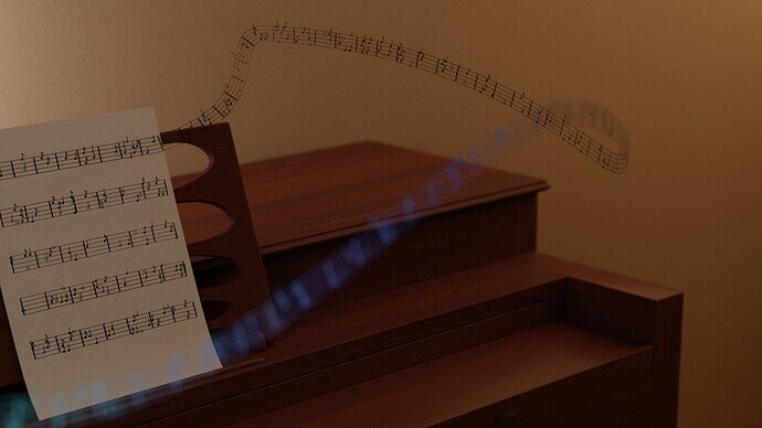
- zeRgenTa - Great idea. While its giving sound (curved lint), the piano keys aren’t visible. They could have given more detail to the model.
- Cathy_M - So recognizable. The scene could have more story telling ( a little dispute between the musicians… )
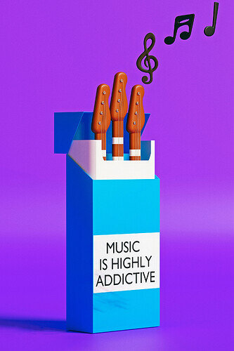
- Oloztarr - Great visual style and story (which is excellent). A bit more details to the blue box. Add bevel to the box corners, making it softer.
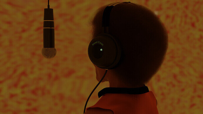
- Willrun - great model and solution to a difficult problem. A realistic recognizable face. But maybe it’s also the problem of a missing face in the scene.
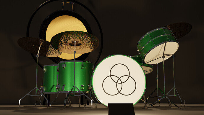
- Joey_Cuevas - Great model, re-usable. I think the front light is a bit too strong. The white circle with emblem is to harsh, too visible. Takes away the attention of the rest.
Note: I don’t want to offend anyone for any reason. I try to write down positive ideas and visions that I have in my simple use of the English language. I am also sometimes more inspired by a particular subject or solution. I’m also learning from you!


