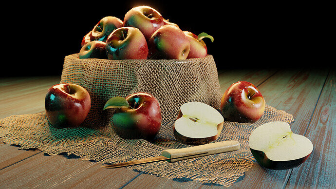
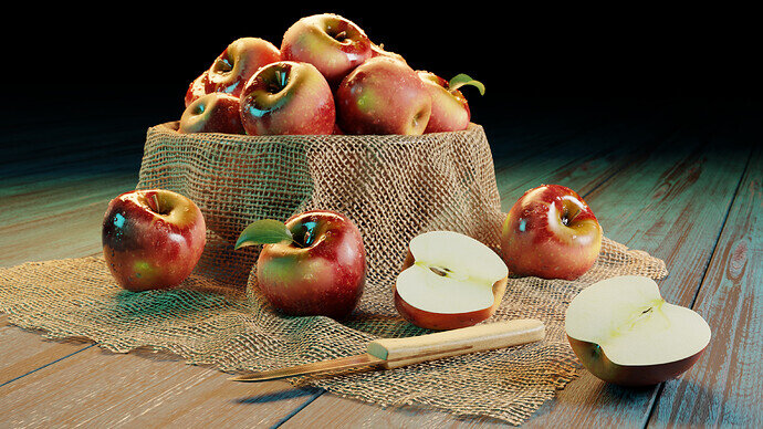
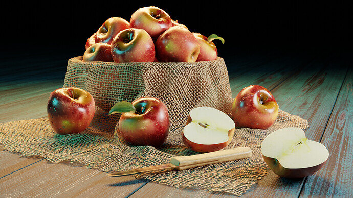
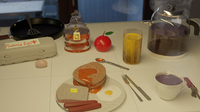
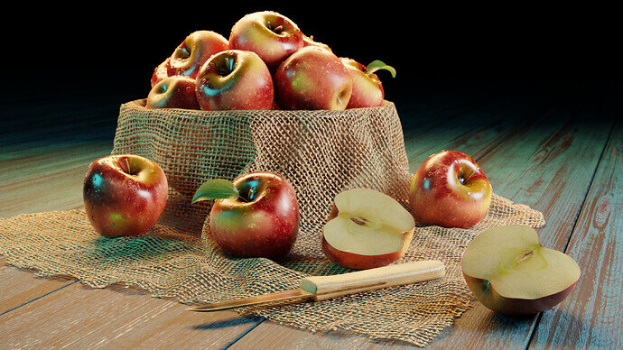
It’s just amazing that you have managed to keep the illustration nearly the same for both Eevee and Cycles!
That’s a great plus.
Yeah eevee can produce some great results too! Without the contact shadow for the fill light enabled they actually look even more similar. But it makes the front apple look like it’s floating which I don’t like, so I decided to keep it on.
Looks awesome! I think I prefer the cycles version because of the shadows. My only criticism is that the apples seem too shiny in some spots in all the renders. It makes them look oily or sticky or something.
Such a high quality of entries. Well done everybody.
Still some hours left to fiddle your scene!!
Have fun!
I think that’s an improvement. The texture of the apples is really nice. Is that procedural or images?
Yeah I think that’s an improvement too. Stencil painted from image
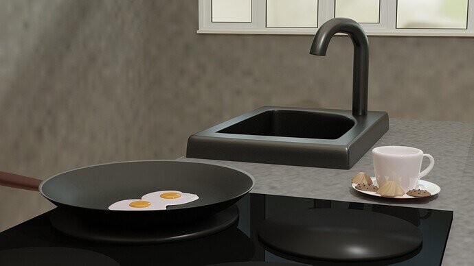
Wow! I am sure that my renders are doomed to be the last in position but I wanted to share it anyways. 
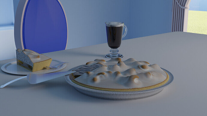
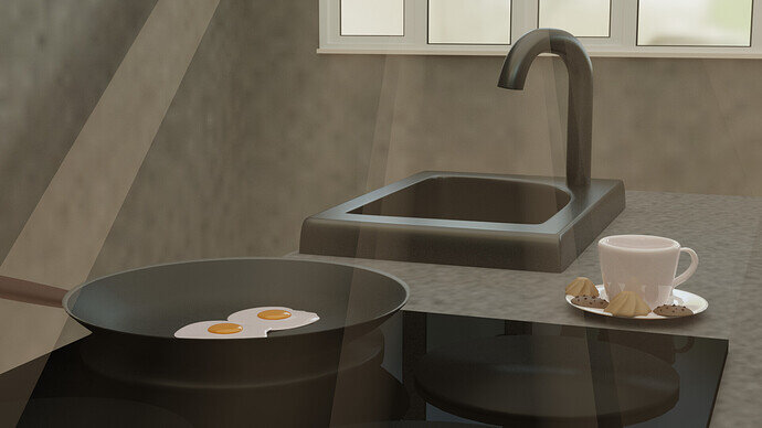
I wanted to try a volumetric lighting version in an indoor scene so this is my first try of a volumetric lightray.
Sure, winning is fun, but it’s all about the learning process.
Getting out of your comfort zone, that’s the idea.
Small projects to test new features and or just get better at modelling.
Glad you shared it.
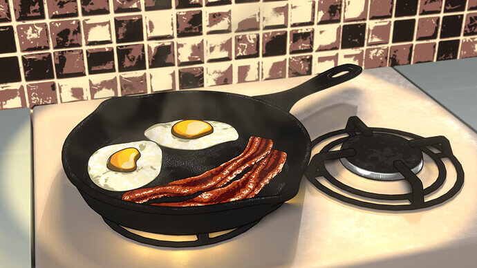
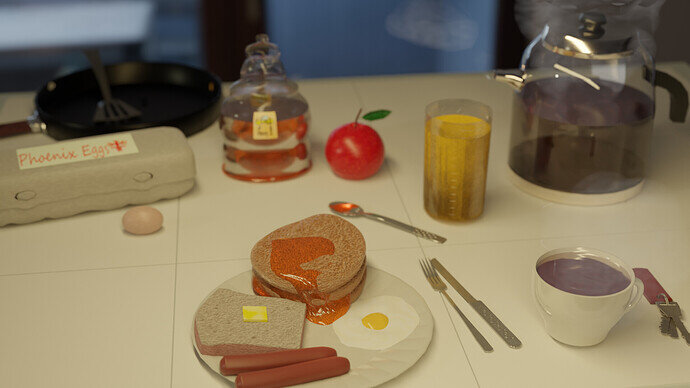
frying pan turned out great
Looks great. One thing I think that shows it up as a model is the smooth perfect shapes to the half apples. Plus the washed out, overexposed inner apple I would try to darken. But that is nit picking It looks great.
Looks good! Gotta try those new things or we don’t learn anything, right? Volumetrics are fun, I have to control myself from putting them in every project  . Try plugging a noise texture into the density of your volume and playing with that. That will give you a nice uneven distribution of smoke/fog/dust.
Good call. I used a rgb curve node to adjust the color. Looking at references for apples cut in half, they all look very cleanly cut. But I still tried to move around some verts slightly. And I also added a little red edge within the skin to try to make it look like it has some thickness. It’s not perfect, but an improvement!
We @BlenderCollab have a few days to vote. You can vote fast but also think slowly about design, colors, technique, difficulty, subject, realism, etc. Choose consciously and not on your own entry.
And the new subject week 8 “Freak show” has already started. The winner of this week’s “Food” challenge may select a subject for next week 9 and wins a badge.
0 voters
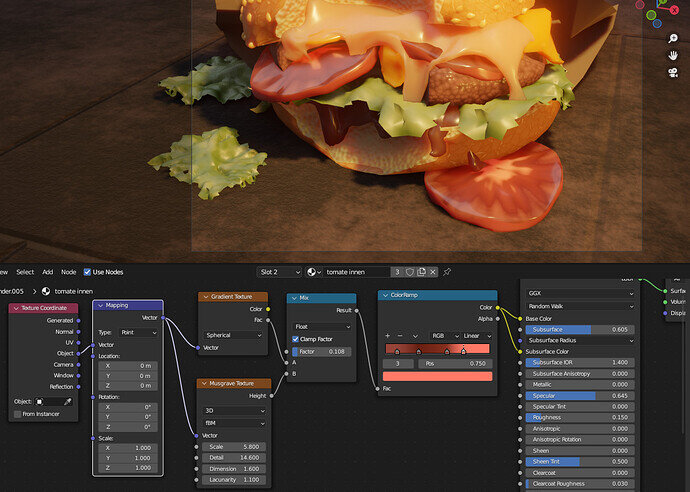
Thank you! it’s a gradient mixed with a musgrave, basically. Doesn’t look so appetizing close up, lol.
I Yours looks really realistic, you put in a lot of attention to detail!
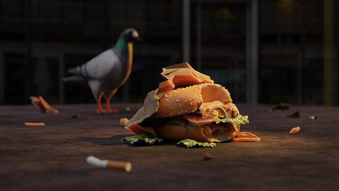
Oh, that’s interesting. It’s a shame that someone threw away such a good looking burger  . Thanks for sharing!

