
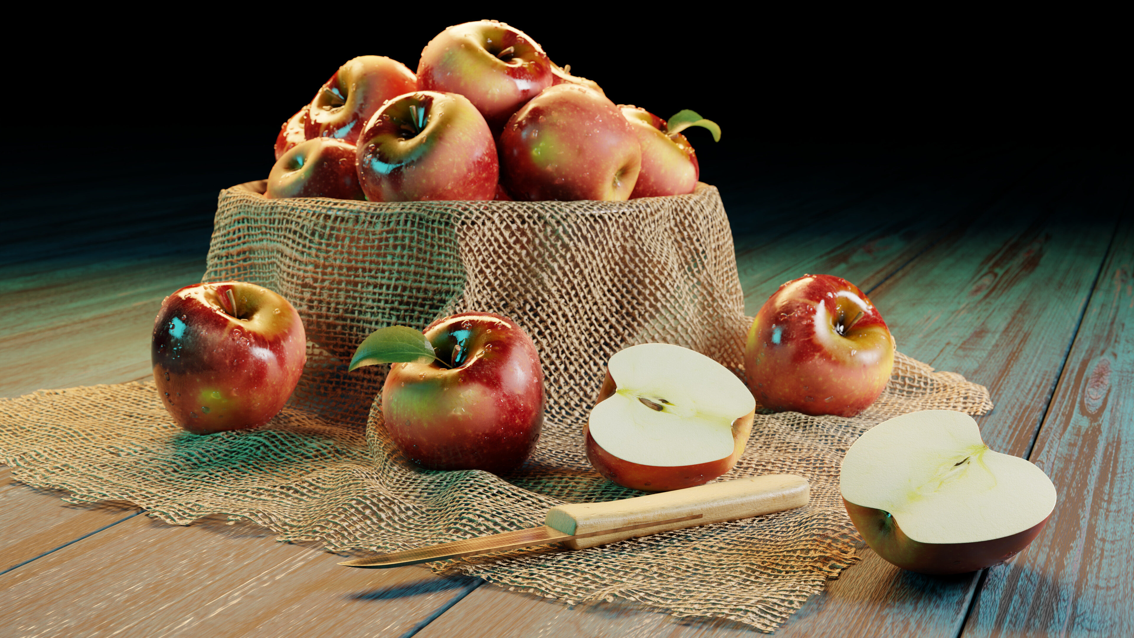
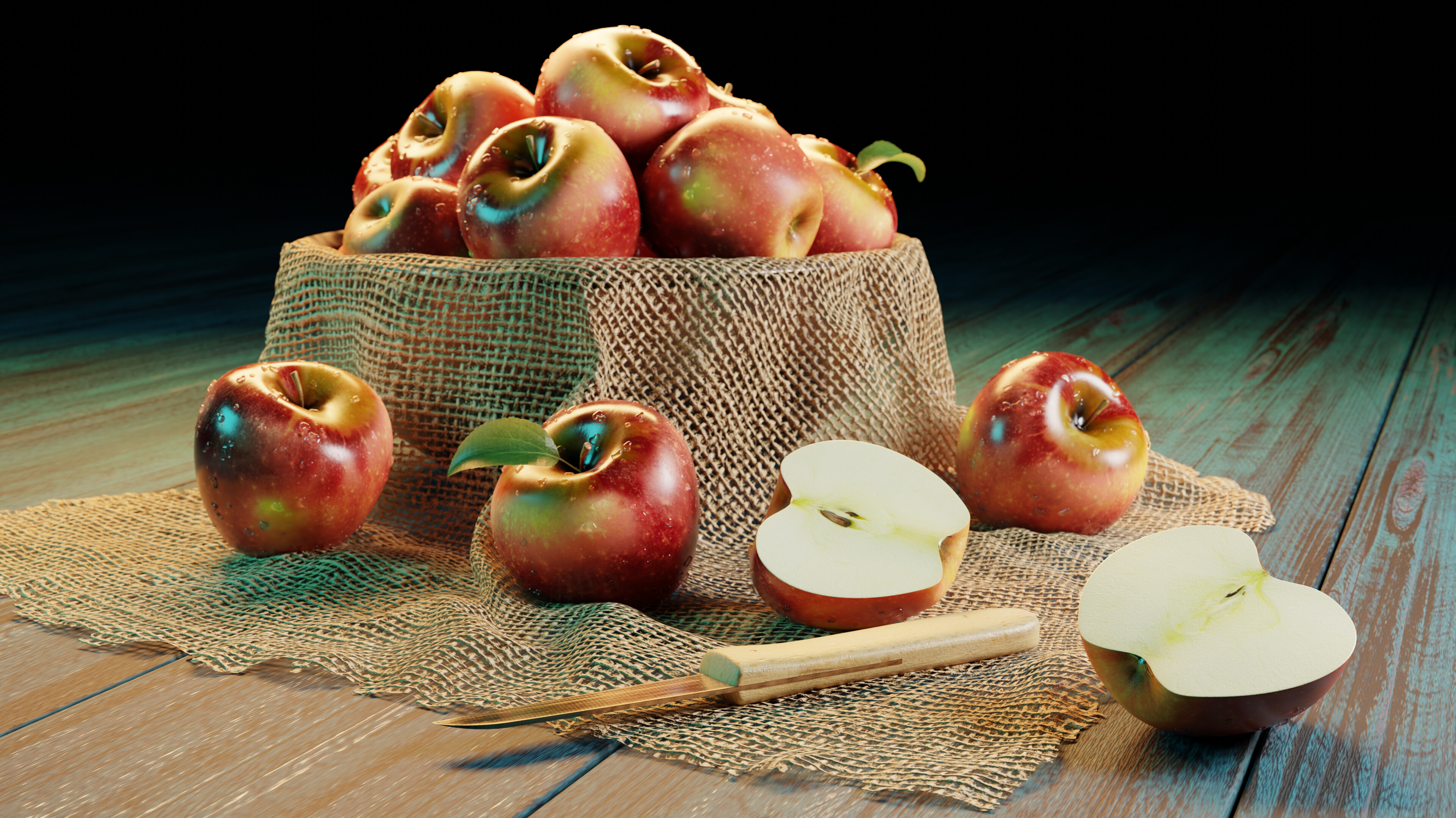
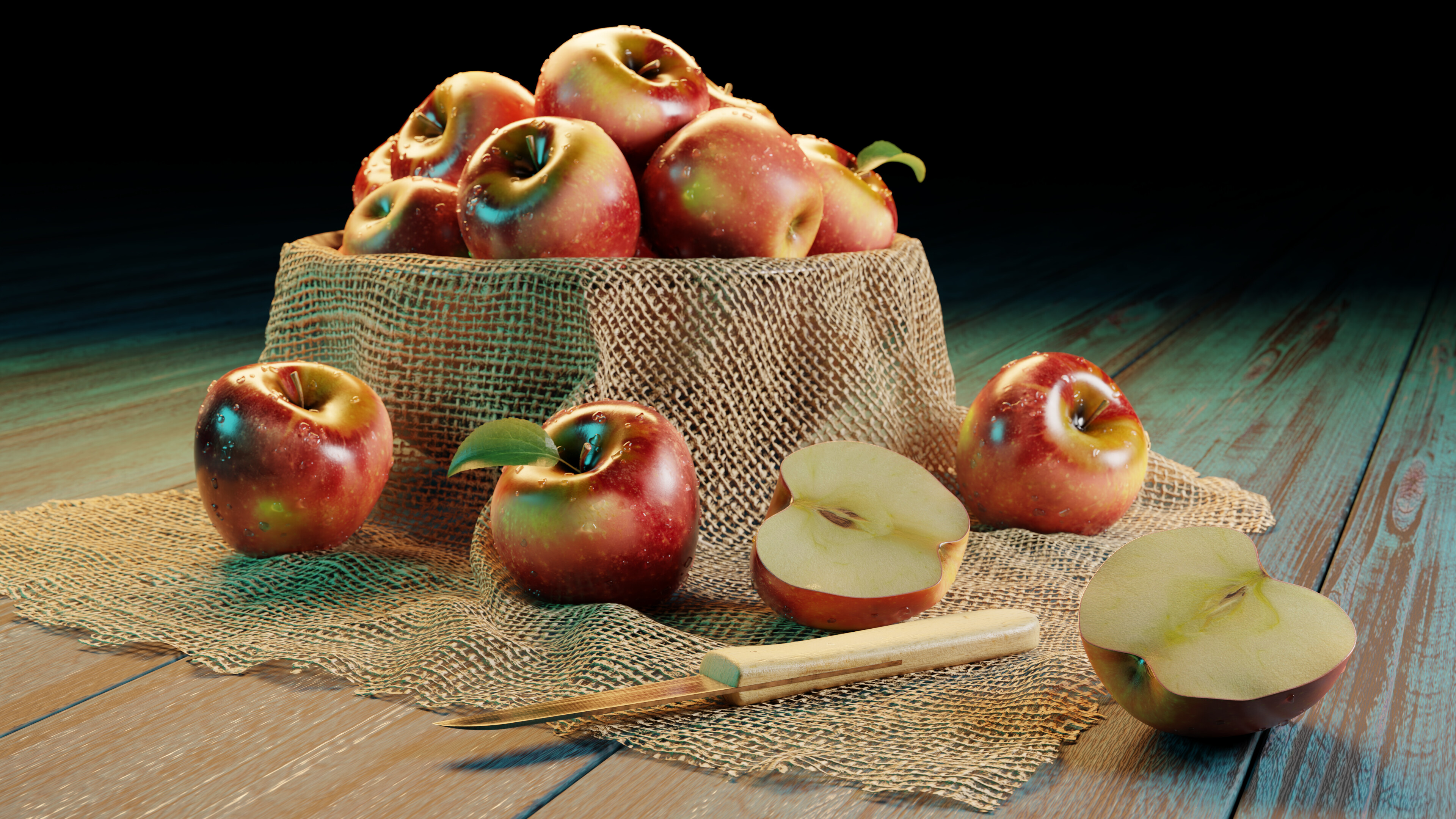
Looks awesome! I think I prefer the cycles version because of the shadows. My only criticism is that the apples seem too shiny in some spots in all the renders. It makes them look oily or sticky or something.
Such a high quality of entries. Well done everybody.
Still some hours left to fiddle your scene!!
Have fun!
I think that’s an improvement. The texture of the apples is really nice. Is that procedural or images?
Yeah I think that’s an improvement too. Stencil painted from image

Wow! I am sure that my renders are doomed to be the last in position but I wanted to share it anyways. 
I wanted to try a volumetric lighting version in an indoor scene so this is my first try of a volumetric lightray.
Sure, winning is fun, but it’s all about the learning process.
Getting out of your comfort zone, that’s the idea.
Small projects to test new features and or just get better at modelling.
Glad you shared it.
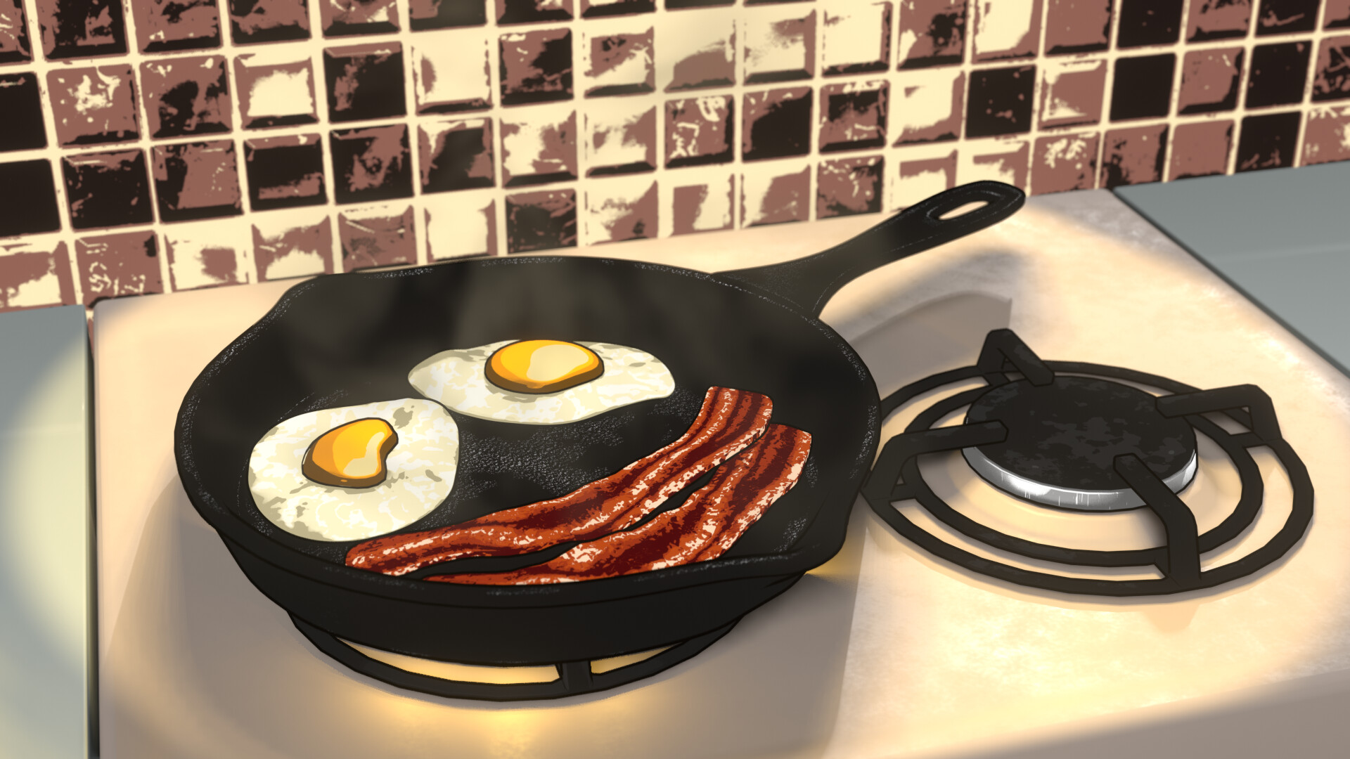
frying pan turned out great
Looks great. One thing I think that shows it up as a model is the smooth perfect shapes to the half apples. Plus the washed out, overexposed inner apple I would try to darken. But that is nit picking It looks great.
Looks good! Gotta try those new things or we don’t learn anything, right? Volumetrics are fun, I have to control myself from putting them in every project  . Try plugging a noise texture into the density of your volume and playing with that. That will give you a nice uneven distribution of smoke/fog/dust.
Good call. I used a rgb curve node to adjust the color. Looking at references for apples cut in half, they all look very cleanly cut. But I still tried to move around some verts slightly. And I also added a little red edge within the skin to try to make it look like it has some thickness. It’s not perfect, but an improvement!
We @BlenderCollab have a few days to vote. You can vote fast but also think slowly about design, colors, technique, difficulty, subject, realism, etc. Choose consciously and not on your own entry.
And the new subject week 8 “Freak show” has already started. The winner of this week’s “Food” challenge may select a subject for next week 9 and wins a badge.

0 voters
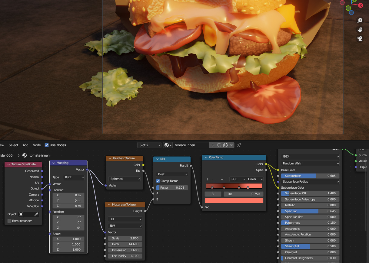
Thank you! it’s a gradient mixed with a musgrave, basically. Doesn’t look so appetizing close up, lol.
I Yours looks really realistic, you put in a lot of attention to detail!
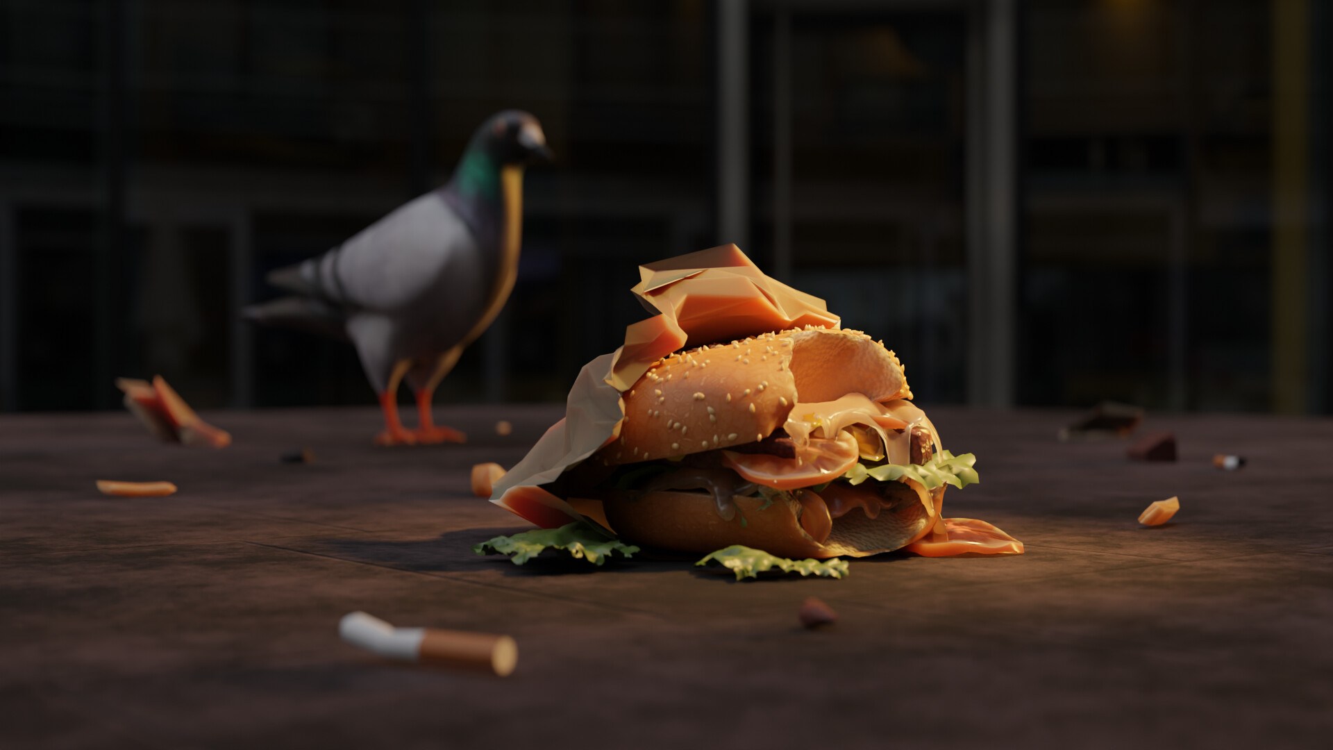
Oh, that’s interesting. It’s a shame that someone threw away such a good looking burger  . Thanks for sharing!
All the models look great, and it amazes me that people can have such skill to pull these models off. All of the them look beautiful!
@benu I love the detail with the half eaten sandwich, it looks phenomenal! I also like how the bird is kind of faded in the background, it just gives a more realistic feel to this scene. Wonderful!
@Gordon I love how the apples look incredibly real, and how is all nicely put together. The apple that has been sliced in half also looks very realistic, and eatable. Great job!
@anastasions I can’t even put into words how much detail I see here. I particularly love the swirl that’s going around the ramen bowl. All the vegetables look amazing, and overall, there’s just a great feel with this model. Amazing job!
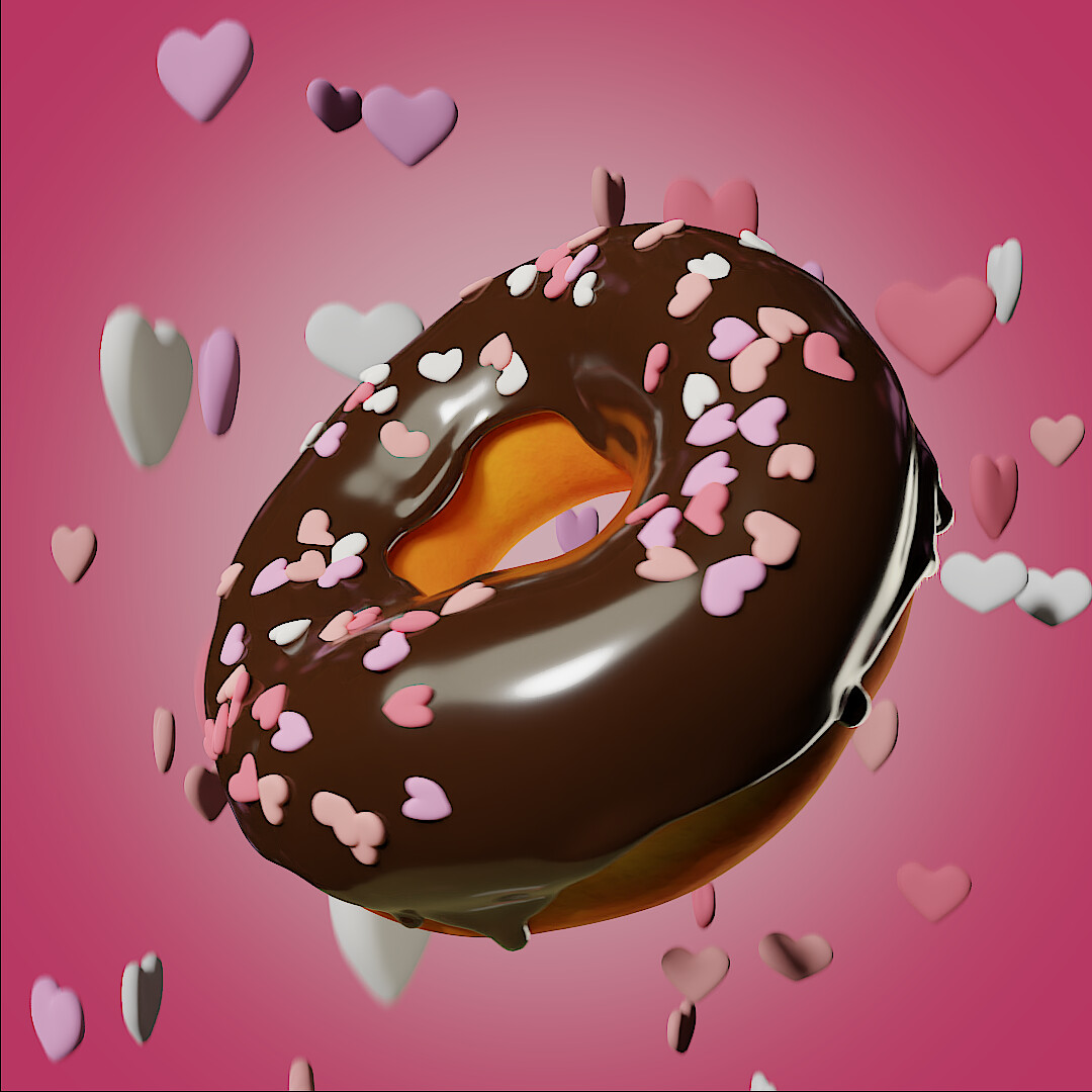
@Kzanna That donut looks very delicious, and looks perfect for Valentine’s day, I love how vibrant the colors are, and how the sprinkles look as if they are floating. Perfect for Valentine’s day!
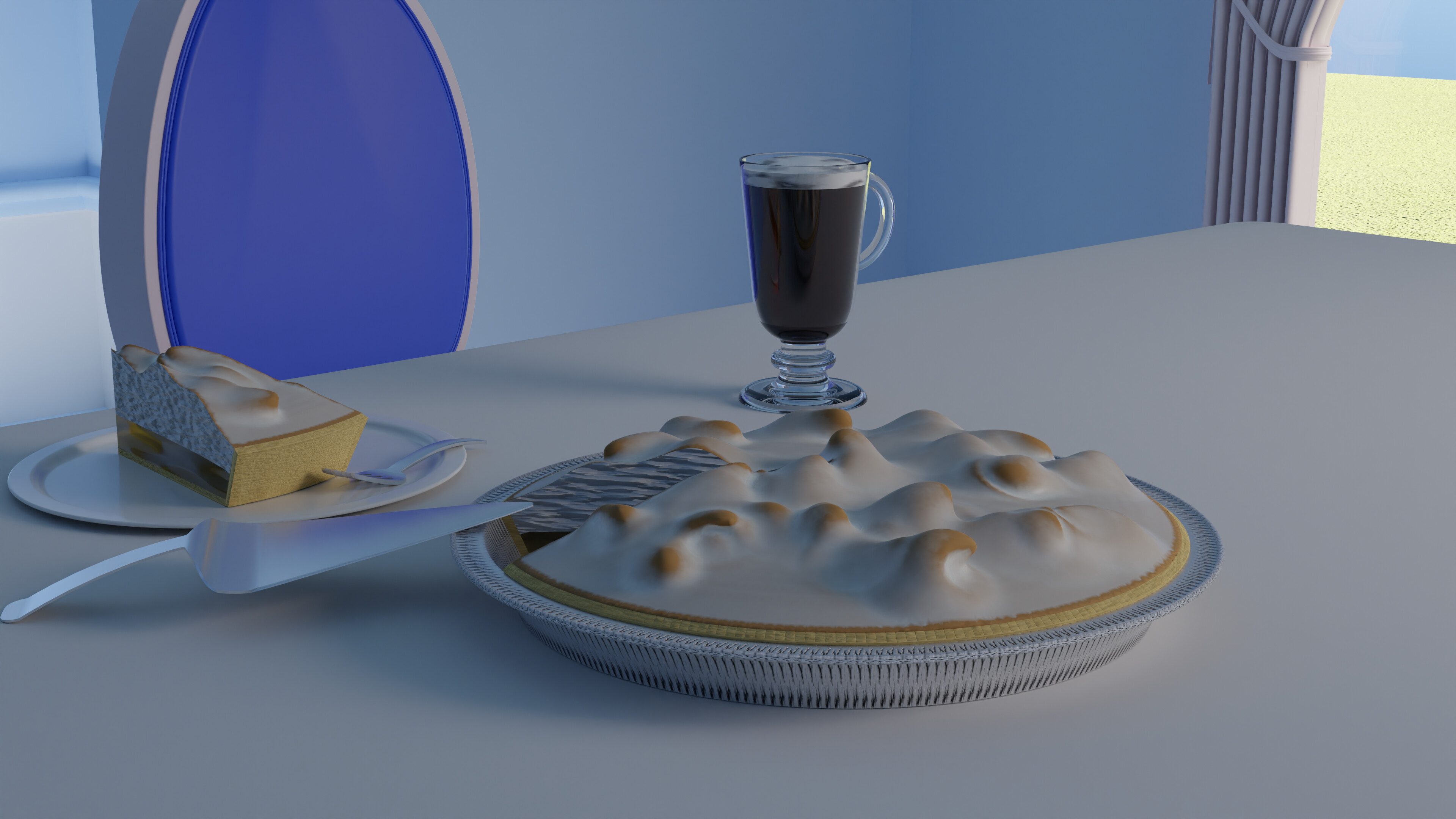
@Joey_Cuevas I love the scene you created. The detail on your cake is also amazing. The overall scene just had that comforting feel to it, and I love it!
@Willrun I love all the different things you did here. The models have a simple yet effective feel to them. I especially love the different models, and how you were open to create different things. Amazing!
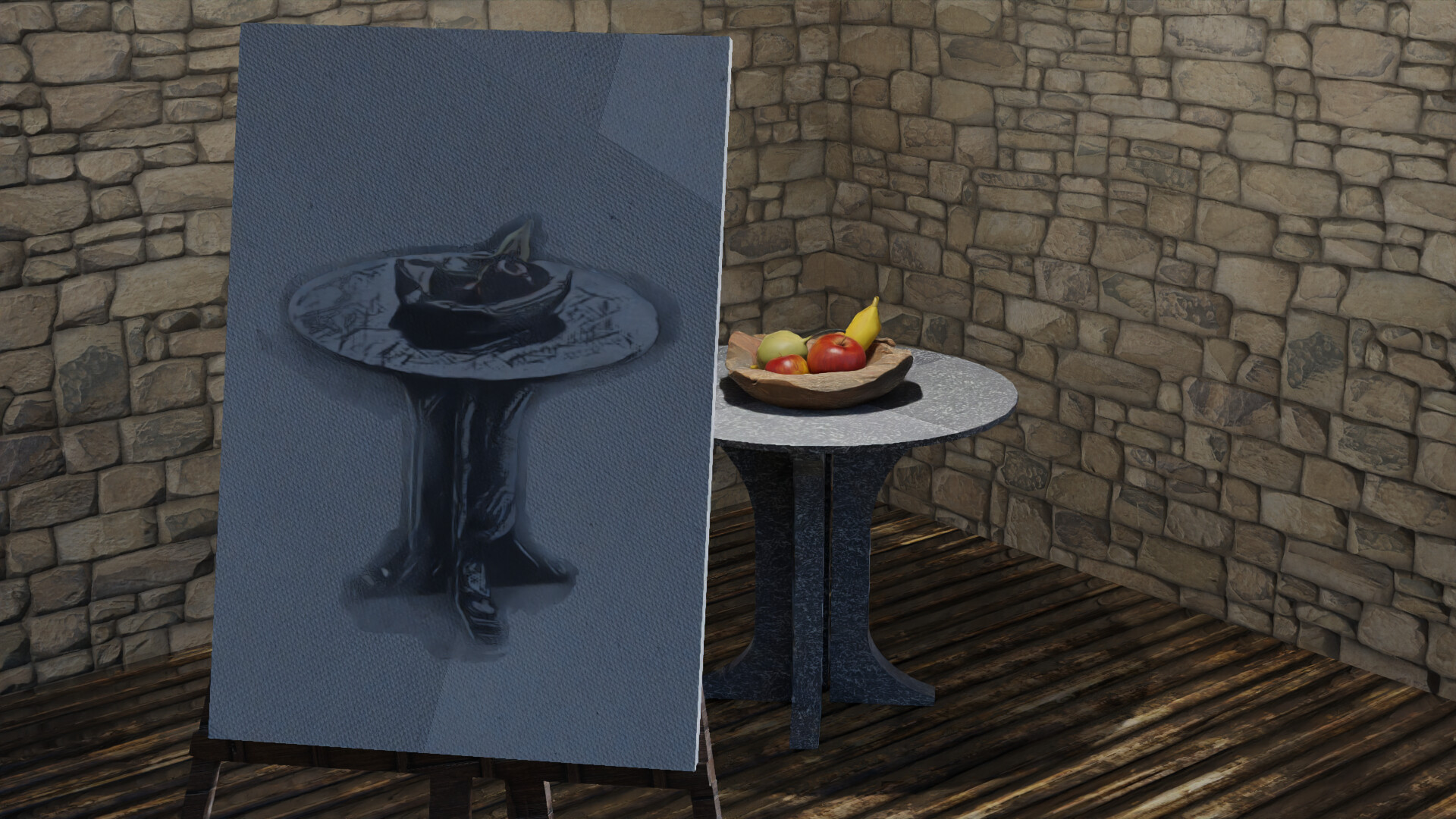
@Kato-San I love how you leaned towards your artistic side for this. Your drawing capabilities are amazing, and it shows. Not only did you do that, but you also included a model of fruit which looks great. Nicely done!
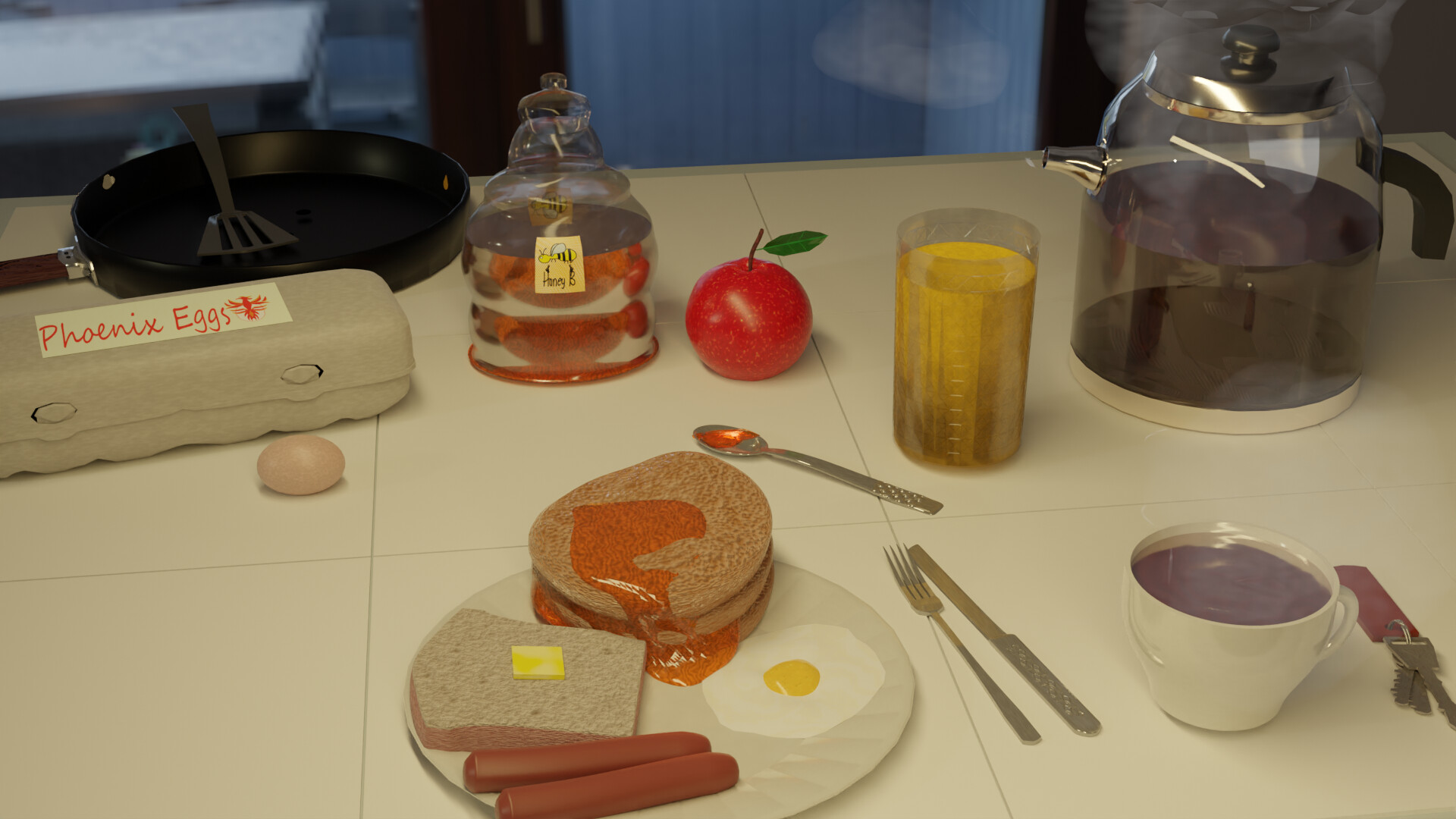
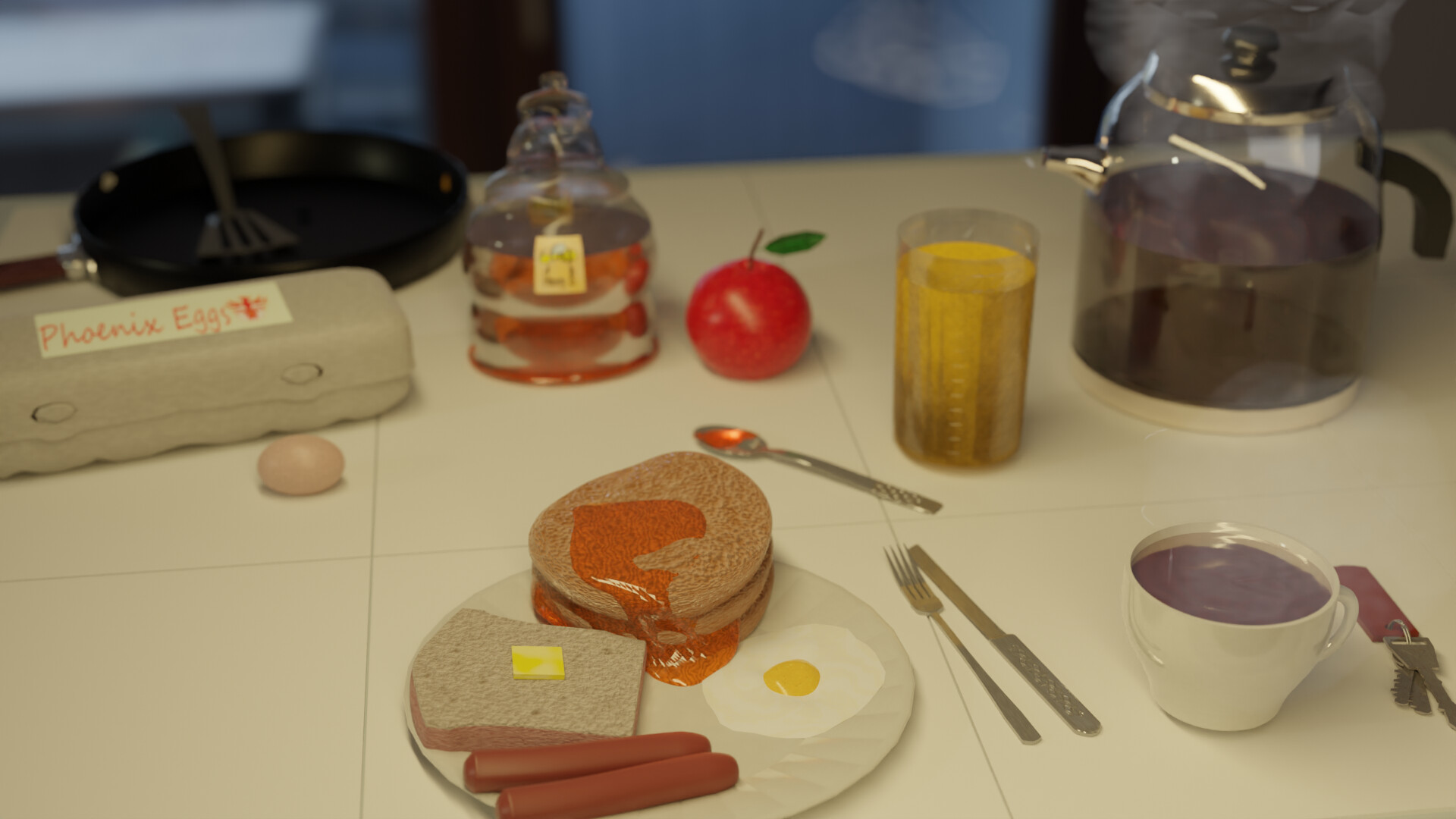
@Tyger2 Great job with the details on the Bacon! Not only that, but your scene looks amazing, the stove details are great! Amazing job!
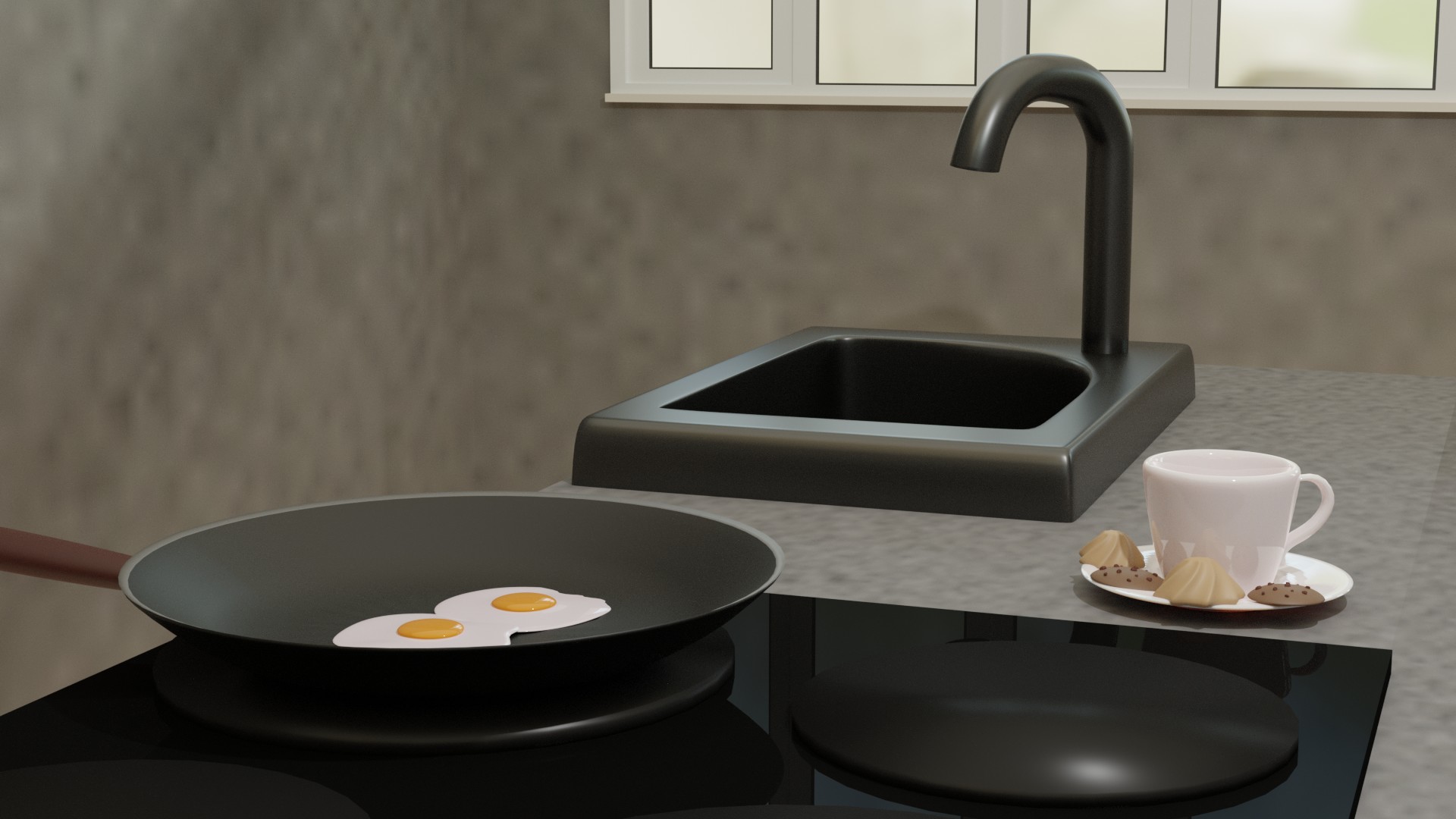
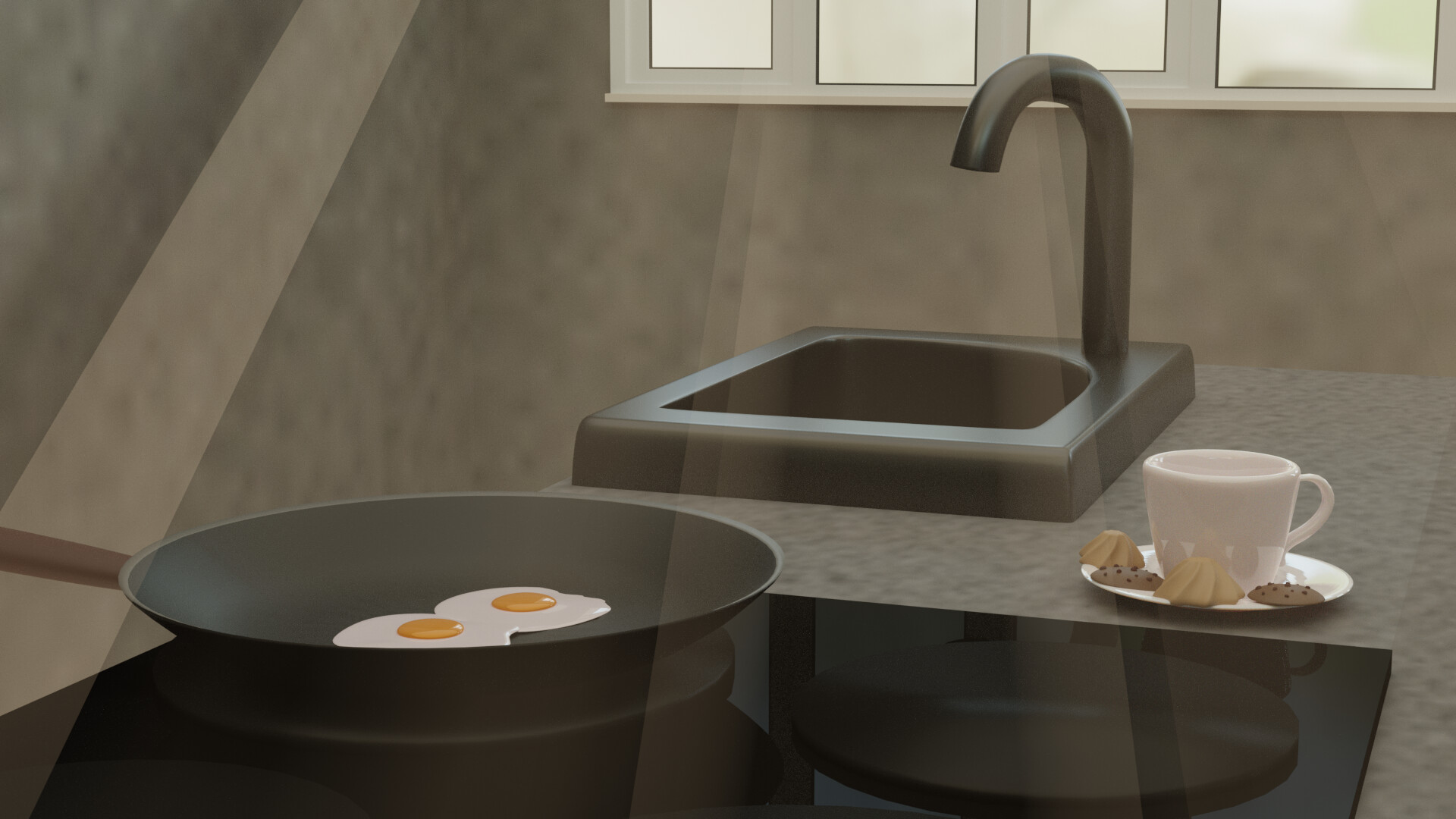
@consummatumest The simplicity of this makes this scene incredible. I love the tea, and the eggs are presented very nicely. Phenomenal job!
All and all, everyone if you guys did great, and you all should be proud of yourselves!
Very nice entries this week - good luck to all
@benu Congratulations for your beautifully crafted food scene. It’s not only well modeled and textured. But also the composition is very good. Rule of thirds. Subject in the middle, well lit (and focused). And the other objects gives meaning to the story of the scene.
- Gordon - So much details in model and texture. Great effort. My only concern goes to the background and floor. I think the contrast (black vs color) is too high. could use a subtle background.
- anastasions - So much fun in this one. Could easily been mistaken as a vector illustration. It’s an artistic choice for colors, but blue food means mostly spoiled food?
- Kzanna - so much fun this version of the Blender Guru donuts challenge. The next step would be to add a bit more natural material texturing (bun (bread), chocolate (glaze), sweets (sugar dust)).
- Willrun - Great progress! Nice scene build, love the tomato (or apple?). Try to improve the lighting. Maybe auto correct image in GIMP, Photoshop, Krita.
- consummatumest - Nice experimentation of the sun beams. I think they need to be more blurred. Could be done with post processing Blender set up. I little study, on your own, on this tool will improve your Blender skills. I think the wall and table are blending in too much.
- Joey_Cuevas - Good starter. Put some additional time in texturing the details (chair, cake crumbles, dirt on the knife). All these items are also part of the scene. And makes it more believable. The camera points to the cake as centre, and not the scene of cake eating.
- KatoSan - Fun idea, and also the way your created the black and white drawing. While a lot looks 3D the wall and floor are a bit flat. Improving this with a ‘bump-map’ could enhance the total scene.
- Tyger2 - I like the approach of creating a different style. But I do think that the wall is too noisy. It takes too much attention away from the subject. I find this a very nice cartoon shade type.
Note: I don’t want to offend anyone for any reason. I try to write down positive ideas and visions that I have in my simple use of the English language. I am also sometimes more inspired by a particular subject or solution. I’m also learning from you!