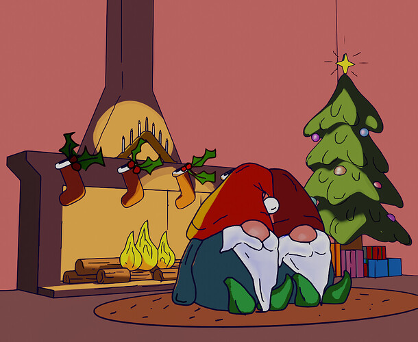
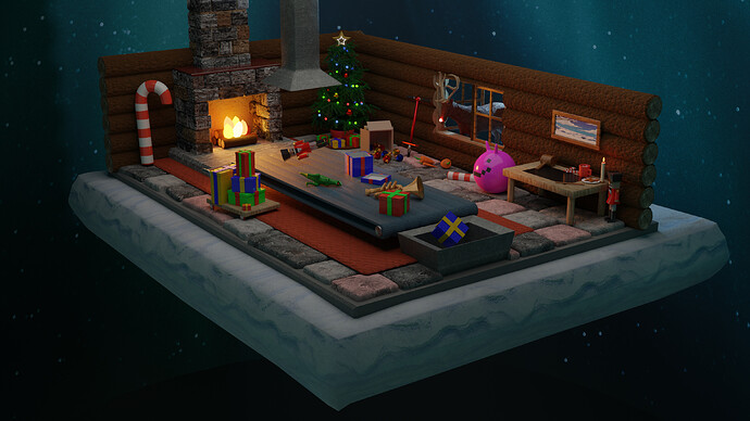
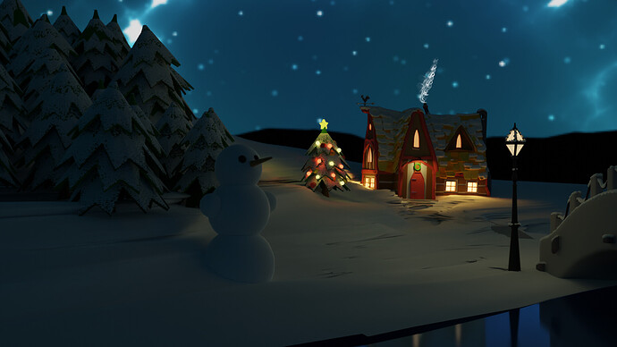
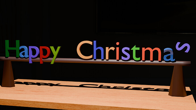
Wanted to try some grease pencil stuff. Here’s my Christmas Spirit Scene 
So much fun! 
Updated the video. Some small improvements/additions.
Great additions and improvements to the updated video @NP5 and I’m REALLY liking it . . . even more than I liked it before, if that’s at all possible. 
We @BlenderCollab have a few days to vote. You can vote fast but also think slowly about design, colors, technique, difficulty, subject, realism, etc. Choose consciously and not on your entry.
The new subject week 52 “Sun” has already started. The winner of this week’s “xxx” challenge may select a subject for next week 1 and win a badge.
0 voters
Oops 8) I fell asleep while the image was rendered. Cycles takes time, yes )))
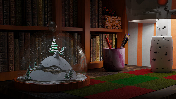
Soo… late for entry, but one never late to share their progress. thanks @FedPete for the advice, I think its better now.
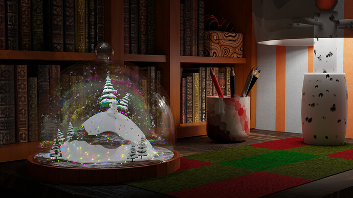
…and after posting it I remembers that I wanted to add christmas lights 
Hmmmm… Which one you like more?
I really like the second one with all the colours looks like the northern lights in there, very magical!
I really love these now in this new setting, both images are great, the colors make the second one look magical as described above and it’s so much fun. Thank you so much for still sharing these!
I like both versions, but am a bit partial to version 2, as it really shows everything well lit. 
Great improvement!
I like #2, but, as @Miss_B said, perhaps too brightly lit.
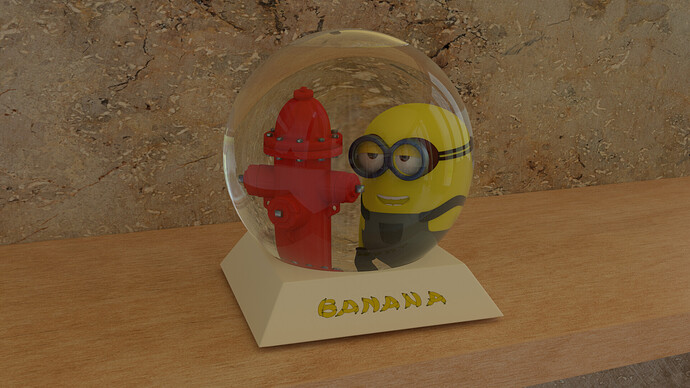
A glass dome is hard to do. Even more when it is a snow globe filled with fluids.
You avoided that, using a glass dome instead.
If I were making a snow globe, I wouldn’t use any liquid. I wouldn’t even think about it. Now I’m thinking that I need to do this in order to learn how to work with liquid 
Thanks! Looks interesting!
I really like the minion’s loving look
@DustyUnicorn Congratulations on your “Warm feelings” Christmas Spirit entry. And yes, with Grease pencil you can do amazing things. Nice color palet and composition.
- Jindrich_jungmann - Beautiful winter scene! It’s very nicely lit. I think, if you emphasized the snowman, using the lantern light more, the composition would be more equal in symmetry. Check also the scale size of the snowmen and lantern.
- jimmy - so much fun in this setup. Lots of details and ideas. Try to keep the same style for each object (textured vs plain)
- Kzanna - As discussed before, your last post’s improvements give a better presentation. I think the inner lights are too much. I understand the need for it, but may be differently implemented.
- NP5 - Mastering animation and hard work! - If you made the text more beveled (simple switch) and a bit reflective, you got more highlites and playfulness in the scene.
Note: I don’t want to offend anyone. I try to write down positive ideas and visions in my simple use of the English language. I am also sometimes more inspired by a particular subject or solution. I’m also learning from you!
