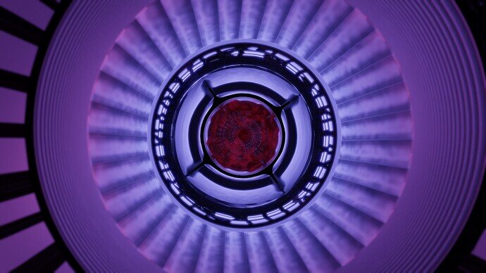
New version, slightly corrected and with new light. Still, lighting is difficult …
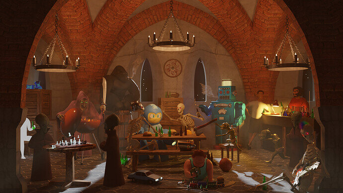
After Hours at the Undercroft
Spent way too much time on such a silly project, but it was too much fun! I’d like to go back and do even more, but I say that about every project 
 .
.
Great reuse!
Did you had any issues about scaling en textures going wrong?
Much improvemen, well done!
Great scene. It reminds me of the paramount commercial with all the characters talking to each other. I like the car and the toy train. And of course your robot. It all fits together so well.
Good thought!
@FedPete yeah there were some scaling issues, but I had more trouble with particle hair. The length of the hair doesn’t seem to scale with the scale of the model.
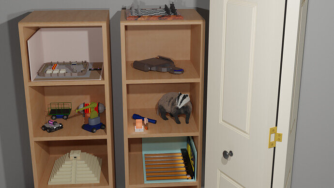
@GameProgrammer2k thanks! I like the robot too. I think it’s probably the best standalone model in my scene. I like your scene too. The addition of the door is nice to give it more context, but I feel like with the current framing, the door is being given equal importance to the shelf, which I think is the real focus.
@Kzanna I like how your assets fit in together. They are different from each other, yet have a cohesive style. The lighting in the second image is a definite improvement.
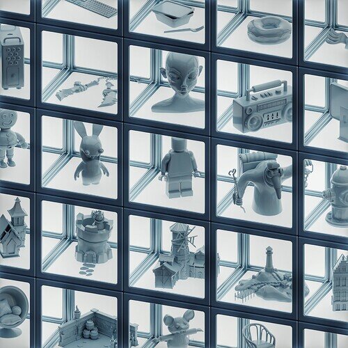
@zeRgenTa I saw from the file name that it’s a space dock, but it seems more abstract to me. But I think that’s cool. Could be a lens, could be a portal, could be a space ship. My only issue is that the most interesting part (the middle bits) are too small and a little difficult to see.
We @BlenderCollab have a few days to vote. You can vote fast but also think slowly about design, colors, technique, difficulty, subject, realism, etc. Choose consciously and not on your own entry.
And the new subject week 6 “mushrooms” has already started. The winner of this week’s “mushrooms” challenge may select a subject for next week 7 and wins a badge.
0 voters
This weeks congratulations goes to @anastasions and @Tyger2 for their wonderful presentation of assets from previously created projects. Anastasions did it in a stylish way, with an eye for detail (same sort of presentation for all objects). Tyler2 has a beautiful composition, where you keep looking and every time you see something new. A really playful scene.
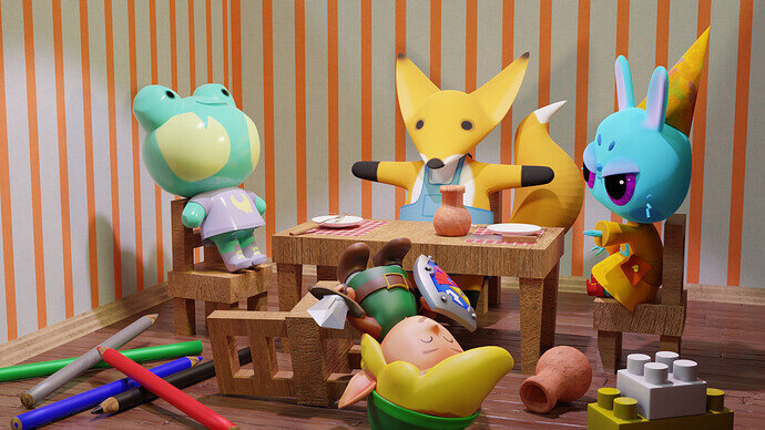
- Kzanna - Welcome, I’m glad you’ve improved the lighting. It’s a good scene. Lot’s of fun details, we hope to see more from you.
- GameProgrammer2k - It is a good improvement to add a door to give more context to the scene. Try to improve the lighting (softer shadows, experiment with HDRI, or world lighting)
- zeRgenTa - Love the colors and textures, but I miss a bit of recognition of old assets …
Note: I don’t want to offend anyone for any reason. I try to write down positive ideas and visions that I have in my simple use of the English language. I am also sometimes more inspired by a particular subject or solution. I’m also learning from you!

