
Good thought!
2 Likes
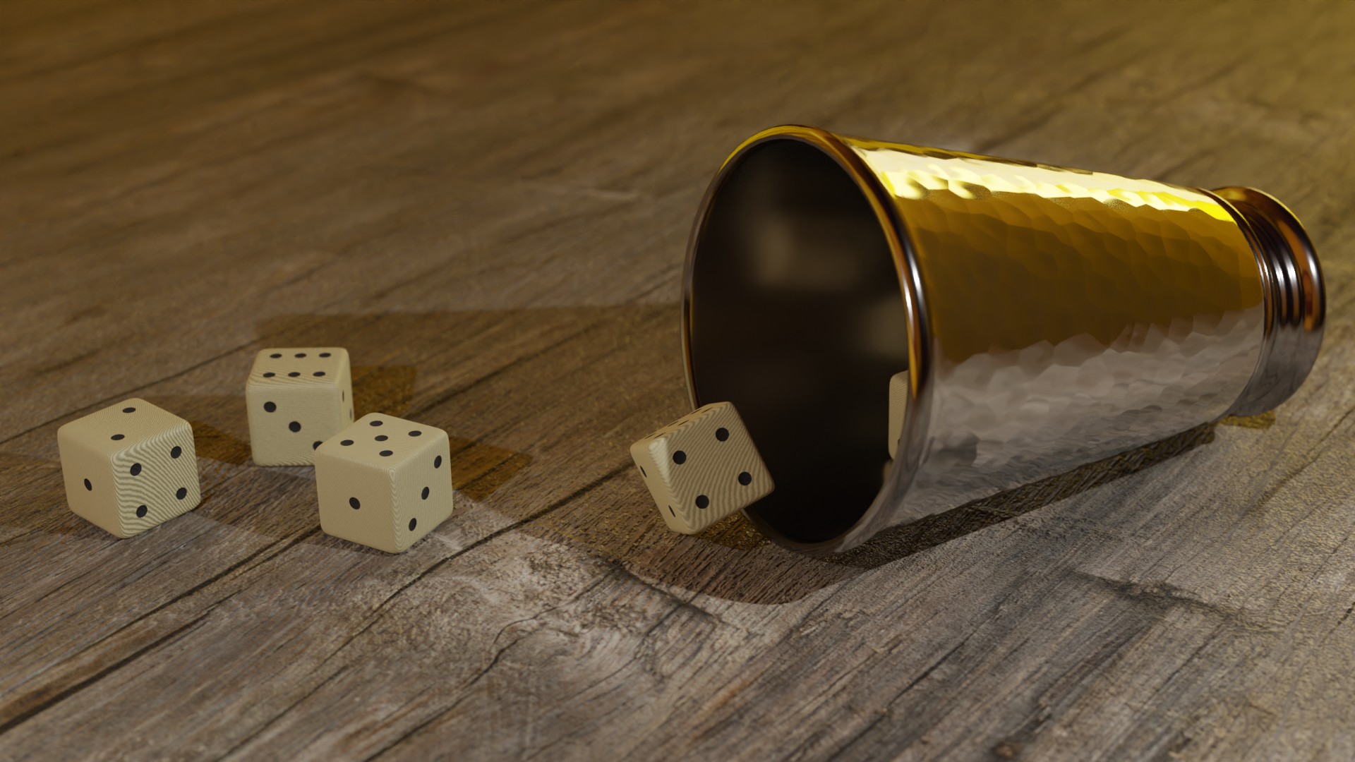
Nice work on the textures. I especially like the cup.
3 Likes
Thanks. I was rather pleased with managing to make that hammered effect, procedurally too which I rarely use.
3 Likes
I like it. The dice are cool too, but I feel like the dots should be recessed inward, concave like. Depends on the type of dice you’re going for, of course.
1 Like
Actually, they are recessed but the black is not letting it show.  Meant to be bone or ivory as old ones were likely to be. So burnt black hollow dots.
Would show if I made the dots a paler red or green or something.
1 Like
Don’t do mushrooms kids, you’ll forget your hat somewhere and you do not want to be on the mean streets of the mushroom kingdom at night
10 Likes

Nice update. The glowing green makes it pop!
1 Like
I always appreciate getting feedback on my work, so I’d like to do the same for you guys too. Some of you I already mentioned, but here’s for the rest.
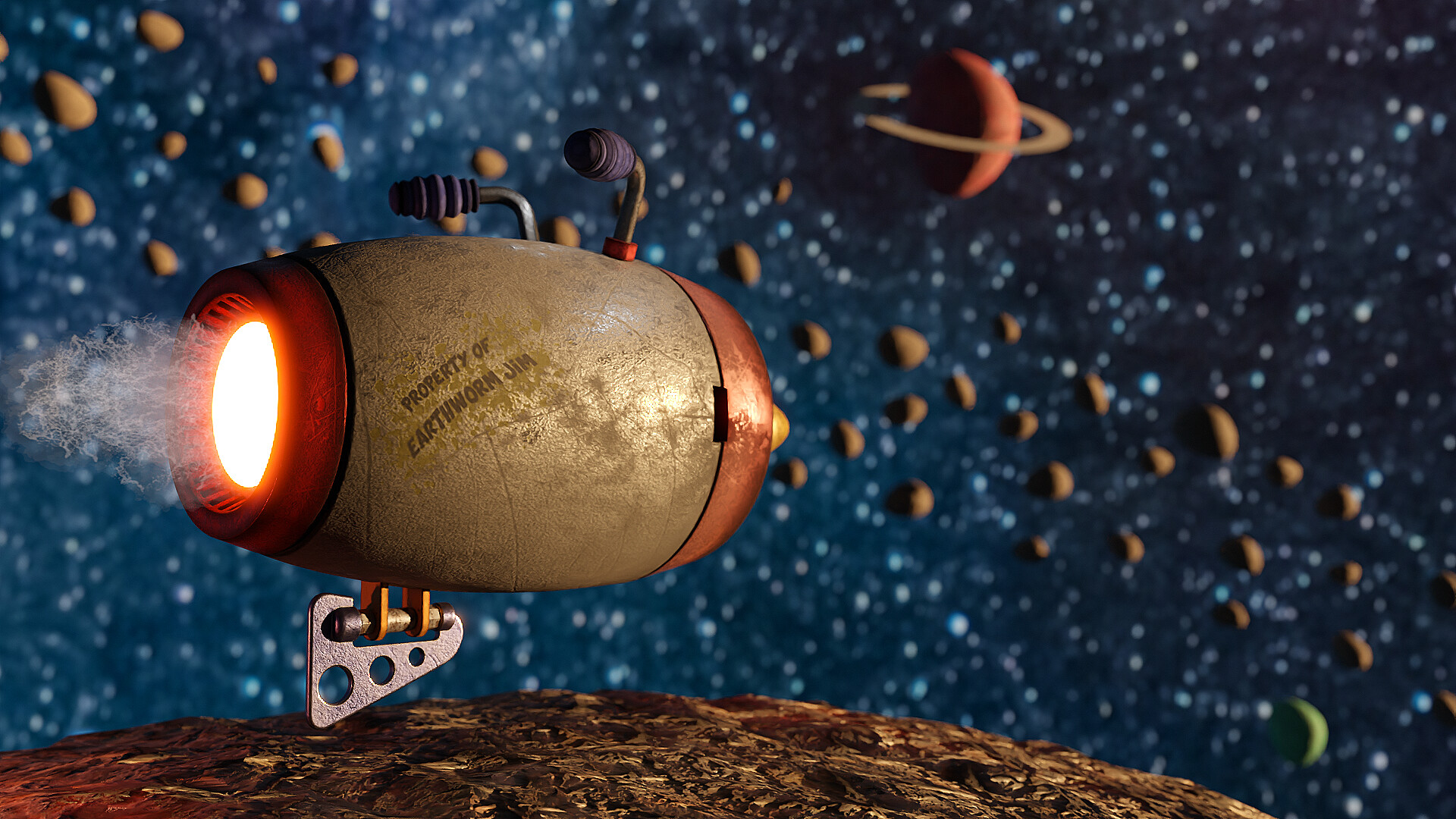
@3DE_Study Nice updates. The background objects fill out the frame without distracting from the foreground. I also like the textures, especially the body of the vehicle. The fumes/trail coming out of the back look cool too, but could maybe use an emission? Not sure if it makes sense but I feel like it should be a bit brighter.
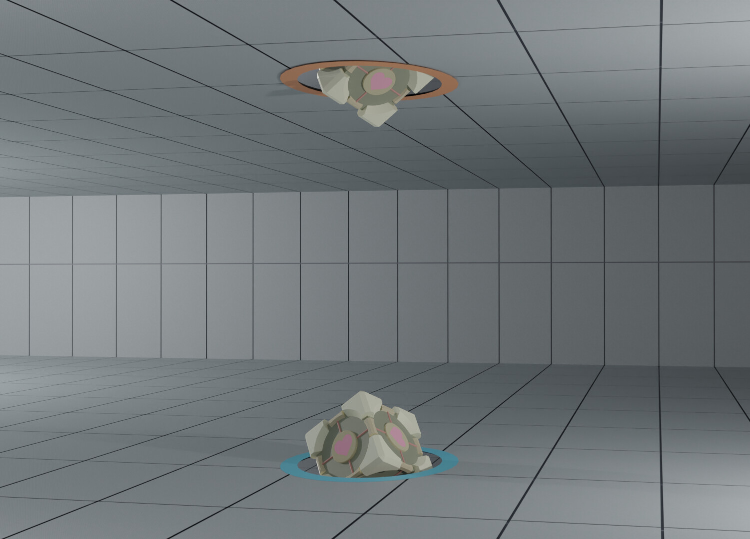
@Michael_Legrande Nice job on the cubes. I think there might be a way to situate the floor and walls in such a way to draw the eye to the portals/cubes. Some emission on the portals might be nice too, to make them glow. Great job on your first scene! Hope to see more entries from you.
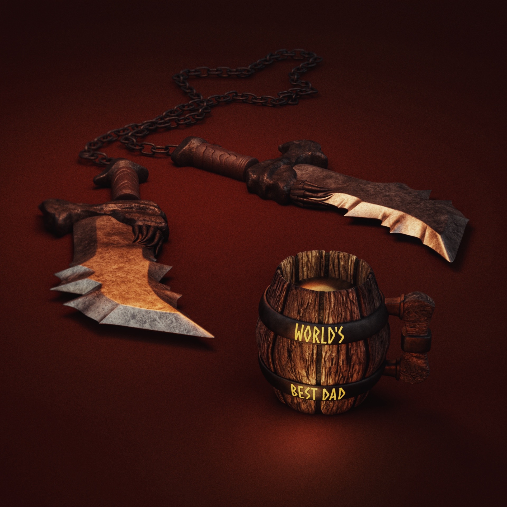
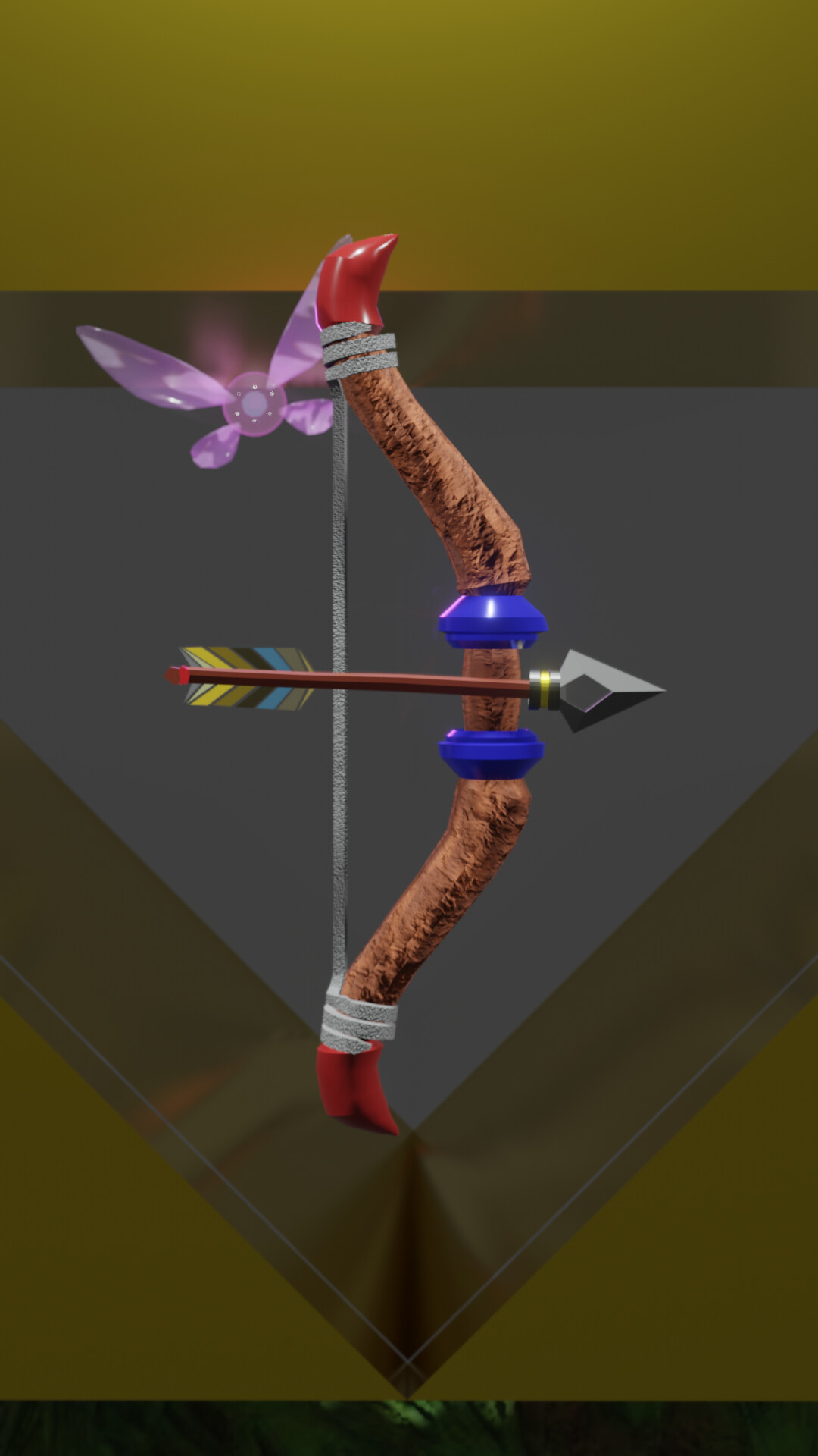
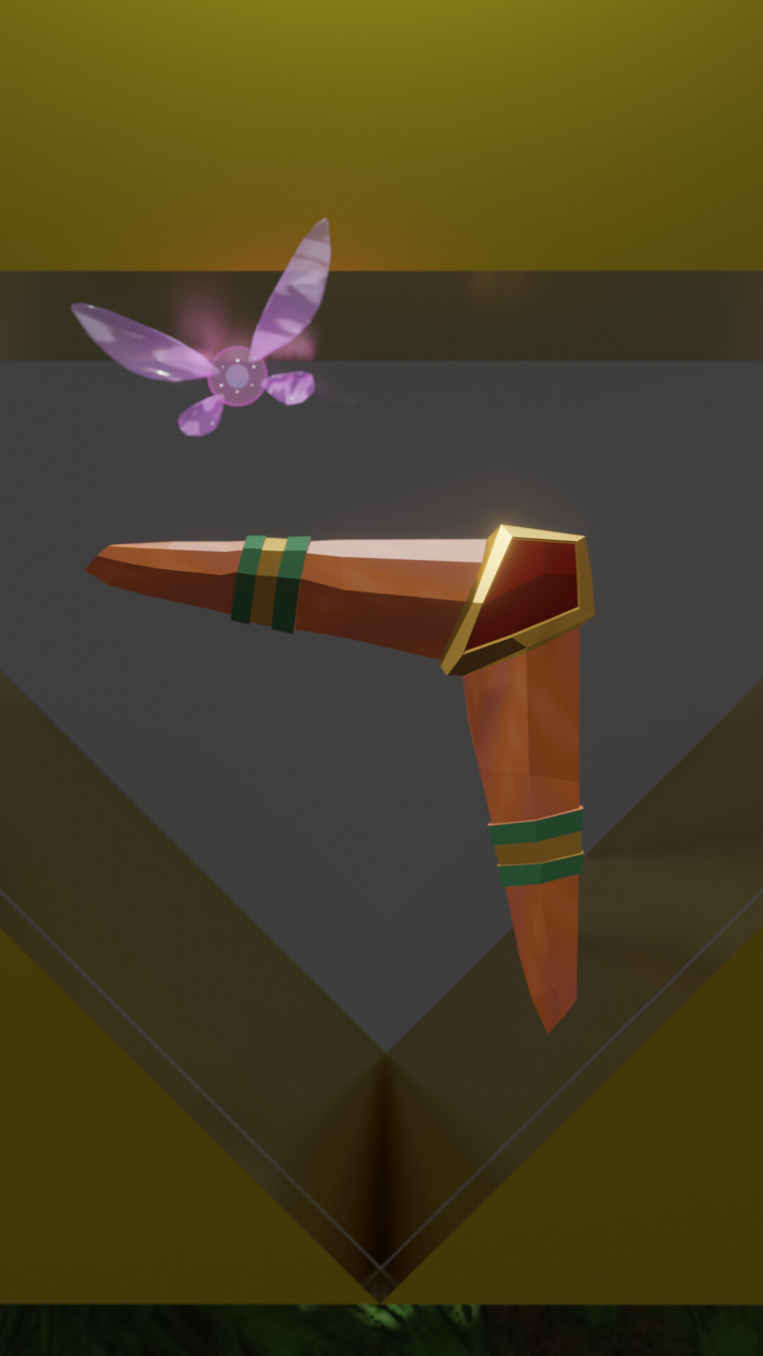
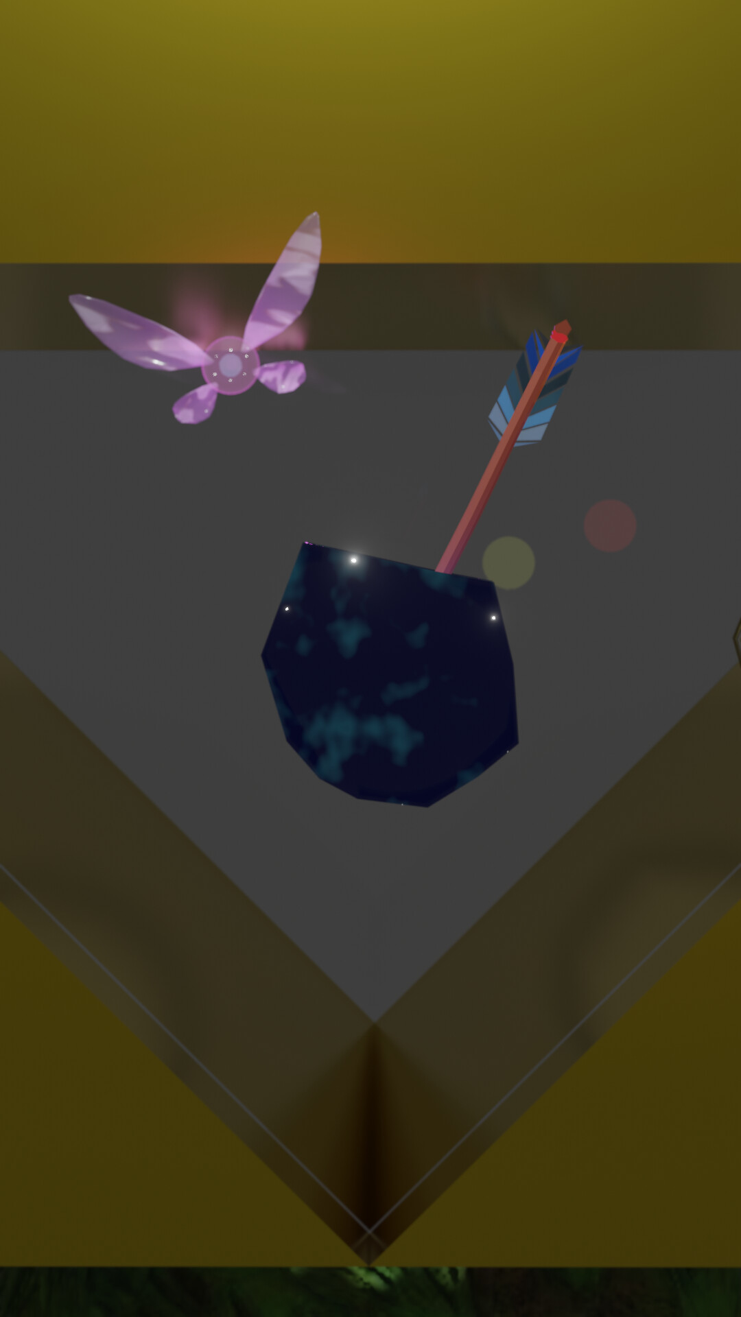
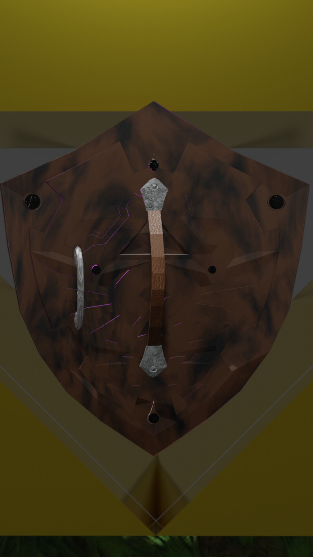
@anastasions this is a very nice blend of stylized and photorealistic. I’ve struggled to find that balance. That mug  . I can’t think of much to improve on here, other than I might like to see the blades in the foreground. Nice work!
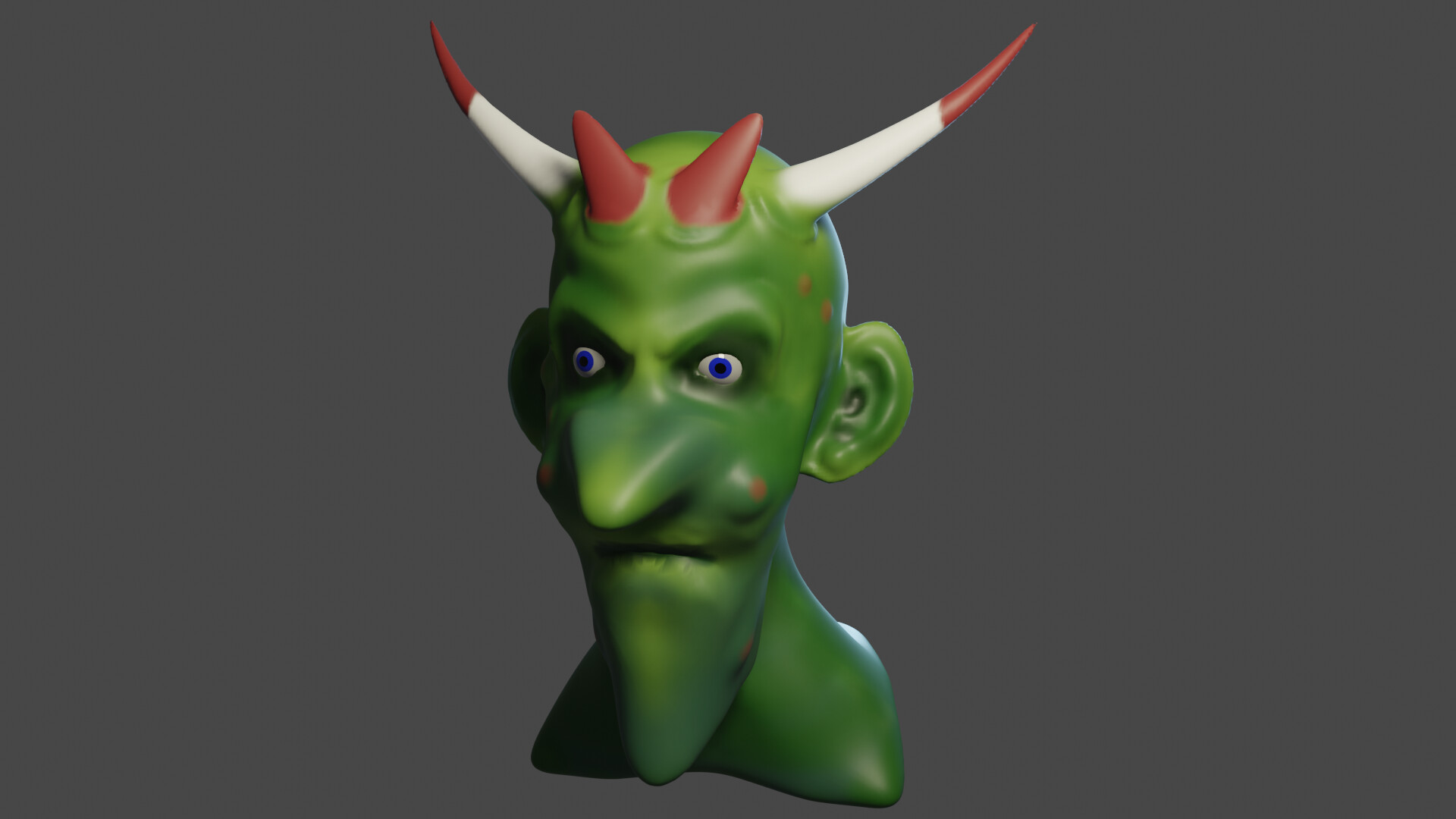
@Iffan_Morasilp Nice ogre! I haven’t gotten that far in the character course yet, so I don’t have much feedback for you there. But I like it. Keep it up!
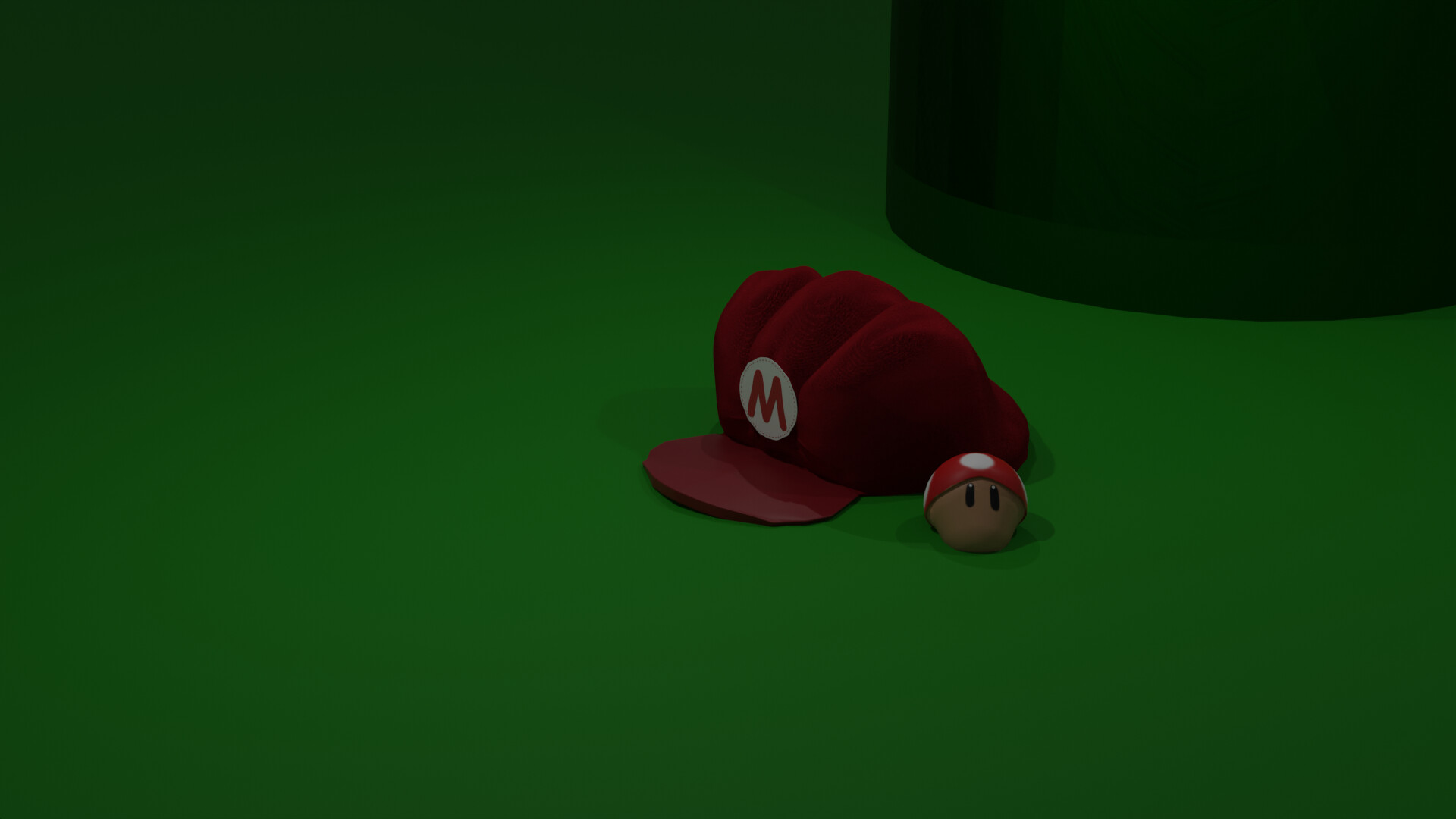
@Willrun I like the cap and the mushroom. Maybe bring the camera in a bit more so we can see them better? Now the image is mostly green background.
Just my opinions here. Do with them what you will. Cheers 

6 Likes
Updated the exhaust. I appreciate the feedback. This actually enhances the sharpness of the image which I did not expect. Thanks again! 
2 Likes
7 Likes
Nice but which one image is the entry?
2 Likes
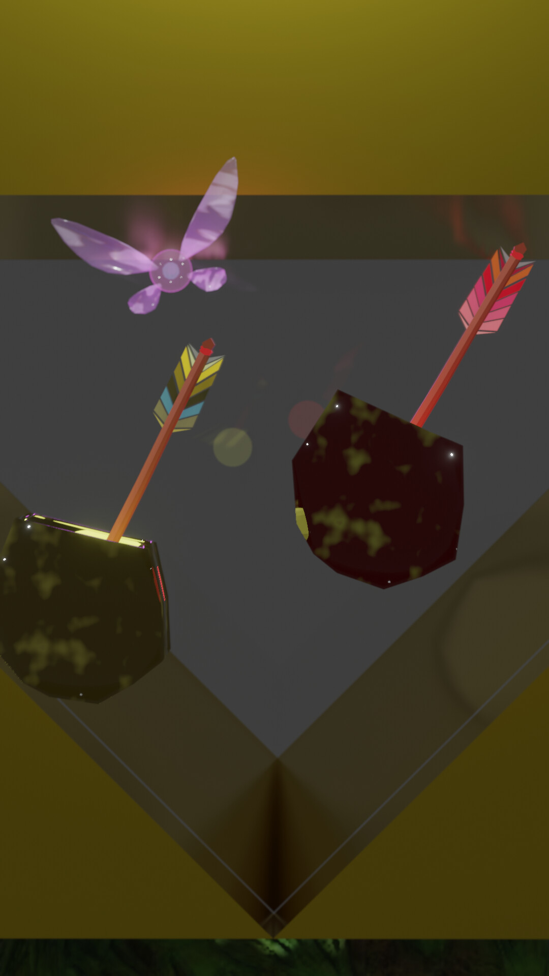
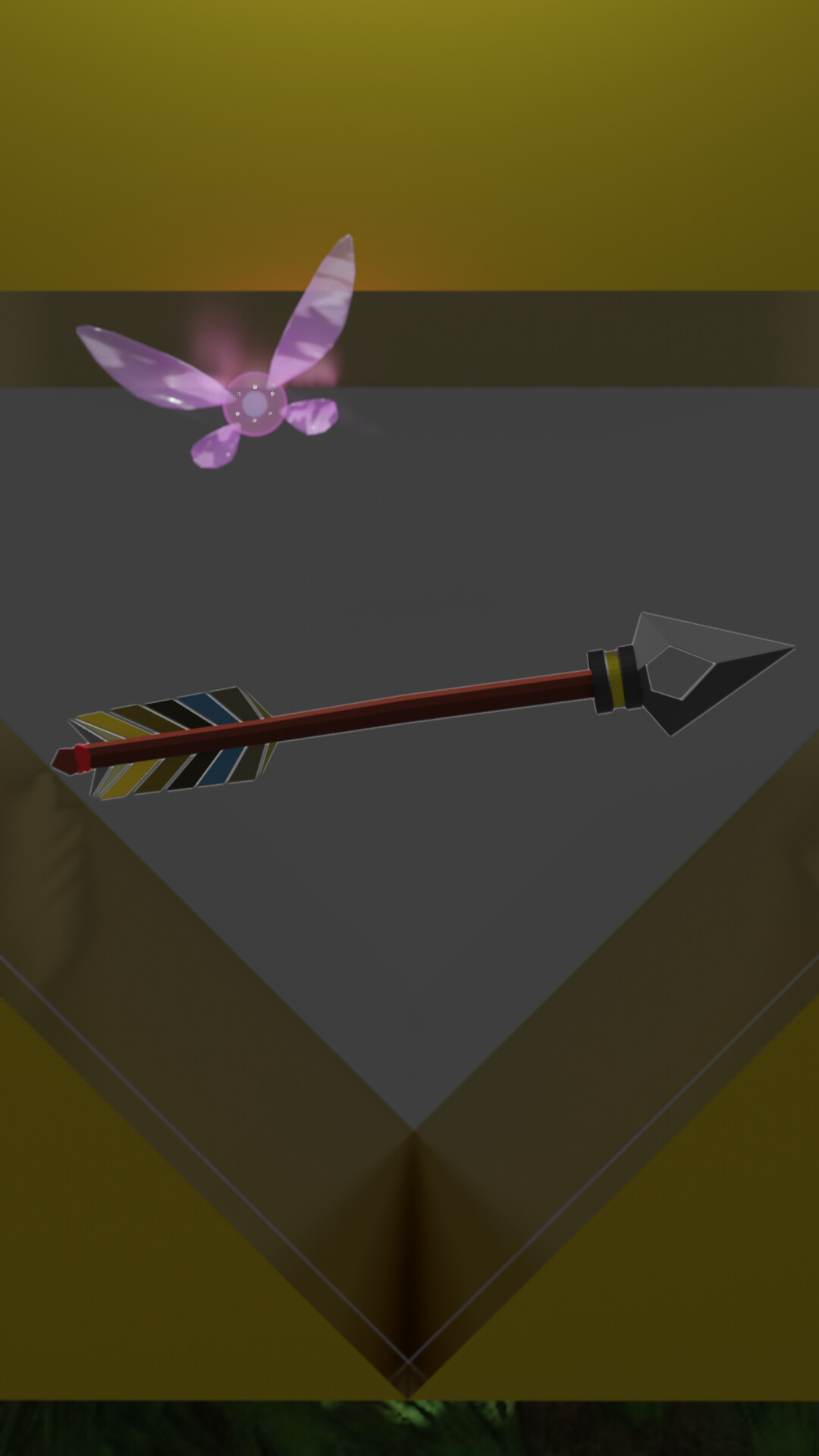
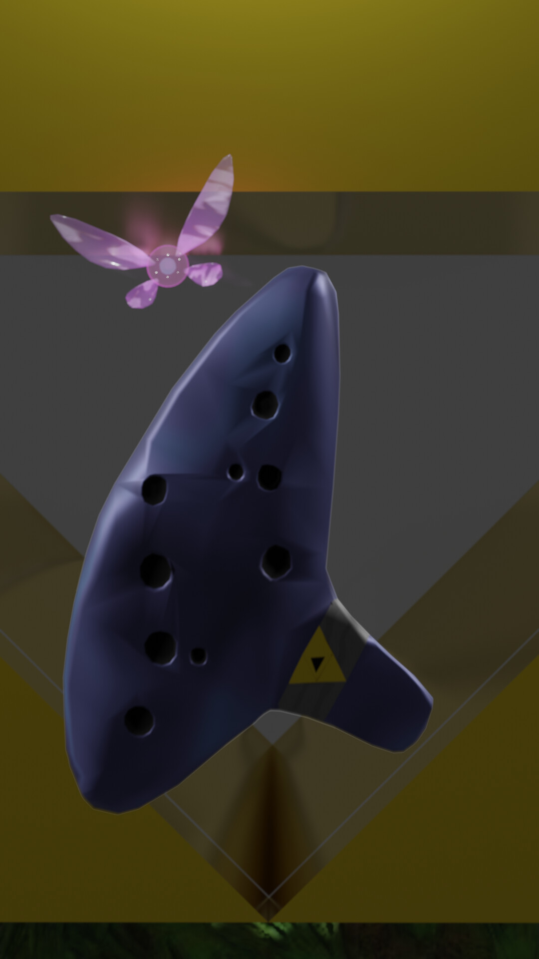
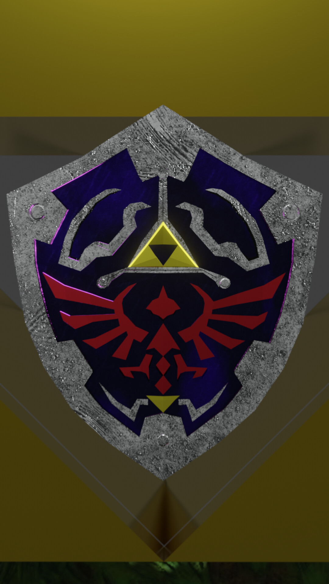
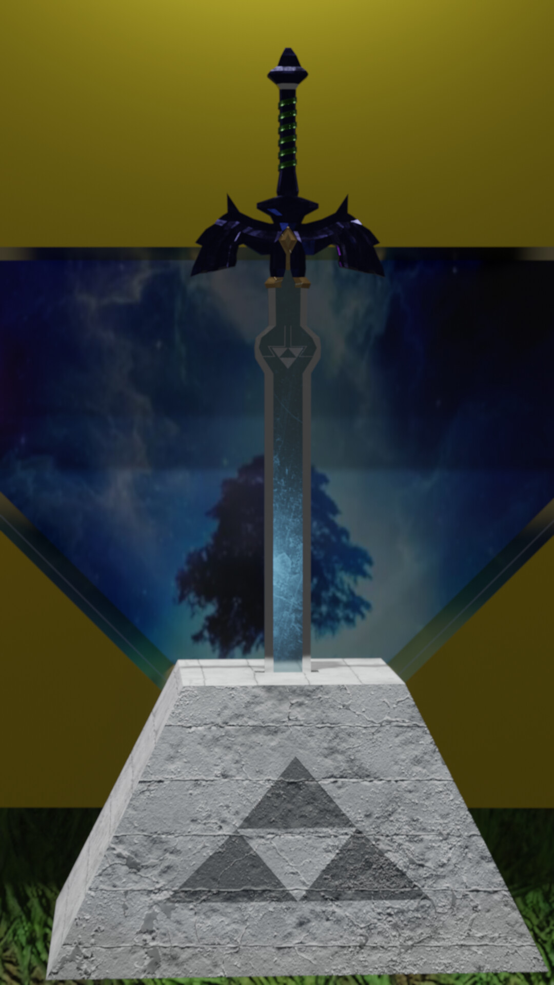
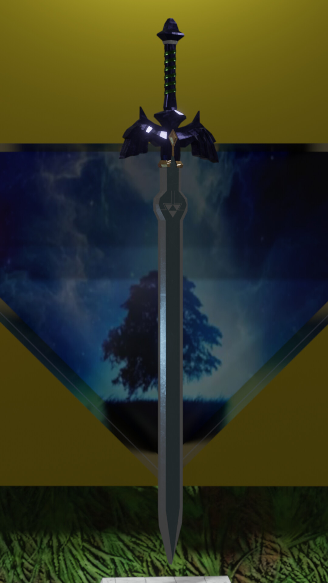
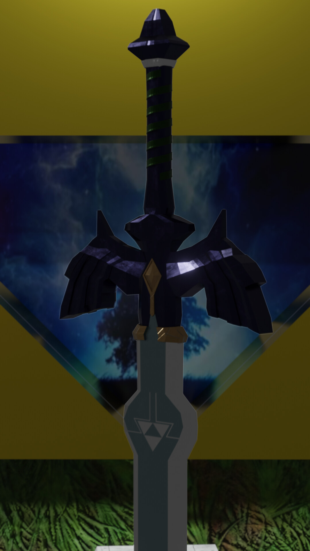
Hello, thank you, sorry, I thought I wouldn’t have time, so I believe the image will be eevee9.png, the one with master sword with pedestal.
3 Likes

We @BlenderCollab have a few days to vote. You can vote fast but also think slowly about design, colors, technique, difficulty, subject, realism, etc. Choose consciously and not on your own entry.
And the new subject week 5 “Asset Archive” has already started. The winner of this week’s “Game related” challenge may select a subject for next week 6 and wins a badge.
Game related
0 voters
2 Likes
This is a tough choice. Really good entries this week. Nice work everyone!
5 Likes
@anastasions , congratulations on your beautiful composition of game-related assets. Such a nice blend of materials, textures, and colors. The little text on the mug gives immediately a sort of funny game context. Well, thought-out scene!
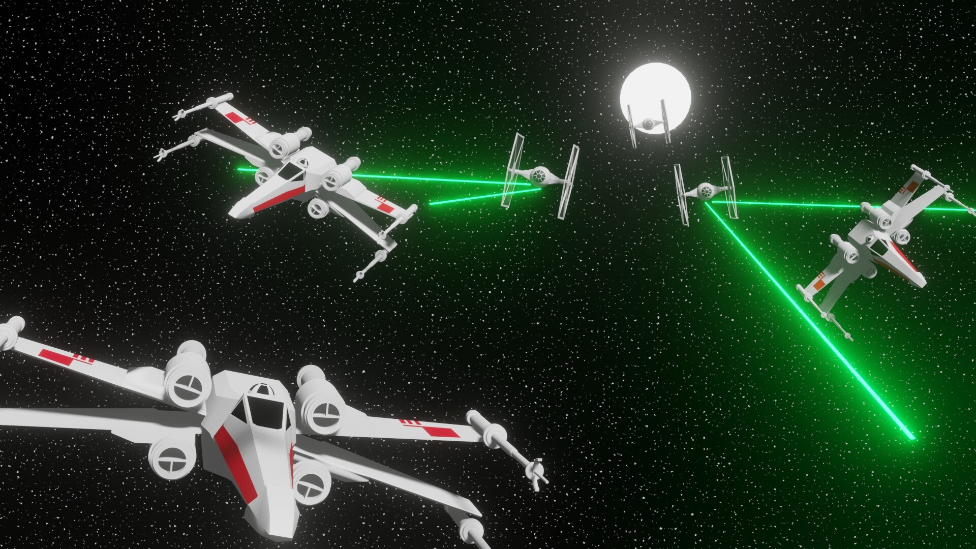
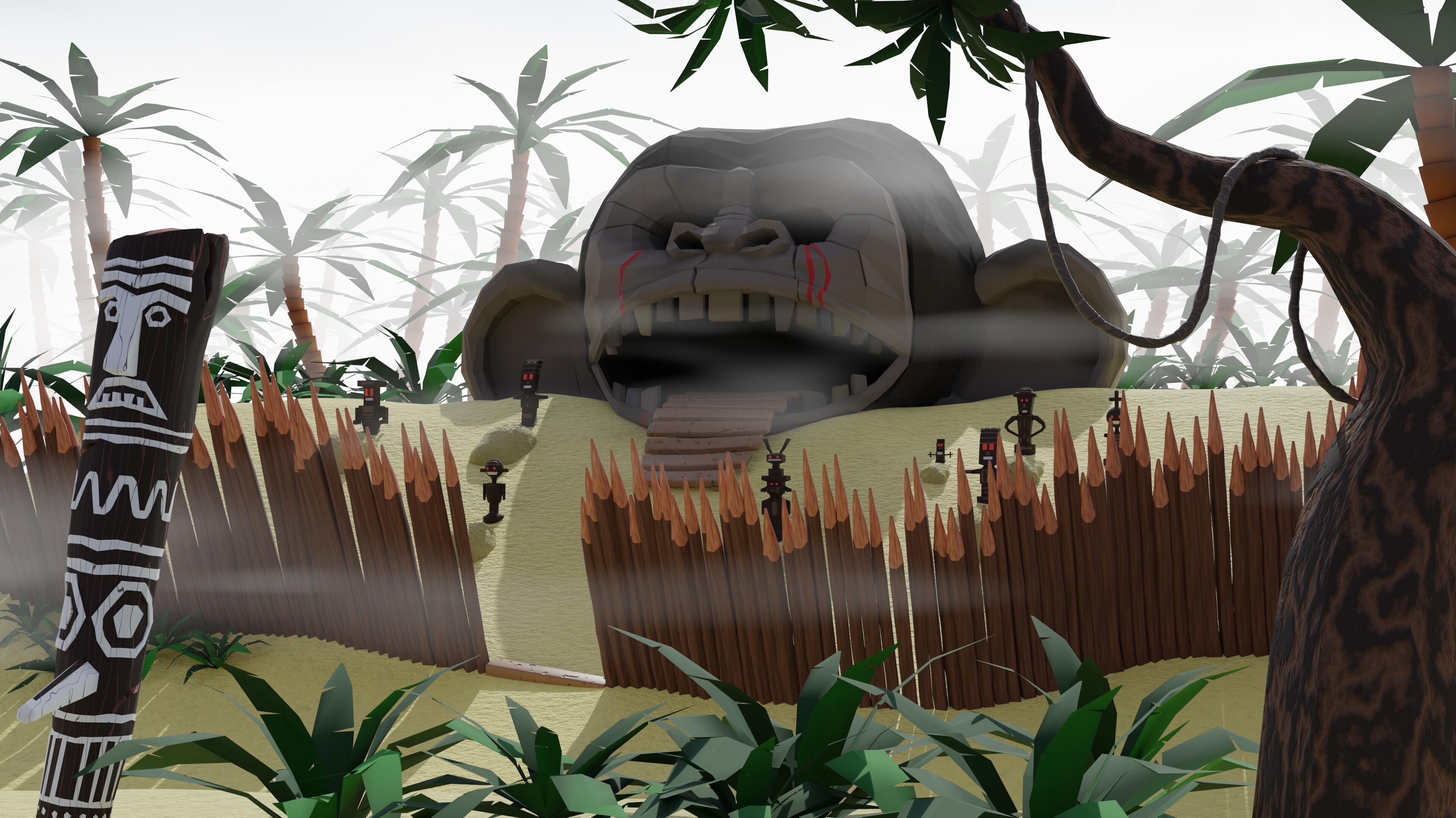
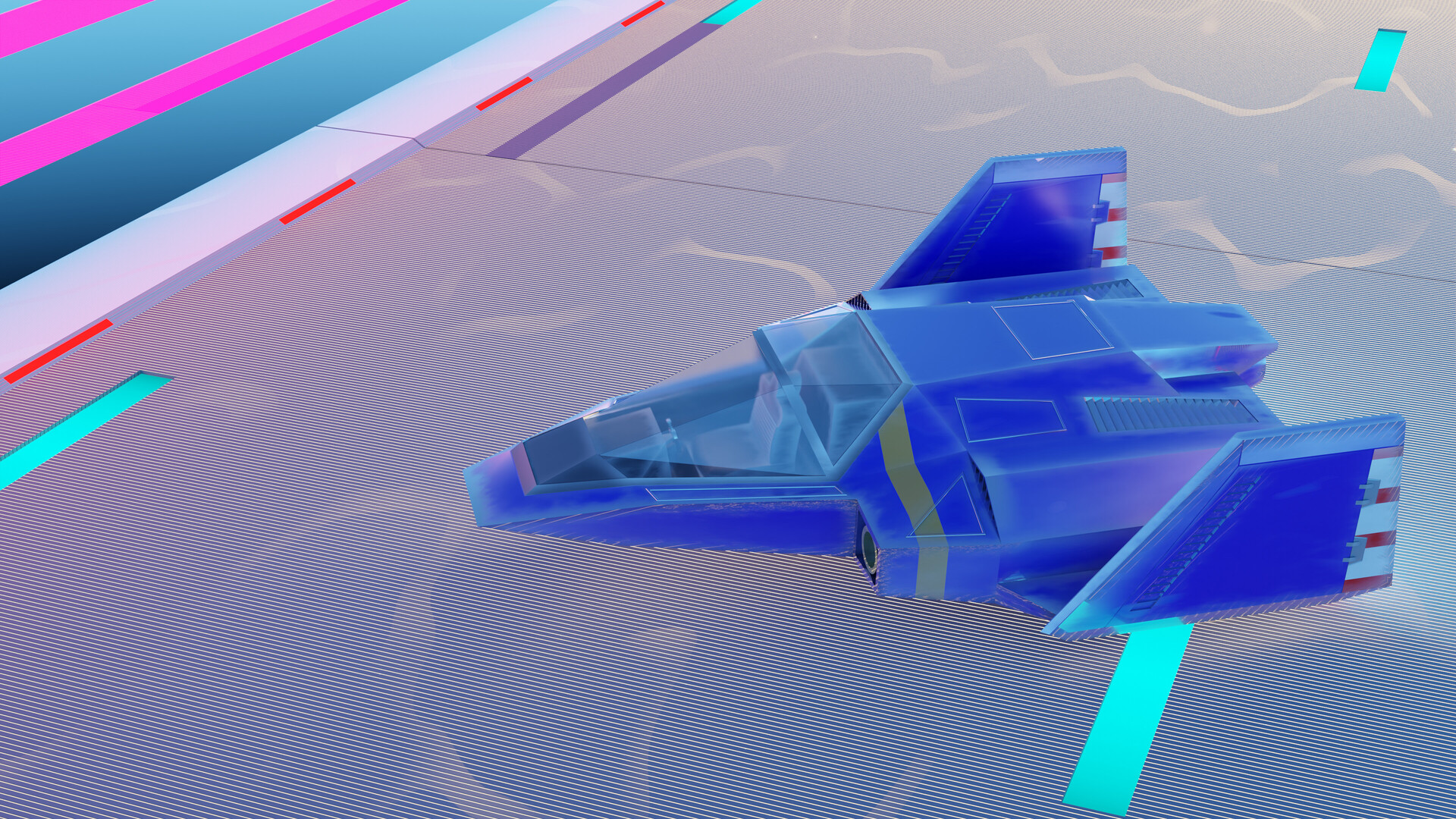
- Tyger2 - I didn’t know about this game (there are so many), but seeing it does give the feel of a game. I like the difference in style between the background and asset objects.
- 3DE_Study - I miss Jim? I expected to see a more cartoon-shaped illustration. But his bike is very recognizable.
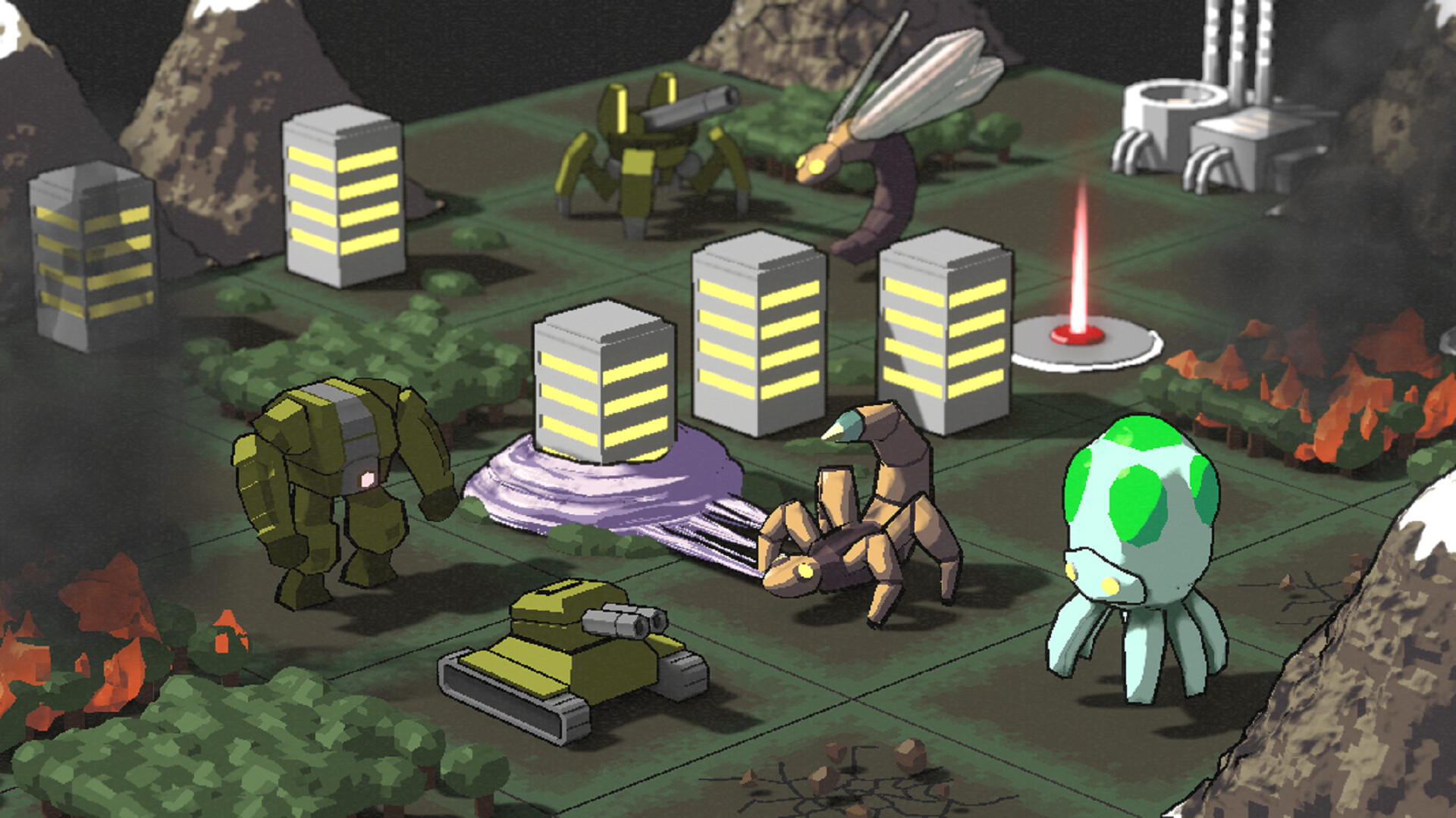
- Gordon - Good reproduction! Difficult to match the low resolution and simple color palette. I still like the purple palette.
- Joey_Cuevas - Great shading and material (very distinctive). If you don’t know the game (I do), then I miss more environmental details.
- NP5 - Love the way you did this. I immediately thought of metal shininess reflection from the cup on to the table. Making it more 3D special effects.
- kidgobur - A nice set of game assets. Unfortunately, we only use one illustration. If you were able to combine all those assets into one image, it would be a great promotion.
- DANB1 - Very recognizable. But I think it’s more movie related (although there are games). A bit of motion blur could give more speed to the scene. Or camera focus …
- Willrun - This one is nice. Add more scene details and or zoom in.
- Iffan_Morasilp - Great implementation of Grants lessons. Adding others makes it more Game related.
- Michael_Legrande - Also very recognizable. Try to make the environment more interesting. By adding more details, light points, tubes, gravity, signs, etc. Details!
Note: I don’t want to offend anyone for any reason. I try to write down positive ideas and visions that I have in my simple use of the English language. I am also sometimes more inspired by a particular subject or solution. I’m also learning from you!
7 Likes
Hello! Following the tip, I made an animation putting the items together, I posted it in the display section. Thanks for the feedback!
2 Likes