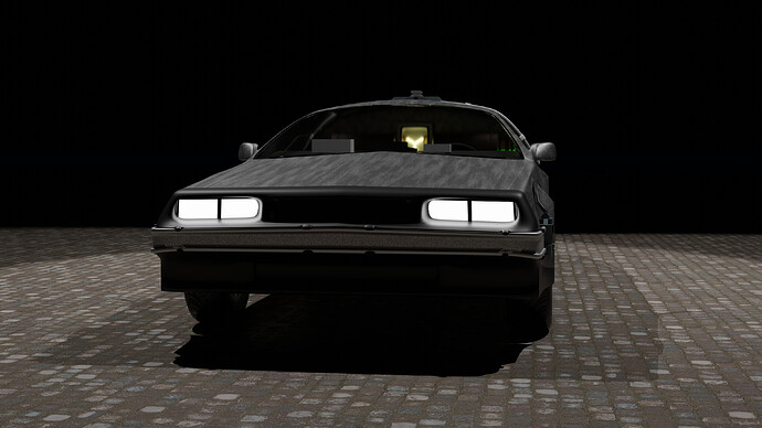
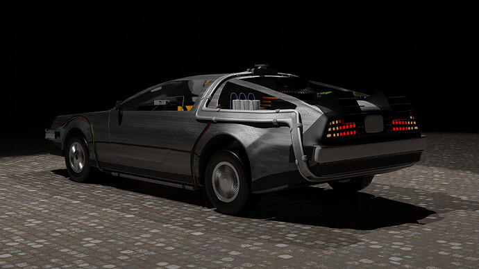
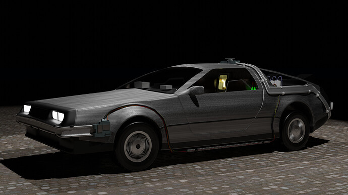
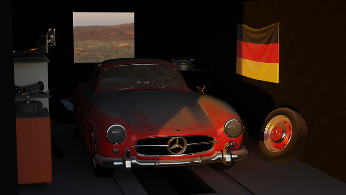
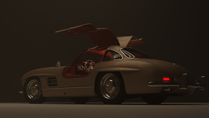
Maybe lowering the camera, because from persons point of view it could be the same height as the car.
I spent too much time detailing and too little composition.
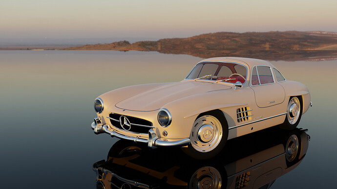
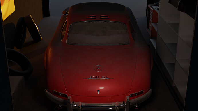
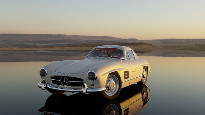
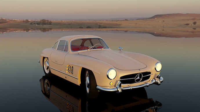
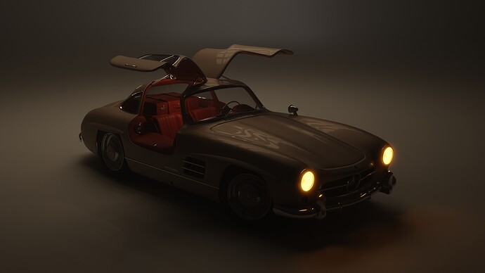
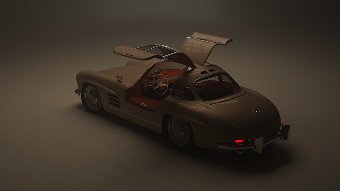
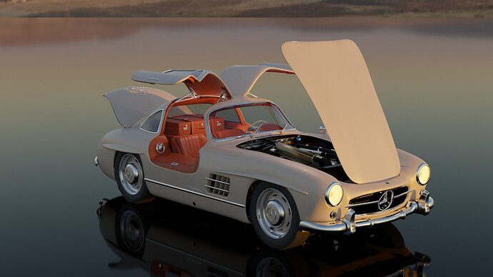
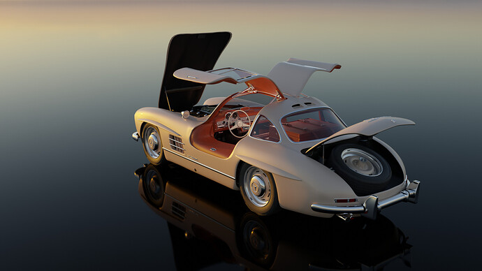
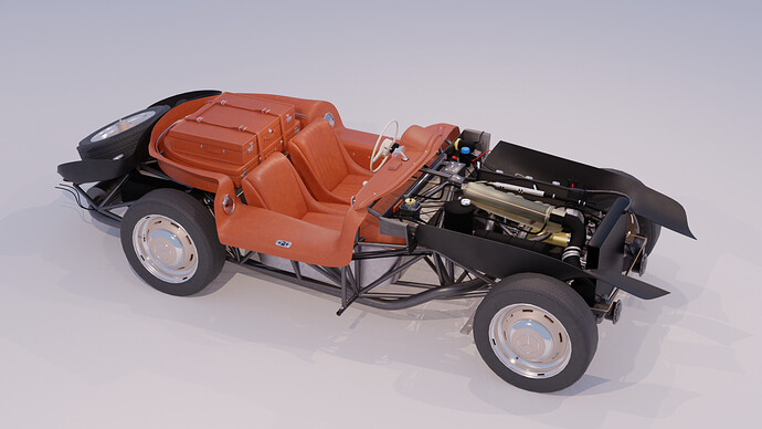
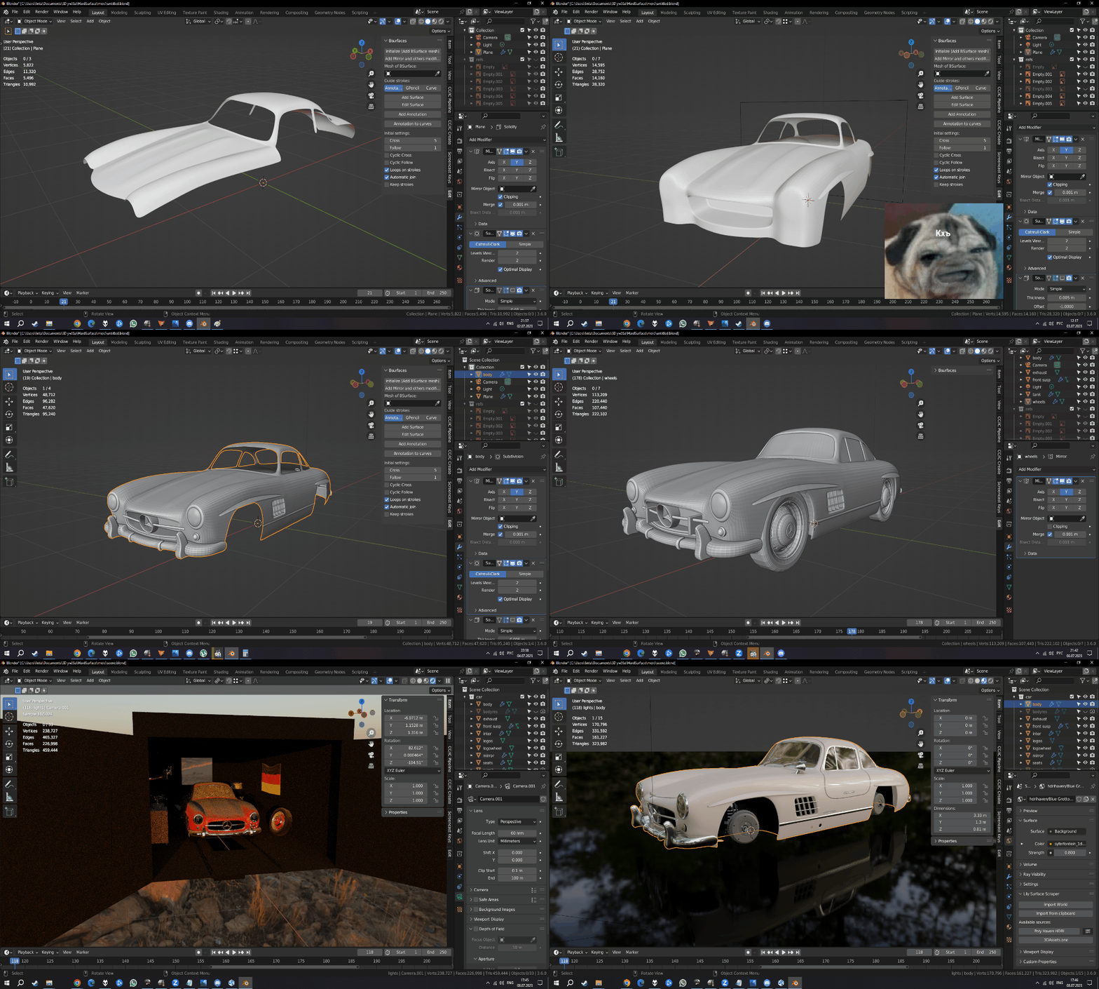
I chose this Mercedes impulsively. I just wanted something rounded to practice with the subdiv and 300 SL just came to my mind. I worked on it for 15 hours, created extra suspension, but a very simple interior, even without textures. The only texture here is the Mercedes badge. The rest is mesh.
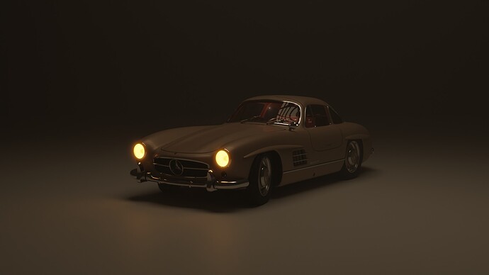
I created the scene in the last hours, but then I realized that it looks too dark.
Therefore, I made the second version - a mirror and a beautiful HDR, always a simple but beautiful composition.
I don’t know which one is better (I like all of them), but I’ll probably give the first one to the competition.
WIPs:
Please, give attention to your entry. I will pick the last image uploaded!


We @BlenderCollab have a few days to vote. You can vote fast but also think slowly about design, colors, technique, difficulty, subject, realism, etc. Choose consciously and not on your own entry.
And the new subject week 28 “Fantasy weapons” has already started. The winner of this week’s “Classic cars” challenge may select a subject for next week 29 and wins a badge.
0 voters
I didn’t have the intention of having mine voted on as it wasn’t created this week. I explained why in an earlier post. Thanks anyway.
To be honest, I don’t read all the posts carefully.
If you want to show your work, but not participating, it is best to create a new topic.
With a link in this Collab post.
I think we all use old projects and revive them in a new Collab. Or reusing old assets from previous work. It’s all about learning.
does it even works?
Of course! You strand inside it and run.
It was soooooo hard to chouse! In the end I went with color I liked most  sorry not sorry…
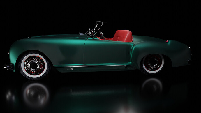
@Lintari you’ve won the Blender Collab “Classic cars” with a beautifully staged scene. The model is excellent but it’s like a presentation in a glossy car magazine.
I think this subject was a popular one. Making streamlined shiny models, we all like to do this. It shows us also that the presentation of the subject is important. keep this in mind for further projects.
Overall the models are very good. The difference lies in the presentation.
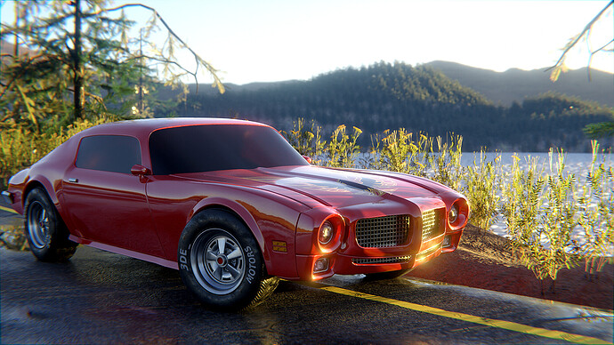
- 3DE-Study - Nothing wrong with your model, textures, and lighting. I looks realistic. But it misses the “Glossy magazine” feel.
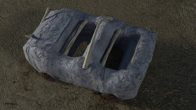
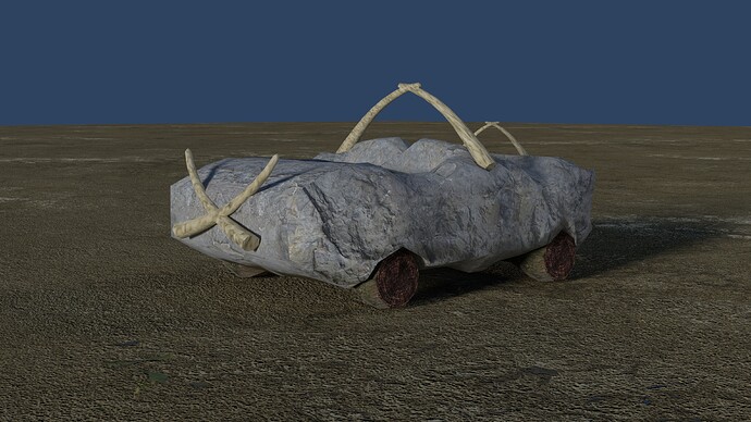
- NP5 - So much fun. I didn’t think of that one. Otherwise, I would have participated. It could use more visual stories and other stone-age assets. It has the potential of a funny cartoon.
- Kzanna - It’s a good start. I do miss the final touch like smoothing out the body works. And the wheels.
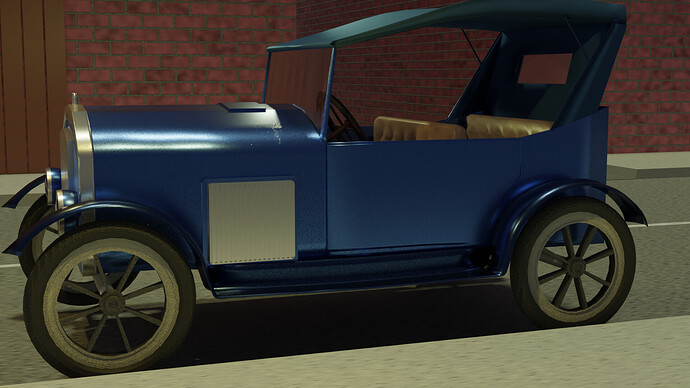
- Willrun - Excellent model. I miss a bit of authenticity. Those cars (to my knowledge) were only sold in black. Adding a street light(s) and a darker environment will also block the need to fill in the background. But we all know, for some projects one week is not enough.
- consummatumest - Also a very good model and material. Lots of tiny details. I do though miss a door handle …? I could improve the presentation of the project. Now we can’t see (part) of the front of the car. which took a lot of time creating it!
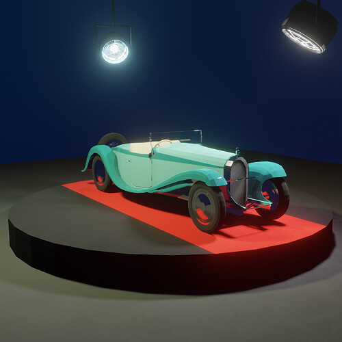
- Joey_Cuevas - This is truly a classic car. very recognizable and rich in details. Presentation-wise it could be improved. There is a harsh shadow on the floor. Most car salons will use many lights to emphasize the curves and shape of a car. It is still a good project.
Note: I don’t want to offend anyone. I try to write down positive ideas and visions in my simple use of the English language. I am also sometimes more inspired by a particular subject or solution. I’m also learning from you!
Vey good complete with luggage in the back!
Great model, but I miss some light in the viewer’s front.
Most light come from top.
@NP5 Thank you! I just love small details, and branded suitcases are in almost every 300SL.
@FedPete Yep, that was an idea, I just liked the low dim lighting.
I have some light renders
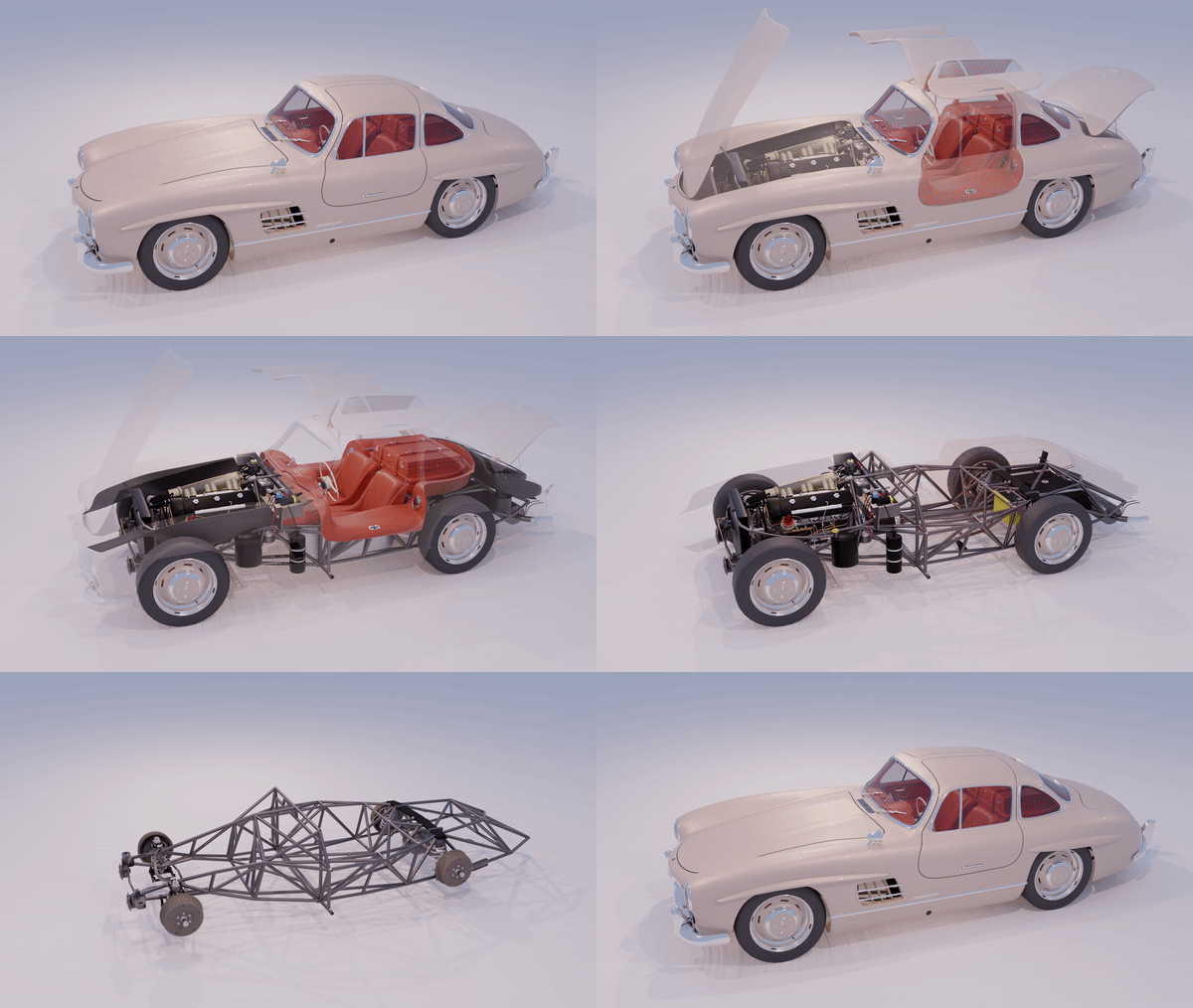
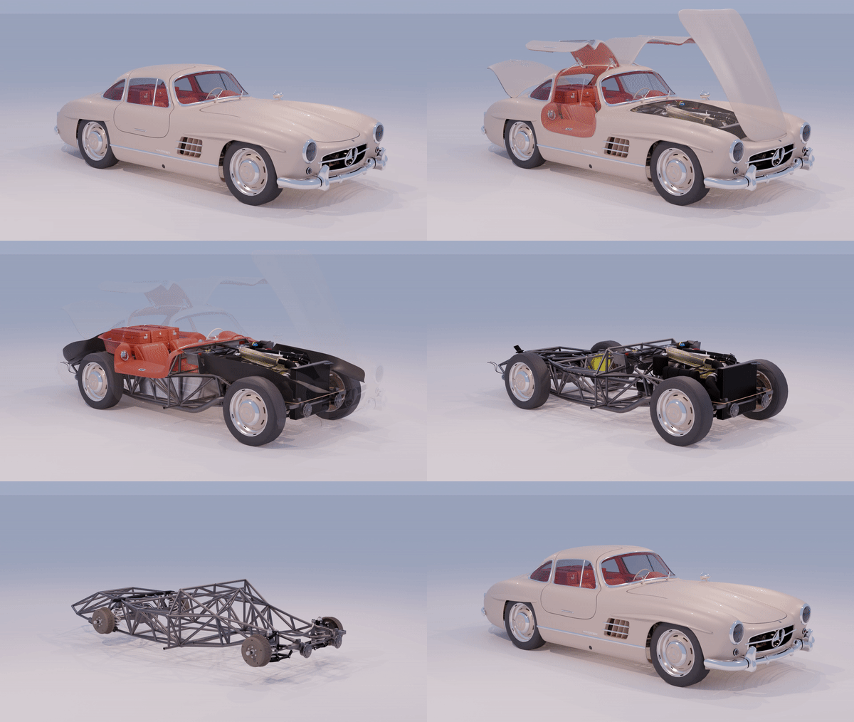
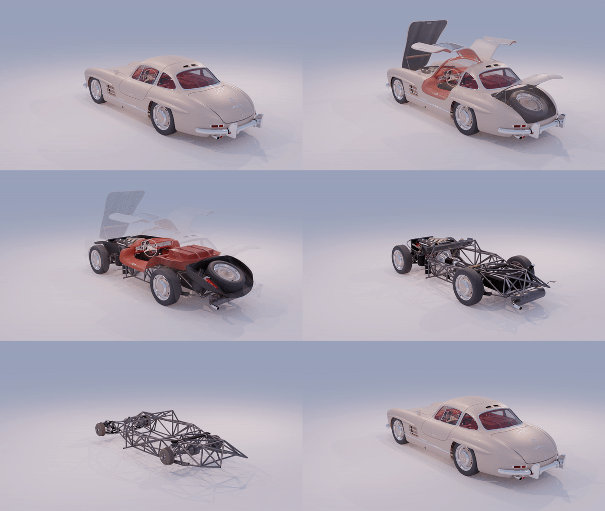
Great to see the internal stuff has been made. You must have had some very good reference materials.
Beautiful craftsmanship!


