Tribble trouble!
Cycles 55 secs render.

Great bright lighting, love it. Just as in modern SciFi.
If I’m correct, Tribbles have fur … not needles.
Yes, they was soft. Now I am tormented by the question of how to make a tribble with fur, not needles. does anyone know? Because… I also wanted to make a picture with tribbles 
@NP5, Cool corridor, very high-tech. And the feeling “They’re coming!!” 

Edit: Tried to make my own tribble. Played with hair. The third option, IMHO, is the best (yellow and dark brown tribbles), if you do not look at them from below. But they still don’t look soft. 
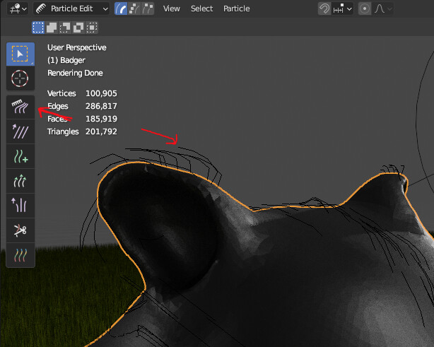
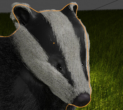
You need to comb the hair. In particle edit, use the comb tool. And play the the Root and Tip diameter in the Hair shape.

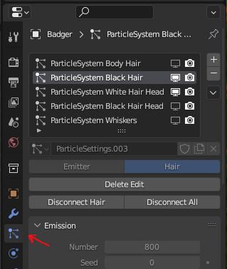
If you want more than one color, you can create more than one particle system

You can hide and show just the hair particles you’re working on to make blender crash less often. But with hair, it will probably still crash occasionally.

I used the quick fur in 3.5 all geo nodes based. Particle hair is the ‘past’ now, or soon!
@Kzanna Yes I should have combed it. But wanted something done and usable as I keep missing these collabs! Time time!
I might revise it, if I have time, I had enough trouble manipulating the geo node parameters. I saw the originals were more simple, poorer than I remembered. I quite like the spikey effect now, lol. It is how they will look if they remake it! 
I tried a comb. Let’s be honest - I will never become a hairdresser.  But combed (shaggy) tribbles look better.
Not figured out how to work with hair thickness.
in 3.3 there are no nodes for fur?
I was using 3.5 I am pretty sure they are quite new, 3.3 is ‘old’ lol.
I think they look great! I particularly like the orange one in the bottom right. It’s so furry looking. I haven’t worked with the hair in a long time. Looks like the ‘fur’ geometry node changes were added in 3.5. Blender changes so quickly. I just upgraded to 3.41.
I love the tribbles!
I’ve been looking at procedural planet textures lately so decided to add a little Enterprise battle to an ongoing project.
The ships are deliberately small because a) I like space scenes where ships just feel tiny, and b) to hide how bad the ships are. One of those more than the other…
I’m a Star Wars fan so I don’t know much about Star Trek, but here’s Enterprise from Azur Lane having some fun with an Enterprise model
@Joey_Cuevas She really does look like she’s having fun 
Maybe try to additionally illuminate the girl. The picture is too evenly lit, and she merges a little with the wall.
@Myn Nice planet!  (What is it, procedural planet textures? I also need to make a planet for my project)
I think that the ships could have been made a little larger… although, perhaps, as is they are on the same scale as the planet. Realistic picture. 
@DANB1  Cool!
Cool!
My variant. Other than Spock and Kirk, the most memorable thing from the show for me is the tribbles. The plot is inspired by a crime theme that I missed
The second and third variants of the corridor. I don’t like both, but the my imagination refuses to work any further. 
Great story
We @BlenderCollab have a few days to vote. You can vote fast but also think slowly about design, colors, technique, difficulty, subject, realism, etc. Choose consciously and not on your own entry.
And the new subject week 24 “Gift” has already started. The winner of this week’s “Enterprise” challenge may select a subject for next week 25 and wins a badge.
0 voters
@DANB1 congratulations with your Enterprise NCC-1701 textured model. Well done!
It was a close call, with one vote difference.
Note: I don’t want to offend anyone. I try to write down positive ideas and visions in my simple use of the English language. I am also sometimes more inspired by a particular subject or solution. I’m also learning from you!
Very disappointed that I missed the Star Trek one, but I like what you guys came up with! TNG is one of my favorite shows of all time. I’ve been working on game dev projects so I haven’t had time for pure blender renders, but I miss the collab. How are you guys doing?
Hello Tyg2!
Good to see you back about here. Win a collab and do a TNG subject call! 
It’s summer time, and participants are then always a bit low in numbers.
And like you, other projects on hand.
On the other hand, more chances to win a collab!
Haha it’s a bit too specific, I’d be afraid no one else would join