11 Likes
Love the humour in this! haha cute scene
2 Likes
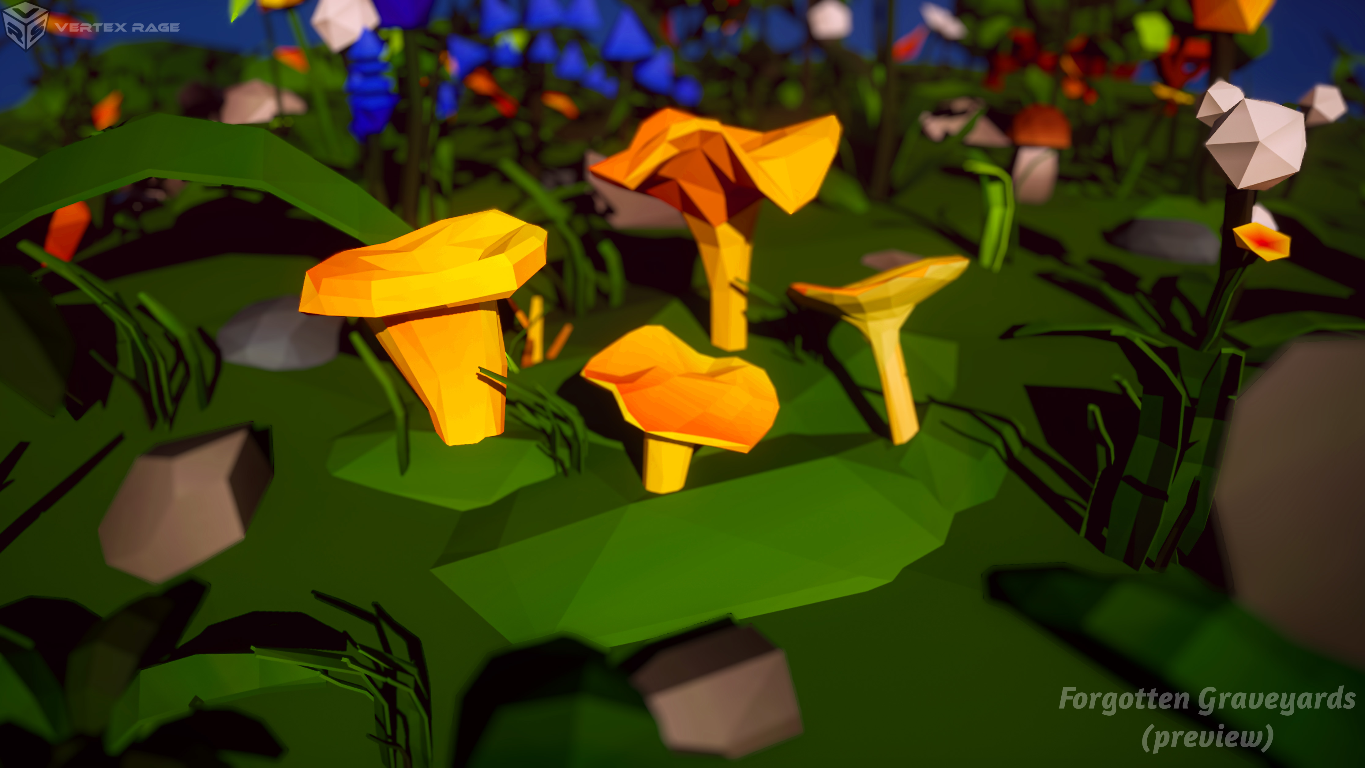
Oh noes, I just realized I forgot to add grass particle system (Animation went out of bounds for particle lifetime for this render), so this is the final submission 
9 Likes
This was very challenging for me. I am very new to blender (started in Dec 2022.) I realized I have no experience doing low poly. I tend to want to keep refining to get image realistic. Thanks for the challenge. I would love all feedback.
10 Likes
Are you following any course in udemy or somewhere…?..
I love your scene…
2 Likes
Mostly YouTube and SkillShare. There is always lots and lots of trial and error.
3 Likes
We @BlenderCollab have a few days to vote. You can vote fast but also think slowly about design, colors, technique, difficulty, subject, realism, etc. Choose consciously and not on your own entry.
And the new subject week 17 “Coral reef” has already started. The winner of this week’s “Low poly nature” challenge may select a subject for next week 18 and wins a badge.
Low poly nature
0 voters
3 Likes
Me personally, id say this is one of the best blender collabs I’ve seen, I don’t know what it is, but each scene looks great in my eyes(maybe because I don’t do blender so lots of stuff looks impressive). I usually wait until the end of the vote, but if I don’t do it now I’ll prolly forget, and it’s not like new entries are accepted. I put these comments in the order that the votes were at this time.
@VVruba If I’m not mistaken, this would be your first blender Collab? If so, amazing for your first one, I think that you did a great job with focusing the scene to a certain part, while still having the subtle details in the back. I watched your timeline video, and it’s a pretty cool montage, nicely done scene!
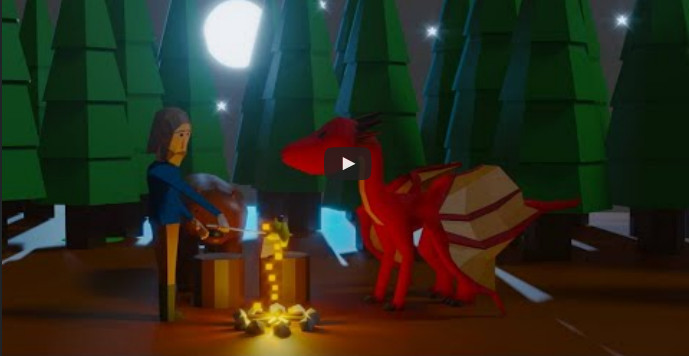
@Rao I’m gonna comment on the animation a bit, really smooth, I thought it was kinda interesting that the man was casually able to wave down a dragon. Great lighting on the scene, great subtle details on the overall scene as well, good job!
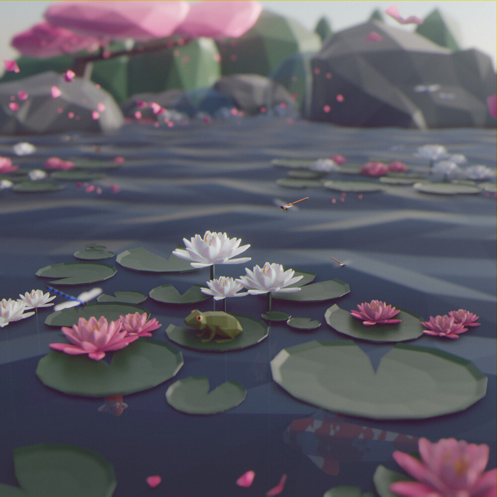
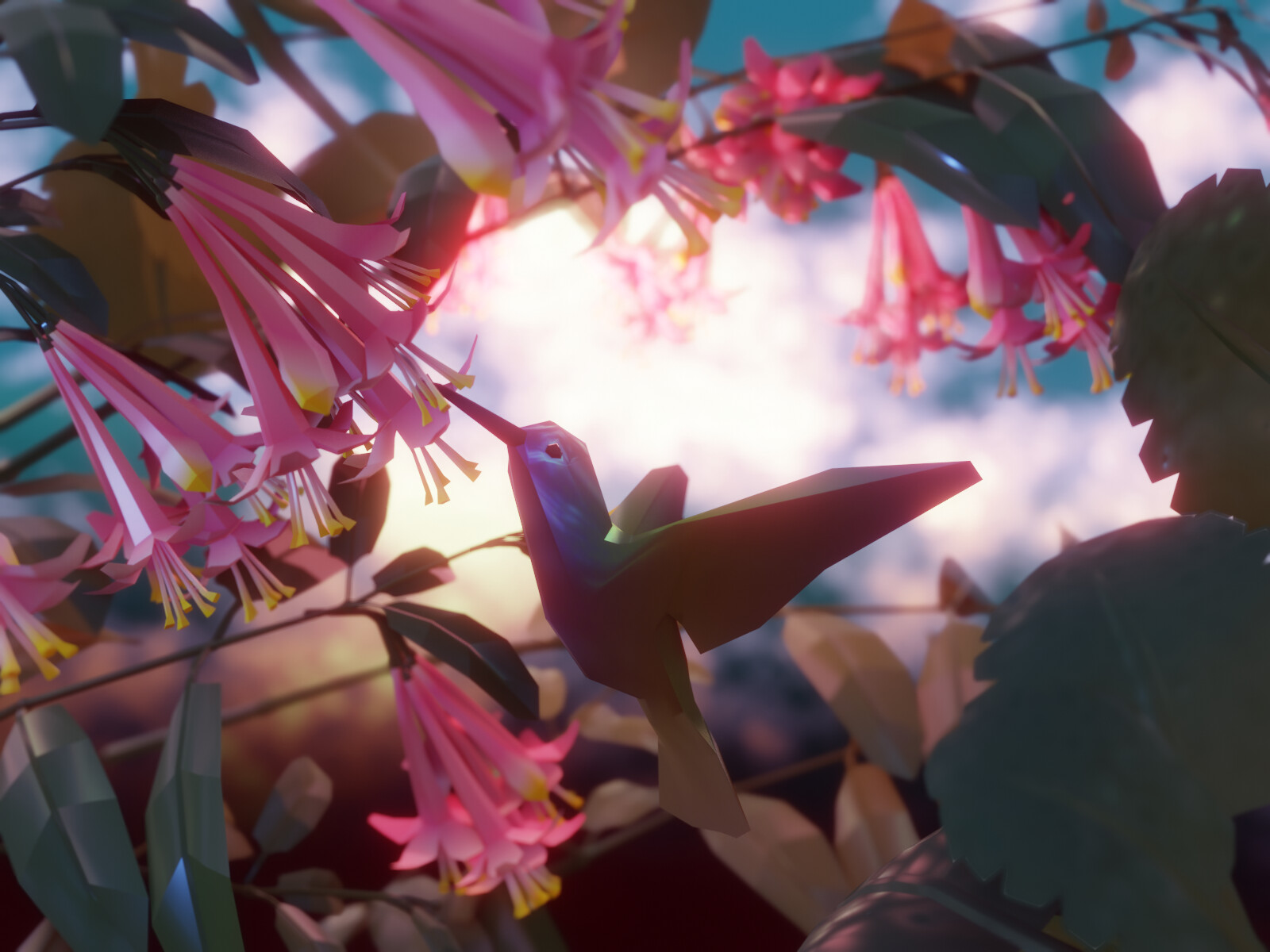
@benu really great scene, the nature is amazing, especially the flowers in my eyes, I like how you constructed the scene with the attention on the bird, including the good lighting in the back, I’ve seen criticism on the color of the tail, however I think just making the leaf in the back slightly less visible fixes, wonderful job!
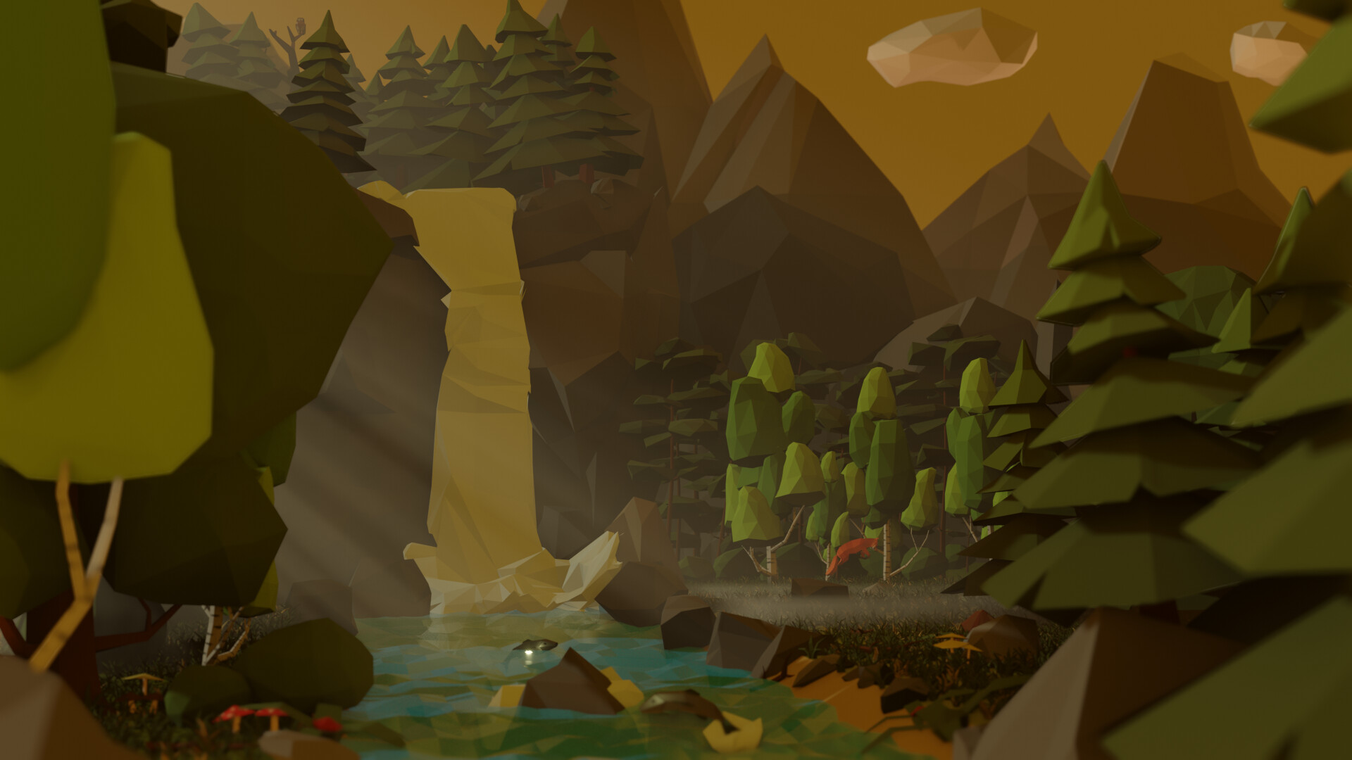
@Medial Might be your first Blender Collab as well? Regardless, there is a lot in this scene to look at, and a lot to be proud of, the trees have detail while still being simple, the mountains look great, my favorite part is probably the river with nice textures, and great details not only in the river, but in the vegetation on the side as well, awesome job!
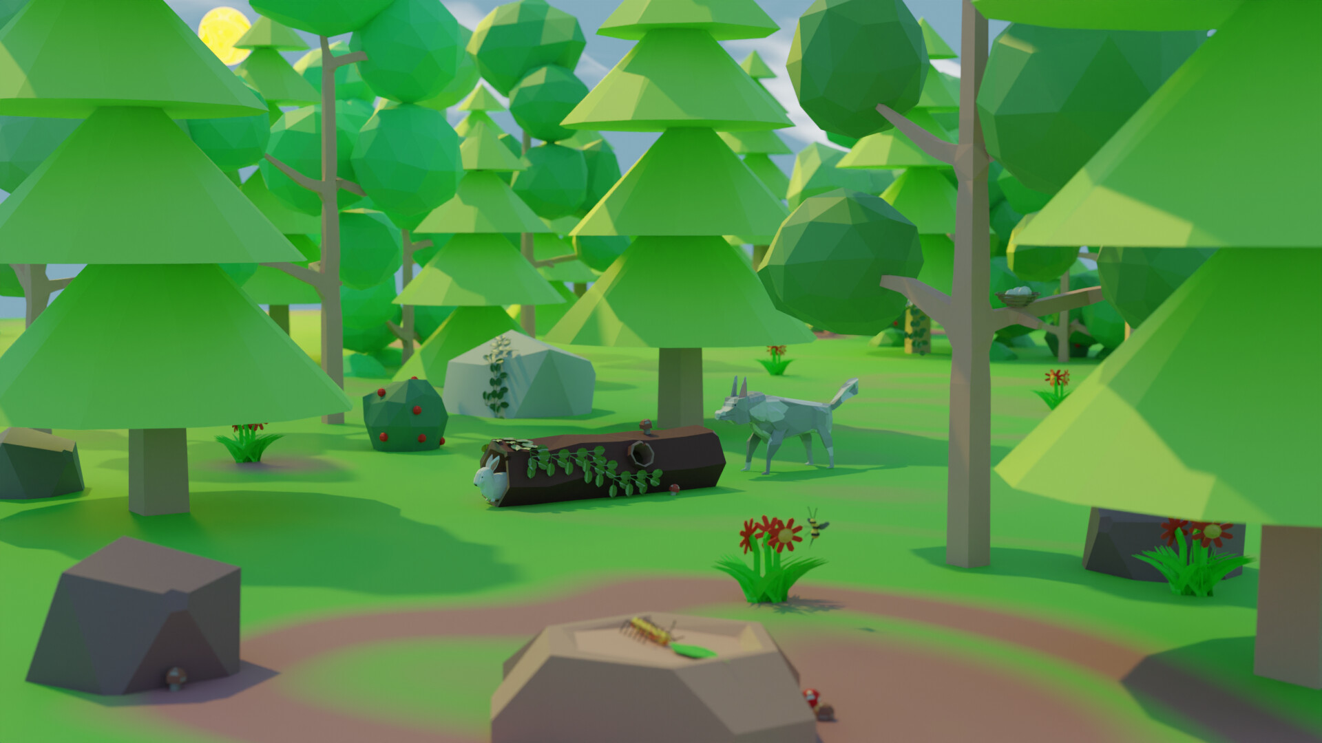
@Willrun Rather simple scene, however the bright colors and subtle details make this scene stand out, I really like all the vegetation, especially the log, nice job with the fox too, overall a really nicely put together scene, great work!
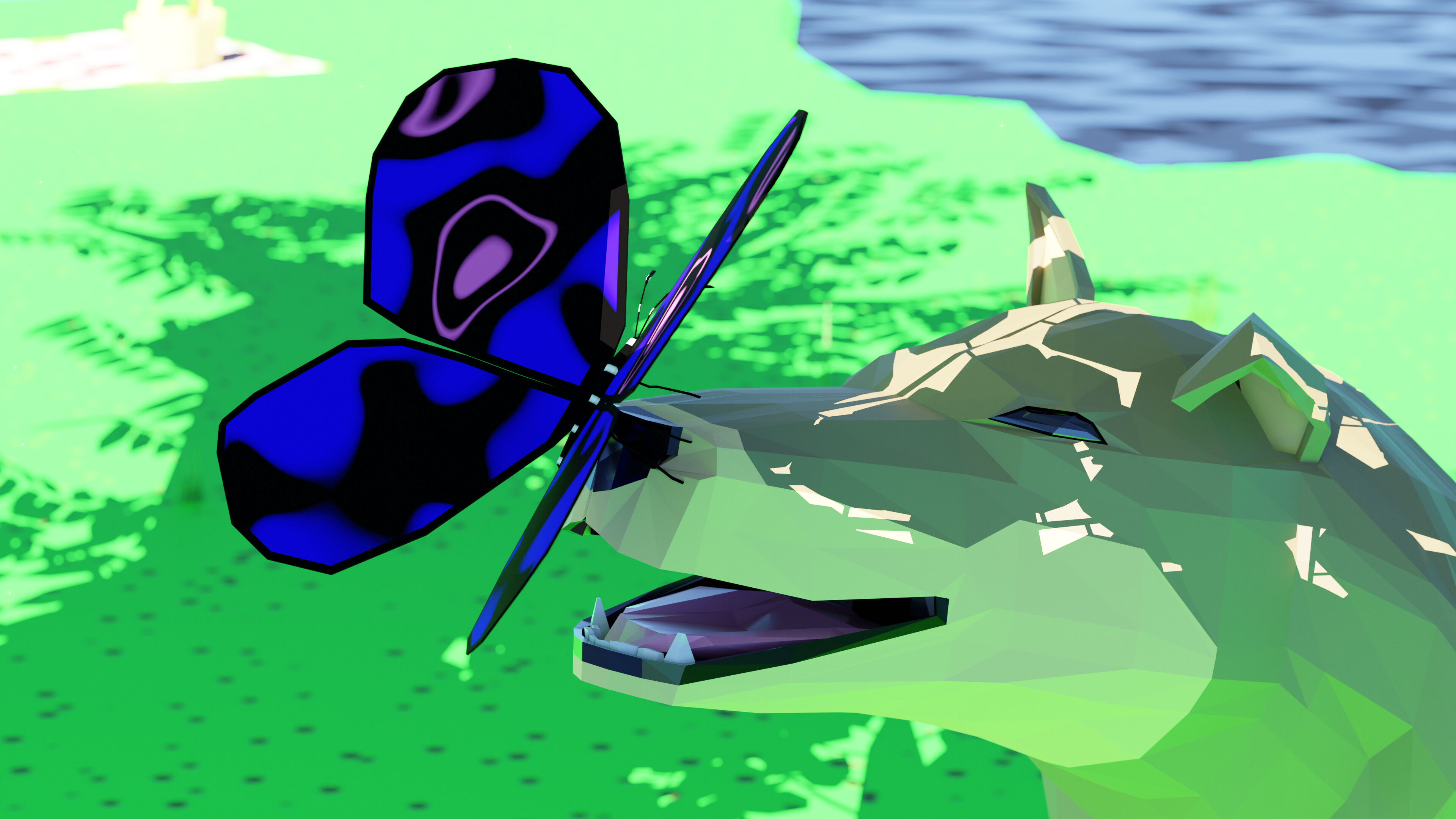
@Joey_Cuevas Nice scene, great details on the dog, and great colors on the butterfly, I for some reason originally thought the dog was under water, regardless, nice colorful scene with great details, nicely done!
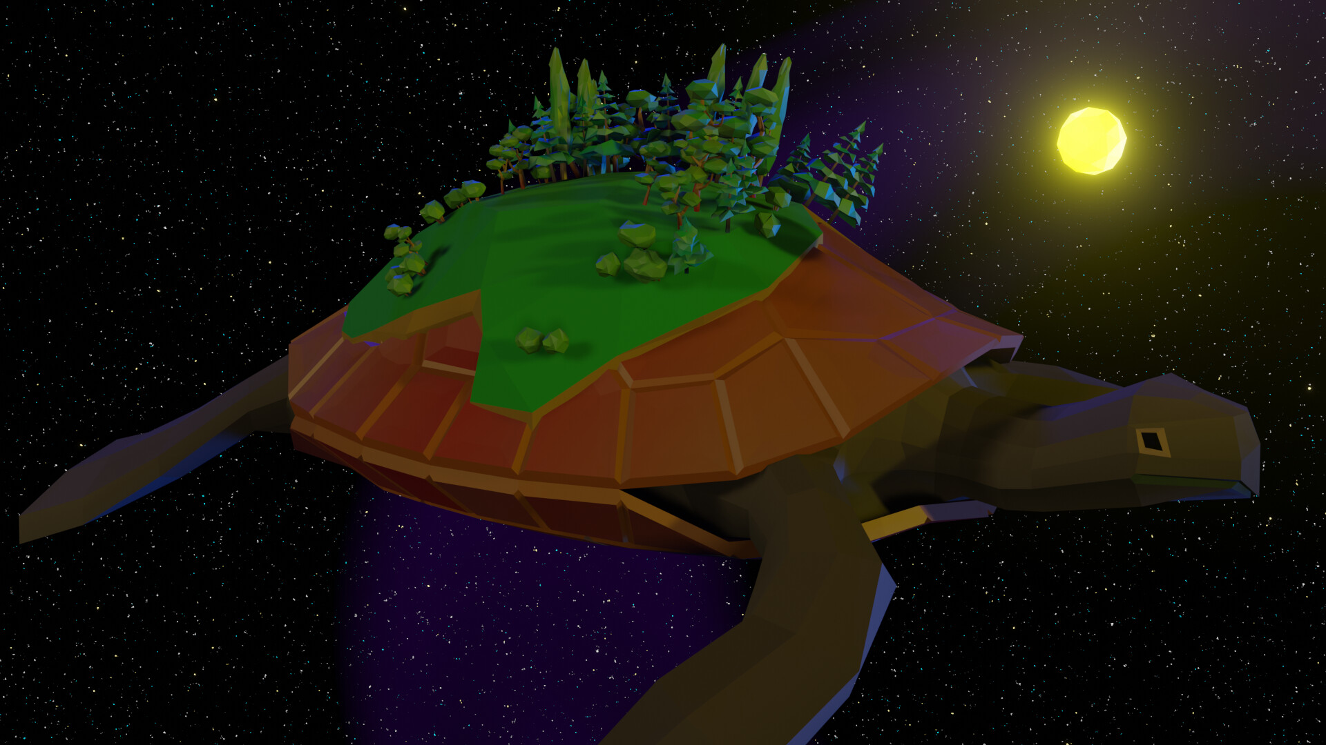
@Kzanna I love the idea with this, I would have never thought of a turtle in space, despite being pretty simple there is a pretty nice background, and great details with the turtle including the part where the shell and head meet, amazing job!
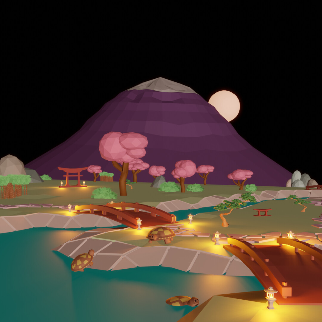
@visionary5 As it stands right now, this scene is in last, a huge shocker for me because I think this is one of the better ones(there still is 4 days), the details are great including the bridge, and the turtles. I also really like what you did with the trees, and the lighting is on point as well, excellent job!
I’m only a kid, so I’m not as smart as you all obviously, just to put that out there in case somebody questions my intelligence with my posts😅
6 Likes
Thanks
1 Like
Very hard choice this time, great entries everyone.
2 Likes
@Christopher_Powell Yeah it’s my first time, I just recently came back to GameDev and found this. To be honest I was hesitant about participating at first since while I wouldn’t consider myself an expert in either Blender or art in general, I am certainly not a beginner (this was actually my first time doing “low poly” style…). After looking over what people made in the past collabs though, and seeing that there are some heavy hitters better than me here already I decided to join in.
I think concept wise my favorite piece this week is @Kzanna’s space turtle, it’s really cute. I probably would have voted for it but @Medial earned some browny points with me this week (sorry Kzanna) and I also really liked their forest scene, so much so that I have a photoshopped nighttime version of it now. Not sure if it’d be rude to share that, it’s really good as wallpaper.
I’m hesitant about giving critiques because people tend to have mixed reactions to unwanted feedback, but @visionary5 asked for it so here goes some, I’ll try not to make it too harsh.
I think the first thing you could easily change in your scene to elevate it would be to add a sky in the background, stars, and maybe some clouds. The rest of your piece has a “serene” vibe to it but the big void of space and emptiness feels unsettling, almost horror-like.
The next big thing that sort of relates to the sky too is the lighting. Think about the setting of your scene more. Where is the light coming from?
In your scene, there seems to be a white Sun Lamp pointing toward the mountain that just universally makes everything bright, but the setting is at night, and the moon, which should be the primary light source, is behind the mountain.
The result is that all the objects in your scene are shaded in the opposite direction to where the light should be coming from and the scene is lit too brightly. Because it’s night it should be a lot darker in general, which would also make your secondary light sources (lanterns) shine more.
There is also a concerning lack of ground shadows, which is partly an eevee issue but it’s still something you should fix, it makes your scene look “flat”.
I get that lighting is difficult and kinda obscure in how you should approach it but good or bad lighting can make or break your scene, no matter what else is in it.
On the modeling side, I think you did a pretty good job but there are some areas for improvement.
I can see you using smooth shading in many places, I’m not gonna say it can’t work but, for a low poly style, I think more often than not you should set the polygons free.
Take your turtles for example, you smooth-shaded their shells and added coloring to convey their plated nature, but this is something that flat shading could do by itself. You should try to lean into any strengths an art style naturally provides instead of nullifying them.
For your mountain, I think you used a UV Sphere as a starting point, but the square pattern across it feels too uniform. I think using an Ico Sphere instead would have been a better choice, the triangles would give it a “rougher”.
There is a few more things I could talk about here but this is already kinda long and I think the three things above are what you should really focus on more than anything else.
To summarise:
- Make sure to establish a consistent feel across your piece. What do you want the viewer to feel when they look at it?
- Make sure your global lighting is correct. What are your light sources? What do you want to be lit?
- Embrace the style you’re working in. What are its strong points and shortcomings? Work around it.
I hope this wasn’t too harsh or discouraging in any way, it would not be my intention. Perhaps because I like getting the stick when others critique me I tend to be rough on others too. In my opinion, having mistakes pointed out in my work is worth infinitely more than most praises, even better if it comes with how to correct them.
4 Likes
Amazing entries !
Very close fight !
Don’t know whether I am right on my choice while voting, but I think all entries are winning entries this time!
1 Like
Thanks a lot, that’s nice  I have to admit was very fond of your pond (what a premium pun!), and I 100% agree - Kzannas turtle concept is fantastic, its well executed aswell (but it lacks elephants ).
Sure, post it please! I’d love to see it, its awesome!
To be fair I was thinking to make it night scene, but I did post a night scene for one of the previous collabs I participated (Steampunk), so I decided to go more of a morning vibe. IMO its not 100% clear whether this is morning or evening, but that’s something I decided not to play more with Id say that creeping fog is more of the morning thing. (And I was thinking of putting it as a wallpaper myself.)
1 Like
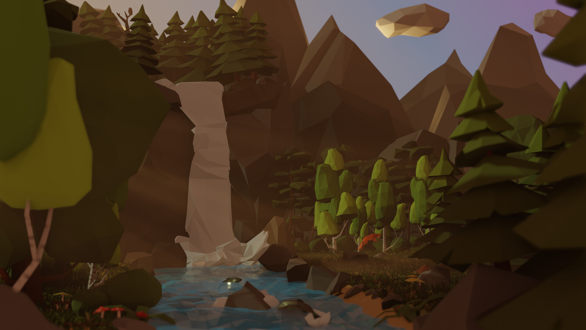
Ok, here’s night version  :
:
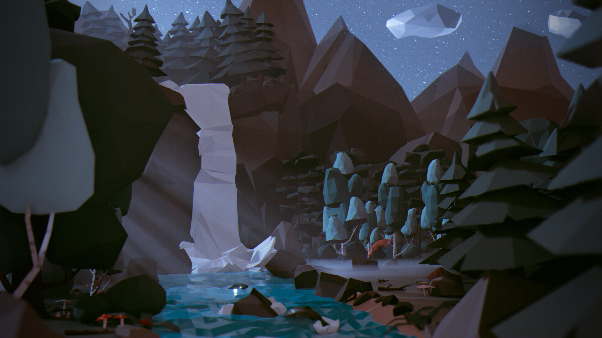
I was thinking you were going for either dawn/sunrise or a sunset. If I’m honest you had a really strong piece with good modeling and a fairly strong circular composition. The lighting was also good but what kinda brought down your scene was the color of the sky and which bled into the color of the ambient light too. It’s a color I can only describe as “baby poop”, and the sky should never be that color unless the air is heavily polluted which doesn’t really fit your forest scene. If it wasn’t obvious, that really frustrated me because the rest of your scene was super solid, so I photoshopped it to look to my liking lol.
Sky colors tend to be very vibrant unless obscured by clouds, fog, dust, smoke, or some pollutants.
See this for example:
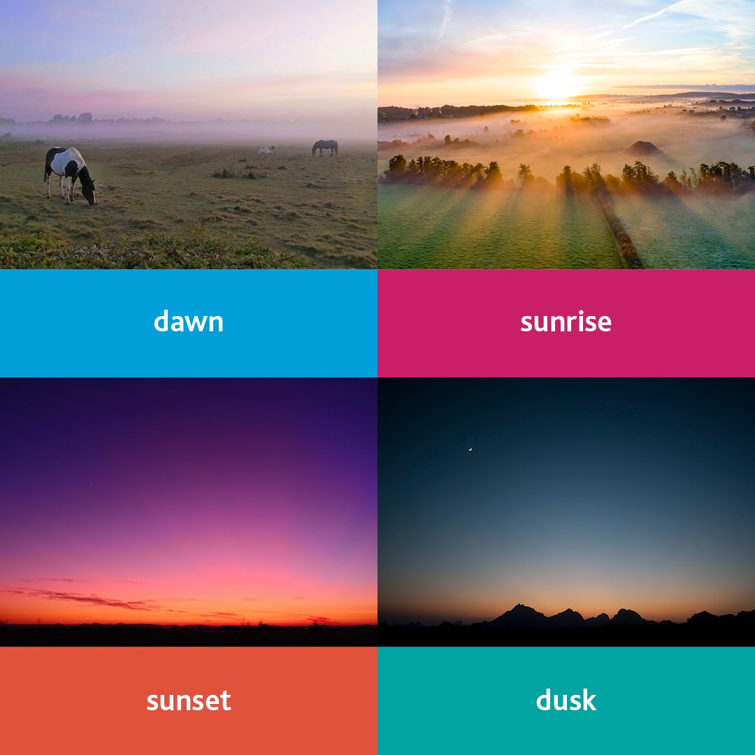
Obviously, in a stylized image, you don’t have to 100% adhere to real-life colors but it’s good to keep them in mind.
3 Likes
Oh bonkers, you are 100% right! Now I cant unsee the baby poop, thanks!
As a matter of fact I went with dawn/sunrise reference, but decided not to place background image and the background is solid world node color. So I chose a “proper” color, than I did adjust it to fit with the color of the main light source - and I didn’t check it again and it went poop. Also, dawn/dusk are very hard to get without a gradient, and I didn’t want a gradient (for an unknown reason…). I have to go back to this now and correct.
Thanks for this feedback, absolutely fantastic to read this.
As for the night scene, it is amazing what light can do… Because this edit is basically only about light (i mean… colors come from light so…)
2 Likes
Glad I could help! Make sure you share your next version, I really want to see it.
As for the gradients, I think it’s basically impossible to get a scene at those day times without it. They’re literally times when you could look in one direction and see the sun and look in the other and see night and stars. It’s what gives them such a nice vibrance and variety of colors.
That said unless you’re looking directly west or east the gradient wouldn’t show much “from the side”, it mostly shows on the extremes, but lighting the scene with a gradient would still give you all its benefits in ambiance.
1 Like
Now, I can do this little tweaks for hours, and that’s exactly what I wanted to avoid  I not doing it any more! No! Please, stop!
Probably I shall not have posted this now and wait till the end of vote, but I guess this what collab is about - and next week is next collab.
4 Likes
 This is perfect. It’s basically what I envisioned your scene to look like at dawn in my head.
3 Likes
@VVruba Congratulations for your beautiful nature low poly scene. It was a tough competition. A great composition and color schema. The camera focus helped a lot. And the low poly water waves are excellent.
- Rao - Great animation, a lot of work. Could spend a bit more time on the materials used. Like the floor, which is too shiny. Tiny details will count!
- benu - Such a colorful scene. Can not say if things where wrong. May be too white or bright center. Which over burns the bird view. Your second entry I liked most.
- Kzanna - Great idea and a very good turtle model! Also improving tiny details like textures will improve the model.
- Medial - So much details and scene variations. And yes, so much tweaking involved. But that’s part of the collab idea. Try to finish on time. Focus on the items which are most important in the scene. I think the water (fall) could be more emphasized (color wise). Look up “Bob Ross” painter.
- visionary5 - Very recognizable scenery. Well done!. It think the sky is too black, could use more tiny details (clouds, stars, color gradient variation).
- Joey_Cuevas - Fun story! But the dog color blends in too much in the background scenery. Not distinctive enough.
- Willrun - Good nature scene, with a lot of details. Could use more variation in colors (natural greens).
Note: I don’t want to offend anyone. I try to write down positive ideas and visions in my simple use of the English language. I am also sometimes more inspired by a particular subject or solution. I’m also learning from you!
7 Likes