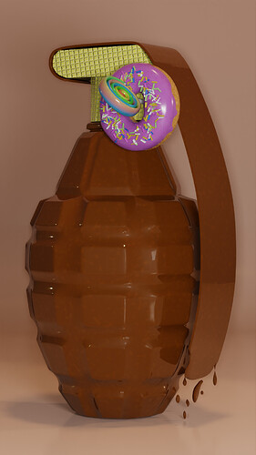
In terms of parts to improve, I honestly think your design is near perfect, the only thing for me is the dripping chocolate at the bottom of the handle, but I think it’s a personal thing, all and all, amazing model!
Here is my final render:
I guess waffle still does not look like waffle but it seems better than before.
I love the additions you made!
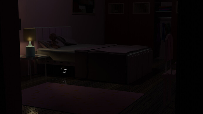
Amazing, the lighting is on point, the scene is nicely constructed, and I’m getting some flashbacks with the monster under the bed when I was younger😅. Great job building your scene!
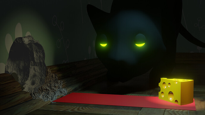
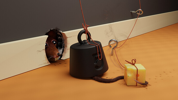
My favorite part about this is the cheese(nice details with the holes as well as excellent lighting and quality), and I like how the mouse is coming from the shadows, I personally think that this is a job well done, amazing scene!
Wonderful job!
After posting, I noticed that the hole in the wall is too big for a mouse. Or is it the cat that needs to be afraid of what can get out of there 
It might look big but when you think about what this scene looks like in a regular perspective, it’s kinda small(normal sized for what it’s supposed to be), but yeah for the scope of this scene it might need to be smaller by a little.
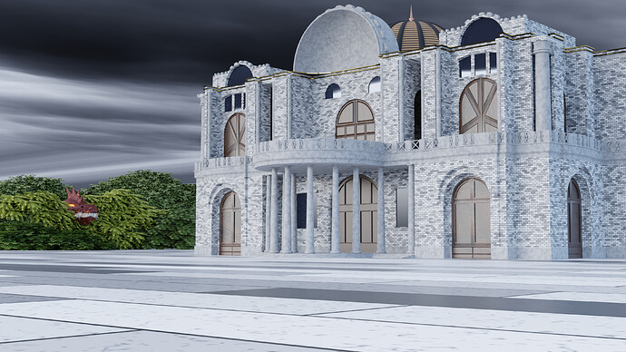
Looks really good, the color on the clouds is amazing, and the castle looks really nice, especially with all of the detailed tiles. The monster looks nice and really adds to the theme. Amazing work!
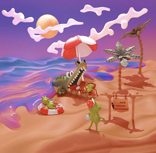
@anastasions I like everything. And water, thick as cream. And waves of sand. And the feeling of a hot beach at noon. And careless vacationers. And a sign that hints to be careful. And, of course, a crocodile.
@consummatumest Sweet danger!
I think the waffles are too small and yellow. But if you make them larger, the structure of the waffles will not be visible… on the other hand, all the ingredients are easy to guess, so good work!
@Willrun Great toothy smile!! 
@Joey_Cuevas I didn’t immediately notice the monster in the greenery, he hid well! It’s funny how it feels like the monster and the castle are looking at each other.
Very nice
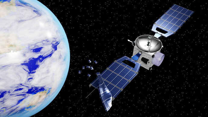
Amazing scene, I love the satellite with all of the details. My favorite part however has to be the earth, I personally think you did a fabulous job blending the colors and making an amazing earth model, the bits and stars just add to the phenomenal scene to make it even better, fabulous job!
We @BlenderCollab have a few days to vote. You can vote fast but also think slowly about design, colors, technique, difficulty, subject, realism, etc. Choose consciously and not on your own entry.
And the new subject week 15 “Wings” has already started. The winner of this week’s “Hidden danger” challenge may select a subject for next week 16 and wins a badge.
0 voters
I imagine this thin pancake under the weight… Poor mouse!
@anastasions Congratulations on your funny hidden danger scene. It has a great visual style and color flow.
- consummatutest - The danger of chocolate! I miss the details of dripping hot chocolate on the floor. Now it ‘hangs’ in the air. I would expect, as a viewer, to see molten chocolate on the floor also. It makes the scene more complete.
- visionary5 - Space is an incredibly harsh environment and also dangerous. But your visual story leaves us with no idea what danger this satellite encountered, except space.
- Joey_Cuevas - Dangerous funny story, but not immediately recognizable to the viewer (didn’t see the monster at first). if you had also put down a banana peel, in the middle of the scene, it was doubly dangerous. The target (monster) is hidden and outside the rule of third.
- Willrun - A great scene and story. But it’s too dark on my monitor. The attention goes to the left of the scene. Therefore all the objects on the right aren’t important for the story. A lamp, table, teddy bear, half bed, and monster were enough.
- Kzanna - Good story and composition. The red carpet looks funny but make it’s also unrealistic. Also the scale of things … I think the cat must be more worried about what can come out of that big hole.
Note: I don’t want to offend anyone. I try to write down positive ideas and visions in my simple use of the English language. I am also sometimes more inspired by a particular subject or solution. I’m also learning from you!


