8 Likes
We @BlenderCollab have a few days to vote. You can vote fast but also think slowly about design, colors, technique, difficulty, subject, realism, etc. Choose consciously and not on your own entry.
And the new subject week 2, 2023 “Rabbits, year of the rabbit” has already started. The winner of this week’s “Toon shader” challenge may select a subject for next week 3 and wins a badge.
Toon shading
0 voters
1 Like
This was really fun subject to do. I already forgot this type of shading (shader). It’s nice to get acquainted again!
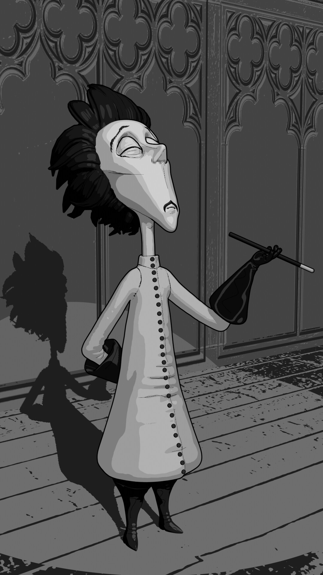
Our congratulations go to @Cathy_N for a really nice cartoon. A cell shading illustration of Vincent. Much attention to the details. Great theatrical pose reproduction.
- FedPete - While it was a quick setup of another project I’m working on. I feel like I could have added another coat or two of gray. And also black ‘outlines’ to put the whole thing on a higher level.
- zeRgenTa - It is a look-a-like of a painting made by Vincent van Gogh. Maybe the colors could be brighter, and more vibrant.
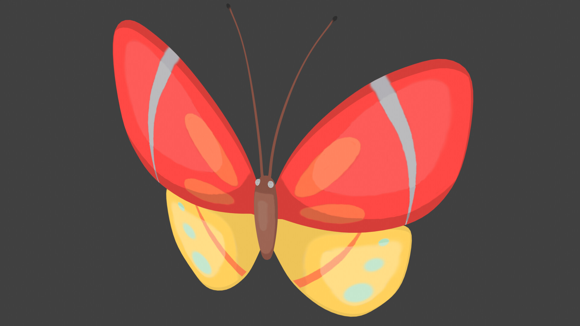
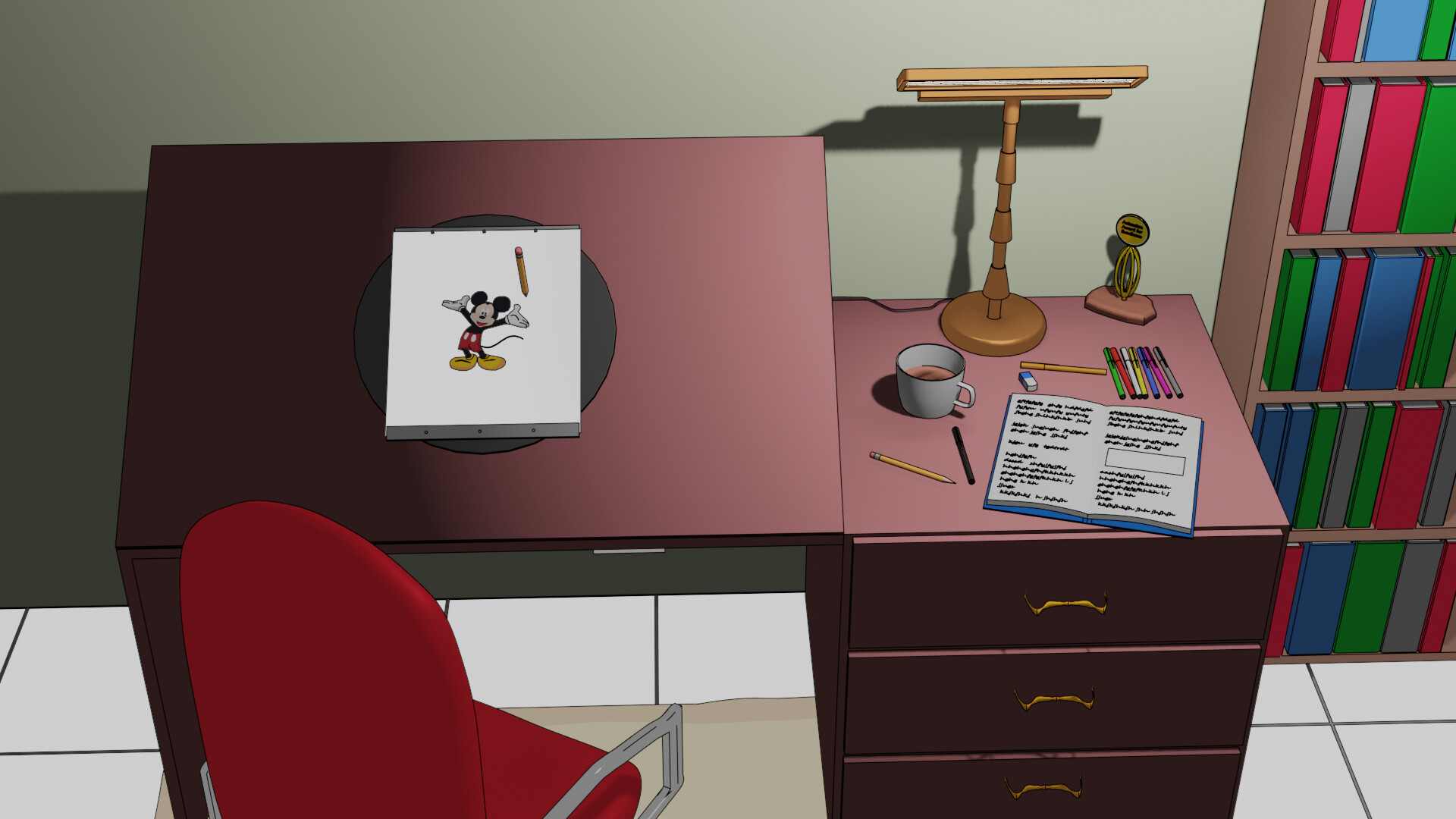
- Michael_Legrande - Love the simplicity and color usage. Your post was early in the week, you could have spent more time on adding details, like more butterflies, flowers, etc. Creating a setting. Still a very good use of the toon shader.
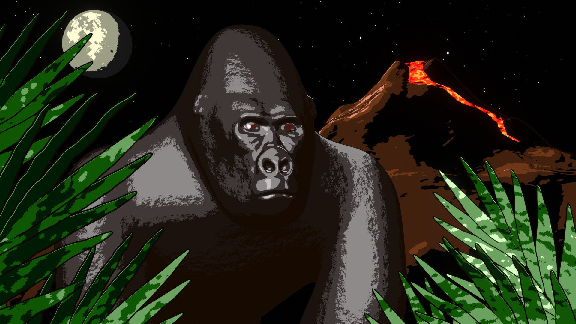
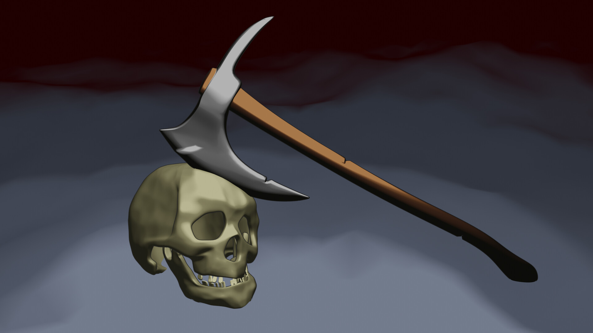
- Typger2 - “Skull island”? The gorilla and Vulcan are excellent models. I do think the choice of the color pallet is a bit harsh and very distinctive. They don’t blend in. But that said, it’s the way to go in a comic book. It has its charm.
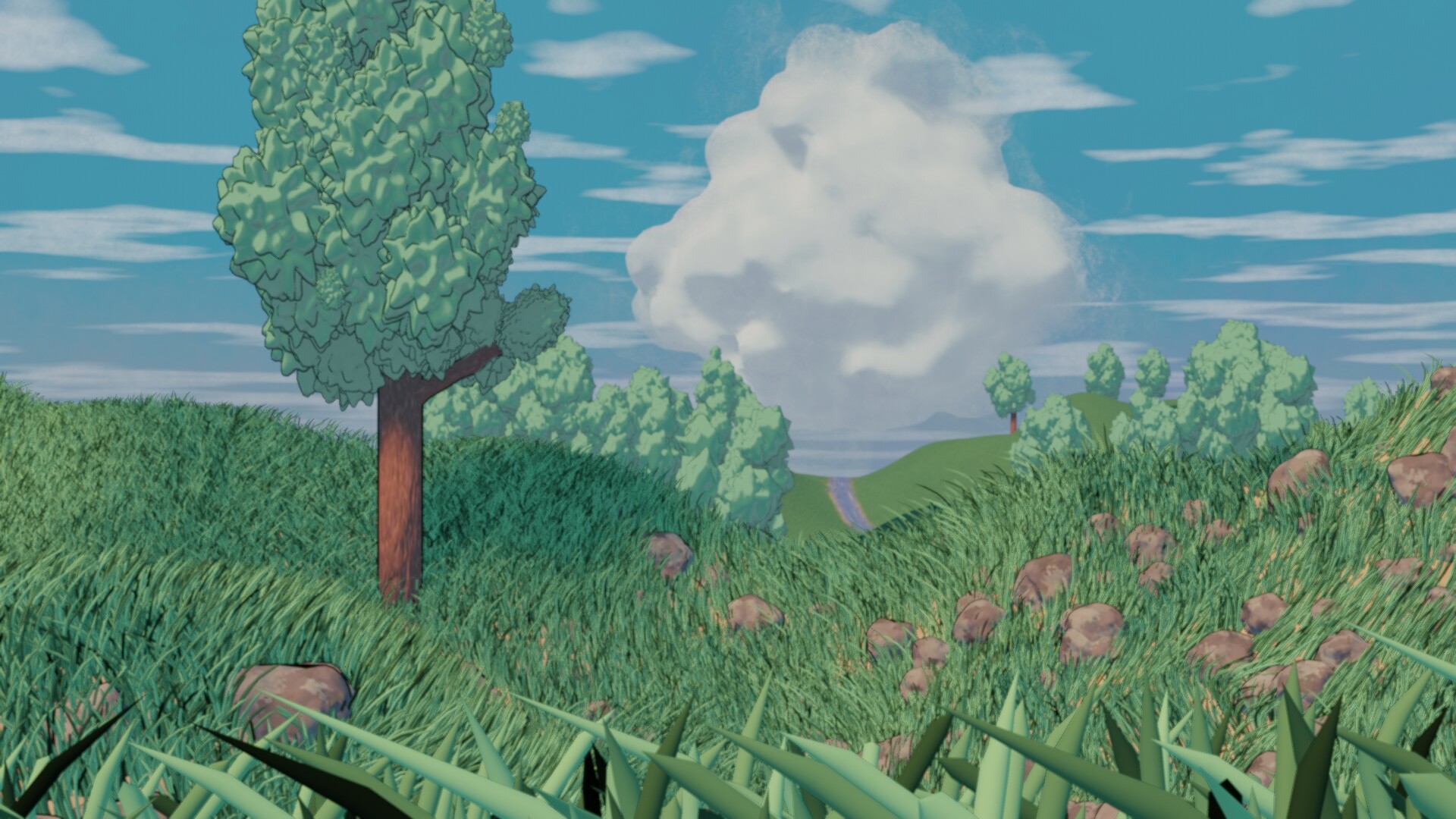
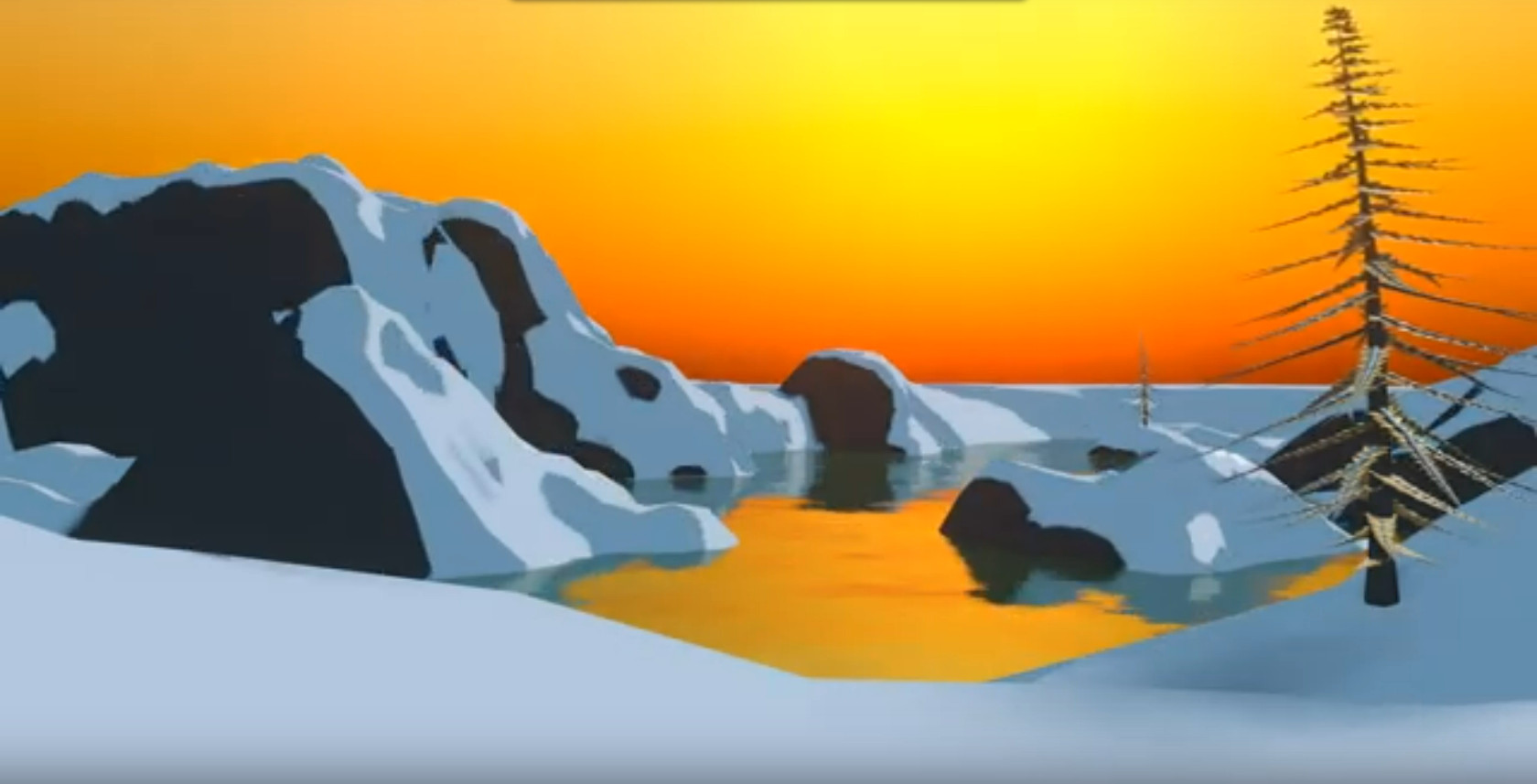
- consummatutest - Really great animation. Although the water ripples are too fast. The scenery is great, and the way you’ve animated it. shows the real power of toon shading. I can’t really say, what’s wrong.
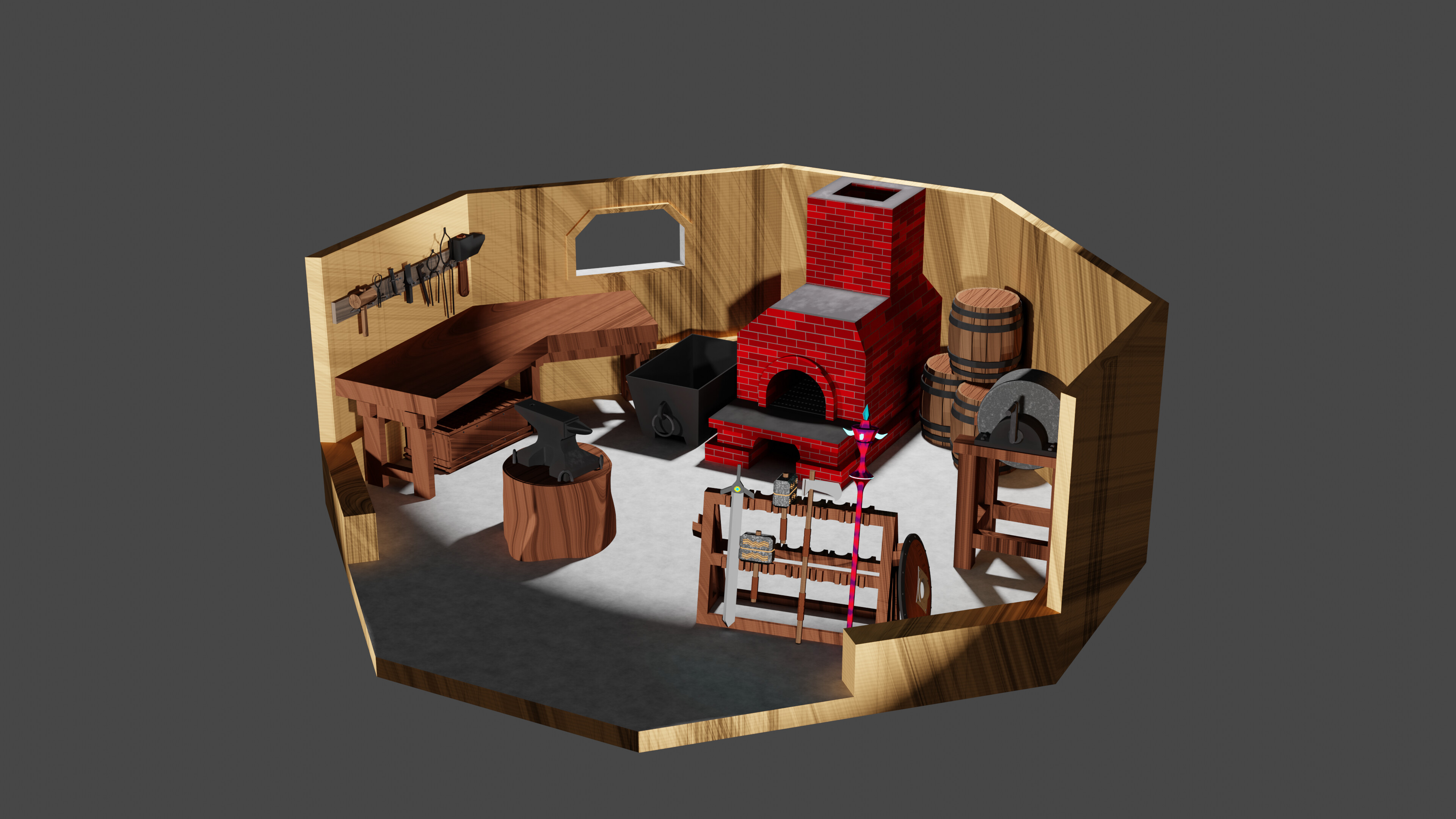
- Gordon - Great storytelling. Good implementation of the shader. I miss a bit more environment, not just a grey background. Maybe sitting on a rock, near a wall …
- Willrun - So much work! I think the toon shader works best on curved surfaces. Then you see different shades of the toon shader better.
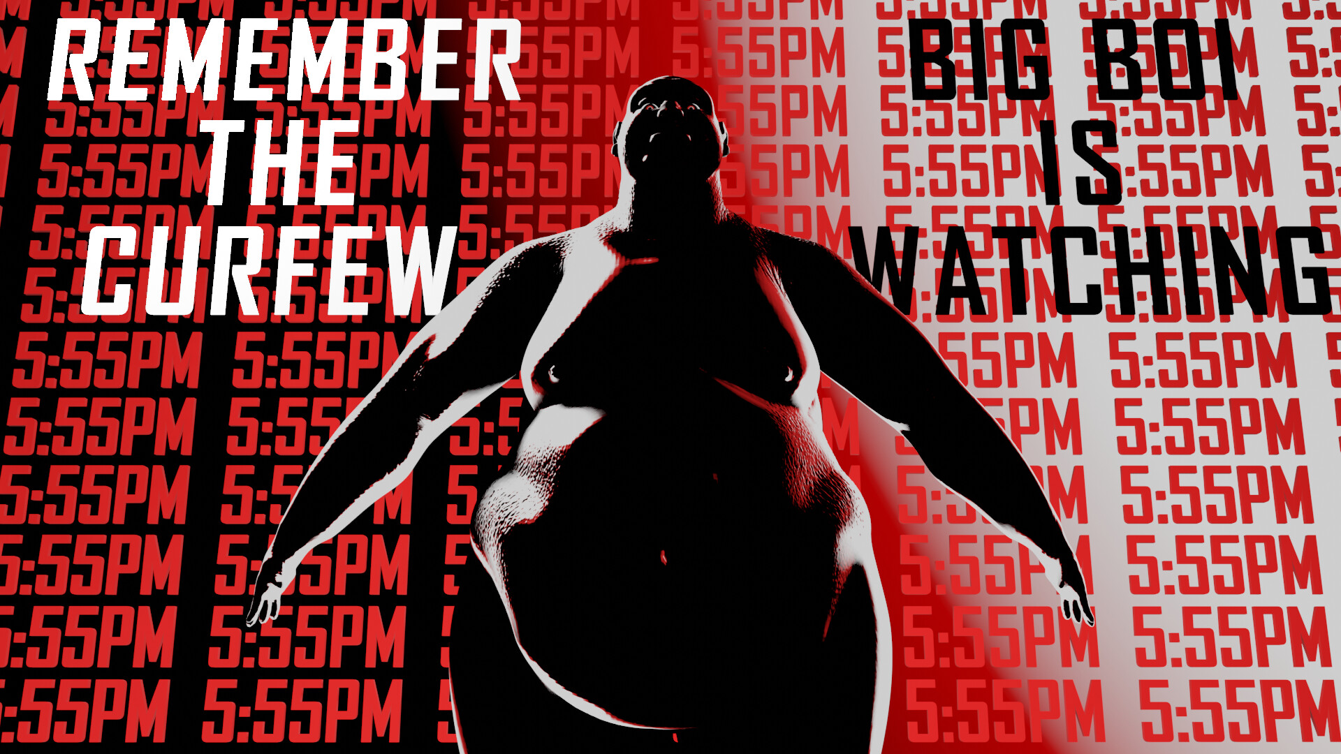
- sezpul - I write this down, just before the curfew … I like the composition, the front of the body could use more light. Just enough to see more variations of the darkness. Now black is very present.
- Joey_Cuevas - Ton’s of details, but due to the shading technique it gets even noisier. Textures and toon shading are fighting for attention. The idea of the toon shader is that the shape of things will give it a feel of texturing. At this moment too much is going on.
Note: I don’t want to offend anyone for any reason. I try to write down positive ideas and visions that I have in my simple use of the English language. I am also sometimes more inspired by a particular subject or solution. I’m also learning from you!
6 Likes