2022 Collab: Week 40 ¨Non-human city¨ - VOTE CLOSED

I was thinking similarly to @FedPete . If you didn’t want to do a flat image, maybe you could reduce the detail of the geometry in the background. I know some video games have a way to switch to low LOD models automatically based on distance, but there’s probably an easier way to do it manually for a single image.

Looks cool, BTW.

3 Likes

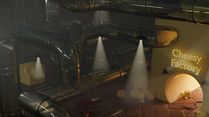
I like this idea, like a huge rodent highway

3 Likes

I suppose I could apply the arrays and curves and then be in a position to delete the two thirds not in the camera view. I am a bit surprised as there are only 2 ‘cells’ and all the rest are just array instances, but it fails to write the first rendered tile at my usual 4k image size. That may be low ram? As half mine died several months back. Promised myself a new machine when these new generation parts are out hopefully by the end of this year ‘ish’.

Exactly my thought as well when I first saw it. :grinning:

1 Like

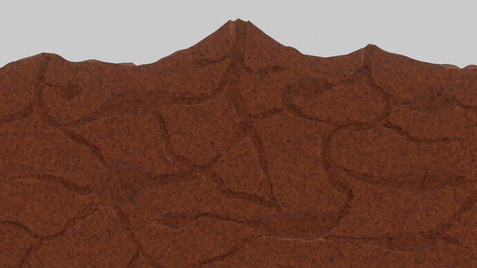
Here’s my work in Progress:

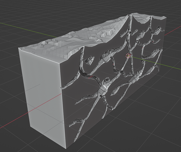
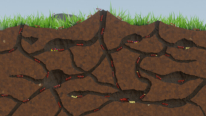
Anyone have any good ideas on how to light and texture it in such a way that the tunnels stand out from the rest of the dirt? Here’s how it’s shaped:

Check out my geometry nodes thread for more info if you’re interested.

8 Likes
  • One big area lamp, the size of the farm (no shadows)
  • Use the compositor to render only the tunnels (different lighting), and render the ground (without tunnels).

Just ideas popping up.

1 Like

Just make the soil a dark colour and the tunnels lighter. Then a general soft light or hdri.

That or they can be advanced ants and have a lighting system in there!

3 Likes

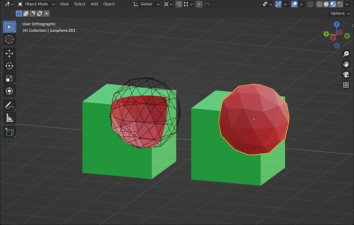
I thought about that. Is there any way to do that without applying the Boolean modifier and selecting the faces manually?

I like the idea of rendering them separately, but the tunnels are carved with a Boolean mod, so they won’t really exist separately. Right now it’s one object.

1 Like

Use X-ray and select the tunnel faces from the X axis view

Make the tunnel cutter object the colour you want them to be when cut into the earth object?

7 Likes

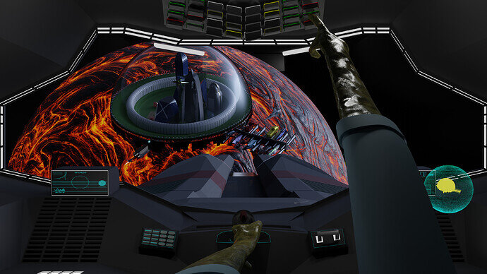
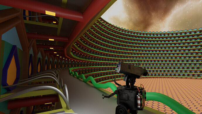
¨Irvaris 6C¨
While there are some similarities with our architecture and lifestyle, humans are yet to reach Irvaris 6C the third and smallest station right above Nurbana 4, where geothermic energy is permanently harnessed.

8 Likes

Maybe I’m incorrect, but you can mark faces (by material), and filter them out on the render pass. Like render only this marked item, etc.

What I can remember, there was something about anti-aliassing and alpha transparency.

1 Like

Ah yeah I forgot that booleans work like that. This fixed it for me. Here’s my entry:

I ended up lighting it with an HDRI. It still needs a lot of work, but this is as far as I want to take it for now. Thanks for the helpful suggestions everyone!

12 Likes

Inspiration came too late! Tons of problems. Huge render times due to the plastic look and volumetrics. Not enough render time. So this is it. Nothing to do with a “Non-Human City”. But it is an entry.

5 min before deadline … but we aren’t that strict.

9 Likes

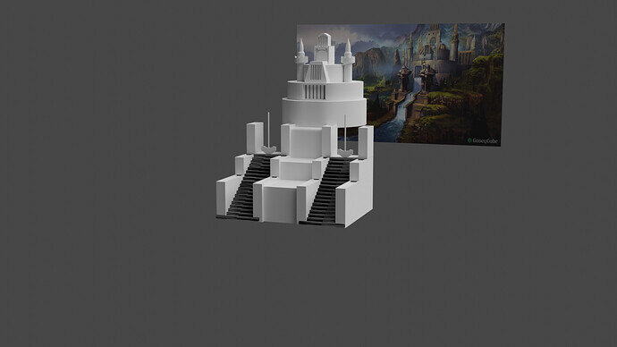
Didn’t have any time this week, so yeah I’ll finish it later.


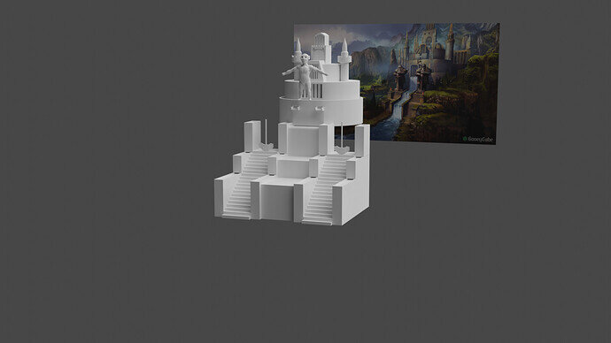
by FerdinandLadera
loosely based on his design

UPDATE… quick dwarf statue sculpt have to do armor but this is a far as I can go on this one for now

6 Likes

We @BlenderCollab have a few days to vote. You can vote fast but also think slowly about design, colors, technique, difficulty, subject, realism, etc. Choose consciously and not on your own entry.
And the new subject week 41 “Vulcano” has already started. The winner of this week’s “Non-human city” challenge may select a subject for next week 42 and wins a badge.


1 Like

I found this a difficult subject. Because the non-human worlds are also based on gravity, land, water and air. A city is therefore based on those aspects. And has the same solution. It’s hard to create something new. Maybe something virtual, like the movie Tron. But there you also see flying machines, cars and motorcycles. You need this type of visualization or else the viewer will get lost. Viewers need referrals to know what they’re watching.

5 Likes

Yeah it was a tough one because cities are so complex. Interesting, though!

3 Likes

FedPete, congratulations!


  • NP5 - I like the composition, it gives the city a scale.
  • Tyger2 - Ant-farm, a nice idea, difficult to express inhabitant details.
  • Joey_Cuevas - All signs of a non-human civilization. I think the concept was too much for one week.
  • Willrun - A pity you couldn’t finish. It was a good starter. But also, a lot of work. Much space to fill with content. Maybe a close-up, from the stairs looking up?

Note: I don’t want to offend anyone for any reason. I try to write down positive ideas and visions that I have. In my simple use of the English language. I am also sometimes more inspired by a certain subject or solution. I’m also learning from you!

2 Likes

Privacy & Terms