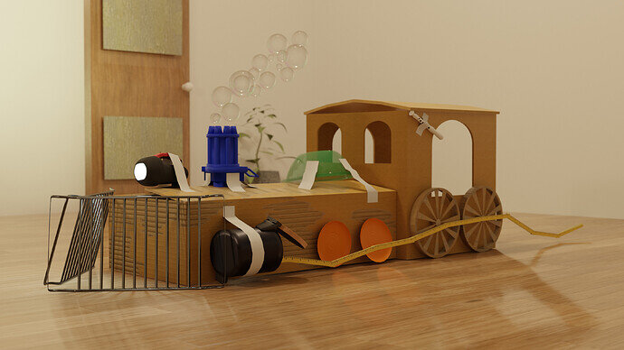
my entry
Credits
Texture on stand: Photo by Dimitrios Savva , Processing by Rico Cilliers
Window: made with Archimesh
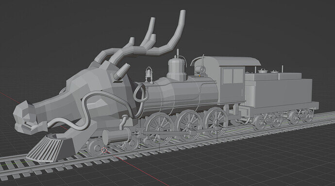
Started a far too complicated project, and had time management issues, so I didn’t get to finish it.
Great project you got a lot further with it than I have with mine!
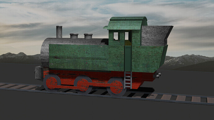
I also struggled with time management. I tried my best to finish… but so much left to do. This is as far as I got.
Just after I posted, I realized the array for the railing fasteners is a bit off. I’m still going to keep working on it and see if I can get in a render before deadline. 
We @BlenderCollab have a few days to vote. You can vote fast but also think slowly about design, colors, technique, difficulty, subject, realism, etc. Choose consciously and not on your own entry.
And the new subject week 37 “Aerostat” has already started. The winner of this week’s “Steam locomotive” challenge may select a subject for week 38.
0 voters
Sure, it’s the super strong ones 
and thank you ^^
It was ^^ and yeah I was too tired to realise it, but in the back is no light, it is the wall with the wrong material which extremly reflects the sun 
This is going to be a very hard choice this week, as there are so many really good entries. 
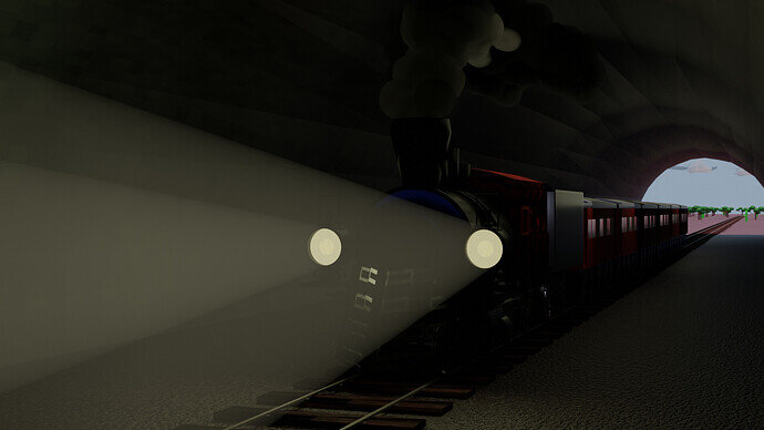
@zeRgenTa Congratulations on winning this collab on steam locomotives. It is a realistic looking project. And a very unexpected idea. The textures used are very well implemented. And the composition is very believable.
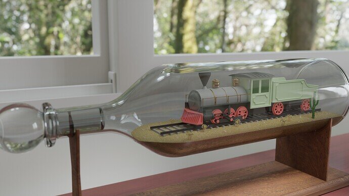
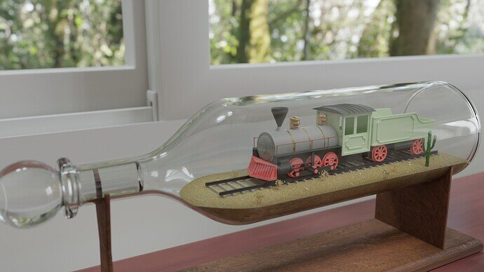
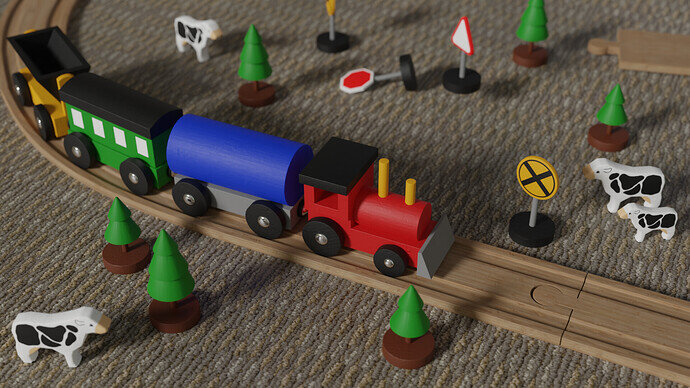
- Tyger2 - Such a nice implementation of steam locomotive, because it allows you to add fun colors to the scene. I think the lighting and shadows could be improved. It’s a closeup and a bit of camera depth (blur) could improve this feeling.
- BlitzDodo - This was also an unexpected entry. Very creative and a really good implementation. A bit more attention to the back door (in a realistic sense).
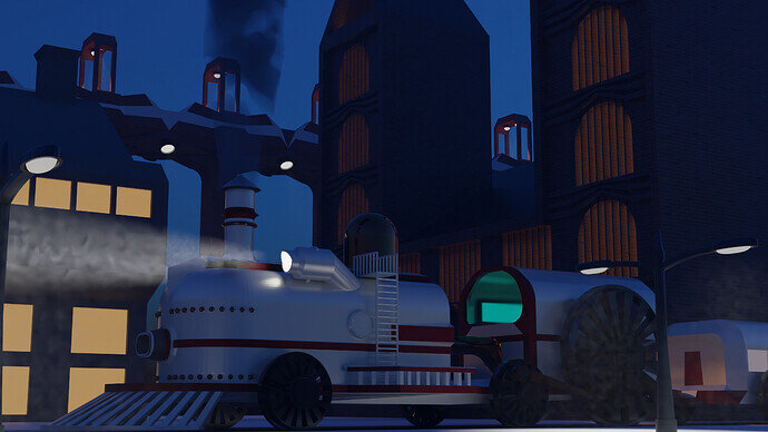
- Joey_Cuevas - This is a really good scene. I love the industrial look of it. All components fit together. You could highlighted the train a bit more, as in center of attention. Now it blends into the background (dark wheels).
- TheDespicableDM - Yes, project planning is difficult sometimes. It happened to me many times. It think your project certainly deserves continuation. Your model is beautiful and can be used in many other projects a main subject or as a prop.
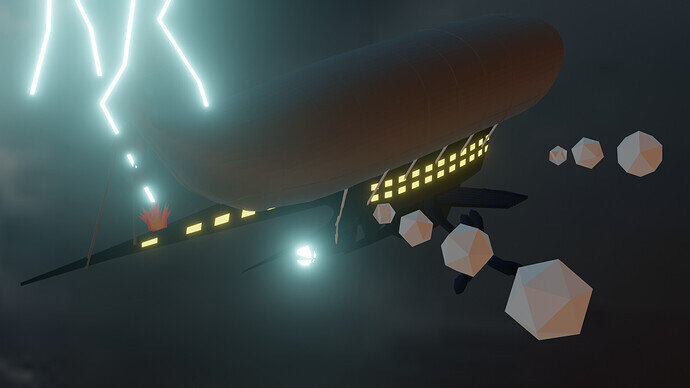
- Cows - And yes, your entry fits more in the next colab. For the viewer it’s hard to recognize a locomotive. But nevertheless I like your composition. Maybe, making the smoke a bit transparent? Or use volume?
- Gordon - I understand the need to be creative. But I think a locomotive without a dragons head could improve the subject. Maybe adding dragon elements to the texture, paint of the locomotive? Now you spend time on the head which could be used to paint the model (time management).
- Jindrich_Jungmann - Even if you say, the model isn’t clean in faces and mesh data, we can see it! The end results counts. And your model looks good in scale, color and texture usage. Also your background solution is very clever. It gives scale to things.
- Willrun - Lovely idea, but the locomotive is difficult to see in detail. I would have given the cockpit? a warm orange glow of the burner. And therefor applying more light to the scene.
