smelly …
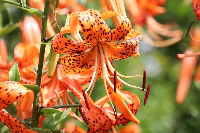
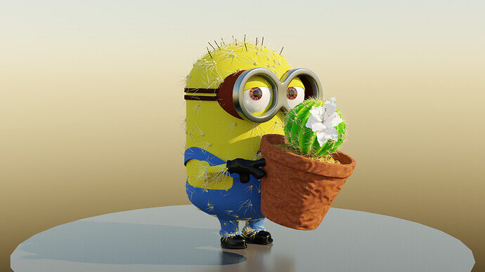
What a good, challenging topic. Definitely outside of my comfort zone, but I will give it a shot. I’m going to try to make this flower a neighbor planted in my apartment complex:
I think it’s a tiger lily?
Gonna be tough but we’ll see how it goes.
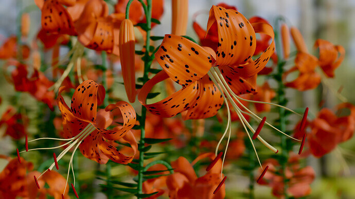
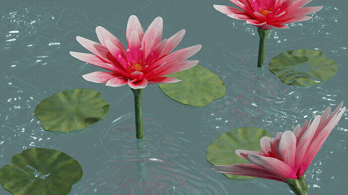
Your plants look really nice! I didn’t appreciate them until I zoomed in. How did you do the detail on the top one. Did you sculpt it?
I used proportional editing for the base shape, then I did the rest with displacement and bump.
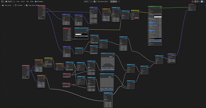
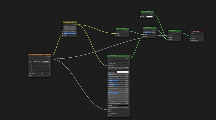
Here is the shader setup for the top of the petal if you’re curious.
It’s a little hard to see all the numbers, but I think it’s good enough to see what I was doing.
My laptop can’t handle that many nodes.
Great achievement.
A node expert!
Fancy stuff there.
Indeed some gnarly nodework. I also appreciate how neatly grouped they are. No spaghetti here!
Maybe adding, increasing slightly subsurface …? 
Very nice, as FedPete says it could do with some translucency or subsurf or something though.
Agreed. I tried to, but I couldn’t quite get it to look right. I don’t quite know what I’m doing with that particular property.
Yes, it’s hard to do. But “We’re all learning here”. 
I´m learning how to create PBR textures and I used them for this scene.
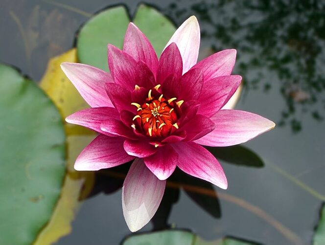
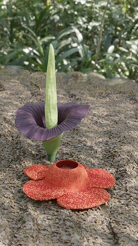
I sculpted a lotus flower, this is my reference.
And my final render.
The scale is a bit off, and I don’t think that’s what a tropical forest floor looks like, but it’s better than a white background.
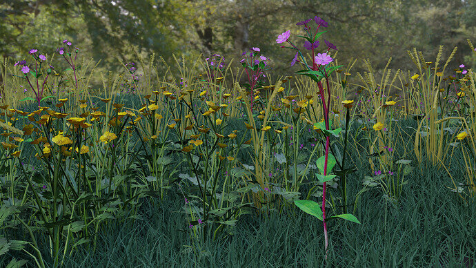
Added the wild pea to the meadow. Had hoped to add more but time held back the poppy I am working on.
Probably have to view full size and look at the lower part to find it, realistic in that, one has to look for them!
Not really made for this closer view, more made as a general ground environment background. Not happy with the seeding grass, is an early all geometry plain colour and it needs a real image for the head.
We @BlenderCollab have a few days to vote. You can vote fast but also think slowly about design, colors, technique, difficulty, subject, realism, etc. Choose consciously and not on your own entry.
And the new subject week 31 “Mechanics” has already started. The winner of this week’s “Music Instruments” challenge may select a subject for week 32.
Excellent work on the flower. I am amazed that it looks exactly like the image reference.
Also in reference to lighting, you can have light passing through the flower petals by this node setup below:
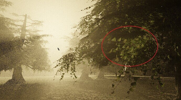
I was recently looking into this myself and I saw your post inquiring about the same thing (too late for before the voting unfortunately). This is how I used it:
You can see the light going through the leaves and illuminating the back with a lighter green. I hope this helps for future projects. 
Cool! I’ll give that a shot. Thank you!
@Tyger2 , congratulations on your entry into the flowering plant’s collab. You’ve succeeded to add rich details to the texture of the flower. The colors are bright. And the resemblance to the reference is astounding. A deserved winner.
- NP5 - I think this is a really good representation of flowering plants. With a diversity of flowers. I miss a bit the wide view of a landscape full of flowers. A higher camera position could improve this feeling.
- FedPete - Still getting points for something else than a small flower … maybe the little story going on?
- Rulo_Martinez - Love the flowers you’ve made. Also the idea of placing them in a water environment. But making transparent, reflective water is very difficult (we all know). I think the ripples are too detailed, too strong, and not on the same scale as the plants.
- zeRgenTa - Beautiful subject to sculpt on. But I’ve seen this plant on TV. And it is a big plant, bigger than a human (my knowledge). So a different composition could help to express this fact.
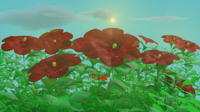
- Willrun - The flowers are good, nicely detailed. The scene could use more brightness, contrast. Try to improve the lighting. looking into the sun is difficult, meaning light shine through the flowers and not on (in front).
That’s it, nice entries, good subject. Well done!
And did you learn something new this week?


